Originally Posted on the KeyLines Blog
A few weeks ago, we had the opportunity to speak about KeyLines and graph visualization at GraphConnect SF 2014.
The 700+ graphistas in attendance needed no convincing about the power of graphs. The “Graphs are everywhere” maxim has long settled into the collective conscious of theNeo4j community, sparking a whole ecosystem of startups, services and tools as well as a wave of innovation across big business.
But what about data that isn’t inherently graphy? We wanted to show the benefit of visualizing data that we don’t automatically think of as a graph, using KeyLines.
Given an audience of Neo4j enthusiasts, we decided to look at Neo4j itself. This blog post shows how we used the GitHub API to visualize how Neo4j’s is built and maintained.
What is GitHub?
First, some background:
GitHub is an online service for sharing and publishing code. It allows teams to collaborate on projects and easily manage revisions using three functions:
- Forking – copying a repository from one user to another.
- Pushing / pulling – managing revisions back to the project repository.
- Merging – to merge the changes back to the main repository.
With 17 million repositories and 7.5 million users, great rivers of data are flowing through GitHub every second. The potential for insight into how projects and teams work is huge.
Existing visualization
For some inspiration, we took a look at the data visualization options already available in GitHub. Mostly, they focus on standard quantitative measures:
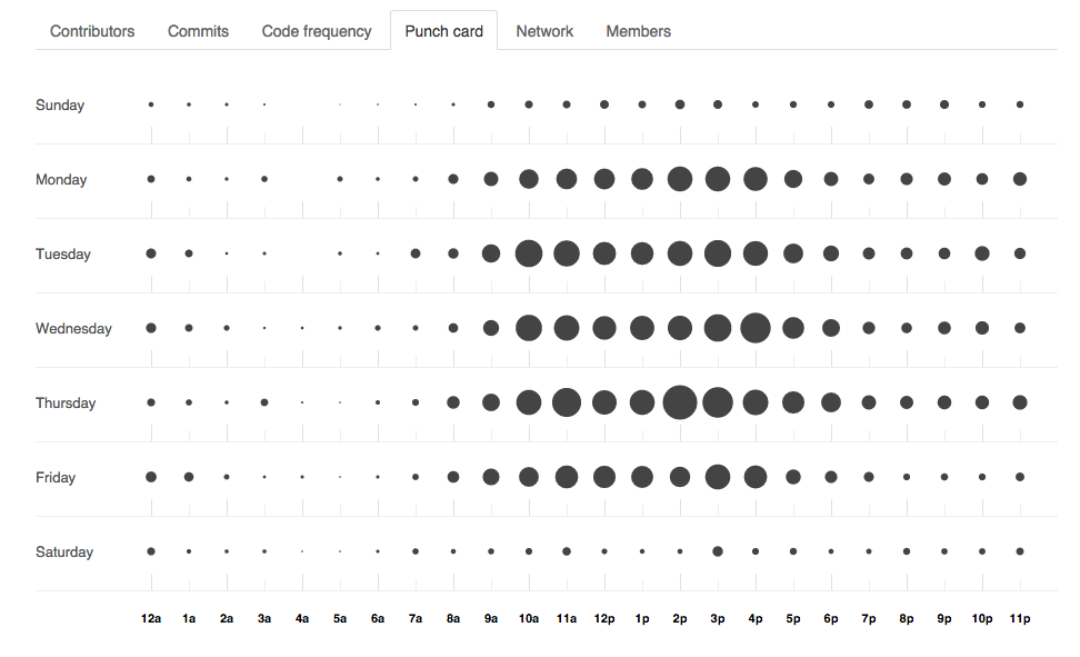
Heat maps and punch cards show detail on what’s happening and when
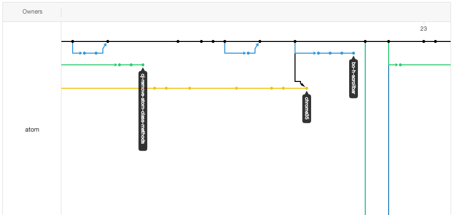
A network chart attempts to summarize different branch histories
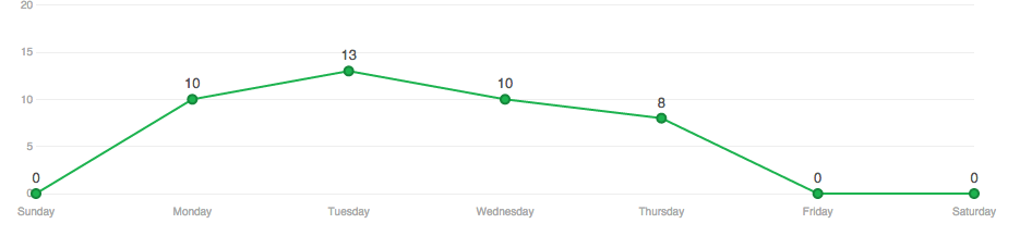
Never push on a Friday
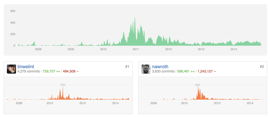
Contributor charts can show when the highest volumes of contributions were made.
But what’s missing here?
Focusing on the contributors and files in isolation means we’re missing an entire dimension of data insight. Including the relationships between different entities enables a richer, deeper analysis of our GitHub data.
Building the graph visualization application
To build our application, we broadly followed five steps: gather, model, design, refine, and interact.
Gather
GitHub has a great API that enables the extraction of data about specific code repositories and users. For easy demonstration purposes we decided to visualize just the last 10 days of commits to the Neo4j repository. (That said, there’s no reason that the whole repository could not be visualized in KeyLines. It would just need a bit more work to prevent excessive visual noise and sensible AJAX calls to allow users to drill down into the large amount of data.)
The information we gathered related to commits within a specific time period and the meta information relating to the commits (represented as links in the chart) as well as the files modified and users responsible for the commit (each of which were represented as nodes in the chart).
Model
Converting flat data to a graph model can be complicated. There are many different combinations in which entities can become nodes, links or properties of nodes and links. The questions you want to ask of your data should define the model used.
More detail on this process is in our blog post Building Great Network Visualizations.
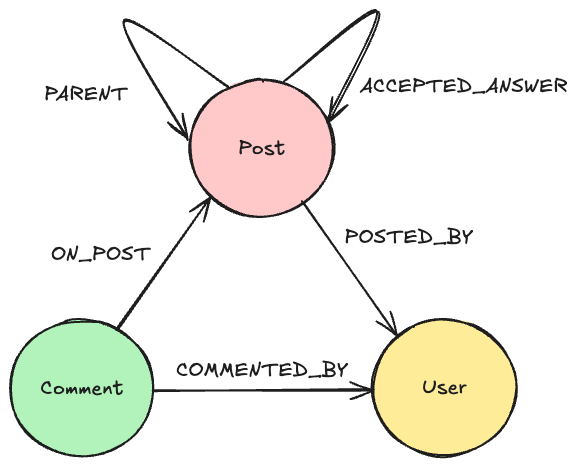
We decided to look at the relationships between individual contributors and files within a single repository, meaning we could sketch this basic model:
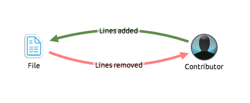
GitHub collaboration mapped to a graph structure: contributors and files are nodes, links are commits. Links are colored dynamically from a scale of red to green, where red means the commit has removed more lines than added lines, green means the commit has added more lines than removed lines and yellow has roughly equivalent additions/removals.
Represent
Data slurped and model (loosely) defined, we can get start building the application.
(More detail on this can be found in our SDK documentation Getting Started page. Contact us for an evaluation if you don’t have access to the SDK site.)
We made a few design and functionality decisions early on:
- All the data was time-stamped, so incorporating the time bar was a no-brainer.
- To give the application a different ‘look and feel’, we decided on a black background to the chart and time bar.
- Most commits have a mix of deleted and added lines, so we wanted to color links on a red-green scale programmatically.
- Contributor and file icons would be extracted from the GitHub API.

Refine
Basic application running, we set about refining the behavior and tweaking the appearance. We’ve found the best way to do this is through basic UAT. Giving the app to someone who hasn’t used it before and asking them to answer some questions.
From this we learnt we needed to:
- Add the option of sizing the file nodes by the degree of commits:
- Add glyphs to links, showing the number of lines added and removed:

- Highlighting sub-networks of nodes and links by ghosting everything not selected:

- The ability to double-click nodes to link to GitHub files and profiles.
So, what can we learn from the graph?
Now we have a functioning graph visualization application populated with10 days’ worth of repository data. But what can we actually learn with this tool?
Activity over time
The time bar offers an instant view of commit volume through time. But unlike the charts provided by GitHub, the time bar allows instant filtering of the time range to investigate peaks and troughs in productivity.
On October 13, a maintenance version (1.9.9) was released, and we can see the flurry of commits taking place the Friday before:
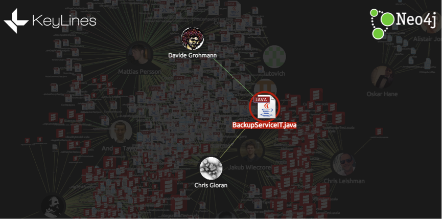
Find important files, and see who’s been working on them
This BackupServiceIT.java file was one of the most heavily edited according to our data. Selecting it, we can see who has contributed, how many lines each contributor added or deleted, and also click through to the file to dig deeper.
Likewise, ExpandPlanningIntegrationTest.scala had four contributors during this time period. The time bar shows a red selection line indicating commit activity for this particular file versus total commits in the project (grey bars).
From this data we could reasonably surmise that some core and/or refactoring changes were being made by the contributors and they updated this test file accordingly.

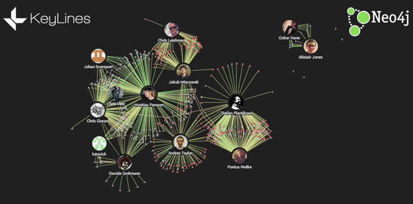
Understand team structures and expertise
Often in open source projects, teams can be formed organically. Viewing collaboration as a graph visualization emphasizes these team structures. In this graph, we can find three distinct teams:
Java

Scala
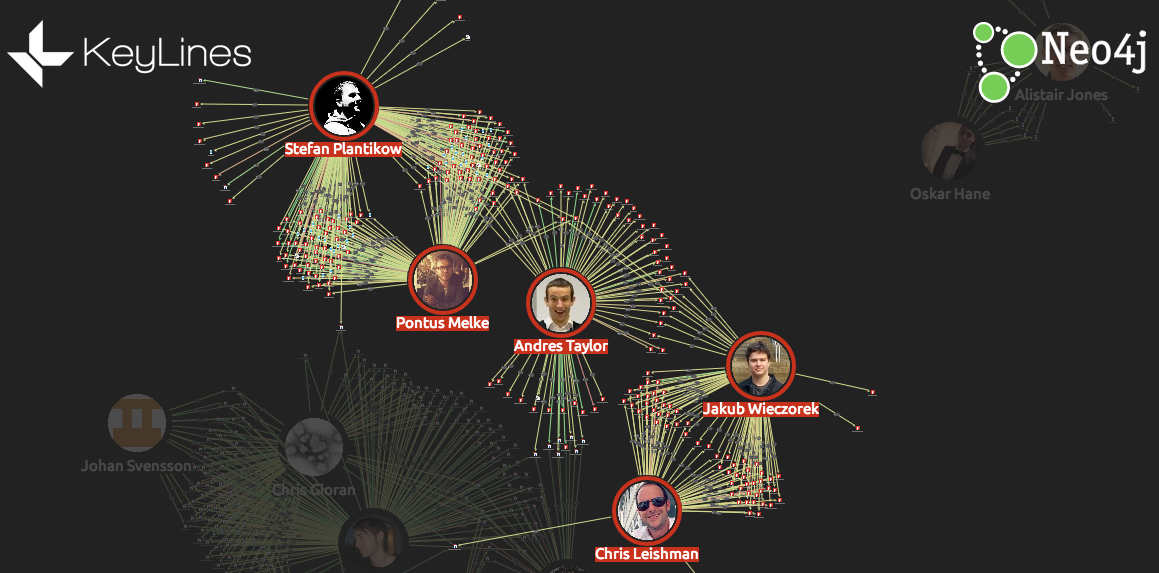
Front-end
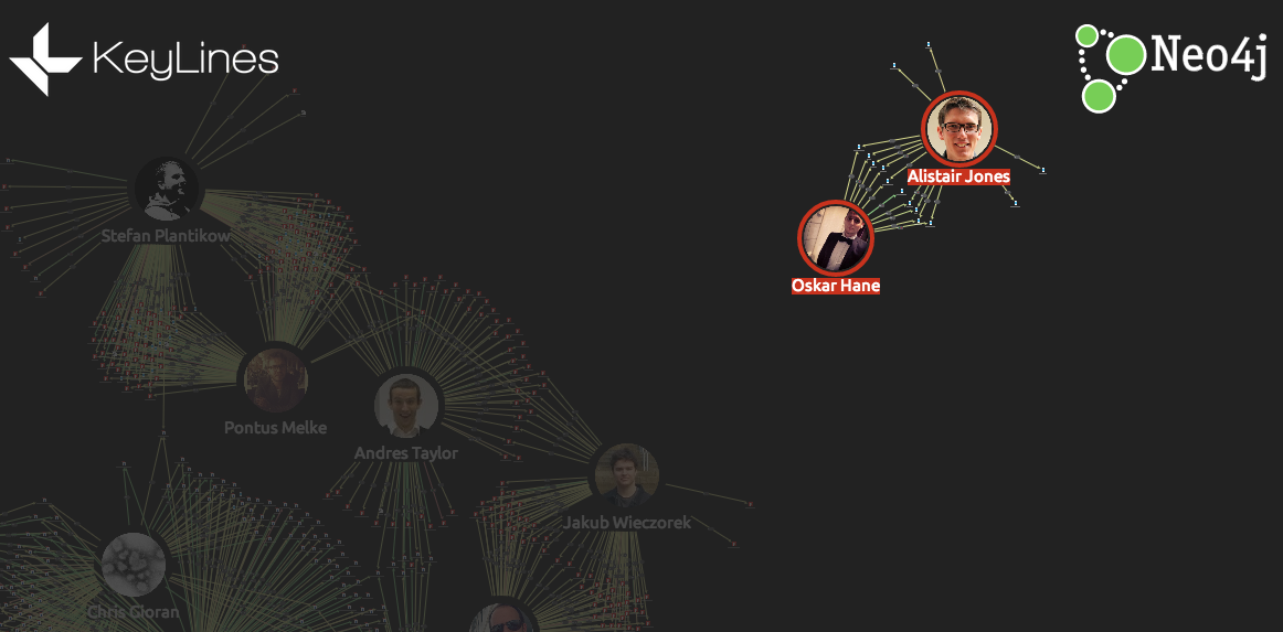
We can learn more by watching these relationships over time. For example, here are two devs working together on Scala files over the course of a week:

Watching the second relationship over time, we can see each developer working independently on files before partnering.
Try it yourself
Obviously, we’re only looking at a tiny subset of the data available here, but in about a day we were able to build a functioning visualization application to help us understand how a team and a project is working.
If you would like to try it for yourself, just get in touch – we’d love to hear from you.
Want to learn more about graph databases? Click below to get your free copy of O’Reilly’s Graph Databases ebook and discover how to use graph technologies for your application today.
Share Article


Explore
Related Articles

Mastering Fraud Detection With Temporal Graph Modeling

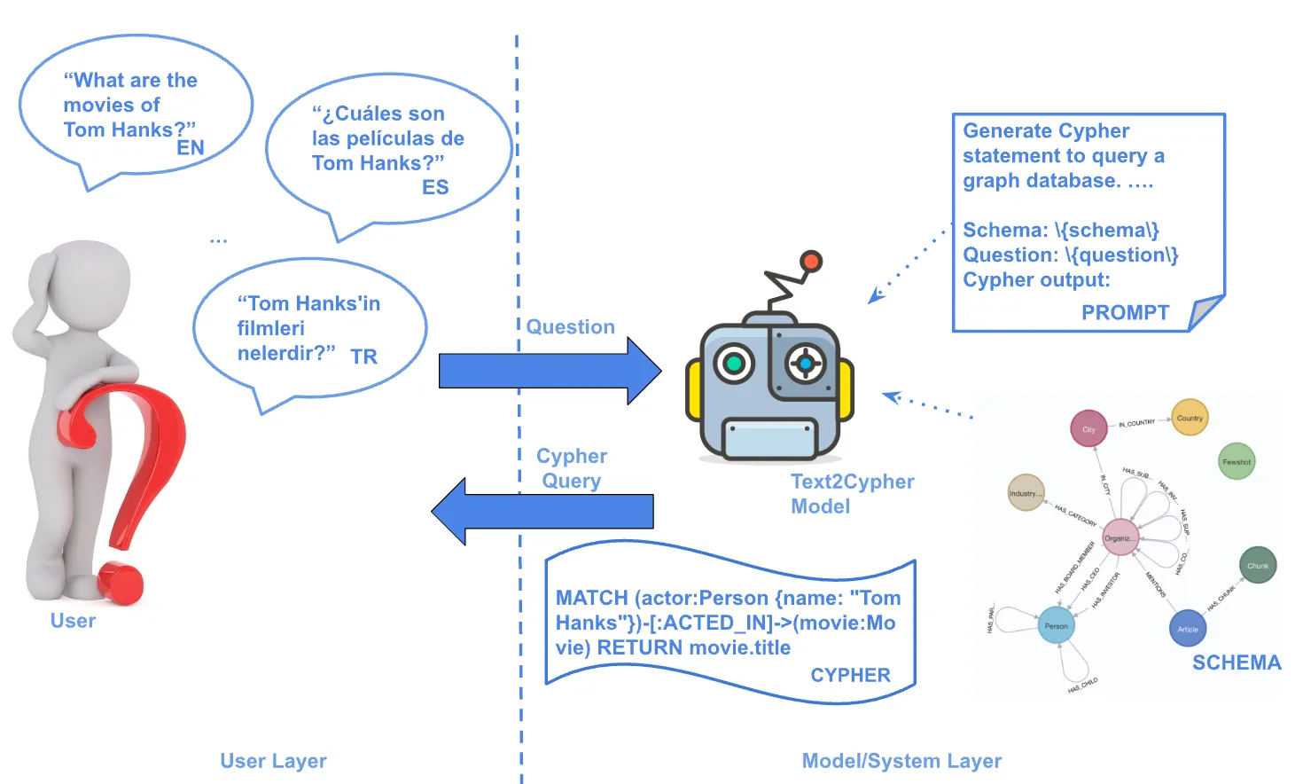
Text2Cypher Across Languages: Evaluating Foundational Models Beyond English