5 ways to tackle big graph data with KeyLines and Neo4j

Product Manager, Cambridge Intelligence
7 min read

Understanding big graph data requires two things: a robust graph database and a powerful graph visualization engine. That’s why hundreds of developers have combined Neo4j with the KeyLines graph visualization toolkit to create effective, interactive tools for exploring and making sense of their graph data.
But humans are not big data creatures. Given most adults can store between 4-7 items only in their short-term memory, loading an overwhelming quantity of densely-connected items into a chart won’t generate insight.
That presents a challenge for those of us building graph analysis tools.
How do you decide which subset of data to present to users? How do they find the most important patterns and connections?
That’s what we explore in this blog post. You’ll discover that, with some thoughtful planning, big data doesn’t have to be a big problem.
The challenge of large graph visualization
For many organizations, “big data” means collecting every bit of information available and then figuring out how to use it later. One of the many problems with this approach is that it’s incredibly challenging to go beyond aggregated analysis to understand individual elements.
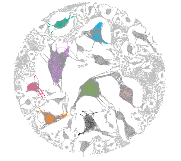
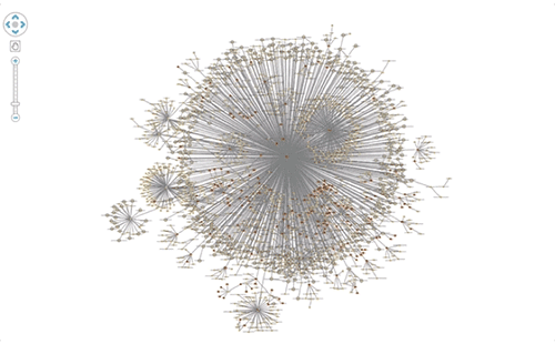
20,000 nodes visualized in KeyLines. Pretty, but pretty useless if you want to understand specific node behavior. Data from The Cosmic Web Project.
To provide your users with something more useful, you need to think about the data funnel. Through different stages of backend data management and front-end interactions, the funnel reduces billions of data points into something a user can comprehend.

The data funnel to bring big data down to a human scale.
Let’s focus on the key techniques you’ll apply at each stage of the funnel:
1. Filtering in Neo4j: ~1,000,000+ nodes
There’s no point visualizing your entire Neo4j instance. You want to remove as much noise as possible, as early as possible. Filtering with Cypher queries is an incredibly effective way to do this.
KeyLines’ integration with Cypher means giving users some nice visual ways to create custom filtering queries, like sliders, tick-boxes or selecting from a list of cases.
In the example below, we’re using Cypher queries to power a “search and expand” interaction in KeyLines:
MATCH (movie:Movie{title: $name})<-[rel]-(actor:Actor)

RETURN *, { id: actor.id, degree: size((actor:Actor) --> (:Movie)) } as degree
First, we’re matching Actors related to a selected Movie before returning them to be added to our KeyLines chart:
There’s no guarantee that filtering through search is enough to keep data points at a manageable level. Multiple searches might return excessive amounts of information that’s difficult to analyze.
Filtering is effective, but it shouldn’t be the only technique you use.
2. Aggregating in Neo4j: ~100,000 nodes
Once filtering techniques are in place, you should consider aggregation. There are two ways to approach this.
First, there’s data cleansing to remove duplicates and errors. This is often time-consuming but, again, Cypher is your friend. Cypher functions like “count” make it really easy to aggregate nodes in the backend:
MATCH (e1:Employee)-[m:MAILS]->(e2:Employee)
RETURN e1 AS sender, e2 AS receiver, count(m) AS sent_emails
Second, there’s a data modeling step to remove unnecessary clutter from entering the KeyLines chart in the first place.
Questions to ask in terms of decluttering: Can multiple nodes be merged? Can multiple links be collapsed into one?
It’s worth taking some time to get this right. With a few simple aggregation decisions, it’s possible to reduce tens of thousands of nodes into a few hundred.

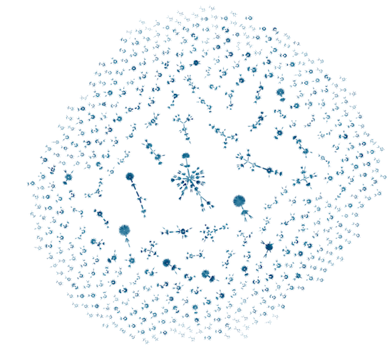
Using link aggregation, we’ve reduced 22,000 nodes and links into a much more manageable chart.
3. Create a Clever Visual Model: ~10,000 – 1,000 nodes
By now, Neo4j should have already helped you reduce 1,000,000+ nodes to a few hundred. This is where the power of data visualization really shines. Your user’s visualization relies on a small proportion of what’s in the database, but we may then use visual modelling to simplify it further.
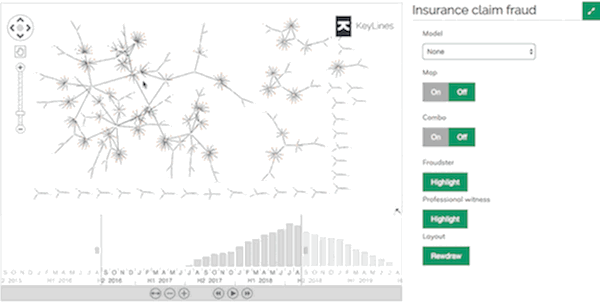
The below chart shows graph data relating to car insurance claims. Our Neo4j database includes car and policyholders, phone numbers, insurance claims, claimants, third parties, garages and accidents:

Loading the full data model is useful, but with some carefully considered re-modelling, the user may select an alternative approach suited to the insight they need.
Perhaps they want to see direct connections between policyholders and garages:
Or the user may want a view that removes unnecessary intermediate nodes and shows connections between the people involved:

The ideal visual data model will depend on the questions your users are trying to answer.
4. Filters, combining and pruning: ~1,000 nodes
Now that your users have the relevant nodes and links in their chart, you should give them the tools to declutter and focus on their insight.
A great way to do this is filtering by adding or removing subsets of the data on demand. For better performance, present them with a filtered view first, but give the user control options to bring in data. There are plenty of ways to do this – tick boxes, sliders, the time bar or “expand and load.”
Another option is KeyLines’ combos functionality. Combos allow the users to group certain nodes, giving a clearer view of a large dataset without actually removing anything from the chart. It’s an effective way to simplify complexity, but also to offer a “detail on demand” user experience that makes graph insight easier to find.
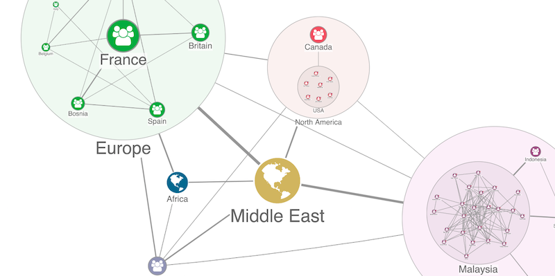
Combos clear chart clutter and clarify complexity.
A third example of decluttering best practices is to remove unnecessary distractions from a chart. This might mean giving users a way to “prune” leaf nodes, or making it easy to hide “super nodes” that clutter the chart and obscure insight.
Leaf, orphan and super nodes rarely add anything to your graph data understanding, so give users an easy way to remove them.
KeyLines offers plenty of tools to help with this critical part of your graph data analysis. This video on managing chart clutter
explains a few more.
5. Run a layout: ~100 nodes
By this point, your users should have a tiny subset of your original Neo4j graph data in their chart. The final step is to help them uncover insight. Automated graph layouts are great for this.
A good force-directed layout goes beyond simply detangling links. It should also help you see the patterns, anomalies and clusters that direct the user towards the answers they’re looking for.
KeyLines’ latest layout – the organic layout. By spreading the nodes and links apart in a distinctive fan-like pattern, the underlying structure becomes much clearer.
With an effective, consistent and powerful graph layout, your users will find that answers start to jump out of the chart.
Bonus tip: Talk to your users
This blog post is really just a starting point. There are plenty of other tips and techniques to help you solve big graph data challenges (we’ve not even started on temporal analysis or geospatial visualization).
Probably the most important tip of all is this: Take time to talk to your users.
Find out what data they need to see and the questions they’re trying to answer. Use the data funnel to make that process as simple and fast as possible, and use the combined powers of Neo4j and KeyLines to turn the biggest graph datasets into something genuinely insightful.
Visit our website to learn more about graph visualization best practices or get started with the KeyLines toolkit.
Cambridge Intelligence is a Gold Sponsor of GraphConnect 2018. Use code CAM20 to get 20% off your ticket to the conference and training sessions, and we’ll see you in New York!
Share Article


Explore
Related Articles


A workbench for teams to query, explore, and visualize graph data
Neo4j Named “One to Watch” in Snowflake’s 2026 Modern Marketing Data Stack Report
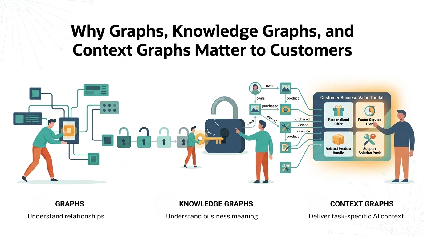
1 of 3: The difference between a graph, a knowledge graph, and a context graph