
Connecting the Dots in Early Drug Discovery at Novartis

Senior Scientist, Novartis
18 min read

Editor’s Note: This presentation was given by Stephan Reiling at GraphConnect San Francisco in October 2016.
Presentation Summary
In this talk, Senior Scientist Stephan Reiling describes some of the ways that a major pharmaceutical company conducts the search for medical compounds, and the significant role that graph database technology plays in that effort.
The underlying problem is how to construct a system of scalable biological knowledge.
This means not just connecting vast amounts of heterogeneous data, but enabling researchers to construct a query for a particular kind of triangular relationship: The nodes are chemical compounds, specific biological entities, and diseases described in the research literature, and the system has to use the uncertainty in key links as part of the query.
A specific way graph technology furthers this effort is that it enables the system to capture the strength of the relationship between terms in a medical research text by encoding it in the properties of a graph connecting these terms.
This in turn provides a foundation for later queries that link the literature to observed chemical or biological data. These results can also be tested by knocking out some of the links to see how the results differ.
Full Presentation: Connecting the Dots in Early Drug Discovery
This blog post is about how we have combined lots of heterogeneous data and integrated it into one big knowledge graph that we are using to help us discover cures for diseases.
A Graph for Biomedical Research
The Novartis Institutes for BioMedical Research is the research arm of Novartis, a large pharmaceutical company. Our research is focused on identifying the next generation of medicines to cure disease.
We identify medicines using biomedical research. This enterprise has become a big data merging exercise where you generate lots of data, you analyze even more data, and all of this at the very end is distilled into a small pill or injection or in some treatment.
This is a project that we’ve been working on for almost three years, and we are now getting the first results and they look very promising. One topic is how we have combined lots of heterogeneous data and integrated that into one big graph that we are now using for querying.
Some of the data we are putting into this graph is coming from text mining, and we are doing this a little bit differently in terms of what we extract from the text and how we do the pattern detection. Further down, I have some examples of how this can actually be used.
Why We Built the Graph
Let me start with why we are doing this in the first place.
In the present, it’s about images used to capture complex biology. In the past, when you wanted to understand biology and you were interested in proteins, you would isolate a protein, you would purify it, you would put it into a little test tube, and you would characterize it.
If you wanted to identify a compound or something that acts on it, you would put the compound into the same test tube and see what it does to the activity of that enzyme or some other protein. This is very reductionist, but it allows you to get very precise measurements if you want to, and we have decades worth of data along those lines.
For a long time that was the workhorse for drug discovery. This initial compound goes into a multi-year effort that at the very end results into a drug that comes onto the market. And, as we found out, biology cannot be reduced to a single protein in a test tube. It’s much more complex.
Over the last five to eight years or so, all of the pharmaceutical companies and research institutes across the world are now starting to try to capture the complexity of this biology. One way to do it is to run high content screens.
High-Content Screens
The image on the left below is a snapshot of a cell culture; this is a crop of a much larger image. We run large-scale screening assays on these kinds of things. We have big automated microscopes with lab automation, and we can easily generate terabytes and terabytes of images along those lines.
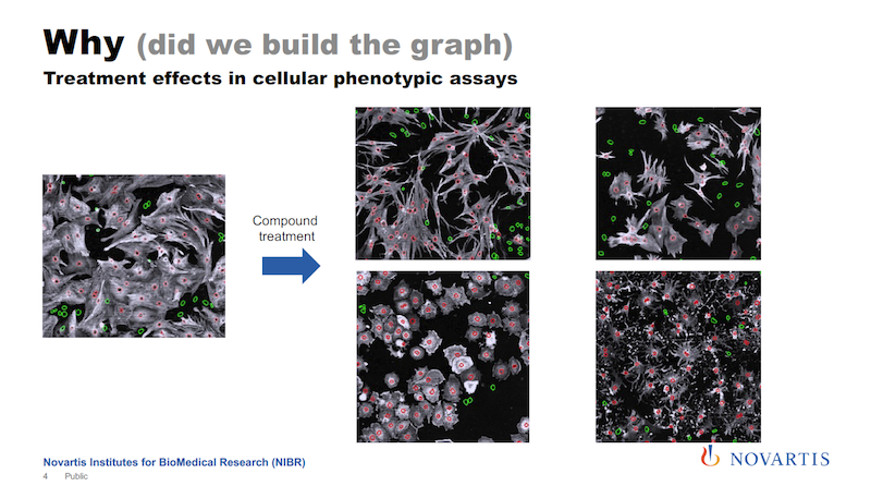
What you see in white is basically the cell body, the red circles are the nucleus, and green are the nuclei of cells that do not contain a certain protein. And let’s say the goal is to increase the number of the cells that express this protein, which is colored white here.
So let’s say you add some treatment to it; it could be a compound, it could be a small RNA, it could be anything. Then you see that not only do the numbers change, but I hope you can see that there is more going on. The shape of the cells is changing. Now you add a different compound to it, and something else happens. We call this a phenotype.
We’re now running very large-scale screening efforts where we use phenotypes to understand the underlying biology, and also to better identify the compounds that will go into this long process to get a drug in the end.
This process of generating data is only making our job harder. Lab automation is progressing, and we can generate more and more of this data. There are now movies coming up where we take live cell imaging and we follow the cells over time. There is 3D. We take 3D slides and so on. There’s more and more of this data coming our way.
The Basic Problem: Scalable Biological Knowledge
Here is the basic problem statement: We have decades’ worth of this reductionist data. We have these large compound live-reads that are annotated. We know what they did in the past, but now things are changing, and we’re getting more and more of this imaging data and these phenotypic assays.
When we try to analyze this, it becomes much more apparent that we need to have a way to scale biological knowledge, to have a system that allows us to store biological knowledge, and then run queries against it so that we can use this store to analyze this data. I still don’t know exactly what “biological knowledge” means, but we’re going to make a system for it.
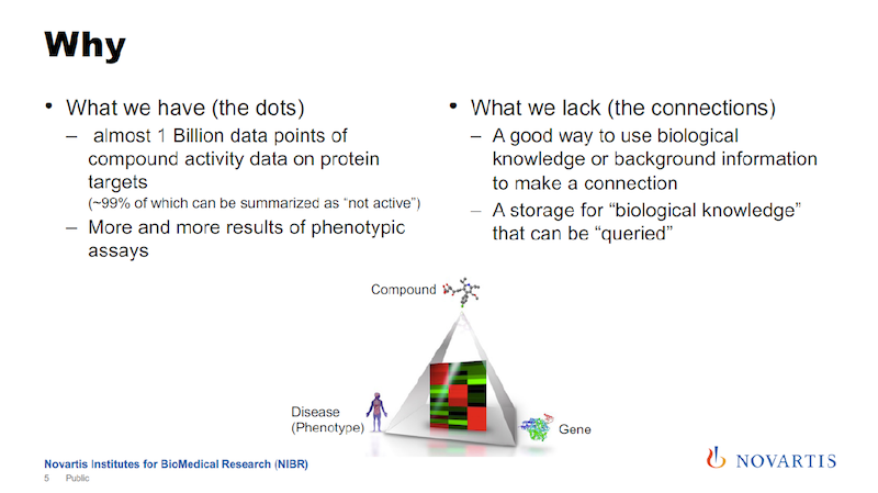
In the image above, the key triangle connects a compound, a gene and a phenotype. The way we think about it is that for successful drug discovery, you need to be able to navigate this triangle.
Using the data that we accumulated historically, we are very strong on one edge of the triangle, between the compound and the gene, but not so much on the other edges. We’re trying to fill this knowledge gap.
Text Mining for Chemicals, Diseases and Proteins
I mentioned that one of the sources of information that we are using is text mining. In the slide below is some scientific text, and there are tools available that will then identify entities of interest in this text.
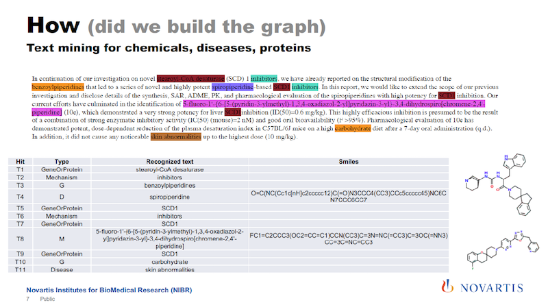
Here we are identifying compounds, genes, diseases and processes and so on. And some of these tools cheat you a little bit in that they tell you only this is a compound, but they don’t tell you what the compound is composed of.
One of the things we have been working on is to identify exactly what compound or gene it really is. We then basically re-engineer the chemical structure from what we identify in the text.
We also try to identify relationships between the entities in the text and come up with statements: “The compound inhibits this target.” And so on.
The Richness of the PubMed Library
The corpus that we were using initially is PubMed from the National Library of Medicine (see below). It’s an incredible resource. Since 1946, they have been collecting articles from about 5,600 scientific journals, and they make abstracts of these articles freely available. It’s a really incredible resource.
But what is sometimes not appreciated is that when an article or an abstract gets entered into this library, it is tagged by human experts. They call these MeSH terms: the medical subject headings.
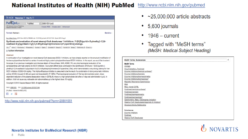
In the image above, the text on the left gives you an impression of how many tags you actually get, shown on the right. And the nice thing about these tags is how they are organized and that they’re coming from human experts.
Sometimes tags describe the article in a way that you would not be able to get from the text because of the human curation that is happening.
I mentioned that the MeSH terms are organized, and below there is a little bit about how they are organized. They’re organized in trees. The diagram shows five of them, which are the ones we’re interested in. In total there are 16 trees, which include things like geography or occupation, which for our purposes, is not of that much interest.
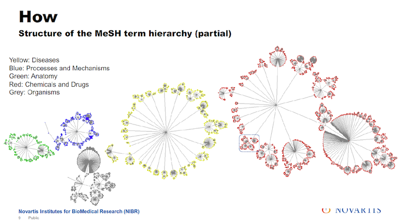
There are about a quarter million tags that are used in these trees. And I have to make one disclosure here: In reality they don’t look quite that nice. The overall organization is a tree.
There are some connections between the branches and so the actual layout of this doesn’t quite look that nice but, in general, it’s organized as a tree.
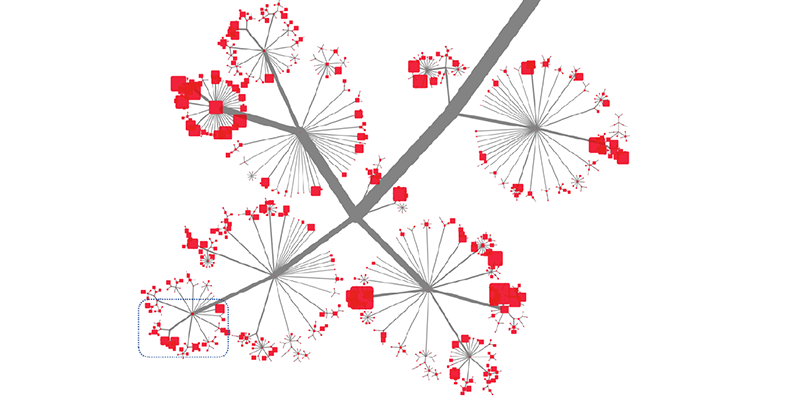
This slide shows a little bit how deep and how rich this is. This is sized by the number of articles that are annotated with a specific tag. And you cannot see the tags.
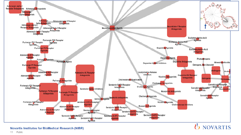
As you zoom further in, you can tell, just from the tags, that the article is going to cover a specific subtype of a receptor. So we’re using very rich and detailed information.
But the disadvantage of this is that from the text mining we’re getting entities, and we’re getting relationships between these entities. Here we can only tell that the tag is in the abstract, or it’s annotated as this. And we would like to combine these by putting the PubMed information into our graph. So how do we do it?
Constructing Relationships in a Graph from Relationships in a Text
We’re exploiting the fact that we’re looking across all of these 25 million abstracts. Here’s a simple example using four articles. And if you do this and you look across these articles, you will see that some of these entities – like Compound A and Gene 1 – occur together quite frequently.
We’re using association rule mining to establish the probability of co-occurrence for these entities. So we’re not using the verbs of the sentence; we’re only using these entities. We can collect the lift, as it is known, and we scale it from zero to one.
If it’s above a certain threshold, we then say there is a relationship between entities (in this example Compound A and Gene 1) that we put it into the graph. So here’s a way that we can use the statistical analysis of relationships in a text to generate relationships in a graph.
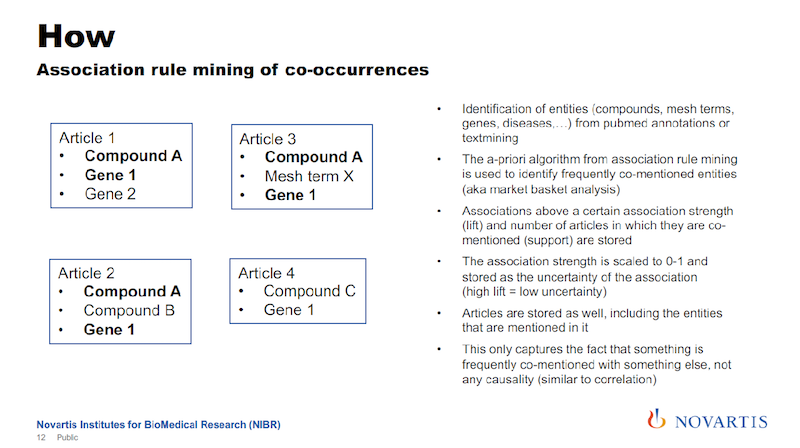
The lift is the association strength, and we actually store that as the uncertainty of the association. The reason is that later on, we’re going to do a lot of things where we do graph traversals, and we’re going to use this as a distance measure in the graph.
The associations will give us a confidence measure for the association, and we just take the inverse. A high association strength has a low uncertainty, and that’s the way that we’re entering this into the graph.
Putting This Metric to Work
What can you do with this?
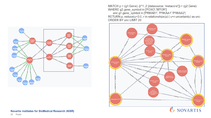
An earlier graph showed the triangle that we’re trying to navigate, so now I can just do a triangle query, where I say, “I want to find a triangle between a compound, a gene and a phenotype or a disease, and I want to take the sum of the distances of the three edges, and use that sum to rank these triangles. And I want to find the triangle that has the lowest uncertainty at the top.”

When I do this (shown on the left), one of the first triangles that comes up shows tafamidis amyloid neuropathies as a disease and transthyretin as an enzyme. How can we validate if this is common knowledge, or not?
We go to Wikipedia and we check. The text in the left box is taken from the Wikipedia page about tafamidis. One of the first sentences on the Wikipedia page states that tafamidis is the drug that is used to treat this amyloid neuropathy, and it’s caused by a transthyretin-related hereditary amyloidosis.
This is the validation, or one way of validating this, that with this approach, with this association, we have captured this.
We can do this again, and the second one that comes up (shown on the right) is another triangle and again the text is from the Wikipedia page. It talks about Canavan disease, and in this case, the compound is not the drug treatment, but it’s actually the accumulation of this compound that causes the disease.
The point I’m trying to make here is that we are learning more details about this relationship. In the one case, the compound played the role of the drug, and in this case the compound plays the role as the causative agent. The important thing is that we get this overall picture and that’s what we care about.
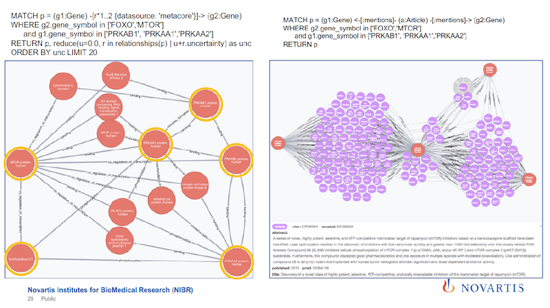
So we go to Wikipedia, and we check. Why wouldn’t we just load Wikipedia?
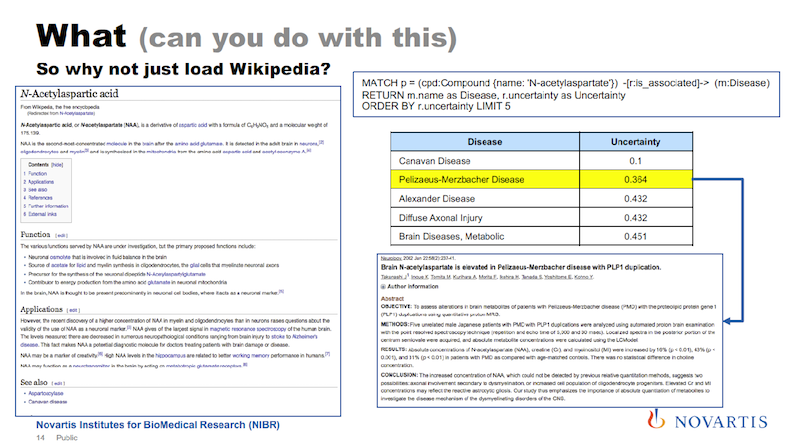
On the left above is the Wikipedia page for this compound that was at the top of the second triangle on the previous slide. This is the entry for N-Acetylaspartic acid, and as far as Wikipedia pages go, it’s a rather short page. And really the only thing that’s on this page is the relationship of this compound with Canavan disease and the enzyme on the previous slide.
Now using our graph, I can do a query for this compound, asking to rank order the diseases that are associated with it.
The results are shown in the box on the right: these are the top five diseases and the first one is Canavan disease. And since this is data from the PubMed literature, I can now ask for the supporting evidence for this association.
Shown in the lower box is one article that you can pull up, and directly in the title it says that this compound plays a role in Pelizaeus-Merzbacher disease, which I didn’t know.
Other Uses for the Triangle Search
When we analyze cellular assays, we are actually not that interested in diseases. However, I can basically take the same query that I had before and I just exchange the disease element with a cellular component, for example, and I get the results on the left below.
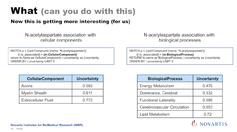
And if you remember, Canavan disease is a neural disease, so the components shown here are all related to the central nervous system.
On the right, I’m doing the same thing. I just replace cellular component with biological process, and here I get the list of biological processes that are associated with this compound. And for the analysis of cellular assays, these cellular processes are really something that we’re interested in. All of this comes from these mixtures.
So this gives us a very broad annotation or knowledge of what is in PubMed. This was the text mining I was talking about in which we are integrating heterogeneous data sets.
Other Data Sources in the Graph Database
The slide below shows what we have put into this graph database so far.

The green ones, the top three, I covered earlier in my section on text mining. There are ten more sources.
The selection was done so that they should complement each other. We have toxicogenomics database in there. We have protein-protein interactions. We have systems biology and pathways, proteins and gene annotations.
All of this, we integrate and match up in terms of the identifiers and the objects that are in there. And we have about 30 million nodes that are now in this database. We’re also putting the articles in there. And the majority of these nodes are these articles.
For us, what is especially important is that we have about two million compounds. That, for us, is a really important number. But we’re not going to use this to identify new genes or anything like that. For us, this is all about relationships.

We have about 91 different relationships and about 400 million total relationships. And the 91 different relationships, that’s just the richness of the biology and the underlying data that we’re getting.
Below you can see briefly what these relationships look like. Here are two examples: a protein phosphorylates a certain protein, and the compound affects the expression of this protein. We’re trying to be pretty broad here.
The Overall Build Process
Here is a little bit about the technical side.
Below is the infrastructure we have in place where the PubMed abstracts first go into the Mongo database (MongoDB), and that is really what is driving the text analysis.
The main reason is that we are using the PostgreSQL database in the middle is because of existing data warehouses at Novartis, where there is already work that has been done to do some pre-summarization of data, internal and external. And we can just do ETL to get this into this Postgres database.
And that is, for us, very fortunate. Many years went into these upstream data warehouses as you can imagine.

To get data into Neo4j we use the CSV batch importer. At this point, we’re still figuring out exactly how we do the text mining and so on, so doing this staging through CSV files has worked very well for us.
Using the Neo4j Database: An Example
What do we really use this for?
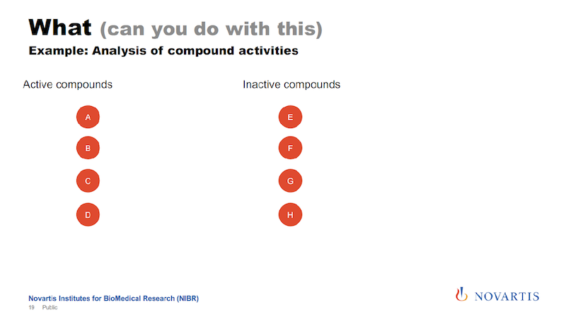
Here is one example: I talked about running these imaging assays and in a lot of cases, we know what we’re looking for, we want to see this phenotype, and we don’t want to see other phenotypes. So we can categorize compounds and categorize them as active or inactive.
And if we now want to analyze this data, what we had done in the past, and we can do this now also here in a graph form. We can look for other target annotations that we have for these compounds, and we call this “target enrichment.”
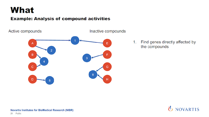
We have been doing this based on relational databases, and it’s a hit or miss. But now we can now go into the graph and run queries where we are saying, “What nodes can we reach for each active or each inactive compound within a certain distance?”
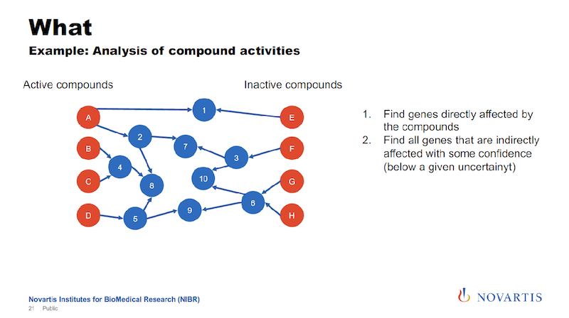
And this is where the uncertainty comes back. We’re trying to identify nodes that can be reached from the actives, but not from the inactives, or are much closer to the actives than they are to the inactives.
And the idea is that this is something that the actives have in common. It could be a gene, it could be a biological process, it could be a pathway that differentiates the actives from the inactives.
The slide below shows a little bit of the technicality here.
We run these queries and we get rows of information. Every row says for the node, which is a compound, the distance, and then we pivot this into a distance metric for every compound. We have an indicator column, the distance to these nodes, and if it cannot be reached, we just set it to a really high value.
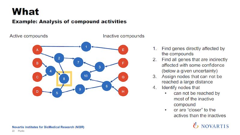
Earlier I mentioned we’re doing this for hundreds of thousands of compounds. This was an example given to me by a biologist and it has 34 compounds, so that makes it easy to display here.
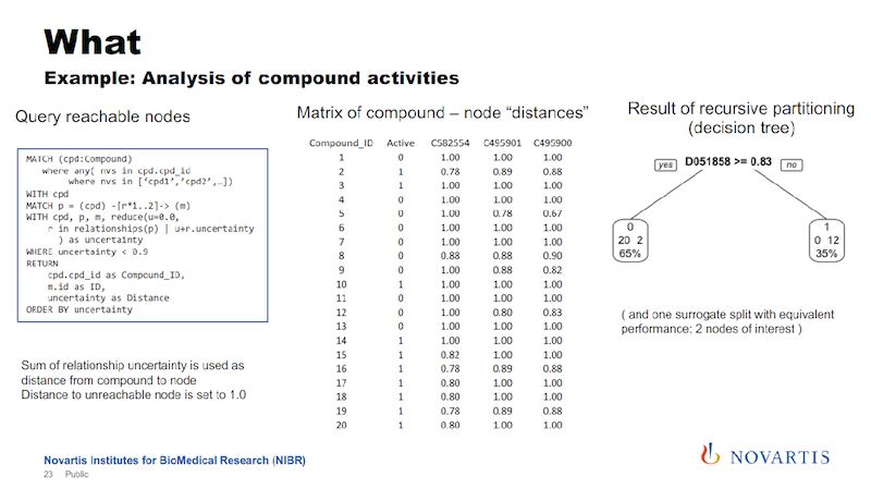
We then run a partitioning. We try to identify a cut that separates the actives from the inactives. In the example here on the right, we can find a cut that splits 12 of the 14 actives on one side, and all of the inactives on the other side.
The way that these decision trees or partitioning methods work, they will also find other cuts that work as well, so this is called a surrogate split, and we also use those.
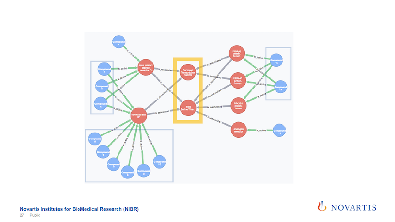
In this example we found two of these internal nodes that we’re looking for, as shown on the next slide.
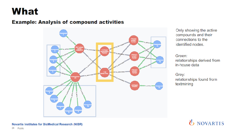
These are now just the active compounds, and the blue are the compounds, the red are the nodes that are in this network, and in this case these are all genes. The yellow highlight shows the two central nodes that seem to determine if the compound shows the desired phenotype or not.
In this example, it turned out to be true.
The other reason why I’m showing this is that the relationships are colored by the date of source.
The green links, and these are all the connections that go from the compound to these initial layer of nodes, are our internal data. The grey, which is all the rest, are coming from these association rules.
Being able to see this is something we wouldn’t be able to do without integrating all of these data sources, and also doing the analysis from the text mining.
But is that really true? In this case, we wanted to find out these associational rules, what is going on, and why couldn’t we it differently.
The objective here is to find the connections in the graph on the left above when the gray association rules are ignored. Every relationship is annotated with the data source that it’s coming from, so I can run the same query without the text mining.
The blue box, within which are just six nodes, is the focus. On the right side of the slide are the results of the new query, just focusing on the nodes in the blue box.
The six nodes with yellow circles are the ones that are in the blue box on the left. You can find a connection between them, but the connection looks much more complicated. If you sum up these uncertainties, it’s a much weaker statement.
So the role that the association results play is that they provide shortcuts across all of these underlying data sources. You can now take these as a shortcut to identify something, and then you can use this to drill down, to better understand what is going on.
This is where these abstracts come in, because most of this is coming from the literature via the database.
Drilling Down into the Association Rules
Once you have these association rules, you would then also like to know, what is the supporting evidence for them?
Above is the same query that I ran before, and all of these purple spheres are the articles that constitute the evidence for this association. Since we have them in the database, you can click on them, and you’ll see what is in that article.
The one that is shown at the bottom right of the slide talks about the same relationship that we identified, and it also talks about a compound that should behave similarly to the ones that we tested.
So not only did we find a hypothesis in this graph, but we also now have a way to test the hypothesis and see if the compound behaves the way that we would predict from this. We have not done this step yet.
Conclusion: A Reality Check on Biological Knowledge
I would like to do a little bit of reality check and circle back to the question of biological knowledge.
Above is the result I showed earlier, and it is similar to the very first time we got this to work. At that point, we were also trying to identify connections between things.
So, the very first time we did this, we took the results and we went to a biologist and asked, “What do you think? Does that make sense?” And the feedback that we got was, “I knew that,” with a little bit of disappointment in there because the biologist wanted us to find a really novel insight he didn’t know about, something cool and earth shattering.
But that’s not how this is going to work in most cases.
You can find out how your compound is going to behave and get novel insights into why they do what they do, but it’s not always going to be a smash hit of earth shattering results.
But as I said about one of the first slides, when I described trying to capture this biological knowledge, it is very fuzzy and I don’t know exactly what it means.
But here we have something that is non-trivial to deduce from the data, and it’s mostly about relations between biological entities. And if you take this to a biologist and the biologist says, “I know that,” then that is biological knowledge.
That’s what we’re trying to capture in our graph database by combining the literature and these data sources.
Where This Research Is Going
Here is a list of things that we’re trying to do with this in the short-term.
We’re trying to do a better job with text mining. We have now started doing an analysis of full texts, not just abstracts, mostly for purposes of data mining internal documents.
We are also looking at this concept of uncertainty, which started with just picking a threshold to use, but there are a couple of things about it that we should be a little more rational about.
What we don’t have at this point is a way of automatically updating the database with new additions to the library.
Every day there are new articles that are published and put into the library, and we don’t have an automatic process for getting them. And there’s always more data. What is not in there on purpose is a lot of the genomics data: genes, gene expression data, and so on.
Once we put that in there, it’s going to at least double the size of the database.
Share Article


Explore
Related Articles

What Is Data Lineage? Tracking Data Through Enterprise Systems
BioCypher: Unifying Framework for Biomedical Knowledge Graphs
Graph Data Science for Drug Discovery: The 5-Minute Interview With Ufuk Kirik


Graphs for Information Services: The 5-Minute Interview With Cyndi Streun
