Democratizing Data Discovery at Airbnb


17 min read
Editor’s Note: This presentation was given by John Bodley and Chris Williams at GraphConnect Europe in May 2017.
Presentation Summary
Airbnb, the online marketplace and hospitality service for people to lease or rent short-term lodging, generates many data points, which leads to logjams when users attempt to find the right data. Challenges managing all the data points have led the data team to search for solutions to “democratize the data,” helping employees with data exploration and discovery.
To address this challenge, Airbnb has developed the Dataportal, an internal data tool that helps with data discovery and decision-making and that runs on Neo4j. It’s designed to capture the company’s collective tribal knowledge.
As data accumulates, so do the challenges around the volume and complexity of the data. One example of where this data accumulates is in Airbnb’s Hive data warehouse. Airbnb has more than 200,000 tables in Hive spread across multiple clusters.
Each day the data starts off in Hive. Airbnb’s data engineers use Airflow to push it to Python. The data is eventually pushed to Neo4j by the Neo4j driver. The graph database is live, and every day they push updates from Hive into the graph database.
Why did Airbnb choose Neo4j? There are multiple reasons. Neo4j captures the relevancy of relationships between people and data resources, helping guide people to the data they need and want. On a technical level, it integrates well with Python and Elasticsearch.
Airbnb’s Dataportal UI is designed to help users, the ultimate holders of tribal knowledge, find the resources they need quickly.
Full Presentation: Democratizing Data at Airbnb
What we will be talking about today is how Airbnb uses Neo4j’s
graph database to manage the many data points that accumulate in our Hive data warehouse.
What Is the Dataportal?
John Bodley: Airbnb is an online marketplace that connects people to unique travel experiences. We both work in an internal data tools team where our job is to help ensure that Airbnb makes data-informed business decisions.
The Dataportal is an internal data tool that we’re developing to help with data discovery and decision-making at Airbnb. We are going to describe how we modelled and engineered this solution, centered around Neo4j.
Addressing the Problem of Tribal Knowledge
The problem that the Dataportal project attempts to address is the proliferation of tribal knowledge. Relying on tribal knowledge often stifles productivity. As Airbnb grows, so do the challenges around the volume, the complexity and the obscurity of data. In a large and complex organization with a sea of data resources, users often struggle to find the right data.
We run an employee survey and consistently score really poorly on the question, “The information I need to do my job is easy to find.”
Data is often siloed, inaccessible and lacks context. I’m a recovering data scientist who wants to democratize data and provide context wherever possible.
Taming the Firehose of Hive
We have over 200,000 tables in our Hive data warehouse. It is spread across multiple clusters. When I joined Airbnb last year, it wasn’t evident how you could find the right table. We built a prototype, leveraging previous insights, giving users the ability to search for metadata. We quickly realized that we were somewhat myopic in our thinking and decided to include resources beyond just data tables.
Data Resources Beyond the Data Warehouse
We have over 10,000 Superset charts and dashboards. Superset is an open source, data analytics platform. We have in excess of 6,000 experiments in metrics. We have over 6,000 Tableau workbooks and charts, and over 1,500 knowledge posts, from Knowledge Repo, our open source, code knowledge-sharing platform that data scientists use to share their results, as well as a litany of other data types.
But most importantly, there’s over 3,500 employees at Airbnb. I can’t stress enough how valuable people are as a data resource. Surfacing who may be the point of contact for a resource is just as pertinent as the resource itself. To further complicate matters, we’re dispersed geographically, with over 20 offices worldwide.
The mandate of the Dataportal is quite simply to democratize data and to empower Airbnb employees to be data informed by aiding with data exploration, discovery and trust.
At a very high level, we want everyone to be able to search for data. The question is, how to frame our data in a meaningful way for searching. We have to be cognizant of ranking relevance as well. It should be fairly evident what we actually feed into our search indices, which is all these data resources and their associated metatypes.
The Relevancy of Relationships: Bringing People and Data Together
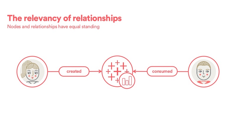
Thinking about our data in this way, we were missing something extremely important: relationships.
Our ecosystem is a graph, the data resources are nodes and the connectivity is all relationships. The relationships provide the necessary linkages between our siloed data components and the ability to understand the entire data ecosystem, all the way from logging to consumption.
Relationships are extremely pertinent for us. Knowing who created or consumed a resource (as shown below) is just as valuable as the resource itself. Where should we gather information from a plethora of disjointed tools? It would be really great if we could provide additional context.
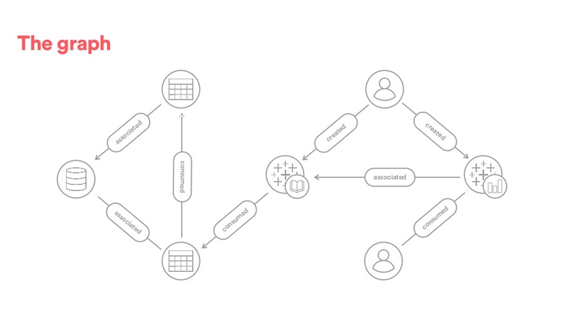
Let’s walk through a high-level example, shown below. Using event logs, we discover a user consumes a Tableau chart, which lacks context. Piecing things together, we discover that the chart is from a Tableau workbook. The directionless edge is somewhat ambiguous, but we prefer the many-to-one direction from both a flow and a relevancy perspective. Digging a little further, both these resources were created by another user. Now we find an indirect relationship between these users.
We then discover that the workbook was derived from some aggregated table that wasn’t in Hive, thus exposing the underlying data to the user. Then we pass out the Hive order logs and determine that this table is actually derived from another table, which provides us with the underlying data. And finally, both these tables are associated with the same Hive schema, which may provide additional context with regards to the nature of the data.
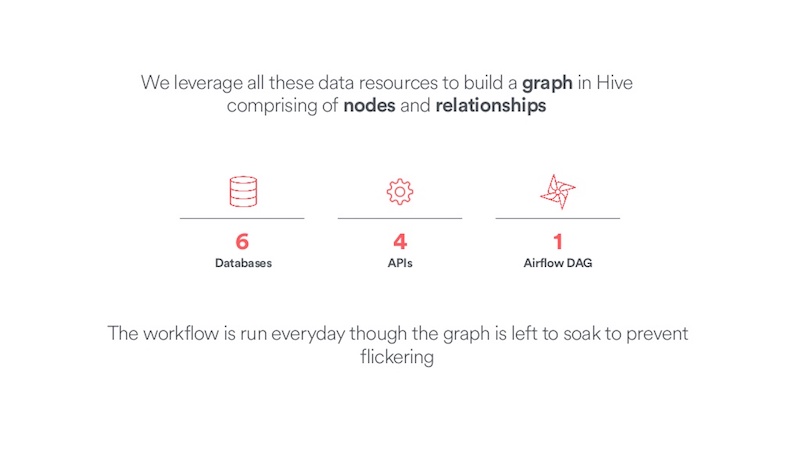
We leverage all these data sources, and we build a graph comprising of the nodes and relationships, and this resides in Hive. We pull from a number of different sources. Actually, Hive is our persistent data store, where the table schema mimics Neo4j. We have a notion of labels, and properties, and maybe an ID.
We pull from over six databases that come through scrapes that land in Hive. We create a number of APIs, be that Google, Slack and also some logging frameworks. That all goes into an Airflow Directed Acrylic Graph (DAG). (Airflow is an open source workflow tool that was also developed at Airbnb.) And then this workflow is run every day, and the graph is left to soak to prevent what we call “graph flickering.”
Dealing with “Graph Flickering”
Let me explain what I mean by graph flickering. Our graph is somewhat time-agnostic. It represents the most recent snapshot of the ecosystem. The issue is certain types of relationships are sporadic in nature, and that’s causing the graph to flicker. We resolve this by introducing the notion of relational state.
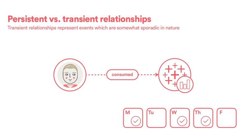
We have two sorts of relationships: persistent and transient.
Persistent relationships (see below) represent a snapshot in time of the system; they are the result of a DB scrape. In this example, the creator relationship will persist forever.

Transient relationships, on the other hand, represent events that are somewhat sporadic in nature. In this example, the consumed relationship would only exist on certain days, which would cause the graph to flicker.
To solve this, we simply expand the time period from one to a trailing 28-day window, which acts as a smoothing function. This ensures the graph doesn’t flicker, but also enables us to capture only recent, and thus relevant, consumption information into our graph.
How Airbnb Uses Neo4j with Python and Elasticsearch
Let’s touch upon how our data ends up in Neo4j and downstream resources.
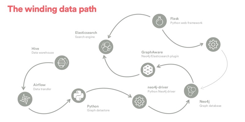
Shown below is a very simplified view of our data path which, in itself, is a graph. Given that relationships have parity with nodes, it’s pertinent that we also discuss the conduit that connects these systems.
Every day, the data starts off in Hive. We use AirFlow to push it to Python. In Python, the graph is represented in NetworkX as an object and from this, we compute a weighted page rank on the graph and that helps improve search ranking. The data is then pushed to Neo4j by the Neo4j driver.
We have to be cognizant of how we do a merge here. The graph database is live, and every day we push updates from Hive into the graph database. That’s a merge, and it is something we have to be quite cautious of.
From here, the flow forks into two directions. The nodes get pushed into Elasticsearch via a GraphAware plugin, which is based on transaction hooks. From there, Elasticsearch will serve as our search engine. Finally, we use Flask as a lightweight Python web app, which is used with other data tools. Results from Elasticsearch queries are fetched by the web server.
Additionally, results from Neo4j queries pertaining to connectivity are fetched by the web server via Neo4j, using that same driver.
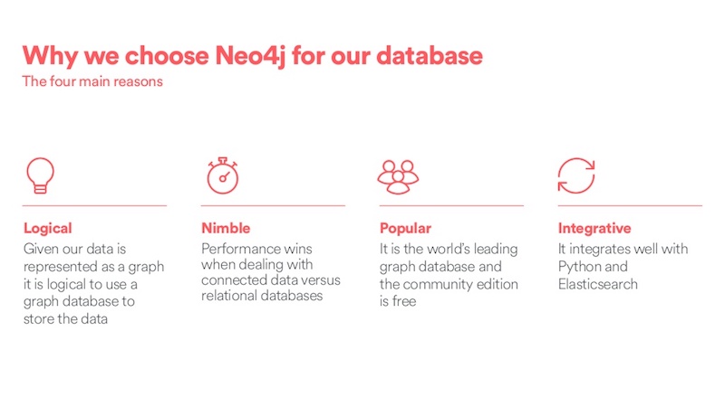
Why did we choose Neo4j as our graph database?
There are four main reasons. First, our data represents a graph, so it felt logical to use a graph database to store the data. Second, it’s nimble. We wanted a really fast, performant system. Third, it’s popular; it’s the world’s number one graph database. The community edition is free, which is really super helpful for exploring and prototyping. And finally, it integrates well with Python and Elasticsearch, existing technologies we wanted to leverage.
There’s a lovely symbiotic relationship between Elasticsearch and Neo4j, courtesy of some GraphAware plugins. The Neo4j plugin, which asynchronously replicates data from Neo4j to Elasticsearch. That means we actually don’t need to actively manage our Elasticsearch cluster. All our data persists. We use Neo4j as the source of truth.
The second plugin actually lives in Elasticsearch and allows Elasticsearch to consult with the Neo4j database during a search. And this allows us to enrich search rankings by leveraging the graph topology. For example, we could sort by recently created, which is a property on the relationship, or most consumed, where we have to explore topology of the graph.
This is how we represent our data model. We defined a node label hierarchy as follows.
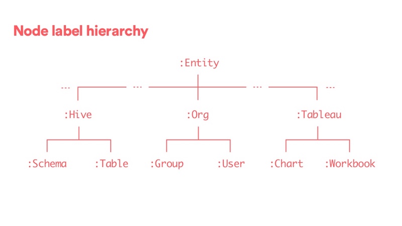
This hierarchy enables us to organize data in both Neo4J and Hive. The top-level :Entity label really represents some base abstract node type, which I’ll explain later.
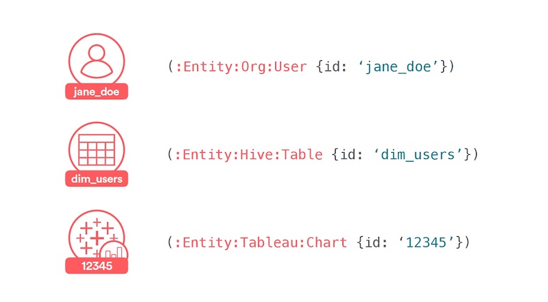
Let’s walk through a few examples here. Our schema was created in such a way that the nodes are globally unique in our database, by combining the set of labels and the locally scoped ID property.
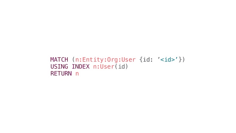
First, we have a user who’s keyed by their LDAP username, then a table that’s keyed by the table name and finally a Tableau chart that’s keyed by the corresponding DB instance inside the Tableau database.
The graph cores are heavily leveraged in the user interface (UI), and they need to be incredibly fast. We can efficiently match queries by defining per label indices on the ID property and we leverage them for fast access. Here, we’re just explicitly forcing the use of the index because we’re using multiple labels.
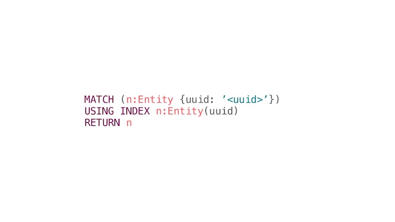
Ideally, we’d love to have a more abstract representation of the graph, moving from local to global uniqueness. To achieve that, we leverage another GraphAware plugin, UUID. This plugin assigns a global UUID on newly created entities that cannot be mutated in any way. This gives us global uniqueness. We can talk about entities in the graph by using just this one unique UUID property in addition to the entity label.
This helps us use PrimeBase queries, which leads to faster query and execution times. This is especially relevant when we do bulk loads. Every day we do a bulk load of data and we need that to be really performant.
Here’s this same sort of example as before. Now we’ve simplified this, so we can just purely match any entity using this UUID property, and it’s global.
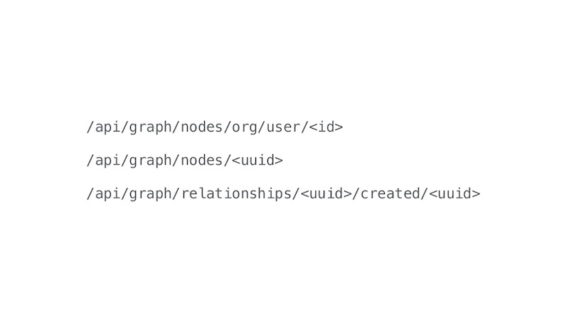
We have a RESTful API. In the first example, you can match a node based on its labels and IDs. And this is useful if you have like a slug type of URL. The second one, you can match a node based purely on the UUID. The third one is how we’d get a created relationship, based on leveraging these two UUIDs. The front-end uses these APIs, as covered in the next section.
Designing the Front-end of the Dataportal
Chris Williams: I’m going to describe how we enable Airbnb employees to harness the power of our data resource graph through the web application.
The backends of data tools are often so complex that the design of the front-end is an afterthought. This should never be the case, and in fact, the complexity and data density of these tools makes intentional design even more critical.
One of our project goals is to help build trust in data. As users encounter painful or buggy interactions, these can chip away at their trust in your tool. On the other hand, a delightful data product can build trust and confidence. Therefore, with the Dataportal, we decided to embrace a product mindset from the start and ensure a thoughtful user interface and experience.
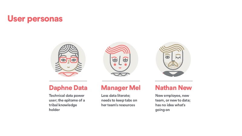
As a first step, we interviewed users across the company to assess needs and pain points around data resources and tribal knowledge. From these interviews, three overall user personas emerged. I want to point out that they span data literacy levels and many different use cases.
The first of these personas is Daphne Data. She is a technical data power user, the epitome of a tribal knowledge holder. She’s in the trenches tracing data lineage, but she also spends a lot of time explaining and pointing others to these resources.
Second, we have Manager Mel. Perhaps she’s less data literate, but she still needs to keep tabs on her team’s resources, share them with others, and stay up to date with other teams that she interacts with. Finally, we have Nathan New. He may be new to Airbnb, working with a new team, or new to data. In any case, he has no clue what’s going on and quickly needs to get ramped up.
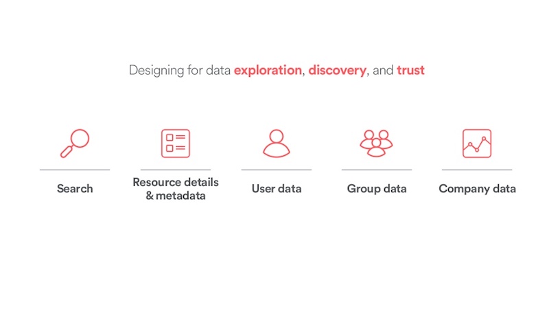
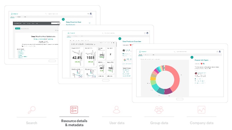
With these personas in mind, we built up the front end of the Dataportal to support data exploration, discovery and trust through a variety of product features. At a high level, these broadly include search, more in-depth resource detail and metadata exploration, and user-centric, team-centric and company-centric data.
We do not really allow free-form exploration of our graph as the Neo4j UI does. The Dataportal offers a highly curated view of the graph, which attempts to provide utility while maintaining guardrails, where necessary, for less data-literate employees.
The Dataportal is primarily a data resource search engine. Clearly, it has to have killer search functionality. We tried to embrace a clean and minimalistic design. This aesthetic allows us to maintain clarity despite all the data content, which adds a lot of complexity on its own.
We also tried to make the app feel really fast and snappy. Slow interactions generally disincentivize exploration.
At the top of the screen (see below) are search filters that are somewhat analogous to Google. Rather than images, news and videos, we have things like data resources, charts, groups, teams and people.
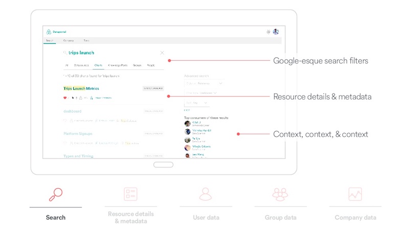
The search cards have a hierarchy of information. The overall goal is to help provide a lot of context to allow users to quickly gauge the relevancy of results. We have things like the name, the type. We highlight search terms, the owner of the resource, when it was last updated, the number of views, and so on. And we also try to show the top consumers of any given result set. This is just another way to surface relationships and provide a lot more context.
Continuing with this flow, from a search result, users typically want to explore a resource in greater detail. For this, we have content pages. Here is an example of a Hive table content page.
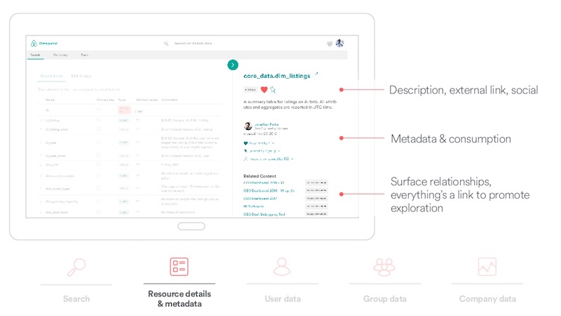
At the top of the page, we have a description linked to the external resource and social features, such as favoriting and pinning, so users can pin a resource to their team page. Below that, we have metadata about the data resource, including who created it, when it was last updated, who consumes it, and so on.
The relationships between nodes provide context. This context isn’t available in any of our other siloed data tools. It’s something that makes the Dataportal unique, tying the entire ecosystem together.
Another way to surface graph relationships is through related content, so we show direct connections to this resource. For a data table, this could be something like the charts or dashboards that directly pull from the data table.
We also have a lot of links to promote exploration. You can see who created this resource and find out what other resources that they work on.
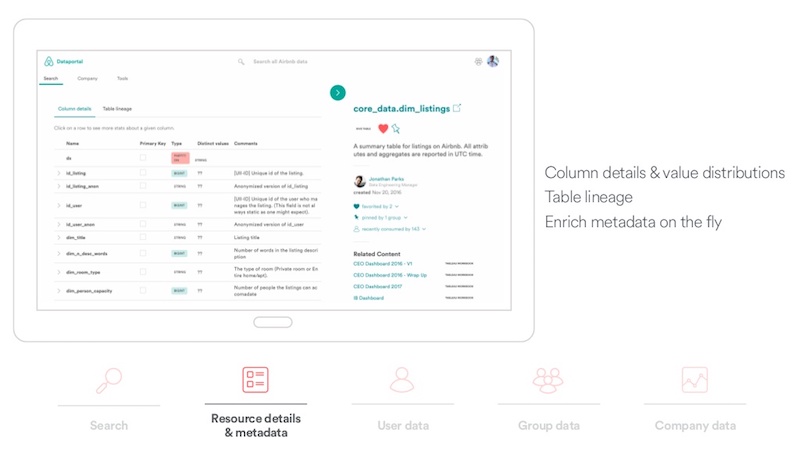
The screen below highlights some of the features we built out specifically for exploring data tables. You can explore column details and value distributions for any table. Additionally, tracing data lineage is important, so we allow users to explore both the parent tables and the child tables of any given table.
We’re also really excited about being able to enrich and edit metadata on the fly, we add table descriptions and column contents. And these are pushed directly to our Hive metastore.
The screen below highlights our Knowledge Repo, which is where data scientists can share analyses. You have dashboards and visualizations. We are typically iframing these data tools. That generates a log, which then our graph picks up, and it will trickle back into our graph, affect PageRank, and affect the number of views.
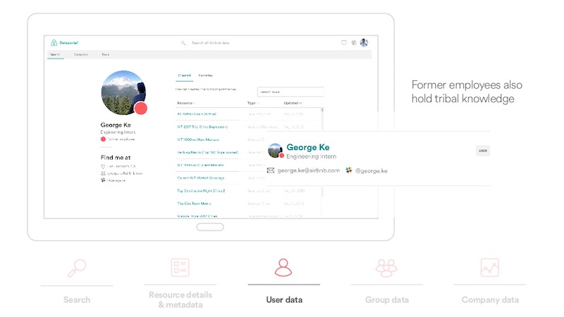
Helping Users, the Ultimate Holders of Tribal Knowledge
Users are the ultimate holders of tribal knowledge, so we created a dedicated user page, shown below, to reflects that.
On the left is basic contact information. On the right are resources that the user accesses frequently, created, or favorited in groups to which they belong. To help build trust in data, we wanted to be transparent about data. You can look at any resources a person views, including what your manager views and so on.
Along the lines of data transparency, we also made a conscious choice to keep former employees in the graph.
If we take George, the handsome intern that all the ladies talk about, he created a lot of data resources and he favorited things. If I wanted to find a cool dashboard that he made last summer, that I forgot the name of, this can be really relevant.
Another source of tribal knowledge is found within an organization’s teams. Teams have tables they query regularly, dashboards they look at and go-to metric definitions. We found that team members spend a lot of time telling people about the same resources, and they wanted a way to quickly point people to these items.
For that, we created group pages. The group overview below shows who’s in a particular team.
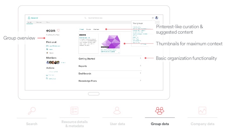
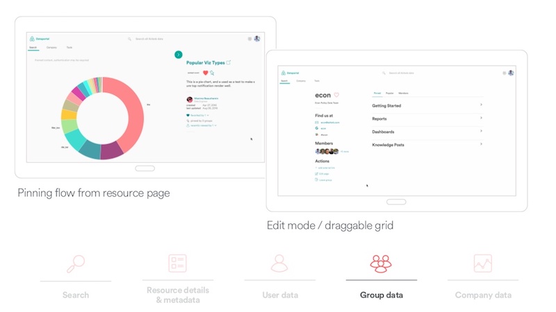
To enable curating content, we decided to borrow some ideas from Pinterest, so you can pin any content to a page. If a team doesn’t have any content that’s been curated, there’s a Popular tab. Rather than displaying an empty page, we can leverage our graph to inspect what resources the people on a given team use on a regular basis and provide context that way.
We leverage thumbnails for maximum context. We gathered about 15,000 thumbnails from Tableau or Knowledge Repo in our Superset internal data tool. They’re a combination of APIs and headless browser screenshots.
The screen below highlights the pinning and editing flows. On the left, similar to Pinterest, you can pin an item to a team page. On the right, you can customize and rearrange the resources on the team page.
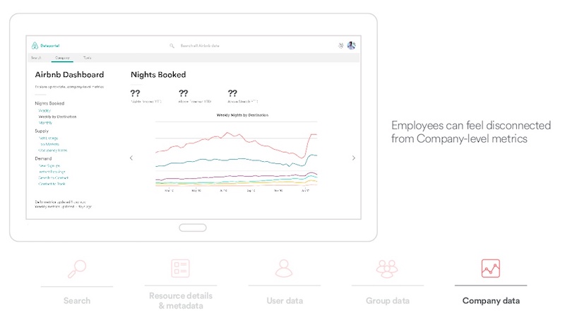
Finally, we have company metric data.
We found that people on a team typically keep a tight pulse on relevant information for their team. A lot of times, as the company grows larger, they’ll feel more and more disconnected from company-level, high-level metrics. For that, we created a high-level Airbnb dashboard where they can explore up-to-date company-level data.
Front-End Technology Stack
Our front-end technology stack is similar to what many teams use at Airbnb.
We leverage modern JavaScript, ES6. We use node package manager (NPM) to manage package dependencies and build the application. We use an open source package called React from Facebook for generating the Document Object Model (DOM) and the UI. We use Redux, which is an application state tool. We use a cool open source package from Khan Academy called Aphrodite, which essentially allows you to write Cascading Style Sheets (CSS) in JavaScript. We use ESLint to enforce JavaScript’s style guide, which is also open source from Airbnb, and Enzyme, Mocha and Chai for testing.

Challenges in Building the Dataportal
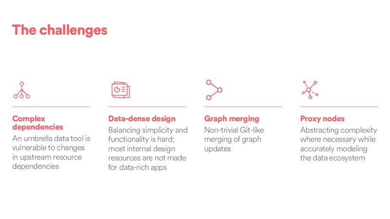
We faced a number of challenges in building the Dataportal.
It is an umbrella data tool that brings together all of our siloed data tools and generates a picture of the overall ecosystem. The problem with this is that any umbrella data tool is vulnerable to changes in the upstream dependencies. This can include things on the backend like schema changes, which could break our graph generation, or URL changes, which would break the front-end.
Additionally, data-dense design, creating a UI that’s simple and still functional for people across a large number of data literacy levels, is challenging. To complicate this, most internal design patterns aren’t built for data-rich applications. We had to do a lot of improvising and creation of our own components.
We have a non-trivial Git-like merging of the graph that happens when we scrape everything from Hive and then push that to production in Neo4j.
The data ecosystem is quite complex, and for less data literate people, this can be confusing. We’ve used the idea of proxy nodes, in some cases, to abstract some of those complexities. For example, we have lots of data tables, which are often replicated across different clusters. Non-technical users could be confused by this, so we actually accurately model it on the backend, and then expose a simplified proxy node on the front end.
Future Directions for Airbnb and the Graph Database
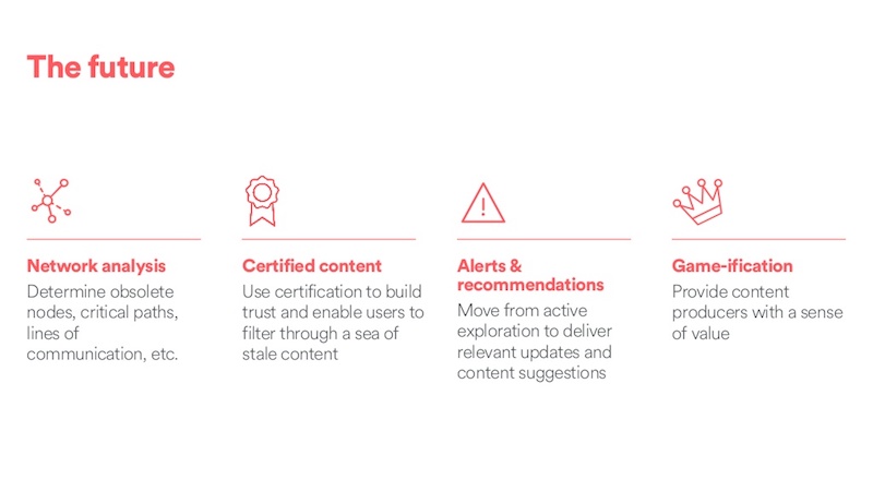
We’re considering a number of future directions.
The first is a network analysis that finds obsolete nodes. In our case, this could be things like data tables that haven’t been queried for a long time and are costing us thousands of dollars each month. It could also be critical paths between resources.
One idea that we’re exploring is a more active curation of data resources. If you search for something and you get five dashboards with the same name, it’s often hard, if you lack context, to tell which one is relevant to you. We have passive mechanisms like PageRank and surfacing metadata that would, hopefully, surface more relevant results. We are thinking about more active forms of certification that we could use to boost results in search ranking.
We’re also excited about moving from active exploration to delivering more relevant updates and content suggestions through alerts and recommendations. For example, “Your dashboard is broken,” “This table you created hasn’t been queried for several months and is costing us X amount,” or “This group that you follow just added a lot of new content.”
And then, finally, what feature set would be complete without gamification?
We’re thinking about providing fun ways to give content producers a sense of value by telling them, for example, “You have the most viewed dashboard this month.”
Share Article


Explore
Related Articles

What Are the Different Types of Graph Algorithms & When to Use Them?


Top 10 Graph Database Use Cases (With Real-World Case Studies)


Turning Your Tabular Data Into a Graph Using Cypher