Demystifying environmental, social, and governance (ESG) reporting with graphs

Managing Director, EY
7 min read

Editor’s Note: This presentation was given by Harish Arora at GraphConnect 2022 in Austin, Texas.
At Ernst & Young LLP, we are passionate about sustainable finance and the impact of Environmental, Social, and Governance (ESG) factors on investing. ESG factors are now being used alongside financial factors to make investment decisions. The data landscape associated with ESG provisions led us to a strong graph epiphany. In fact, once we started looking at our ESG data solution as a graph, we could not look at it any other way.
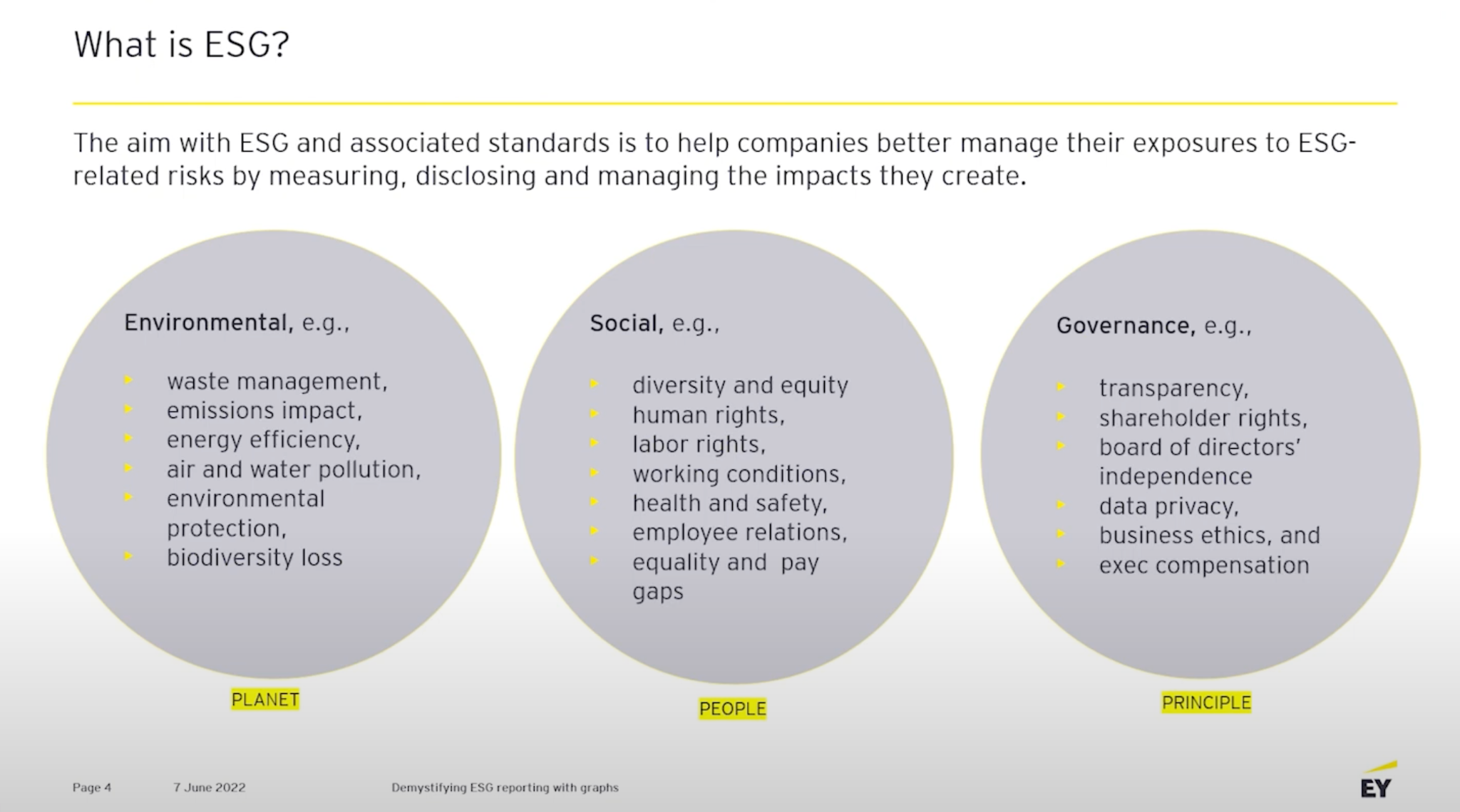
What is ESG?
Today, 80% of the company’s value is made of intangible assets, including brand awareness, intellectual property, and the perception of a company’s impact on society and the environment.
What does ESG stand for?
E stands for environment. This is everything attributed to how a company cares for the planet.
S stands for social. This revolves around humans and includes issues around diversity, equality, inclusiveness, human rights, working conditions.
G stands for governance. This covers transparency, including transparency in tax, in your operating model, in your company structure, in ethics, and in data privacy. All of these have to align to the principles of the business.
ESG data challenges
There are a set of problems associated with ESG data. The ESG data market is extremely polluted. There are dozens of climate tech data providers and FinTech data providers producing aggregated data on a daily basis, as well as a massive set of ESG regulations, frameworks, methodologies, and scorings that we collectively call ESG provisions.
Many organizations over the last many years have been relentlessly making new ESG provisions. Today there are over 600 global ESG provisions, about half of which did not exist five years ago. For companies, these provisions tend to act as both carrot and stick. “Stick” because companies are often penalized for reporting on or adhering to these ESG provisions. For example, Tesla was dropped off S&P’s ESG rating in May. “Carrot” because companies, including fossil fuel companies like ExxonMobil, follow these ESG provisions and are financially rewarded for attaining these high standards. In fact, ExxonMobil, though it is one of the largest fossil fuel companies, has one of the highest ESG ratings in the world.
ESG reporting is crucial for investors
Adhering to ESG requirements and suggestions is no longer just an option for companies, it’s a necessity for investment. We surveyed about 300 investment managers and chief investment officers and one thing that was strikingly clear was that every portfolio manager has either already started, or is very soon going to start, leveraging ESG attributes in their investment decision making process.This is crucial because investment decisions in your company are going to be significantly impacted by whether you are reporting on ESG attributes.
Complex ESG data landscape
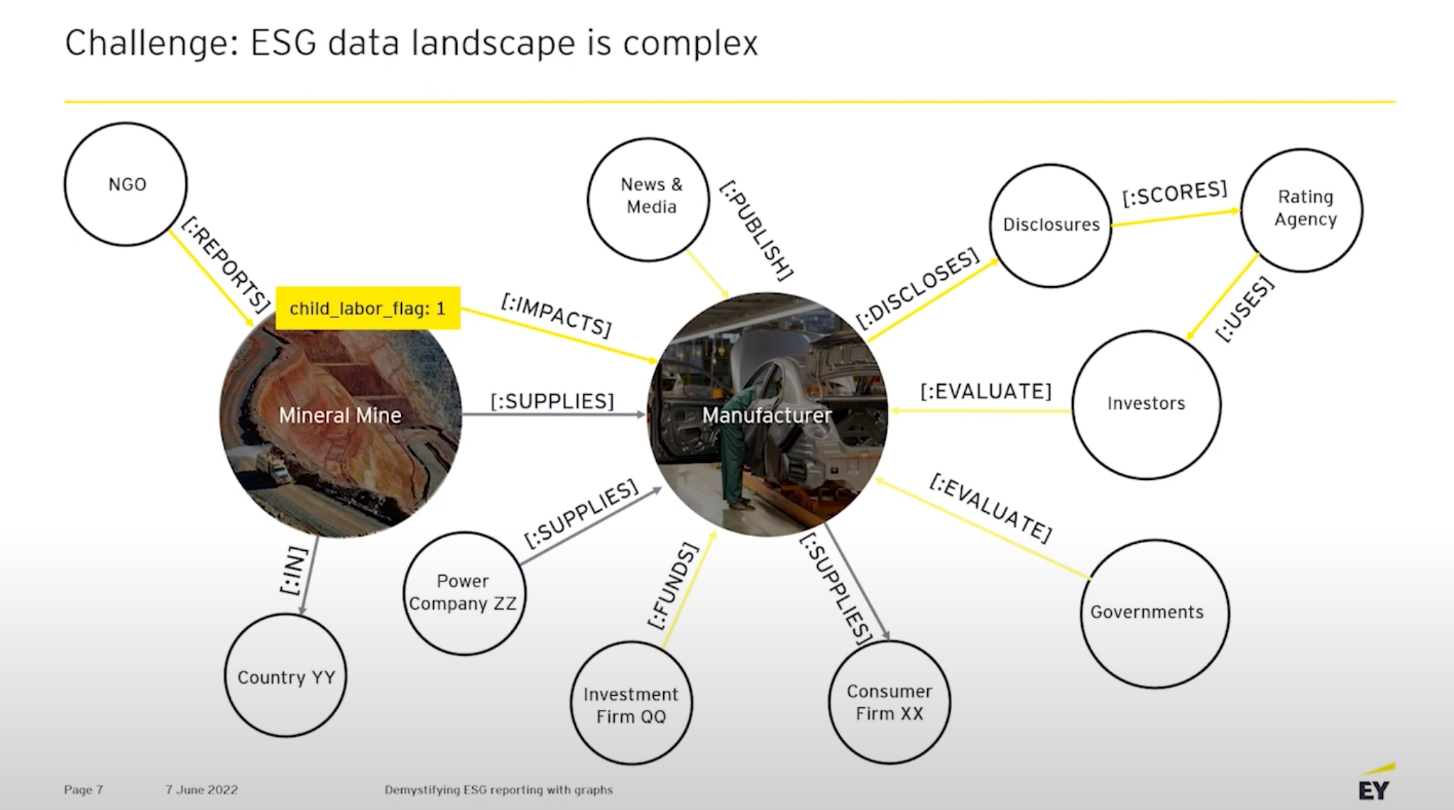
For ESG, graphs have allowed us to reframe the ESG problem and made it so much more clear for us. In this graph you can see the ESG impacts of an instance of child labor in a manufacturer’s mineral mine. The connections in a system shows how the entropy of this ESG violation flows through the system, affecting investment firms, the media, ratings agencies, investors, and governments.
Graphs for coordinating, connecting, and mobilizing ESG data
How can we untangle this problem? Clearly, the answer is through graphs.

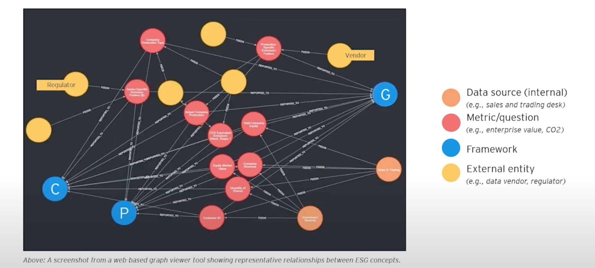
Taking this same view as above, we can zoom out a bit and see a whole data landscape. This includes the structure of how a company sources material, capital, energy, and has downstream relationships with consumer firms that resell their goods.Through this all, there is a similarly large ecosystem of regulations, frameworks, and provisions that need to be met and reported on throughout the whole process of running a business.
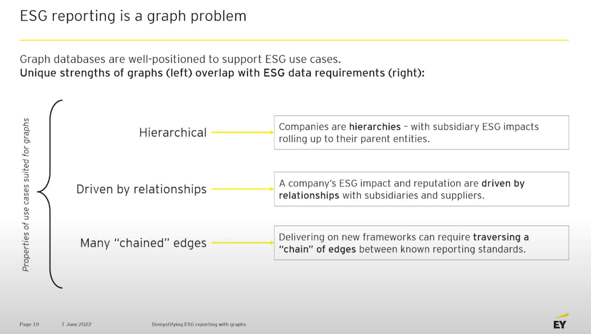
We concluded ESG is clearly a “graph problem” because it involves so many of the properties graphs are generally good at solving, including hierarchical problems; companies are hierarchies and the reputation of a subsidiary will roll up and impact its parent. ESG reporting is also driven by relationships, where reputations and relationships with all interested parties greatly affect a company’s ESG ratings. Lastly, ESG mapping has us dealing with many chained edges. In our graphs we won’t have just a single framework or provision in place, but instead 600. Dozens of these are actively being used by investment firms– and we have to map between all of them.

We approached this problem by taking a set of provisions and creating a node for each provision. This node became the nexus, or center, of our graph. For nexus, we created a linked set of categories. These categories include emissions to air, emissions to water, the wage gap, diversity in the boardroom, and so on. Each of these mapped to a question within an ESG framework. To link frameworks we look at similar questions to find a correlation between them in terms of their language, and these linkages allow us to build translations between existing frameworks everybody knows along with new emerging ones.
How do we get the answers to these questions? For this, we use the universe of ESG data vendors. 50+ companies are selling ESG data. Some sell raw data and others sell ratings. We’re able to add these data providers and their data to the graph.

Investment firms and ratings agencies use these data providers to get raw numbers, like the total tons of carbon emitted by a given company. They then assign a letter grade to a company based on different dimensions. For instance, this company gets an A in terms of diversity but a B- in terms of emissions to water.
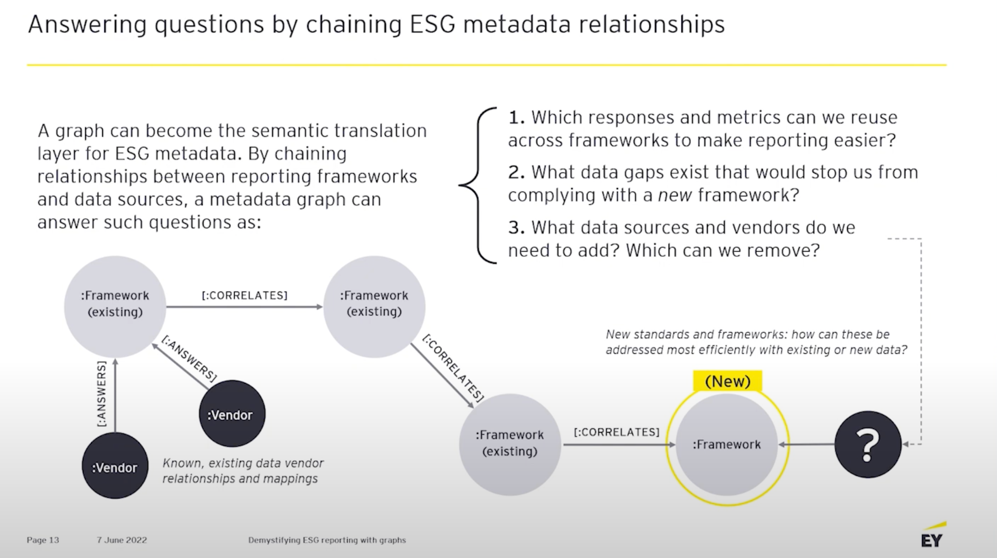
So how do we make use of this graph? Chaining existing metadata relationships acts as a Rosetta stone translation layer. For example, an established framework like the European Union’s SFDR regulation has been around for a while, and we can liken that to new emerging proposals on carbon emissions and how these should be reported by companies. We can translate the requirements through the graph and find what is missing to enable us to deliver on this new report. Do we need to source some extra data from vendors? Can we reuse an existing piece of information here? Answering these questions has helped our clients reduce the burden of reporting on all these. When a new framework arrives, we can look at the graph and usually see that half of it can be constructed from reusing data meeting an existing regulation.
Disclosure graph
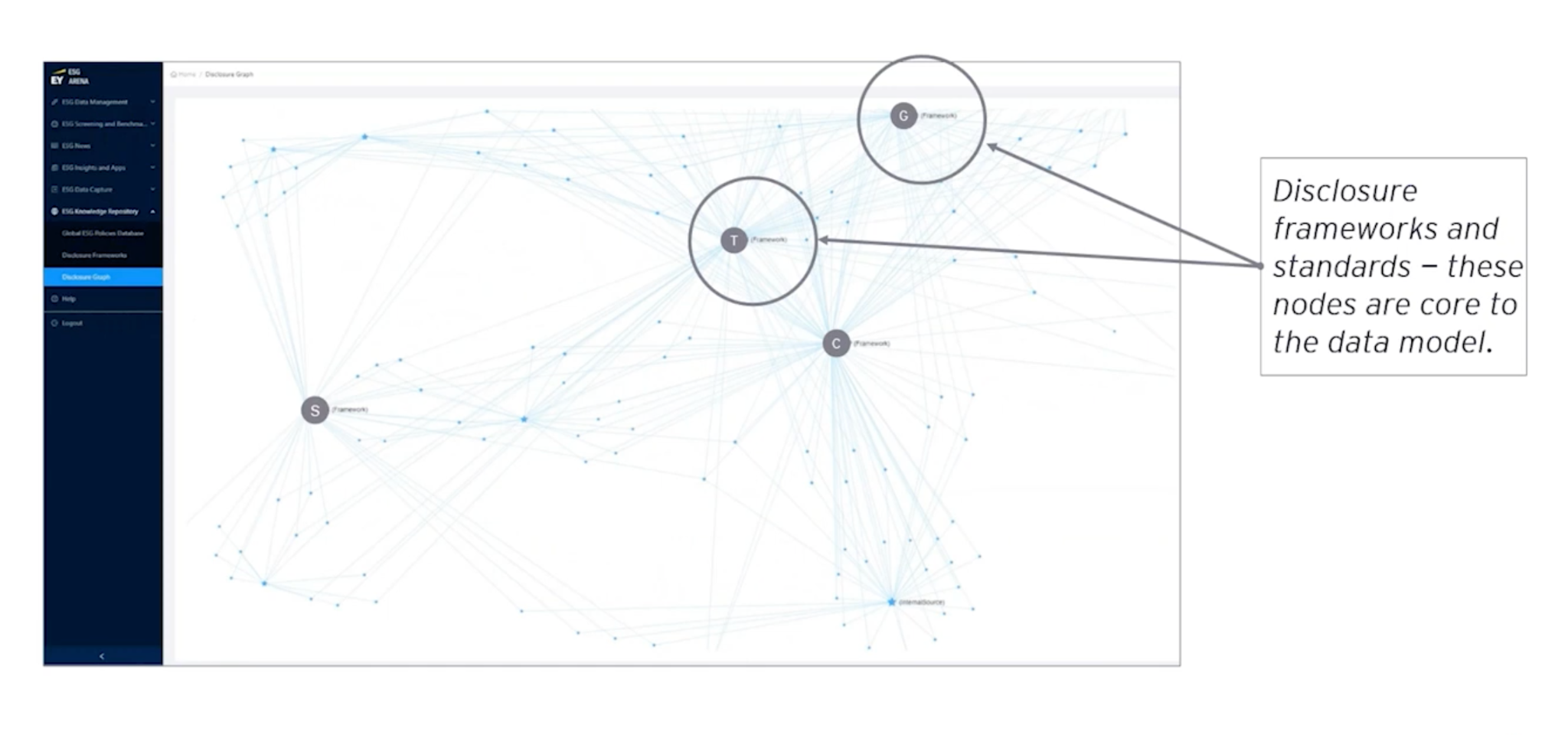
Here’s what this graph looks like in action. We’re seeing disclosure graphs with a single nexus at the middle for one of each framework.
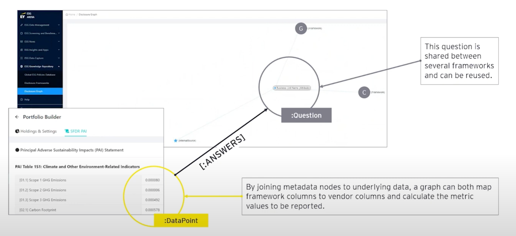
We can also expand the graph with real data. In this example, we uploaded some data points to allow us to calculate SFDR, which is a carbon emissions ESG regulation.
Carbon footprint
This ESG disclosure graph works across many examples, for instance, mortgage portfolios.

The data here is for buildings a company owns, and they are interested in graphing the impact of the energy use from these buildings. We create a graph for that, load it up with vendor data, regulatory data, and internal data sources, as well as questions and metrics: How big is the building? Does it pass a certain industry certification? What year was it constructed? We can see that the vendors and frameworks are all interested in the same data.
This same mapping works with stocks, baskets of companies, baskets of bonds, and even entire indices. From the graph, we found that there are several regulators interested in this same kind of information, and we would never have been able to piece this together ourselves without a graph to map it together.
What’s next for graphs in ESG?
We think we can continue to improve upon our ESG disclosure graph by adding a semantic layer on top. We will put some English language descriptions to the questions, which will make them easier for business users to understand. We’ll then expand this semantic layer to the whole data fabric, putting data and metadata into the same graph.
We believe that knowledge graphs, mixed with metadata and data, are incredibly useful to meet the demand for ESG reporting. In ESG’s complex data landscape, graphs can flourish as they help guide users on their investment and ESG journeys.
Share Article


Explore
Related Articles

Neo4j Named “One to Watch” in Snowflake’s 2026 Modern Marketing Data Stack Report
POLE+O: The 5-Type Ontology That Solves the Hardest Part of Building a Knowledge Graph
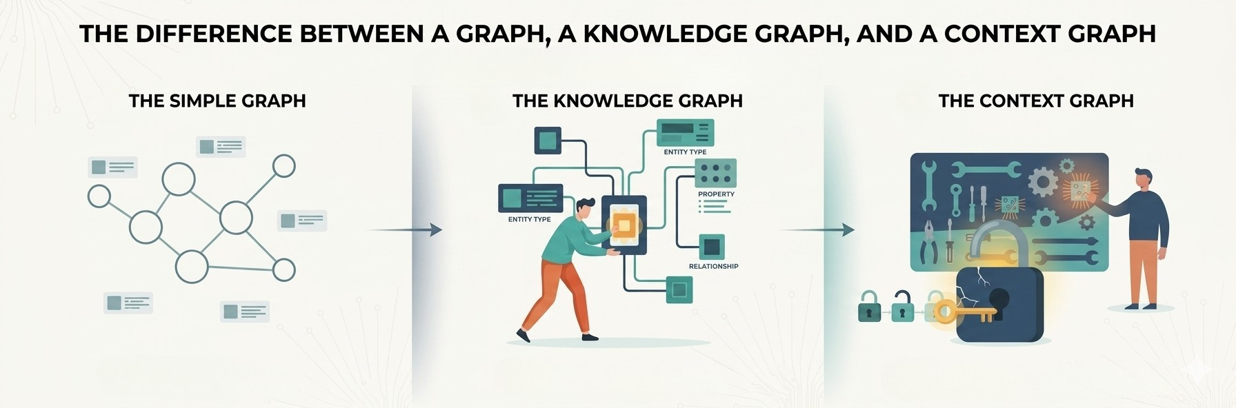
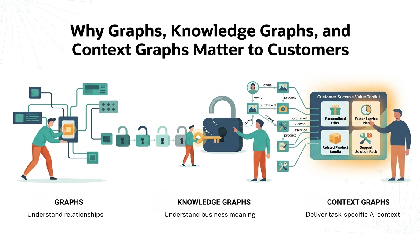
1 of 3: The difference between a graph, a knowledge graph, and a context graph