Design Thinking for Graph Data: The Secret to Successful Graph-Powered Apps

CEO of Predictive UX
12 min read

Design thinking is the secret to successful graph-powered apps. My organization, Predictive UX, designs graph-based applications. We come at it from a human-first user experience perspective and work primarily with enterprise organizations on complex content and data projects. I want to share some insights with you today about how design thinking impacts data products.
UX is about User Needs

I love this meme because it really drives home the point of when we design things, we often think about them from our own perspectives – what we think we know needs to be built. That’s why you have this sidewalk that goes around this angled corner, but people choose to just cut across the yard; this is how users work and think. Users want to go about things in the easiest way possible for them.
Of course, we all know pets are like this too. They always prefer whatever else is around the house over what we actually buy for them. Empathy for these users and putting them at the forefront of all your design conversations is the heart of user experience.
Simplifying the Complex
User Experience is about user needs, and UX designers are really good at simplifying the complex. And what’s more complex than data? With graph databases, you’re really combining content, data, metadata, and different data entities from all across an organization. This is a complicated thing to get right for end users. On the backend, it may make sense to the data scientist putting it together, but when it comes out on the other side, the User Interface doesn’t always make sense to users, and they might not understand the next action they should take from the insights in the UI. From what I can see, data products really need UX help.
Creating a Data Monster
A poor data UX creates a data monster. You’ll know this is happening when users of your data product start saying: It doesn’t work. It’s confusing. We couldn’t adopt it. We don’t understand why we’re doing this project. You’re speaking a foreign language. I don’t really understand the value of what you’re trying to do here…
People are confused by the application, undergoing tremendous cognitive strain, and are forced to learn new behaviors in order to adopt the application. This is when users become data naysayers, saying they don’t want to do this project and don’t believe in it.
At Predictive UX, we want to change this. We want people to use a different mindset when they approach a data product, changing the conversations that people have around data and its value, well beyond the technical implementation. It’s easy to get excited about data if you understand the technology, but there’s a shift to make in your thinking about solving the problem of the business and allowing users to understand the products you’re creating.
Design Thinking
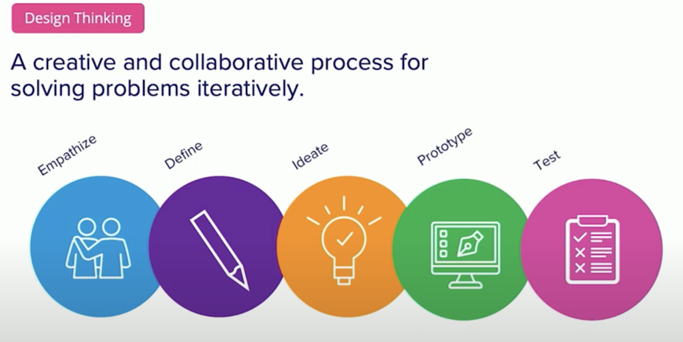
How do we think differently at Predictive UX? We use an approach called design thinking, and you’ve probably heard about it before. Design thinking can add so much value, and it’s not meant to replace anything, because it’s additive. The design thinking process doesn’t have to be linear. You can come into the design thinking process at any stage along the way and still find success with it.
I’m going to walk through what each of these stages of design thinking looks like. The first stage is to empathize. We want to empathize with our audience. Going back to the earlier meme I shared, if we understand what people walking to work need to do, we might understand that they want to take that shortcut and should have built our sidewalk differently. A user isn’t a single person, usually it’s not even a single group. You need to think about groups of users and understand their needs in the backend of systems, in the middle layer, and the frontend.
The next stage of design thinking is to define. Every project begins with a hypothesis and we always think we know what we need. When we start working, if we haven’t asked questions and talked to our different groups of users, we’re actually just guessing. Once we talk to them, we can ask critical questions about whether or not we’re solving the right problem.
After this, we ideate. This is my favorite part, because it begins by getting everyone involved in the solutioning. It shouldn’t just be your business stakeholders telling you what to build, and it shouldn’t just be technical teams or designers saying what to build. It needs to be collaborative and go across all your stakeholders.
Then we prototype and test. This is when we start to put our solution into pictures. Pictures are really effective at communicating ideas, especially because we use jargon all the time. A picture can communicate something that makes people say “Oh, I get it.” If you take these pictures and put them into a prototype, especially with sample data, you can test your application and get feedback that informs your design. From here, you can really start building an application that you’ll know meets your user needs. Unfortunately, this process gets skipped a lot, and application design starts with data instead of the user experience.
Case Study: RecoverX
I want to talk about RecoverX, one of our clients at Predictive UX. RecoverX has an application aimed at helping doctors talk to patients. In any clinical environment, like the hospital office, doctors only have about 15 minutes with each patient. RecoverX wanted to build an application that helps doctors make better diagnoses, because better diagnoses literally save lives. Wrong diagnoses get patients the wrong test and wrong outcomes, sometimes putting people’s lives at stake.
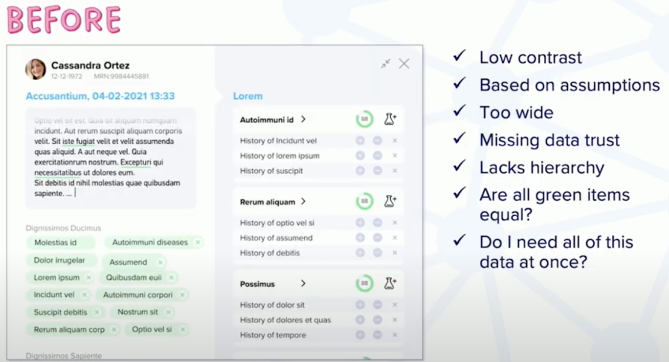
This image is their first iteration of building out their product’s UI. What is unique about this application is that it has a lot of information. At a glance, it looks like it could be helpful, but they knew that they didn’t really know if it was helpful for their audience. RecoverX came to us and asked us what we thought and how they could test their product. I have the list here of some of the potential UX issues I noticed immediately:
- It’s low contrast.
- There’s no value system highlighting if some information is more important than other pieces of information.
- Is it actually useful to keep all of this information on the screen the entire time users are looking at the application? Remember, physicians only have 15 minutes at best to talk to patients about their symptoms and then they have to make quick decisions. And if the application overwhelms the physician with a lot of data, this application immediately stops being useful.
- This data takes up a lot of screen real estate. This application sits on top of an electronic medical record. Because users are using this application on top of another application, the size of the application makes them unable to see things that might be useful in the electronic medical record.
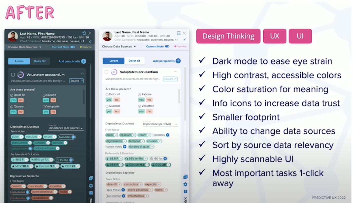
This is the redesigned application:
- This new design is much smaller in width.
- We created a dark mode, as well as a light mode. This is really important when you’re working with data because the increased contrast helps reduce fatigue when you’re looking at a lot of data at the same time.
- We also chose high-contrast, accessible colors because not everyone is able to see color in the same way. Here we took into account neurodivergent users and people who have ADHD or who might be on the autism spectrum. Doctors using the system may process information differently than the people who designed the application.
After putting these prototypes together, we got feedback from users on the things that were important to them. One of these things is data trust. Looking at an application like this in a clinical setting, doctors will ask: “Why are you telling me this? Where is this information coming from?” Information in this application is coming from a few sources: patient history from the electronic medical record, ontologies from a medicine knowledge graph, and a voice assistant to capture the conversation between the doctor and the patient real-time. So there’s a lot of data coming into this screen to create these results. We decided we wanted to provide users with access to this source data and the ability to change the source data.
An interesting feature that RecoverX provides is a percent accuracy for how confident the application is that this result it’s showing is the result that makes the most sense for the conversation a user is having with the patient.
In one click, a doctor is provided with the next best action, so it is not just to provide them with an insight, but to do something with that insight. I often see designers skip this final step. After sharing a beautiful, insightful graph visualization to their user, I’ve actually heard application designers say this, “At this point, we’ll let the human brain take over and decide what matters.” Of course, we want critical thinking from our users, but we also want to provide suggestions and recommendations on what they can do next with this data.
After making these changes, we received super positive feedback from our users; they felt like they “were seeing the future of medicine” and “had more knowledge at [their] disposal”. This is exactly what we wanted! We got here through the design thinking process: prototypes, user tests, and iterations.
I’ll dive more into the stages of design thinking.
Design Thinking Stage 1: Empathize
The first stage is to empathize. Who are we designing for?

I talked earlier about different groups that we’re designing for. This is an example persona for Dr. Sally. We normally build these personas out with A LOT more detail, but I wanted to highlight the pain points here, because these are the objections that people have when they try to adopt a data application: “I’m busy”, “I’m multitasking”, “I need to move quickly”, “I need to be able to trust the data and know where it’s coming from”, “I need to order my test fast”, “I want to make sure I’m getting the right diagnostic test ordered for my patient as quickly as I can, especially if it’s a critical situation.”
We created several personas with these pain points in mind, and having these pain points front and center allowed us to empathize with our user.
Design Thinking Stage 2: Define
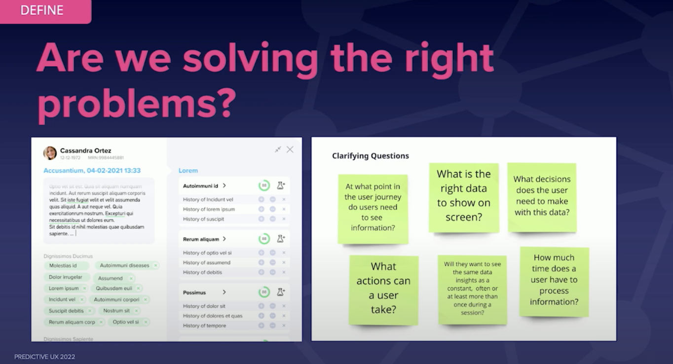
Define is where we start asking ourselves if we’re solving the right problems. We’ll ask clarifying questions:
- At what point in the journey does Dr. Sally even need to see this screen? Does it need to be at the beginning of her visit with the patient, should it be in the middle? Does it come out towards the end?
- How much of the time does she need to see all of the data on the screen at the same time?
- What actions can she actually take within this application? How timely do these actions need to be?
We ask these questions to make sure we’re solving the right problems. Sometimes, just asking these questions will reveal a lot. But even more valuable is talking to users again and asking, of these questions we asked, which one matters the most to you? This helps us prioritize what the application needs to do for them.
For instance, a physician might say: “Well, I want to be able to order tests.” We might then decide to put that at the very top of our priority list. But when they use it in the real world, they realize they do need it, but much later. That means this information doesn’t need to be as prominent at the start.
Design Thinking Stage 2: Ideate
Next, we ideate. And there’s a lot of different ways to ideate: You can draw something on a piece of paper, on a whiteboard, or create really lo-fi wireframes.
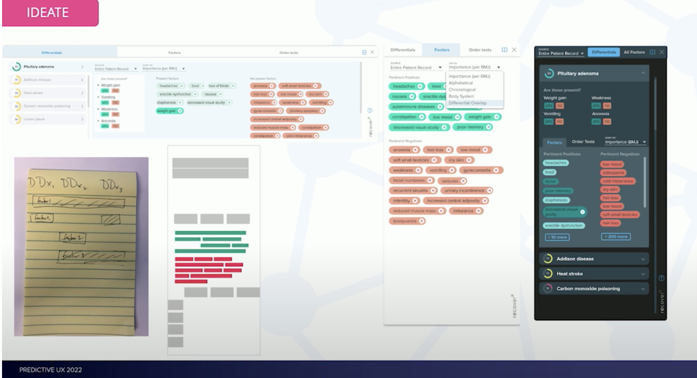
The image here is a really horrible lo-fi wireframe – boxes essentially, but you’ll eventually get into higher fidelity wireframes and UI designs. On the right, we were experimenting with color to try and figure out what had the best contrast: light mode or dark mode. After these wireframes, we further ideate.

We take real scenarios that we want to test with the real users and create all the screens for those scenarios. That way users can click through the entire prototype. The most important thing here is that you use real data. Dummy data ultimately isn’t going to yield the results that you need for the application that you’re designing.
Design Thinking Stage 4: Prototype & Test

This is what RecoverX’s application ended up looking like. We had a really beautiful, clickable prototype in light mode and in dark mode, and we tested both of them across all the scenarios we wanted to using two different kinds of tests.
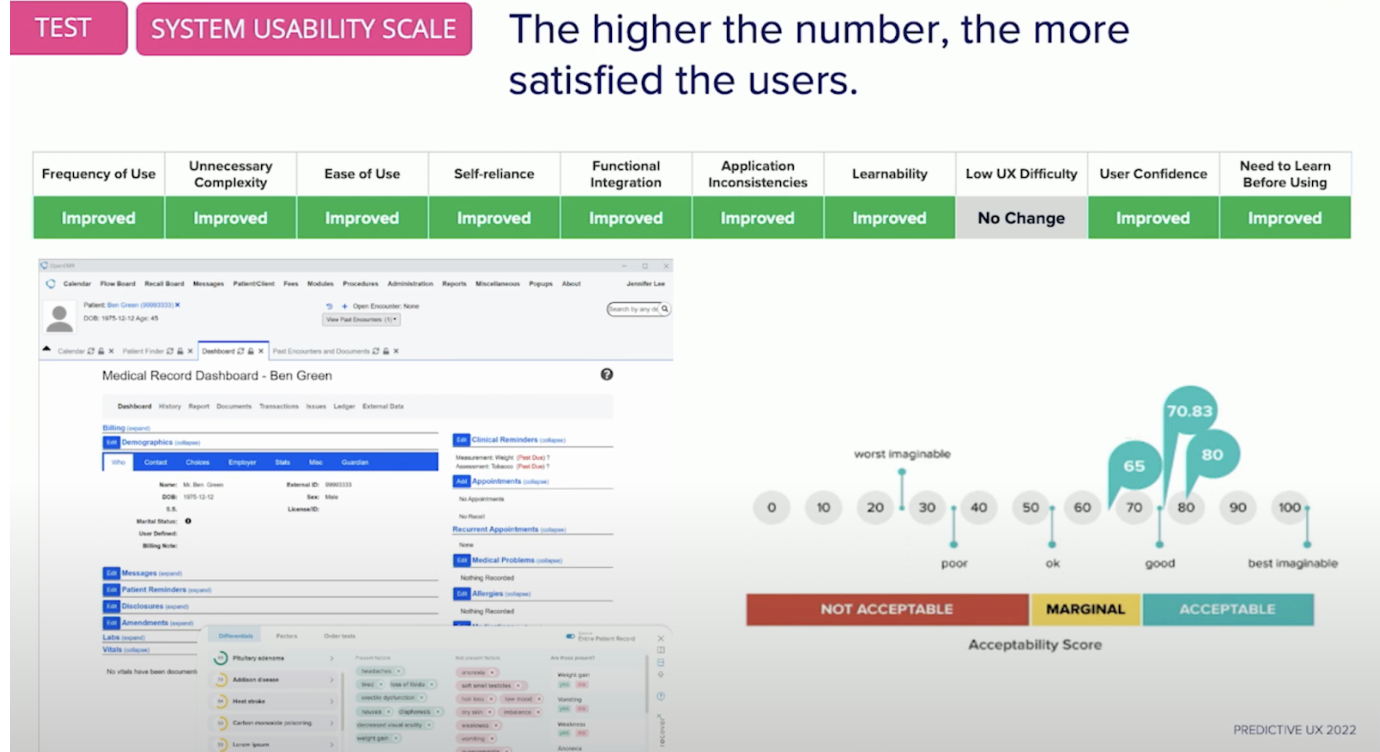
The first test was with the system usability scale. This is designed to measure how usable your system is and how easy it is to learn. Some user questions that are part of this test are: “Do I need a PhD before I come into this system to use it?” “Would I use it again?” “Do I feel self-reliant and confident when I’m using this application?”
So we run this test by asking these questions at the end of each scenario and then score it. We do this multiple times to continue to iterate and improve our application over time. On the right, you’ll notice that the scores are in the acceptable range and ultimately not perfect. Why don’t we strive for perfection? It’s because perfection isn’t attainable.
These applications are always changing. Data is going to change and your semantic model might change. Due to these changes, applications will want to continue to test their usability even when they get into production. Continuing to test the application, especially as users work through big changes, makes sure your usability experience stays anchored on the far right hand side of that scale.

The other test we did is NASA’s TLX. This test was developed by NASA and was designed to test the complex mental workload of systems for astronauts. We decided to use this test for physicians because they’re often in a very time-sensitive, life-or-death environment, having to make fast decisions even when they already have a lot on their mind.
They’re often looking at their entire caseload for the day, reviewing their files in the morning and trying to retain that information throughout the day. Everything that’s happening in the moment is on their mind, plus their entire history of knowledge. We want to make sure that the mental workload of their application is as low as possible and we’re not introducing unnecessary complexity into their lives.
We ran this test multiple times, asking questions like:
- “How demanding was this task for you?”
- “How physically demanding was it?”
- “How hurried or rushed was the pace of the task?”
- “How successful were you in accomplishing what you set out to do?” (This is an interesting question because oftentimes, we think in binary of either I got the job done, or I didn’t get the job done. But how successful someone feels or how frustrated they are is really important from a usability perspective too.)
- “How hard did you have to work to accomplish that level of performance?”
- “How insecure, discouraged, irritated, stressed, or annoyed were you?” (These are the things that cause people to abandon your application and make them into the data monsters we talked about earlier.)
Diff Example
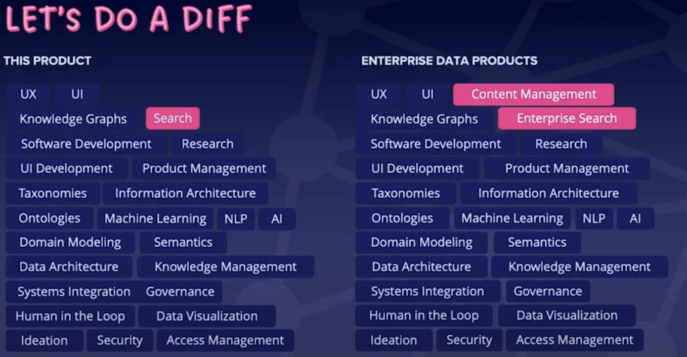
I come from a software engineering background and I like the idea of DIFFs between products. This product was for a startup in the healthcare industry dealing with a certain type of data and predefined ontologies for the medical industry. What I found really interesting is that their application shares a lot of commonalities with enterprise applications.
When you build an enterprise application, you need UX, UI, knowledge graphs, software development, and research. I wanted to point out a couple of things that this product doesn’t have that most enterprise apps have that add a little layer of complexity. One is content management. In enterprise applications, we’re not just dealing with data, we’re also dealing with content, especially if we’re creating unified experiences. Enterprise search is a little different than search because when you’re searching in an app, you’re getting your results with tags and options to select on and off.
While there are some differences, this DIFF applies to any kind of project that you’re doing– whether it’s startup, greenfield, or an enterprise data project.
Conclusion
Data-heavy apps need cognitive strain and high user trust. We establish that by following this design thinking process and baking it into how we approach data applications. We have a data design framework. Design thinking can be applied early, in the discovery phase, when you’re doing discovery workshops with your data domain stakeholders, business stakeholders, data scientists, designers, and developers.
At this time, all of us should be in the room together talking about these things and understanding the problem end-to-end, because then we can all start speaking the same language when we’re trying to solve data problems.
Share Article


Explore
Related Articles


Top 10 Graph Database Use Cases (With Real-World Case Studies)