DevSecOps With Graph for Valuable Insights

Senior Solutions Engineer, Neo4j
9 min read

In my previous article, I explored how combining data from IT services, infrastructure, and other sources can help you better understand your IT landscape and its interconnections. Building on that foundation, this follow-up dives deeper into how integrating IT infrastructure, service, and security operations data can uncover real, actionable insights.
Co-written with my industry peer Jelmer de Reus, a security consultant at RedTeam Cyber Security in the Netherlands, this article continues the journey toward an even more connected and intelligent view of your IT environment.
For a joint customer workshop, we put our heads together in order to investigate how we can extend the IT Service Graph Demo I built, with a comprehensive software bill of materials and security information generated by software vulnerability detection tools like Trivy or Bearer. And what came out of this joint work, we want to share and explain.
At the end of 2022, a high-risk software vulnerability interestingly helped organizations get more in control. As security officers, IT managers, and developers tried to get a picture of exactly where they were impacted by Log4J, it became apparent that this was a lengthy process. Too little information about the composition of software, the quality of source code, and other supply chain risks was available when needed. The information is available in most companies, but not as one connected data pool that would support deep insights into the landscape of software components, vulnerabilities, findings, and where this is running in your IT environment — like this example dashboard:

Large organizations that need custom software to manage their information, like government bodies, have a lot of unknown risk. With hundreds of teams and thousands of applications, this challenge becomes more apparent. Answering the question, “Where and how are we impacted?” becomes tedious. Another factor that influences the “how” question in particular is that applications have different data qualifications. Some records are more sensitive than others. So how do we get a picture of the most imminent risks when needed?
Tools and Limitations
There are tools to help analyze problems with software composition, open-source vulnerabilities, and other issues. Software Composition Analysis (SCA) and Static Application Security Testing (SAST) are examples. People may say it’s a matter of using the right tools to tackle this problem. However, in a complex landscape, there are several issues that require at least a very good approach rather than only a tool.
- What version of the software is currently running?
- Is the risk of this particular version known?
- Does this affect a test environment or production environment?
- What department and team are responsible for the software?
- What are the confidentiality, integrity, and availability scores?
- Is the application connected to the Internet?
Careful approaches introduce processes in addition to proper tools. To ensure an accurate picture of versions and risks, and to have the right metadata available to facilitate connections to be made to the persons responsible. Furthermore, the life cycle changes need to be captured.
One problem that’s also apparent when using a tool in a larger organization is that when a given high-risk vulnerability is identified, it’s easier to drill down than up. To see a list of high risks on the application level is easy, but what are the major categories or sources of risk throughout the department or landscape? How to talk to people responsible for the software life cycle if you don’t have the bigger picture? Sometimes a large portion of the risk may be related to a small number of open-source frameworks. Tackling these first has a major impact.

Having proper tools is important, and to introduce a process that adds metadata and keeps track of recent changes is paramount. In addition, you need to know what applications aren’t in the information system. Knowing what you don’t have is identifying unknown risk sources, and it helps to keep track of progress in these areas.
(Un)Connected Data
Tools have their own limitations. When you look into one of them, you may not see a good picture. In addition, people mostly interested in aggregate numbers cannot get a proper view in several of these tools. Also, even though metadata may be added to a software bill of materials, it may not be so easy to see the top vulnerabilities by a characteristic like department in such tools. They do, however, most likely have an API that allows you to pull the information for analytics. Analytics is what we really need to get proper and actionable insights for vulnerability management in the software life cycle.
In a use case for a large government body owning thousands of applications, more than 10 sources of data were collected that include SCA, SAST, lists of applications, the CMDB, CIA scores, and Internet exposure. The exact data model can’t be shared, but some important takeaways are valuable for people with similar challenges:
- Use a reliable source for the organizational structure around the application landscape.
- When loading data from tools, you can now see which applications are missing insights.
- Report on missing applications and missing metadata to allow security management to follow up.
- Use a database and model that allows you to query the relevant data most effectively.
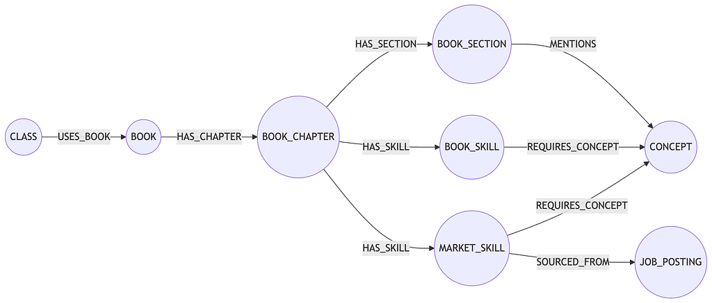
Data Model
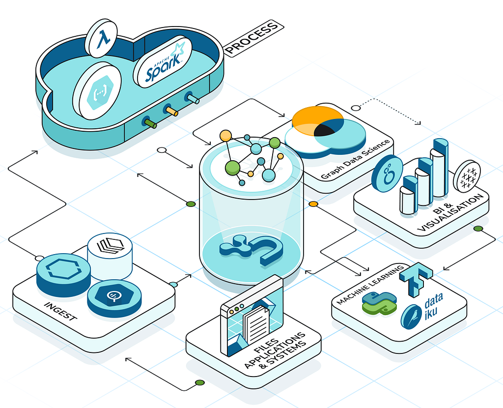
We use the most basic representation of the analyses and the findings and walk through the advantages of this model and the analytical capabilities we can create. At the end, we discuss the dashboard possibilities, give examples and screenshots, and share a GitHub link for experimenting with your own data.
As mentioned, the IT Service Graph Demo is used as the foundation and extended with the data model invented for the security part needed to answer our questions above.

You can see the initial data model for the IT Service Graph. Because a graph database and its data models are flexible, we added the security data graph model to it, combining both.

We can use this as a starting point for an example organization that has a large landscape and offers services to customers using software. When we add analyses as snapshots and connect the vulnerability information to it, this gives us a model to work with for analytics on software risks.
Actionable Insights
All data, dashboards, and code is available from our GitHub repo and can be used to build your own demo environment. The description on how to get it up and running can be found there and in the former article, but it should be fairly easy to set up.
Here’s one example dashboard providing an overview of the SCA data in the graph database that also lets you derive some more insights by clicking on the blue application buttons in Critical Open Source vulnerabilities visualization of the dashboard. This will trigger a query to find the relevant software components and display the dependencies in the graph visualization below.

Another example dashboard lets you search for affected servers and customers to find out where a particular software component is running a service and what customers would suffer from a high risk or major vulnerability, like the Log4j issue mentioned above.

As you can see from the Affected Servers/Customers dashboard above, you can search and select current findings, then click the affected software to see the services currently running with this finding.
Clicking on the service, the complete service chain is shown in the graph visualization below. And additional information of the service owners, customer, and importance levels are also queried from the database.
The other additional dashboards also help you answer the questions we were discussing initially. But there are still more answers we could get from such a graph database. Our dashboards are some possible entries to a more complete solution that could be built. Try it out and let us know what you think about it.
Summary
The dashboards with all data, code, and instructions of the IT service and DevSecOps demonstration are available on GitHub.
We tried to demonstrate and explain how valuable data, and especially its relationships, can be. Starting from an already helpful IT Service Graph, extending that with SBOM and vulnerability Information brought the original graph to a new level. And this might be enough for some people, but there’s still more information that could be added.
Extending with information about the developers responsible for building the applications, the teams they belong to, and their experience with software components, programming languages, or other skills brings additional information into the database. That data can help to get to the right people to fix vulnerabilities or just figure out who the specialist needed for a certain project is.
Missing skill sets could be investigated in order to hire new talent. We could go on and on, adding data and use cases to the graph with many more ideas on how to extend it.
Please keep in mind to secure the data using features like role-based access control (RBAC) or even attribute-based access control (ABAC) when building graph databases with this kind of sensitive information. Those features enable you to tailor access to specific data for designated user roles within your company and are essential for maintaining a secure database environment.
Thanks for reading and we hope this was helpful for you. If so, please leave us a comment and/or give us a clap.
Thanks again to Jelmer de Reus for contributing!
DevSecOps With Graph for Valuable Insights was originally published in Neo4j Developer Blog on Medium, where people are continuing the conversation by highlighting and responding to this story.
Share Article


Explore
Related Articles

Hey LLM, you’re using OPTIONAL MATCH wrong. Here’s the Cypher that actually works.