The fabric of DevOps: Using Neo4j to manage site infrastructure

Senior Software Engineer, LendingClub
19 min read

Editor’s Note: This presentation was given by Ashley Sun at GraphConnect NYC in October 2017.
Presentation summary
LendingClub runs 400+ microservices that comprise its online marketplace lending platform, the largest in America. Every one of these services has been developed, tested and deployed without drama. How? Their DevOps team uses Neo4j to manage infrastructure and operate the company.
Through their DevOps journey from monolith to microservices, datacenter to cloud, the LendingClub Devops team learned that in order to automate all the things, they needed to have accurate and timely data about what exactly those things were.
By loading all infrastructure components – from source code repositories to CI jobs, from bare metal hosts to virtual servers to containers, and from load balancers to auto-scaling groups into Neo4j – the team created a single, central hub of information that they could query at any time. This hub helped them make sense of their complex, interdependent infrastructure components.
Understanding and dynamically mapping the relationships among this complex infrastructure provided visibility into components that previously seemed unrelated. It allowed them to answer important questions vital to ensuring their site had four-nines of uptime, as well as how to diagnose and resolve issues as they arose.
The team was able to set up monitoring, alerting and reporting that helped prevent outages before they happened. Datacenter deployments were now fully automated, and when the time came to move to the cloud and containers, app cluster spin-up and deployments were fully automated too. All of these things and more were made possible because of the Neo4j graph model.
This blog shares key insights learned throughout their DevOps journey, the technologies used, the challenges faced and the lessons learned.
Presentation: The fabric of DevOps: Using Neo4j to manage site infrastructure
I begin working as a DevOps engineer at LendingClub in San Francisco about three years ago, and one of my first projects was to build software around Neo4j. LendingClub is America’s largest online credit marketplace serving peer-to-peer loans, small business loans, patient financing and auto refinancing.
I work on the Infrastructure and Tools team, often referred to as the DevOps team, which builds software and infrastructure automation. This enables LendingClub to efficiently and seamlessly deliver our applications into production, while ensuring civility, resiliency and scalability.
More specifically, we write software to handle our infrastructure mapping, which includes app monitoring and alerting, deployment automation, cloud orchestration and common app frameworks that all of our platform applications use. Up until recently, we were running only out of a data center. About two years ago, we started to migrate our services into AWS.
A philosophy that embodies everything my team does at Lending Club is to be pragmatic and not dogmatic.
Over the years, we’ve worked toward a consistent and unified build, packaging and deployment pipeline. What this means for us is whether our apps are written in Java, node, or Go, and whether we’re deploying that app into production, AWS or the non-prod data center. Everything should look, feel, deploy and run the same way.
We’ve also tried to avoid tool trends. Today, the big thing is Docker and microservices, but tomorrow the next big thing is sure to be something different. And we want our infrastructure to be flexible enough to handle those changes. Neo4j has really helped us work towards this goal, which I’ll cover in a bit.
Growing suite of tools, growing set of needs
Like many of you, as we’ve grown from five microservices to 500 microservices, and moved from the data center to the cloud, we’ve stopped to make our lives a bit easier by automating all the things. We soon found out how many things we really have – and it’s hard to automate everything if you don’t know what all those things are.
Most of you probably recognize the below technologies:

A common problem many of us face is figuring out the relationship and integrations between and among all these tools.
Often when we’re onboarding a new technology, or maybe considering different options for a technology, we’ll look at the built-in integrations to see whether that tool is compatible with our existing infrastructure.
For example, if New Relic doesn’t play nice with pagerduty, does that mean we can’t use one of those tools? If the integrations that we want don’t already exist, then how are we managing those? Are we making hundreds of REST calls to dozens of endpoints?
Enter Mercator, LendingClub’s internal Java application whose job it is to communicate with and build a graph model of our infrastructure components. And – surprise! – it uses Neo4j.
We need models to help us visualize our systems, and by extension, to help us diagnose and track down problems when they arise within those systems.
This is exactly what Mercator does for us. It is periodically calling out to our third-party tools and integrations, and then making sense of those responses by creating and saving those relationships and nodes into Neo4j. This provides us with metadata around which we can build our automation, monitoring and alerting.
Three years ago, we were stuck doing manual deployments, and we were managing our services in an Excel spreadsheet, which provided very low visibility into our infrastructure. We needed to find a way to write real-time queries that would return the current state of our infrastructure – which is why we wrote Mercator.
This tool used to be called MacGyver, which was a “do-everything” type of app for our DevOps. My boss likes to refer to MacGyver as a floor wax and a dessert topping. This is why earlier this year, we split out the graph scanning functionality into our open source Mercator software, which is named after a cartographer and geographer with the same name.
Automating data center deployments
Below is a graph visualization of our blue-green deployment model and the data center:

Each of these circles represents a node or a label, and the lines connecting those nodes are relationships. The yellow node is what we at LendingClub call a virtual server, which is our concept of an application. In this example, our app ID is called lcui. It has two pools, A and B, represented by the blue nodes. Each pool in turn contains a bunch of virtual servers, the red nodes.
How did we get to this visualization?
When we first started building out our graph model, we just wanted to know what we had deployed. Dor example, what did we have in prod vs. non-prod.
To answer that question, we had all of our app instances call in to Mercator every 90 seconds with app info, which included things like what app is running on that server, the version of that app, the environment that instance is running in and its IP and hostname. By adding this, we were able to gain a service discovery feature we didn’t have before.

We then combined our app instances with load balancer information. Mercator calls out to our load balancers and that information every minute. Where the app instances return information about the app, the load balancer has information on the state of the server, i.e. whether it is live or dark.
If the status of the server is active, that means it’s taking requests and the load balancer has information on how many requests are currently open to that server:

Now we have app instance information and load balancer server information. If we map those two together by their host name, we can combine all these properties to provide a virtual server node:

Now we have appID, environment, revision, hostname, IP, status and traffic.
In green we’ve laid out the components from our earlier example. The appID would be LCUI, and with the environment, let’s say it’s production, we can track the exact revision of the app that is deployed on the instance, as well as its hostname and IP. We can also see that it’s active with 78 open.
The virtual server above represents one pink node from our original graph (shown again below):
If you group all of these pink nodes – these virtual servers via environment and appID and some Lending Club naming conventions – you can see how these servers get grouped into two separate pools. If you group the pools by appID and environment, then you start to see how pools are grouped into a virtual service.
Even just this basic scanning of our app instances and our load balancer servers is what allowed us to automate our data center blue-green deployments. Before, we didn’t have a good or a strong concept of which servers were in what pool and which pools were live, and this kind enabled us to get a better visualization and picture of that.
Also, we were able to set up a number of alerts and monitoring off of this functionality. For example, we set up an alert around whether a server or a pool is down. If the status of the live pool servers showed up as anything other than active, we’ll get an alert and investigate to come up with the appropriate solution.
We also never want multiple revisions of a single app to be deployed within a single pool, so we have an alert on that as well. If an app instance phones home and all the instances in a searching pool have one revision, and then there’s one with a different one, we quickly deploy to that one and correct that problem.
Once we got view center scanning into Mercator, you can imagine that each virtual server will have a one-to-one mapping to view a center instance, and then all of the view center instances live on a raise. If there’s a failure for any given app – one pool, in which all the servers are hosted on one array – that provides us with a single point of failure. We also get an alert for that, and can fix it by redistributing the VMs to different arrays.
This worked well until we decided to start migrating our services to the AWS cloud, where we wanted to replicate this blue/green deployment model. And really, it works exactly the same way:
Mercator is periodically scanning a bunch of AWS services, things like SNS, SQS, IAM and RDS. It’s making calls out using Amazon’s SDK, pulling back information and then writing that into Neo4j.
Visualizing the complexity of AWS components
Below is a visualization of some of our AWS components.
There’s really no need to understand this illustration completely; it’s just meant to show how quickly all these components get complicated, and how interdependent and interrelated they all are. And, as a reminder, this is only AWS – not everything in AWS:

There’s really no way our minds would ever be able to comprehend or keep track of all this information. Luckily, Neo4j does that for us. It allows us to track all of our infrastructure – not just in the data center or just in AWS, but all of our infrastructure.
Graphing this cloud model and storing it in Neo4j is what eventually allowed us to orchestrate all of our AWS deployments, and replicate that blue/green model of deployment from the data center in AWS. It also provided our developers with the opportunity to take more service ownership.
For example, they were able to spin up their own instances in app clusters instead of having to write a ticket, open it with us and wait for us to spin up a data center VM for them.
The graph model: A deeper dive
So far we’ve gone over a data center example and a basic cloud visualization to provide a basic understanding of how our graph model works. But there is a lot more that we store in Neo4j, so let’s take a step back and walk through the app life cycle, along all of the components that go into it.
When an app is first created, we write documentation in our Wiki Confluence PMs, and developers then communicate with each other via Jira to write stories and assign tickets. Developers will commit code to GitHub, use Jenkins to build that code, and store the artifacts into JFrog Artifactory or S3. Again, we use Jenkins and AW’s code to deploy to AWS or the data center.
We have our three big monitoring tools: Splunk, New Relic and Wavefront.
A lot of discussion and troubleshooting goes on in HipChat, and we’ll get PagerDuty or OpsGenie. There’s storage. There’s Cisco UCS – you get the idea. We are scanning all of these components from the app life cycle and storing them in Neo4j. You can imagine this huge map of interrelated infrastructure components.
As we’ve gone from five microservices to 500, they’ve all followed this app lifecycle and have been managed from app conception to deployment, monitoring and beyond with Mercator. We went from having very low service visibility by tracking things on Excel spreadsheets, to having this central, unified graph model that we can query at any time and return back real-time information on our infrastructure.
We can now answer questions like, “Do we have a single point of failure? Are revisions synced across different environments?”
Our graph model has allowed us to get ahead of problems, and hopefully prevent outages before they occur. In the case when outages do occur, our graph model puts us in a much better position to diagnose the issue and visualize the state of our infrastructure at any given point in time.
Another point I’d like to make is that the growth of our graph model happened organically. When I first started to build out our graph model three years ago, I wasn’t planning on putting all of the tools I mentioned above in there. It started with a very simple goal: We just wanted service discovery, to know what instances are out there.
This really highlights how flexible Neo4j is, and how easy it is to build on top of existing nodes, relationships and properties – and how to modify existing ones so that your dataset grows and evolves with your infrastructure. I’m not saying that you should use a graph database for every use case, but at LendingClub, it has worked really well for us, which is why we’re continuing to build and use this exact same model.
If we were to use Docker tomorrow, we would follow the same model of Mercator calling out to Docker, and scanning it for components, maybe Docker swarms, services and containers – and then save all those components into Neo4j, and mapping relationships between those components and already existing infrastructure.
Now I’m going to walk you through a demo to show some of the stuff that’s in our graph model, highlight some of the reports we’ve generated off of this information, and how it’s been useful to us.
First, I just want to show some of our infrastructure components within AWS:
Something your manager or VP might care about it: How much does this all cost?
This question came up in a meeting when we were going over AWS budgeting, and we didn’t have a clear picture of what our AWS costs were going to look like at the end of the month. But because we already had all the EC2 instance information stored in Neo4j, it was literally a matter of minutes before we were able to come up with the below query, which just matched all of our EC2 instances to this other label type.
This label type contains the EC2 model, which is maybe c4.Large, t2.medium, as well as the hourly costs of running an instance:

It’s mapping those together and then returning data grouped by account, region and instance type, which is our monthly costs in descending order:
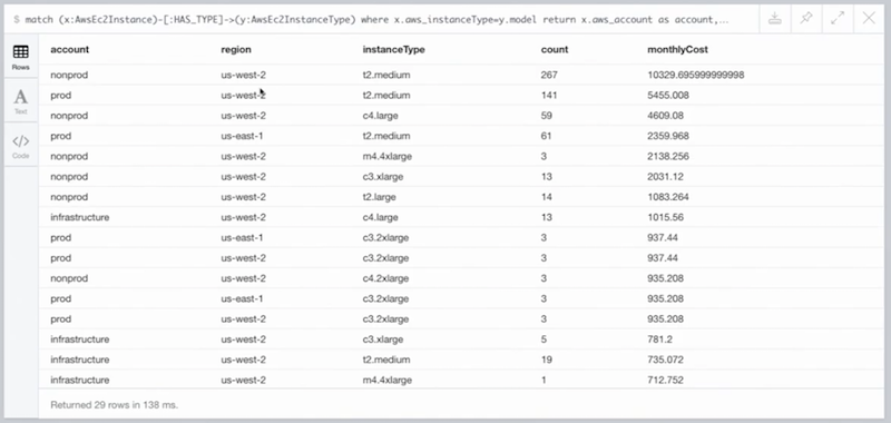
We could really group these any way we want. It we just wanted to show account, or by region, or by instance, we can do all of those things very easily. We can even plot the costs according to app.
We have this other node type called app definition, which is LendingClub’s concept or definition of an app:
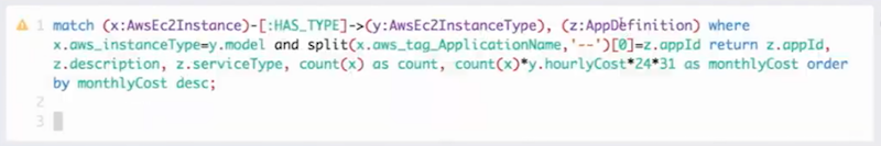
This has information on the apps themselves. If we match the EC2 instances according to app, then we can plot which of our apps are costing us the most or the least by month:

For example, our Docker host costs a lot. There are others that cost a fair amount, but they include a lot of instances, so probably not as big of a deal. So you can do really interesting and cool things, which is all enabled because we have all of our infrastructure components already loaded into Neo4j.
So what if a manager or a VP of Tech-Ops, or someone from InfoSec, comes running over about an issue, such as an IP has been logging a lot, or they just received an alert? Using the information in our graph database, we can match the IP onto its app instance.
Way back in the beginning of the presentation when I was showing all the different app instances, we have their IP information.
If we then map our app instance to a virtual server, and then to the pool, to the virtual service and to the actual app definition, we can go from not knowing what this IP is to knowing everything about the IP:

We can get the host name, exactly what app is deployed on that instance, as well as the version of the app that’s on the instance:

Through our naming convention, the 200s, I know that this is pool B, and since pool B is in the dark pool, maybe it’s not as big of a deal as we initially thought. But if this host was in the live pool and was causing problems, and we needed to restart it, we could also have diagnostics on “it has this much traffic, do we really want to reset all these connections, etc.?”
You can see how with just one query, you can go from not knowing anything to having all this information about the host, what’s deployed, how we should troubleshoot and what kind of actions and steps we should take. Also, if we decided to dig deeper into the troubleshooting, we could map the app definition to a GitHub repo or to certain Jenkins jobs to see when was this built, when the code was pushed, etc.
The true power of graphs: A summary
I mentioned before that you can’t automate all the things if you don’t know what all the things are. And I think with our graph model, we have a very clear visualization of our infrastructure.
Some of the monitoring and the learning capabilities that we gained just from using our graph model – things like single points of failures, our vision synced, and if servers are down or not – all of our deployment and cloud orchestration, and the unified deployment model that we’ve recreated in the cloud, has all been built around the graph model in our metadata that’s stored within Neo4j.
Additionally, we are able to do automated patching. In AWS, we keep track of the image that is attached to every EC2 instance. If that image is older than 14 to 30 days, our software will detect that and automatically roll those instances forward onto the most recent image.
We also have nightly replication from our primary site to our secondary site in the data center, and our primary region in AWS to our secondary region. This means our software will pick up anything that’s deployed in our primary sites and deploy the exact same version of the exact same apps into our secondary sites. So we don’t have to manually do that stuff anymore, which means we can be more hands-off and avoid those late-night pages and alerts.
Also, because we spend less time manually patching, replicating and deploying to our secondary sites, we have more time to build cool stuff.
The graph model has really also allowed us to push for DevOps as a culture, instead of just as a team name or a title. We’ve built a lot of software around Mercator that exposes its data, not only to our teams but to release teams, engineers, QA engineering efficiency and even the risk teams. This enables the engineers and other teams to leverage the data for themselves. They can build their own automation using this information, instead of asking us to create an endpoint for them, or opening a ticket, asking us to write a feature. It has allowed them to self-service more, and given them the ability to take more ownership over their apps to write their own monitoring and alerting scripts.
And lastly, with this graph model, we are able to treat all of our third-party tools exactly the same. We have a standard and unified pipeline, but we’re not locked into any particular technology or tool. If we were to use Docker, it would be no problem. Or if our CTO decided tomorrow we’re switching from AWS to Microsoft Azure or Google Cloud or Oracle Cloud, in terms of our graph model, very little would change. This is what gives us the flexibility when it comes to infrastructure, and when it comes to the next big thing at LendingClub.
Share Article


Explore
Related Articles
Hybrid Search in Neo4j: Full-Text, Vectors, and Graph Topology with Cypher


A workbench for teams to query, explore, and visualize graph data

Hey LLM, you’re using OPTIONAL MATCH wrong. Here’s the Cypher that actually works.