Fixing Your Microservices Architecture Using Graph Analysis

Principal Consultant, GraphAware
11 min read

Editor’s Note: This presentation was given by Nicolas Mervaillie at NODES 2019 in October 2019.
Presentation Summary
So for your brand new project, you decided to throw away your monolith and go for microservices. But after a while, you realize things aren’t going as smoothly as expected.
If that’s the case, graph technology might be just what you need. In fact, graphs can help you detect antipatterns, visualize your whole system and even conduct cross-services impact analysis.
In this talk, we’ll analyze a microservice system based on Spring Cloud, with jQAssistant and Neo4j. We’ll show how it’s helpful for answering questions like:
- Do I have anti-patterns in my microservice architecture?
- Which services or applications are impacted when doing database refactoring?
- Is my API documentation/specification up to date?
- How do I get an up-to-date visualization of my whole system?
Full Presentation: Fixing Your Microservices Architecture Using Graph Analysis
Hi, my name is Nicolas. A big thanks to Neo4j for the opportunity to write this post, which is about architecture, the difficulty of doing microservices and how graphs help identify and fix some problems in this context.
A quick introduction: I work at GraphAware, specifically on development training and consultancy to build things like fraud detection, knowledge management and recommendation engines. Besides that, I co-authored the book, A Graph Project Story. I’m also an advisor at byBr, and I sometimes organize Neo4j meetups.
Background
A bit of context about this post: a few years back, I was asked to work with a client who basically decided to rewrite all his IT systems using microservices. But, the actual benefits were not meeting his expectations. There were plenty of issues, lots of bugs, regression during the QA phase and problems detected very late in the cycle.
Yet, the teams on site were very involved in quality, and they tried to improve the situation with good reviews, refactoring sessions and so on. However, the situation did not seem to improve very much because the system was already quite big, with more than 13 microservices in production. It was difficult to get an overview and know where to act.
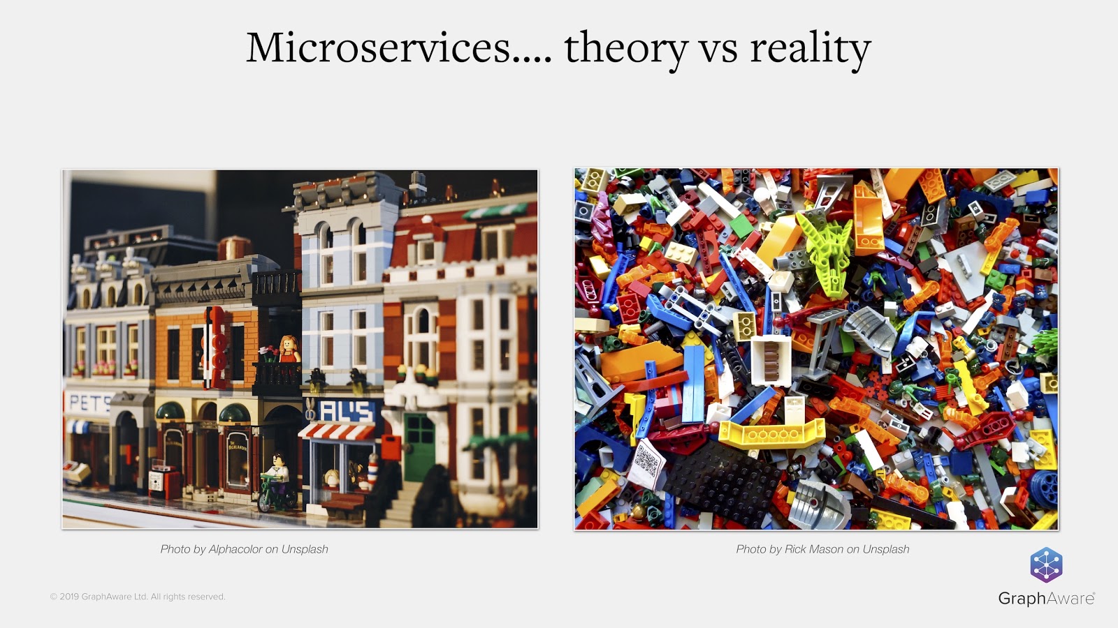
People don’t realize how difficult it is to switch from a traditional approach to a microservices architecture, though it has been discussed in talks and blog posts. It’s easy to get lost on the way and only discover problems too late, when you have tens of thousands of lines of code in production. So, you need to have a very clear vision of the situation and prioritize what you want to do.
Code Is a Graph
After a bit of research, I came across a great tool called jQAssistant, which allowed me to transform code into a graph in Neo4j, because the code actually is a graph. Moreover, not only is the code a graph, but the software architecture and all the rules that go with it are also graphs.

I found that creating a graph was helpful for various tasks, such as detecting anti-patterns, conducting impact analysis and improving data governance or communication between teams. I’ll go into more detail about that later in this post.
An Example Application
For the examples in this post, we’ll use Piggy Metrics, which is a personal finance example application. It’s a blueprint application demonstrating the use of microservices. It’s developed with Spring Boot and Spring Cloud, and is based on the MongoDB database.

The transformation of this application into a graph is very straightforward. We just have to provide the JAR files we need to build the application, and then provide the JAR files to jQAssistant through the command line, as in the example above. A few seconds later, you’ll have a graph – it’s very easy.

In the example above, we have a UserController. This is a class taken from the Piggy Metrics application – it’s a standard Spring RestController. For those who aren’t familiar with Spring, it defines two methods named getUser and createUser. These two methods are exposed from the green @RequestMapping annotations. Inside these annotations we find NPCs and HTTP verbs, which are mapped on. We can also see that we have a call to the userService.
As a graph, this is how the controller looks:
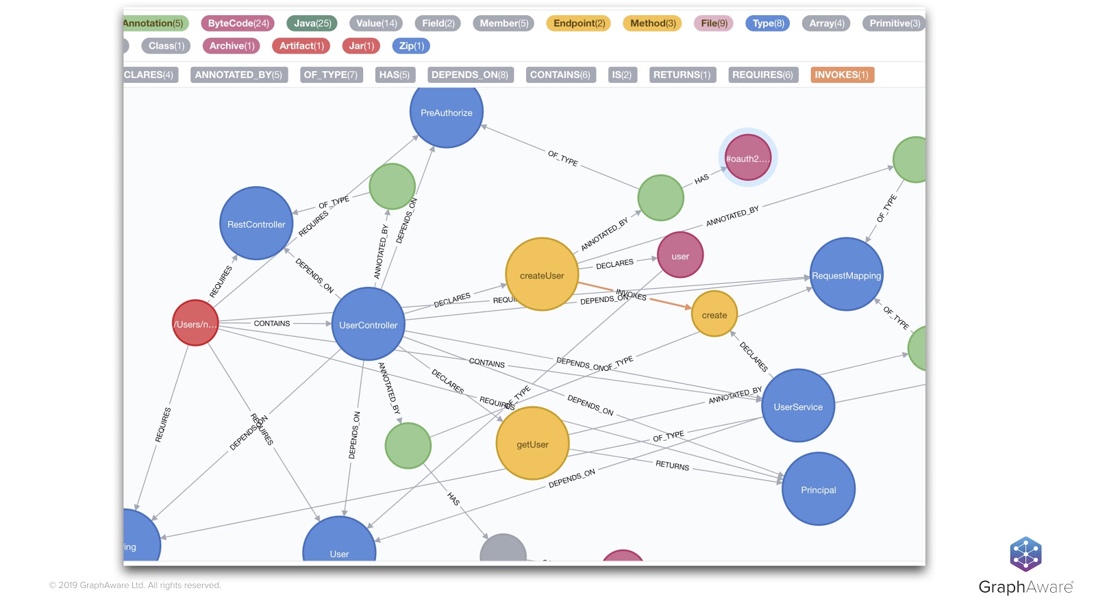
We can see that the different pieces of the code are represented through nodes and relationships.
For example, on the left, the red node represents the JAR file, which is linked to our blue UserController class through a CONTAINS relationship. Our UserController class itself is linked to our getUser and createUser methods that further invoke other methods. Of course, the annotation we saw before – as well as the request mappings – are also present in the graph in green, along with the parameters and so on.
With little effort, we can do a lot of things – like checking for coding or architectural rules and seeing if they’re followed or not. This allows us to detect cyclic dependencies between classes or modules, and see whether specific code is covered by tests, if naming conventions are followed and so on.
Loosely Coupled Microservices
I already hear some of you saying, “But my microservices are loosely coupled. They communicate through HTTP or asynchronous protocols or through message protocols,” and so on. This type of communication is not reflected in the byte code.
Yes, you’re right, but we use our graph to represent the code as a basis and be on top of it. Above languages and frameworks, we have higher-level concepts in our applications: software architecture concepts. It’s also possible to materialize this higher-level concept in the graph with things like API or different engineering practices.
Let’s go through some examples of that.
Let’s go back to the UserController that we’ve seen before. As we use the Spring framework, we can traverse the graph to identify the methods with the right annotations so that your own mappings and some HTTP verbs are associated with them.
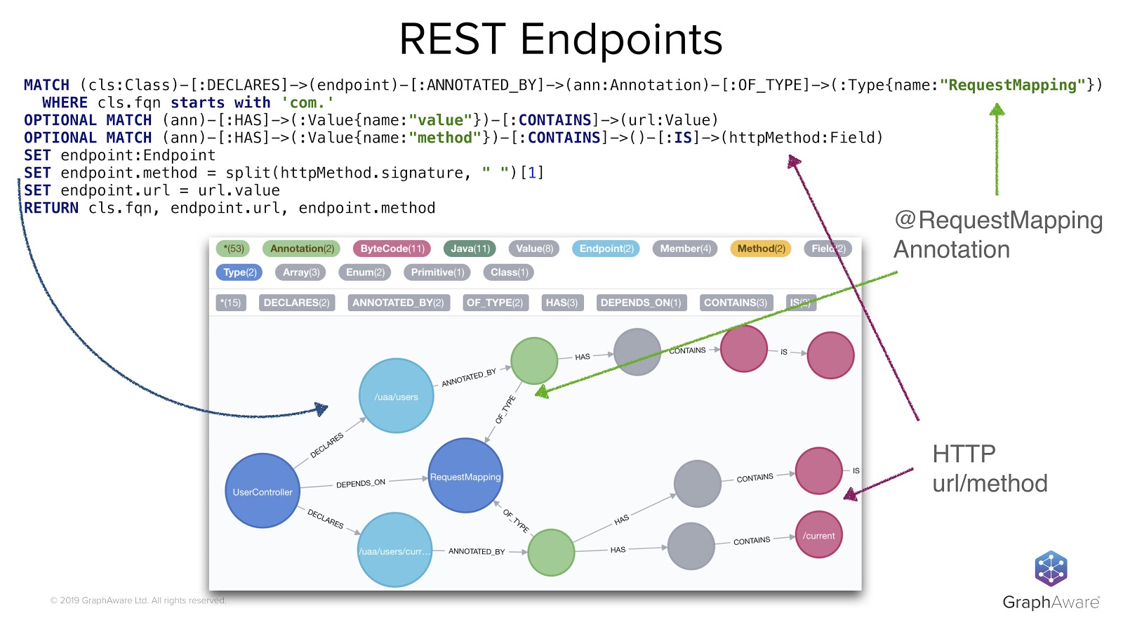
This is what the Cypher query in the image above does. It looks through methods annotated with @RequestMapping annotations and also gets HTTP information into the graph. It enriches the graph with a new concept, the concept of endpoint. Next to the blue row on the left of the screen, we also have set instructions that add the endpoint label to what we found, and add HTTP mapping information to some method nodes that we know are exposed as REST endpoints.
For example, here we are defining some REST endpoints that match the two methods we’ve seen before – getUser and createUser – as well as their different paths. These are the light blue nodes.
In the same way as with endpoints, we can also define some concepts about the HTTP client. Our Piggy Metrics application uses the Feign library to do HTTP calls between one service and another. We can use it to go through the graph and create a new concept by looking for the FeignClient annotation and its related information.

Like for the controller that exposed some REST endpoints, here we have the HTTP client that calls URLs through HTTP verbs. We can add this new FeignClient concept to the graph, through the FeignClient label and with some URL information.
The obvious next step, once we have identified the HTTP clients and the REST endpoints, is to link them by matching the URLs and the HTTP methods they use. This is now really easy to do, thanks to our new concepts.
For example, in the code below, I decided to materialize this course in the graph through a relationship called INVOKES_REMOTE.

Here, we are looking at the clients and endpoints, matching the URLs and methods, and then linking the ones that have to be linked together.
From there, what we can do is very interesting. We can determine cross-service dependencies, something that’s not easy to do from scratch because our services are loosely coupled. Now, these loosely coupled things become apparent in the graph. This is what is in the visualization below, where we see the four services we injected before and how they call each other:

With that, we can find anti-patterns, such as loops between the services that cause chicken-and-egg problems. Or, we can conduct impact analysis to determine, for example, how hard it would be to change this specific endpoint.
Microservices or Distributed Monolith?
With our graph, we can go even further and achieve a higher maturity level for our services. With this, we’re able to check if they respect best practices. Let’s go through some examples of this.
Data Governance
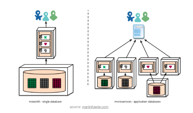
Our Piggy Metrics application is based on MongoDB and Spring Data MongoDB, through which we easily define a persistence entity concept. I didn’t show it here, but it works exactly the same as before. With this kind of information, we check the usage of MongoDB collections across services. By running this query, we see that the account collection is used by two different services.

Maybe it’s a legitimate use case, but it’s also a sign: revealing isolation between those two services, and indicating that those two services should be merged. It’s pretty interesting to see some databases that are managed in several places at a time.
More Impact Analysis
In the same way, we can also define the database repository concept to determine which endpoints are directly or transitively impacted by a repository change.

In the example here, the “UserRepository” at the bottom of the table seems to be used transitively by a remote service. If we wanted to change it, then we might need to check the impact on this remote service. All this isn’t obvious when we just look at the code, or the single service to which this repository belongs.
Just a word here about databases and relational databases specifically: The cool thing jQAssistant does is scan the database metadata for JDBC, and puts the database structure into the graph.
This means we can do even more advanced analysis here than with MongoDB by doing impact analysis, even down to the column level if that’s what you want to validate. For example, if I wanted to change the data format or the length of a column to the database, we identify all objects that are linked to this column.
Is the documentation up to date?
Another best practice in the microservice world is to have a contract-first approach beforehand, which requires defining the specification of the API and then proceeding with the implementation. We can do that, for example, with the OpenAPI specification – the industry standard now – and write our API contract using YAML files.
But, you might run into a problem. How can you know that your specification or documentation is up to date with your implementation?

Luckily, we can also scan YAML files and easily find the OpenAPI description in the content of the YAML files. That query goes through all YAML files, looks for keys named OpenAPI and checks if every service has at least one specification file. This is generally a quick way to identify a lack of documentation.
We can even, in terms of documentation, deep-dive further into the documentation contents. For example, we can extract parameter names, types and so on. We can do the same things with the Spring controllers and then compare the two to actually detect gaps.
In the example below, I omitted the query, but it’s not that complicated. We quickly see that there’s some documentation missing for one service here. We have only two endpoints out of the three that are actually documented.

We can go down to the parameters of the API and even the types of the parameters.
Resilience
Resilience is a very important topic because failures will happen in production, and you need to take them into account to avoid your whole system from collapsing. Luckily, there are well-known mechanisms like circuit breakers and response fallbacks to avoid cascading the failures to upper-level services.

In our case, if we wanted to check that fallbacks were correctly implemented in all our endpoints or HTTP clients, we would use the simple query above to do so, going again through the FeignClient annotation and seeing if they have an attribute declaring a fallback. In our Piggy Metric example, we see that there are two fallbacks missing in some services.
Knowledge Sharing
What we can also do is create nice microservices visualization. The advantage of having an open graph database is that you can selectively export this graph and then export them as GraphML files.
Once you have the GraphML files, it’s very easy to import them and visualize your exported data in tools like Wired. From Wired, you can apply some styling and do some layouting. If you have a large number of elements, this can be very useful.
I won’t go much further into the details, but you can export many different shapes of your architecture data. Here, we have a simple example of dependencies between the services. We can change it to deliver what you want or export a dock visualization, which can be really useful.

Just to give you an idea of how it would look on our system, I’ve included an real-world example below.
I found this visualization super useful for team communication between developers and architects to better understand what needs to be done. It also allows for more efficient conversations with product owners or project managers.

I’d like to mention that this is really difficult to manually create. I’ve actually seen someone work for weeks on it, trying to build it by hand and keep it in sync because the whole system was evolving all the time. Needless to say, it was a nightmare.
More to Explore
We’ve seen examples of what we can do and how to use graphs to identify some issues, but there’s a lot more that can be done.
For example, we could dive deeper into security problems through dependencies or look for annotations that are supposed to be on the endpoint to secure them. We could import runtime data to, let’s say, have an idea about how many calls are done on an API per day and even compute some kind of importance of that API. We could import data from version control to prioritize the fixes according to the dependency of changes into the source code. Of course, if a service is rarely modified, that probably means it’s working okay, so we don’t want to touch it.
A really cool thing would be to scan the front-end side application, for example, a JavaScript application, and impact analysis all the way from the database up to the UI. This is something I was looking for, but I haven’t yet found a way to inject some JavaScript application into Neo4j.
jQAssistant
I’ve been focusing more on architecture analysis and available out-of-the-box features in jQAssistant, but we just scratched the surface of what this tool can do.
jQAssistant is actually really cool. It has around 30 plugins that you can use to scan source code control, spreadsheets, XML and many other things. It can produce nice reports, be integrated into the delivery pipelines and talk with tools like Jenkins or SonarQube.
Everything I showed you today can also be written as executable specifications. This means that checks can be automated, so there’s a friendly way of expressing your concept and constraints.
You can find examples of this in the GitHub repository, where I put the call samples. In the source code repository, you’ll find a tutorial or step-by-step approach, which is a bit more detailed than we covered here, but also circle back into the same points we talked about here.
I hope that I convinced you that according to your needs or your architecture, you can build a graph reflecting higher-level concepts just using basic source code. From there, you’ll obtain real-time, up-to-date knowledge of your running system. You can check how this reality matches your initial plans, perform some review, compromises or adaptations to your actual architecture rules, and decide how to act accordingly.


