Visualizing the GIIN Impact Investing Network with Neo4j [Community Post]


6 min read

[As community content, this post reflects the views and opinions of the particular author and does not necessarily reflect the official stance of Neo4j.The GIIN did not share data or collaborate on this research. The data utilized for this work is publicly available.]
Impact investing is a new and growing field in which financial institutions and individuals invest their money not only for financial return, but also for social and environmental impact.
The field is in such a state of rapid growth that Antony Bugg-Levine and Jed Emerson, two central players in this arena, recently described impact investing as a “dark wood” whose boundaries are in flux and definitions are contested.
I have been working in impact investing for much of the last half-decade; so when my RGK Center colleague Clare Zutz asked me how she could learn more about impact investing in food and agriculture, my response was to point her to individuals knowledgeable about the state of the field, rather than the industry.
Something clicked for us both – the information is out there, but it isn’t easily accessible or visible, especially to newcomers and outsiders. What if we used a graph to help people see and access this field?
The Global Impact Investing Network (GIIN)
With help from our friends at Enable Impact, Clare and I began our hunt by looking at the Global Impact Investing Network (GIIN) list of asset managers.
GIIN is a non-profit membership organization that uses robust metrics to support and grow the impact investing world. We started to identify asset managers who have made food and agriculture investments, and we used Neo4j to visualize the overlap in their investment portfolios.

Figure 1: The publicly available, food- and agriculture-related investments of the members of the GIIN. Yellow nodes represent investors, blue nodes represent companies, and edges represent investments.
Despite the limitations created by the data available to us (more on that shortly), we can already begin to develop some hypotheses.
For example, if you are a food entrepreneur attempting to raise money from GIIN investors, then identifying companies that have raised money from multiple GIIN members, such as Kompanion Financial Group or Terrafertil, (Figure 2), may be an efficient way to gather information about potential investors.
MATCH (n)-[r:INVESTED]->(m)
WHERE (n.affiliation = "GIIN")
WITH m, count(r) as rel_cnt
WHERE rel_cnt > 2
MATCH ()-[r:INVESTED]->(m)
RETURN m, r

Figure 2: Showing recipients with more than two investments by GIIN members Kompanion Financial, Terrafertil and Cooperativa Agraria Noradino Ltda.
When we started this research, we thought mapping would be useful as a field-building exercise, revealing connections and paths entrepreneurs could take through the network.
How graph visualization might help GIIN investors
As we went along, we also discovered ways this research might benefit GIIN itself. The information could be used to recruit members, influence programming and conduct research designed to drive value back to GIIN members.
For example, if you are responsible for managing the GIIN community, a graph visualization can illustrate membership opportunities. The graph might reveal which members of your network are active but not regularly co-investing with other GIIN members (see Phatisa and Investisseurs & Partenaires in Figure 1).
If not that, then they might simply be unaware of what other GIIN investments are relevant to them. A combination of this type of network analysis with traditional analysis of GIIN members’ portfolios might reveal how GIIN can connect potential co-investors, adding value to the network it manages.
Perhaps you are a cooperative and want
to know which GIIN members have invested
in cooperatives. Neo4j allows you to query the properties of nodes and edges. For example:
MATCH (n)-[r:INVESTED]->(m)
WHERE (n.affiliation = "GIIN")
AND (m.type = "Cooperative")
RETURN r

Figure 3: Showing investments in cooperatives by GIIN members.
From that initial seed set of GIIN investors, we began to snowball outwards: Which non-GIIN members have co-invested with GIIN members? With some aggressive press release combing, we gathered information about investments made in GIIN companies by investors who were not members of the GIIN.
Using Neo4j, we added a label to all GIIN members, differentiating them from the other investors.

Figure 4: Publicly available information on GIIN members’ investments in food and agricultural companies, and the investments made in those companies by non-GIIN investors. Yellow nodes are secondary investors; red nodes are GIIN members; blue nodes are companies; edges represent investments.
Two things jumped out to us. First, the graph reveals the network of investors in food and agriculture that are not a part of GIIN but co-invest with multiple GIIN members, or rather, which GIIN members have co-invested with multiple non-GIIN co-investors.
These relationships could reveal potential GIIN members and realize increased revenue for GIIN. Using Neo4j, you can query to see which ventures have co-investments from both GIIN and non-GIIN members.
MATCH (g:GIIN) - [r:INVESTED] -> (m) <- [s:INVESTED] - (l)
WHERE (l.affiliation = "Secondary")
RETURN r, s

Figure 5: Publicly available information on investments in food and agricultural companies by GIIN and non-GIIN investors. Yellow nodes are secondary investors; red nodes are GIIN members; blue nodes are companies; edges represent investments.
Second, the graph reveals that some companies have raised most of their money from non-GIIN investors. We are curious about what jumps out to others – including entrepreneurs, investors and network managers.
Conclusion
We have to add a number of caveats to these graph visualizations. For this round of research, we only had access to publicly available information.
This proved to be problematic in two ways: First, not all GIIN members list their investment portfolios publicly. Second, we had to scavenge the Internet for information about co-investors because public databases (Crunchbase, Angelist, Impact Alpha) lacked information on the majority of these investments.
Additionally, this graph represents only a small handful of the investments made by GIIN members. If we were able to map out all of the GIIN investments, the map would look quite different.
To us, these limitations only speak to the potential power of graph databases and network visualization for exploring impact investing networks to the benefit of entrepreneurs, investors and even network managers themselves. Neo4j made taking these first steps straightforward.
Given more time and resources, we would take the opportunity to dive further into the data in order to provide more granular insight to the GIIN, bring transparency to the opaque field of impact investing and provide tools that allow entrepreneurs to more easily locate the resources they need to grow their businesses and maximize the social impact they wish to have.
Stay tuned for more to come!
Want to learn how to use graph databases in your industry or field? Click below to get your free copy of O’Reilly’s Graph Databases ebook and discover how to use graph technologies for your mission-critical application today.
Share Article


Explore
Related Articles
APRA just put the financial sector on notice over AI. Government agencies need to take notes.
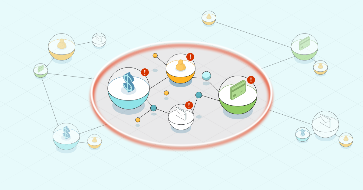
Detect fraud faster with a transaction graph
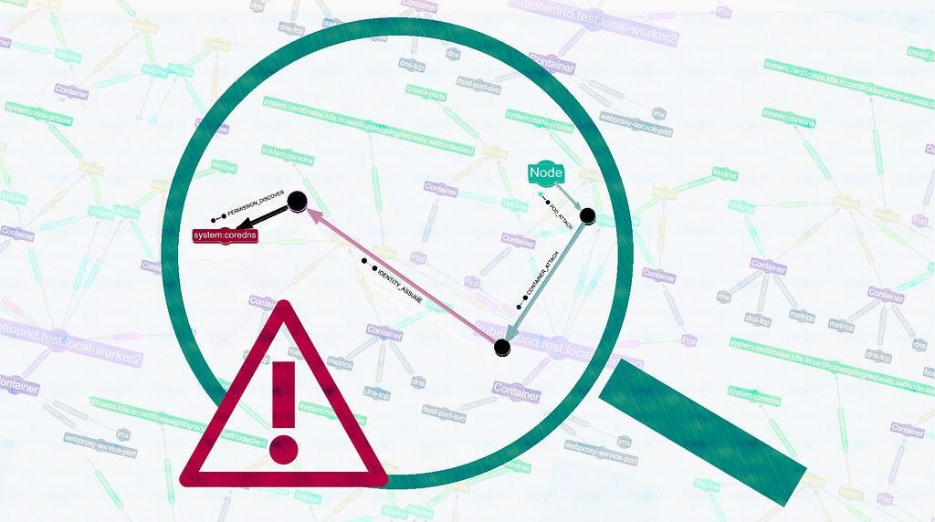
Bolster your cybersecurity by visualizing attack graphs with Neo4j & G.V()