Graph Algorithms: Make Election Data Great Again

Technical Advisor, Right Relevance
10 min read
Editor’s Note: This presentation was given by John Swain at GraphConnect San Francisco in October 2016.
Summary
In this presentation, learn how John Swain of Right Relevance (and Microsoft Azure) set out to analyze Twitter conversations around both Brexit and the 2016 U.S. Presidential election data using graph algorithms.
To begin, Swain discusses the role of social media influencers and debunks the common Internet trope of “the Law of the Few“, rechristening it as “the Law of Quite a Few.”
Swain then dives into his team’s methodology, including the OODA (observe, orient, decide and act) loop approach borrowed from the British Navy. He also details how they built the graph for the U.S. Presidential election and how they ingested the data.
Next, Swain explains how they analyzed the election graph using graph algorithms, from PageRank and betweenness centrality to Rank (a consolidation of metrics) and community detection algorithms.
Ryan Boyd then guest presents on using graph algorithms via the APOC library of user-defined functions and user-defined procedures.
Swain then puts it all together to discuss their final analysis of the U.S. Presidential election data as well as the Brexit data.
Graph Algorithms: Make Election Data Great Again
What we’re going to be talking about today is how to use graph algorithms to effectively sort through the election noise on Twitter:
John Swain: Let’s start right off by going to October 2, 2016, the date we published our first analysis of the data we collected on Twitter conversations surrounding the U.S. Presidential Election.
On that day the big stories were Hillary Clinton’s physical collapse and her comment about the “basket of deplorables” — which included talk about her potentially resigning from the race. It was a very crowded conversation covered intensely by the media. We wanted to demonstrate that, behind all the noise and obvious stories, there were some things contained in this data that were not quite so obvious.
We analyzed the data and created a Gephi map of the 15,000 top users. One of the clusters we identified included journalists, the most prominent of whom was Washington Post reporter David Fahrenthold. Five days later, Fahrenthold broke the story about Donald Trump being recorded saying extremely lewd comments about women.
We’re going to go over how we discovered this group of influencers which, even though there was a bit of luck involved, we hope to show that it wasn’t just a fluke and is in fact repeatable.
In this presentation, we’re going to go over the problem we set out to solve and the data we needed to solve that problem; how we processed the graph data (with Neo4j and R); and how Neo4j helped us overcome some scalability issues we encountered.
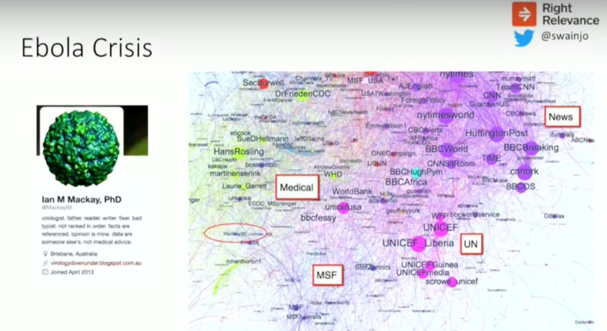
I started this as a volunteer project about two years ago with the Ebola crisis, which was a part of the Statistics Without Borders project for the United Nations. We were looking for information like the below in the Twitter conversation about Ebola to identify people who were sharing useful information:
Because there was no budget, I had to use open source software and started with R and Neo4j Community Edition.
I quickly ran into a problem. There was a single case of Ebola that hit the United States in Dallas, which happened to coincide with the midterm elections. The Twitter conversation about Ebola got hijacked by the political right and an organization called Teacourt, all of whom suggested that President Obama was responsible for this incident and that you could catch Ebola in all kinds of weird ways.
This crowded out the rest of the conversation, and we had to find a way to get to the original information that we were seeking. I did find a solution, which we realized we could apply to other situations that were confusing, strange or new — which pretty much described the 2016 U.S. Presidential election.
Debunking the Law of the Few
So, where did we start? It started with something that everybody’s pretty familiar with – the common Internet trope about the “Law of the Few,” which started with Stanley Milgram’s famous experiment that showed we are all connected by six degrees of separation. This spawned things like the Kevin Bacon Index and was popularised by the Malcolm Gladwell book The Tipping Point.
Gladwell argues that any social epidemic is dependent on people with a particular and rare set of social gifts spreading information through networks. Whether you’re trying to push your message into a social network or are listening to messages coming out, the mechanism is the same.
Our plan was to collect the Twitter data, mark these relationships, and then analyze the mechanism for the spread of information so that we could separate out the noise.
To do this, we collected data from the Twitter API and built a data model in Neo4j:
The original source code — the Python scripts and important routines for pulling this into Neo4j — is also still available on Nicole White’s GitHub.
However, we encountered a problem. At the scale we wanted to conduct our analysis, we couldn’t collect all of the followers and following information that we wanted because the rate limits on the Twitter API are too limiting. So we hit a full stop and went back to the drawing board.
Through this next set of research, we found two really good books by Duncan Watts — Everything Is Obvious and Six Degrees. He is one of the first people to do empirical research on the Law of the Few (six degrees of separation), which showed that there is actually a problem with this theory because any process that relies on targeting a few special individuals is bound to be unreliable. No matter how popular and how compelling the story, it simply doesn’t work that way.
For that reason, we rechristened it “The Law of Quite a Few” and named the people who are responsible for spreading information through social networks, which are ordinary influencers. These aren’t just anybody; they’re people with some skills, but it’s not just a very few special individuals.
Methodology
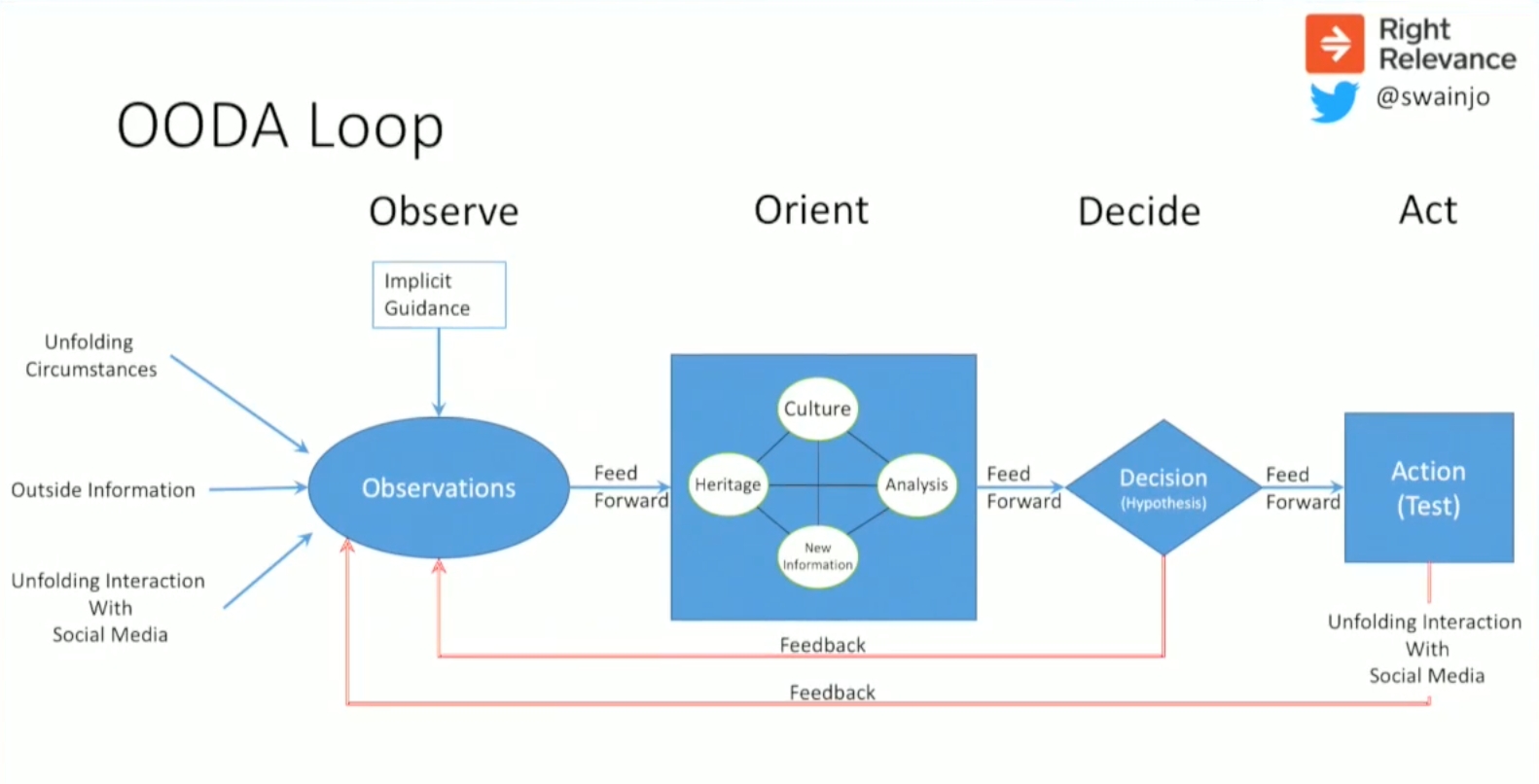
We borrowed a methodology from military intelligence in the British Navy called the OODA loop: observe, orient, decide and act. Below is a simplified version:
The key thing we learned in the research is that people are not disciplined about following the process of collecting data. Instead we typically perform some initial observations, orient ourselves, decide what’s going on and take some actions — but we shortcut the feedback loop to what we think we know the situation is, instead of going back to the beginning and observing incoming data.
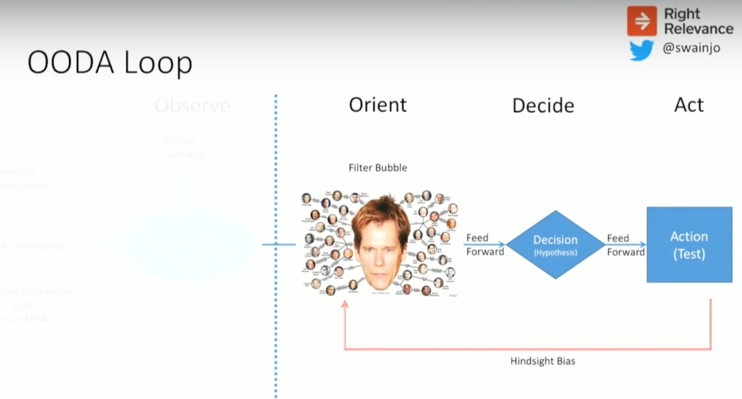
Using a feedback loop like this is essentially hindsight bias:
Hindsight bias is the belief that if you’d looked hard enough at the information that you had, the events that subsequently happened would’ve been predictable — that with the benefit of hindsight we could see how it was going to happen.
This gets perverted to mean that if you’d looked harder at the information you’d had, it would have been predictable, when in fact you needed information you didn’t have at the time. Events aren’t predictable, even if they seem predictable when you play the world backwards.
Building the Graph
Using that methodology, we committed to building the graph with Neo4j. This involved ingesting the data into Neo4j, building a simplified graph, and processing with R and igraph.
Ingesting the Data
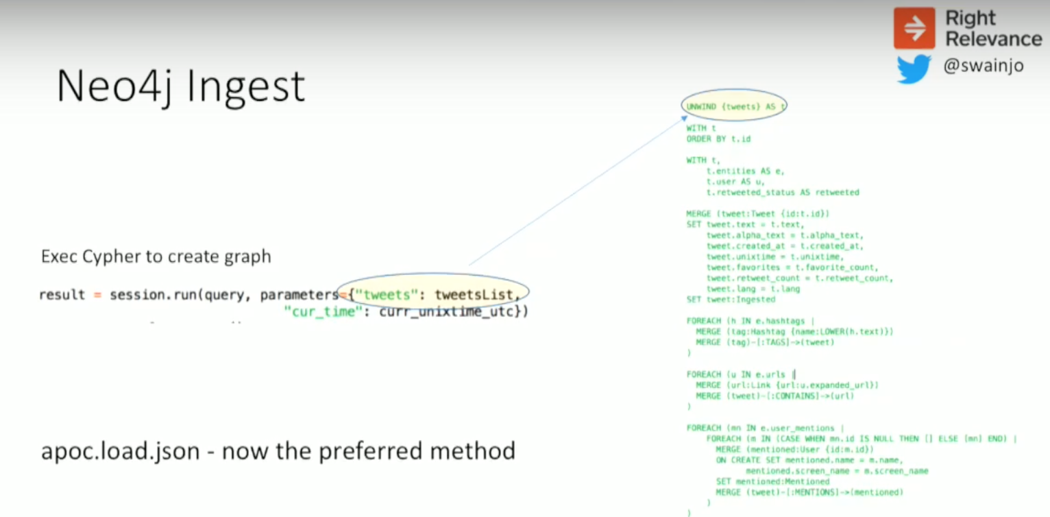
The first part of the process is to ingest the data into Neo4j, which gets collected from the Twitter API and comes in as JSON. We scale this up so we can use the raw API rather than the Twitter API, have our libraries in Python, push that into a message queue and store this in a document store, MongoDB.
Whether you’re pulling this from the raw API or whether you’re pulling it from a document store, you get a JSON document. We pushed a Python list into this Cypher query and used the UNWIND command, and included a reference to an article. Now the preferred method is to use the apoc.load.json library:
We were interested in getting a simplified version of the graph with only retweets and mentions, which we use to build the graph. We built the following simplified graph, which is just the relationship between each user with a weight for every time a retweet or mention happens.
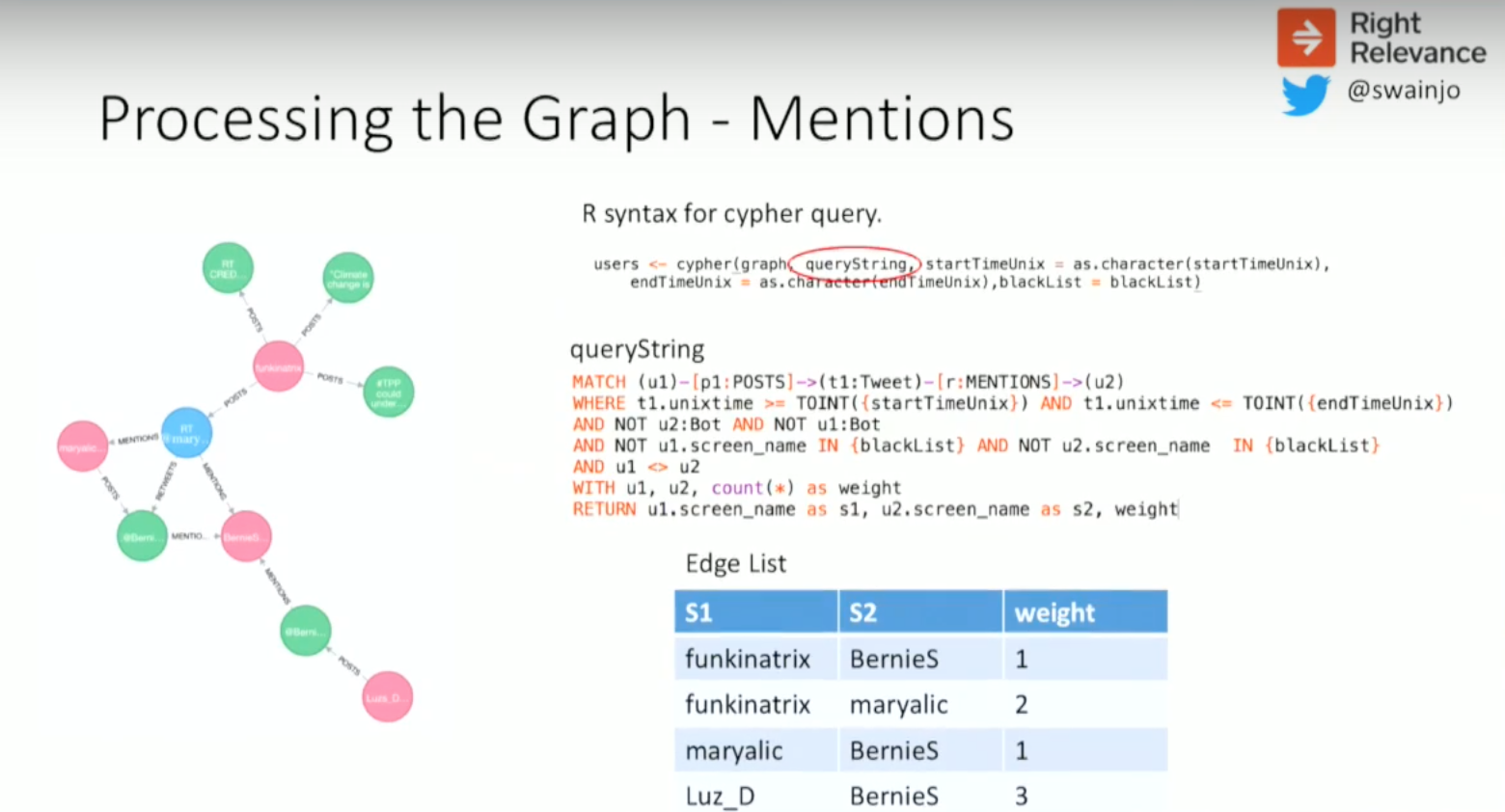
The R call calls a queryString, which is a Cypher query that essentially says MATCH users who post tweets that mention other users, with some conditions about the time period, that they’re not the same user, etc. Below is the Cypher code:
This builds a very simple relationship list for each pair of users and the number of times in each direction they’re mentioned, which results in a graph that we need to make some sense out of.
Analyzing the Graph: Graph Algorithms
The key point at this stage is that we have no external training data to do things like sentiment analysis because we have a cold start problem. Often we’re looking at a brand-new situation that we don’t have any information about.
The other issue is that social phenomena are inherently unknowable. No one could have predicted that this story was going to break, or that a certain person is going to be an Internet sensation at a certain time. This requires the use of unsupervised learning algorithms to make sense of the graph that we’ve created.
PageRank
The first algorithm we used is the well-known PageRank, a graph algorithm originally used by Google to rank the importance of web pages and is a type of eigenvector centrality algorithm by Larry Page. This ranks web pages or any other node in a graph according to how important it is in relation to all the pages that link to it recursively.
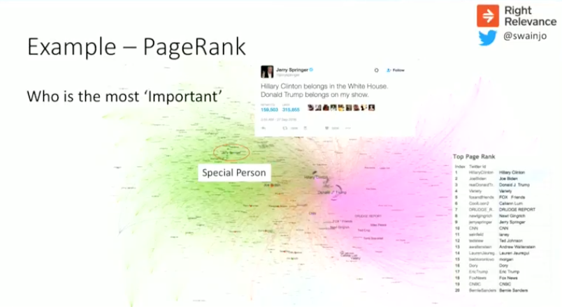
Below is an example of what we can do with PageRank. This is the same graph we started with at the beginning with top PageRank-ed users:
Here the three users Hillary Clinton, Joe Biden and Donald Trump heavily skewed the PageRank. There were a couple of other interesting users that we can see from this graph, including Jerry Springer who had an enormous number of retweets. That’s a big number of retweets, and illustrates this temptation to pay special attention to what certain people say.
Looking backwards, it’s very easy to put together a plausible reason why Jerry Springer was so successful. He had some special insight because of the people he has on his show. But the reality is, it was just luck. It could have been one of the 10,000 A-list, B-list, C-list celebrities these days. But it’s tempting to look back and rationalize what happened, and believe that you could have predicted it — but that’s a myth.
Betweenness Centrality
The next graph algorithm we use is betweenness centrality, which for each user measures the number of shortest paths from all the other users that pass through that user. This tends to identify brokers of information in the network, because information is passing through those nodes like an airport hub.
We also calculate some other basic stats from the graph, some of which are collected in degrees, i.e. the overall number of times a user is mentioned or retweeted; retweets, replies and mention count; plus some information returned from the API.
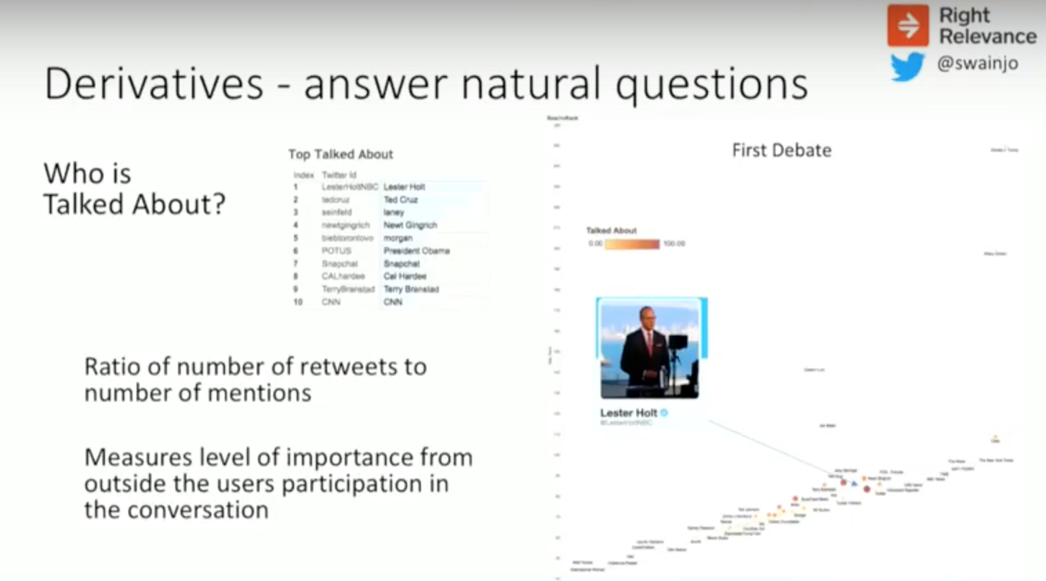
And what we create is a set of derivatives which answer some natural questions. An example of that is a metric that we call Talked About:
The natural question is: who is talked about? This is from the night of the first debate, and measures the ratio of the number of times someone’s retweeted to the number of times they’re mentioned, corrected for number of followers and a couple of other things as well.
Katy Perry is always mentioned more than anyone else simply because she has 80 million followers, so we adjust for that to measure the level of importance from outside the user’s participation in a conversation. For example, there can be an important person who isn’t very active on Twitter or involved in the conversation, but who is mentioned a lot.
On this night, the most talked about person was Lester Holt. He was obviously busy that night moderating the presidential debate and wasn’t tweeting a lot, but people were talking about him.
Rank: Consolidated Metrics
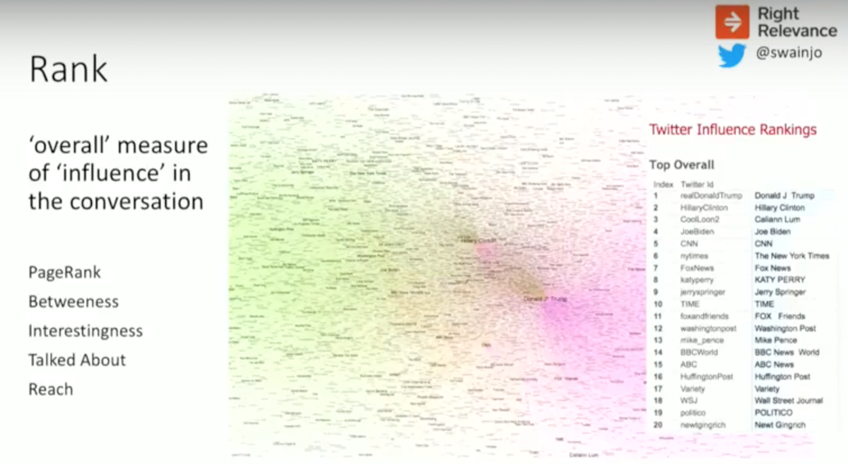
We consolidate all of these metrics into overall measure that we call Rank:
Rank includes PageRank, betweenness centrality and a measure we call Interestingness, which is the difference between what someone’s PageRank is and what would you expect that PageRank to be given a regression on various factors like number of followers and reach. Someone who has a very successful meme that’s retweeted a lot and gets lots of mentions can be influential in networks, but we try to correct for that as just being noise instead of actually valuable information.
This image above is the same graph as before, and it’s natural that Donald Trump and Hillary Clinton are continually the top influencers in their network on any graph of this subject. But Rank evens out those distortions and skews from some other metrics to give you a good idea of who was genuinely important.
We’re talking about influencers, which is not something you can directly measure or compare. There’s not necessarily any perfect right or wrong answer, but you get a good indication on any given time period who has been important or influential in that conversation.
Community Detection Algorithm
Community detection separates groups of people by the connections between them. In the following example it’s easy to see the three distinct communities of people:
In reality, we’re in multiple communities at any given time. We might have a political affiliation but also follow four different sports teams. The algorithms that calculate this non-overlapping membership of communities are very computationally intensive.
Our solution was to run a couple of algorithms on multiple subgraphs. We take subgraphs based on in-degree types of giant components, which is the most centrally connected part of the graph, run those several times and bring together the results to create a multiple membership.
When you visualize this, it looks something like the below. This is back to the U.K. Brexit conversation, with about two million tweets in this particular example:
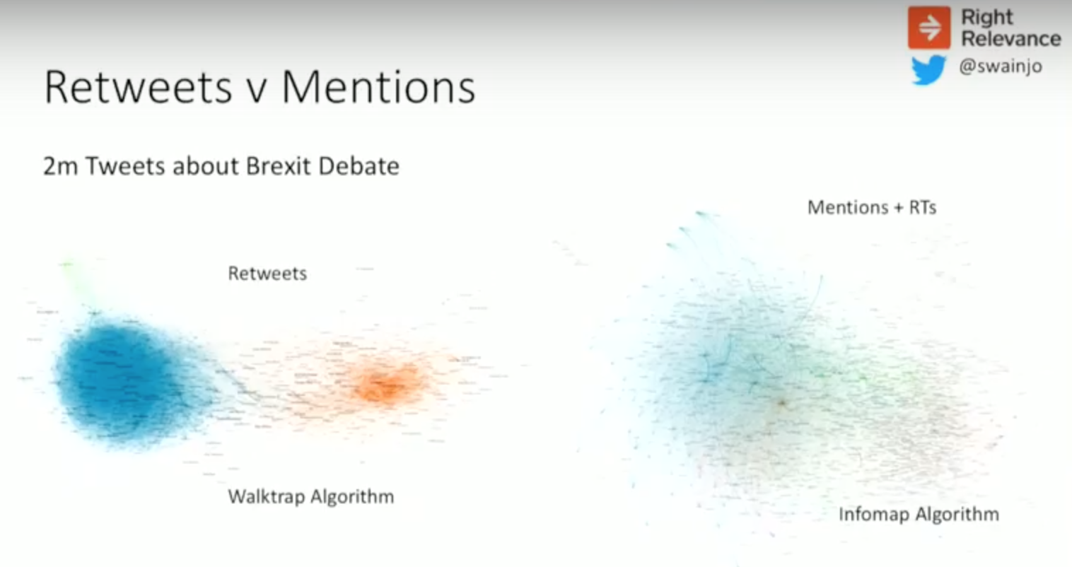
We have two types of graphs above: one based on retweets and one based on mentions. The “retweets” graph always creates this clear separation of communities. No matter what people say on their Twitter profiles, retweets do mean endorsements on aggregate; people congregate very clearly in groups where they share common beliefs.
Mentions including retweets gives you a very different structure is not quite so clear. You can see that there are two communities, but there’s a lot more interaction between them.
The same is true with the community detection algorithms. The two we most frequently use are Walktrap and Infomap. Walktrap tends to create fewer, larger communities. When you combine that with retweets, you get a very clear separation.
Conversely the Infomap algorithm creates a number of much smaller communities. In this case it wasn’t a political affiliation, it was a vote to either leave the EU or to remain – a very clear separation. At the same time, people’s existing political affiliations overlap with that vote. It’s not usually this easy to see on the 2D visualization with colour, but you get some idea of what’s going on.
At this point, we get some sense of what’s going on in the conversation. If we go back to the first U.S. presidential debate, below is the community that we detected for Joe Biden:
We call these kinds of communities – which are people active in that conversation in a certain period of time – flocks. These results are from totally unsupervised learning. And you can that by and large, it pretty accurately relates a coherent, sensible community of people sharing certain political affiliations.
We were happy going along doing this kind of analysis and getting bigger and bigger graphs. And then the Brexit campaign created this huge volume of tweets, and we a hit brick wall in scalability. We realized that we didn’t have the capacity to handle 20 million tweets each week, and we needed to scale the graph algorithms.
We looked at various options, including GraphX on Apache Spark, but after talking to Ryan and Michael we found that we could do this natively in Neo4j using APOC. We’re currently processing about 20 million tweets, but our target is to reach a capacity to do a billion-node capacity. And Ryan Boyd with Neo4j is going to talk more about that.
Neo4j User-Defined APOC Procedures
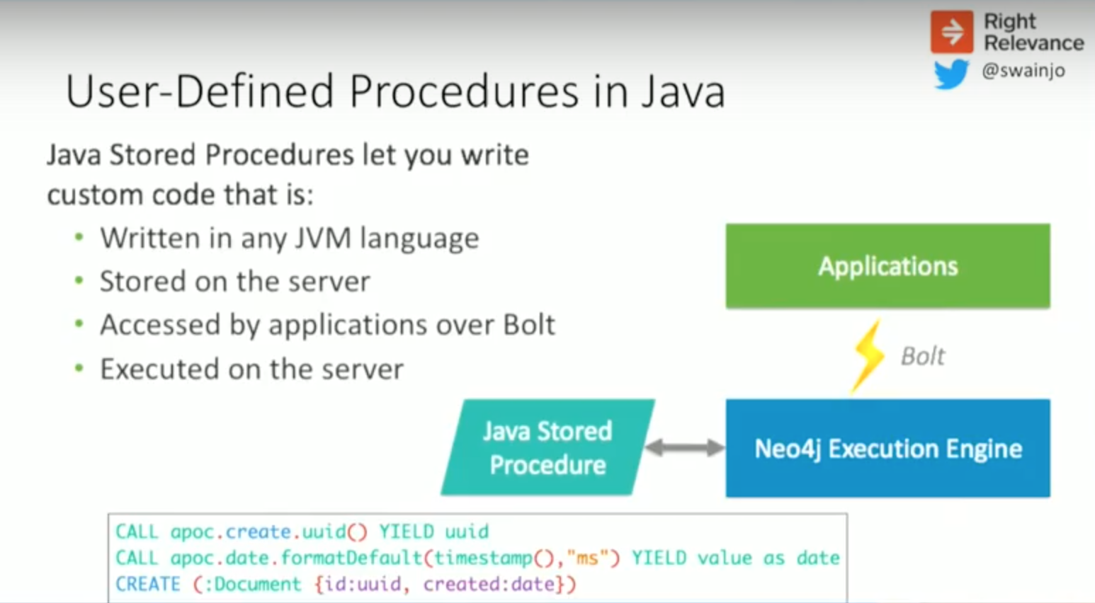
Ryan Boyd: Let’s start with an overview of user-defined procedures, which are the ability to write code that executes on the Neo4j server alongside your data:
To increase the performance of any sort of analytics process, you can either bring the processing to the data, or the data to the processing. In this case we’re moving to processing to the data. You have your Java Stored Procedure that runs in the database, Neo4j can call that through Cypher and your applications can also issue Cypher requests.
At the bottom of the image is an example call, and as a procedure the YIELD results. First you use the APOC feature to create a UUID, a timestamp of the current time, and to CREATE a node and include that UUID and the timestamp that was yielded from those first two procedures.
You can do this all in Cypher but now Neo4j 3.1 has user-defined functions, which allow you to call these as functions rather than procedures:
If you look at the bottom right where you CREATE your document node, you can set the ID property to the apoc.create.uuid and then set the CREATE property to be apoc.date.format and your timestamp. This makes it easier to call directly.
We’ve taken a lot of the procedures in the APOC library and converted them to functions wherever it made sense, and the next version of APOC is out there for testing the 3.1 version.
APOC is an open source library populated with contributions from the community, including those from Neo4j. It has tons of different functionality: to call JDBC databases, to integrate with Cassandra or Elasticsearch, ways to call HDP APIs and integrate pulling data in from web APIs like Twitter.
But it also has things like graph algorithms. John’s going to talk a bit more about their work with graph algorithms that they have written and contributed as a company to the open source APOC library that is now accessible to everyone.
Swain: We’ve started creating the graph algorithms that we are going to need to migrate everything from running the algorithms in igraph in R, to running it natively in Neo4j.
We started with PageRank and betweenness centrality, and we are working on two community detection algorithms: Walktrap and Infomap. Everything is available on GitHub, and we hope that people will contribute and join us. It’s just the tip of the iceberg, and we have a long way to go until we can complete the process and run this end-to-end.
Below is the result from three different time periods of our Brexit data:
The igraph implementation of PageRank is pretty efficient, so we’re only getting a relatively minor performance improvement. But with betweenness centrality we have a much larger performance improvement.
Because we can run this natively in Neo4j, we don’t have to build that graph projection and move it into igraph, which is a big win. When we do this with R, on fairly small graphs we get a huge improvement, but at a certain point we just run out of memory.
Putting It All Together
Let’s turn back to where we started and how we discovered what we discovered. We had to pull together important people in the conversation (flocks), topics of conversation, and topical influence (tribes):
We’ve already gone over special people versus ordinary influencers. With the Right Relevance system we have approximately 2.5 million users on 50,000 different topics, and we give everyone a score of their topical influence in those different topics.
Let’s turn back to journalist David Fahrenthold, who has significant influence in lots of related topics – some of which were in that conversation that we looked at right at the beginning.
What we’re trying to do is find the intersection of three things: The conversation, the trending topics — the topics that are being discussed in that conversation — and the tribes. The topics are defined by an initial search, but it can be quite difficult defining the track phrases they’re called for pulling data from a Twitter API.
This means you can get multiple conversations and still not really know what the topics are going to be. This kind of influence is what we call tribes. People who are in the same tribe tend to have the same intrinsic values, demographic and psychographic qualities.
People who support a football team are the perfect example of a tribe because it changes only very slowly, if at all. If I support Manchester United, I might not be doing anything about that quality today. But if I’m going to a game, look at a particular piece of news about players being signed, or whatever, then I’m engaged in a conversation. People who are involved in that conversation are organized in flocks.
Below is Twitter information that was pulled on September 11:
This image above includes trending terms, hashtags, topics and users. The people in this conversation had expertise or influence in these topics. That’s just a filter which selects the people in that flock, so it is now the intersection between people with certain topical influence and people in a certain flock, which includes active reporters and journalists.
You have to be really careful with reviewing and going back to the observation phase.
Below is a later analysis, which shows something happening slowly but detectably, and we expected after the next debate that this process would accelerate.
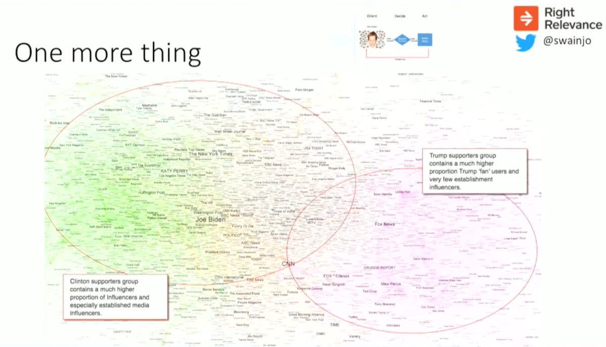
Basically, establishment commentators and media have gradually become more and more prevalent in the Hillary Clinton side of the graph, leaving the Trump side of the graph quite sparse in terms of the number of influencers:
Everyone on the Hillary side of the network was starting to listen more and more to those people, and the information was filtered and became self-reinforcing.
It’s very similar to what we detected on Brexit, only it’s the other way around:
The “remain” side was very much establishment and the status quo, so people were not so active. Whereas in the US presidential election both sides were very active, which is one main difference. In the Brexit campaign in the U.K., anybody who was anybody really was supporting remain. The main proponents of Brexit didn’t really believe it was going to happen, but it did. There was a complacency on the other side, and the turnout ended up being very low.

