
Graph Technology to Fight Terrorist Threats


9 min read
Editor’s Note: This presentation was given by Frederick Kagan and Sébastien Heymann at GraphConnect New York in October 2018.
Presentation Summary
The American Enterprise Institute (AEI) is an independently-funded nonprofit that uses unclassified information to understand ongoing conflicts in the Middle East, Africa and Europe to produce forecasts and policy recommendations.
Like the intelligence community, and almost any large-scale business analysis team, the nonprofit had to solve problem of munging all their data together into a single interface. They found their solution with the combined power of Neo4j and Linkurious, even though they encountered some challenges related to static data visualization and nodes with extensive properties.
The backbone of AEI’s system is a Neo4j database supplemented by a cloud search index, as well as AWS and Azure document stores. By taking advantage of Python and Neo4j Sandbox, the team can take advantage of Neo4j’s extensive node-tagging abilities while still being able to visualize the complex schema in Linkurious.
AEI’s work includes mapping networks such as the Salafi-jihadi network in the Sahel region of Africa. AEI’s work uncovered previously unknown connections between the network and local tribal and ethnic groups, which U.S. leaders use to inform policy in the region.
Based on the different kinds of databases that AEI has worked with, they have concluded that graph databases like Neo4j should become core backbones for analytical organizations both within the government and beyond.
Full Presentation: Graph Technology to Fight Terrorist Threats
Sébastien Heymann: What we’re going to be talking about today is how the government uses Neo4j and Linkurious to conduct terrorist analysis for terrorist threat detection:
I’m the CEO of Linkurious, a French company that provides technology for graph visualization and graph analysis. Our graph intelligence platform helps speed up the investigation of complex threats, and in partnership with Neo4j was used to reveal the
complex fraud schemes housed in the Panama Papers and Paradise Papers. Today, investigators in enterprises and government agencies use these graph analysis tools to quickly reveal and investigate fraud, money laundering activities and cyber threats.
Frederick Kagan: The American Enterprise Institute (AEI) is an independently-funded nonprofit that uses unclassified information to understand ongoing conflicts in the Middle East, Africa and Europe to produce forecasts and policy recommendations.
We partnered with the Institute for the Study of War, a single, open source analytical team, to start an initiative called the Critical Threats Project. Our primary areas of focus are Iran, Russia, Syria, Iraq, Yemen, Afghanistan and Northern Africa, particularly Libya and the Horn of Africa.
We study global al-Qaeda and ISIS networks, the Iranian network of allies, and proxies operating throughout the Middle East, and are in the process of establishing a South Asia program. We publish our analysis, forecasts and the results of our planning exercises to present options to American and allied policy makers.
We are engaged in an effort to model a transformation in the way open source intelligence is generated and used. We call this the intelligence revolution. We believe that an overall picture of what’s going on in the world is best generated from unclassified information, and supplemented with classified data when necessary.
Unfortunately, the necessary division of labor between analysts and collectors in the intelligence community is actually harmful in the open source world. To address this, we have the same people both gather and analyze the data, people we call collector analysts. Our platform is therefore a collection analysis platform controlling both functions.
Our data comes many formats and structures from many sources:
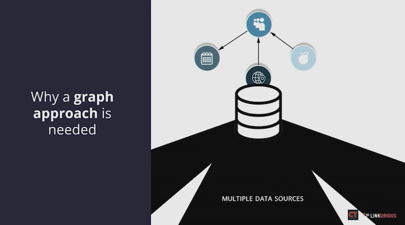
Like the intelligence community, and almost any large scale business analysis team, we have the problem of munging that data together into a single interface that lets analysts find everything of relevance with one search.
Graph databases, and particularly Neo4j, are the optimal systems for such a problem. They require no schema or ontology, and can readily accept data in any structure.
Neo4j’s label system permits the creation of multiple overlapping ontologies, co-existing peacefully within a single database without compromising search performance. This means we do not need to transform each new data source into some preexisting data model in order to use it. We can simply bring it into our Neo4j database and adjust only our graphical user interface and make minor modifications and query structures in order to begin using it immediately. There is no need to re-index our large data set every time we add a new data field or entire sub-ontology as one must do with SQL Databases.
These capabilities make the hard problem of interacting with many different data formats and structures relatively easy and painless to resolve.
Challenges
Despite the advantages of using Neo4j, to make all of our data readily accessible, we still faced some challenges:
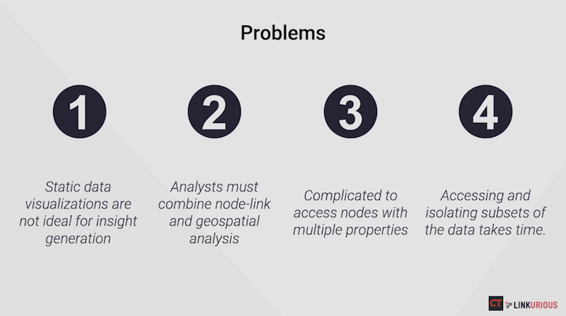
We need to make the data visible to our users. We have a team of more than 40 analysts and interns who are constantly creating events, entities, and relationships from the unstructured data they collect. Analysts must be able to visualize the data dynamically and historically in order to see patterns and derive insight.
Insight comes from the intersection of node-link and geospatial analysis. We build pictures of the states, militaries, and non-state act organizations of interest, overlay those pictures on geo-located events to discern the capabilities and try to discern the intentions of those states and groups.
Discerning intent is what permits intelligent forecasting, and is one of the hardest analytical tasks. It requires not only the study of the events and organizations themselves at this moment, but also of the context within which the humans in those organizations have developed and evolved.
Our nodes have therefore become very extensive, with many properties added over the years by successive generations of analysts. We must be able to place nodes in a node-link graph, show them on maps, and also access those properties. Our extensive dataset covers many states and regions, so we must also be able to gather subsets of the data and visualize them quickly and dynamically as part of our quest to understand, evaluate and forecast.
AEI System Requirements
The backbone of our system is a Neo4j database supplemented by a Cloud Search index and document stores on AWS and Azure:
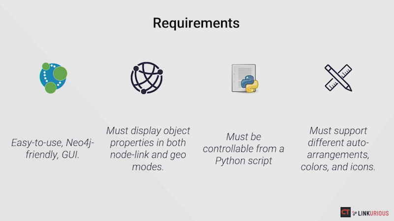
Our team interacts with the data via a purpose-built Python script that is meant to be the single graphical user interface (GUI), optimized for their work flow.
This means we need a visualization system that is optimized for integration with Neo4j, produces attractive and publishable graphics, and can display node-link graphs, geolocated data and detailed property nodes easily and dynamically. It must be able to perform various auto layouts, let users color nodes and display icons and update from the live dataset as required.
All these features must be accessible via API calls from the Python script itself so that the visualization is integrated as seamlessly as possible into the analytical workflow. The visualization, in other words, must perform more like another window of the GUI than like a distinct software package.
We have studied the reasons for the success and failure of integrating new software into analytical workflows in our own teams and in U.S. Intelligence Community. We have learned the importance of designing the software tools to match existing workflows as precisely as possible.
When the tools permit or require changing the workflows, we have observed that it is essential for the software engineers to work with the analysts directly to help them adjust their workflows. Simply plopping a new tool into an existing workflow frequently results in the failure of users to take advantage of the tool, and they remain stuck in the rut of their preexisting workflow.
Our purpose-built GUI is optimized for our workflow, and we’ve found that it’s much better to add functionality via that GUI than to require users to learn how to use multiple new tools. That is why we require not merely a powerful software package, but one whose power is readily accessible through an API.
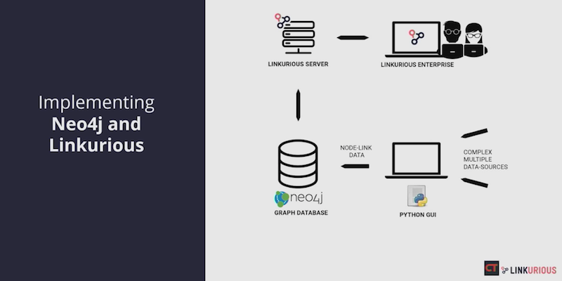
Implementing Neo4j and Linkurious
Neo4j’s ontological flexibility does more than allow us to munge data. It also supports a highly articulated data schema that allows us to retain sourcing and data provenience at the property level.
We use what we call a thin node model (i.e. the main entity event node has only a few properties on it), a UID, name, type, and perhaps one or two others. Most of the other properties such as age, geolocation, rank, descriptions and quotations are stored on distinct Neo4j nodes with a property label linked to the main node.
This arrangement makes it possible to link each property directly to its source and the user who created it, and allows us to control how much data moves from the Neo4j server to the user interface. This greatly improves performance.
The downside of this structure is that it does not fit neatly into the normal approach to visualizing graph data. We have therefore adopted the following model to allow us to take full advantage of the capabilities Linkurious provides to visualize our complicated data schema:
The Python script draws data from the canonical database and restructures it to optimize for visualization, putting the restructured data in Neo4j Sandbox database distinct from our canonical database. Each user accesses that visualization Sandbox via the Linkurious interface. The script updates the Sandbox database as required and also uses the Linkurious REST API to create change and display visualizations, including coloring nodes.
By accessing Linkurious through a browser controlled by the Python script, we can refresh the browser automatically to display changes in the visualization, creating a user experience that is seamless. Our users interact directly with the single GUI, our script, and see the visualized result of their efforts in what appears simply to be a separate window of the GUI, but it is actually Linkurious. We thus find a good balance between performance and sourcing on the one hand and visualization on the other.
Published Dataset: Mapping the Salafi-jihadi Terrorist Network
We have published the results of our analysis using Linkurious, notably depicting the insanely complicated and overlapping relationships among individuals and groups in the Salafi-jihadi network in the Sahel region of Africa:

Much discussion of the counter-terrorism problem at the time attempted to map the ISIS al-Qaeda division visible in Syria and Iraq, to Salafi-jihadi networks elsewhere. However, as we built up and examined the evolution of the Salafi-jihadi groups in Africa over time, it became apparent that the ISIS al-Qaeda distinction is much less important in that region.
Instead, we saw a complex set of overlapping human networks that changed their branding periodically but rarely changed their actual relationships with one another. Those human networks included not only the Salafi-jihadi leadership and the groups that followed individual leaders, but also tribal and ethnic groupings that form common bonds and connections through which Salafi-jihadi control and influence spreads.
The above graphic was generated dynamically from our database and then touched up by an intern to make it more easy to interpret visually. It was built on live data, and could be updated dynamically as more data is ingested or changed. We published this graphic in an article that was part of our larger effort to change the way U.S. policymakers think about the Salafi-jihadi problem in Africa.
Perspectives for Intelligence Analysis and Graph Technology
Our experiences with different kinds of databases lead us to the conclusion that graph databases like Neo4j must become core backbones for analytical organizations within the government, and beyond it.
The difficulties of integrating many heterogeneously-structured datasets affect almost every analytical team, and the need to adapt and adjust ontologies and schema dynamically in order to incorporate new tools and data. Both militate for the schema-less Neo4j approach. The performance cost of restructuring and re-indexing SQL type databases are just too high in our view to allow those kinds of systems to form the basis of analytical databases moving forward.
SQL-type databases and other data systems will continue to outperform graph databases in certain functions, which leads us to the requirement of a data layer, comprised of multiple different types of databases rather than a single database itself. But graph databases are and will remain the optimal means to integrate that data layer and make it easily accessible to end user.
Graph analysis and visualization platforms also help us easily find hidden pieces of information within large graphs faster.
Investigations are a continual interactive process and Linkurious is a key to empowering our analysts. Dynamic and real-time network visualization helps them visualize connections in the data to better understand and analyze complex situations. It also means that they can focus on being excellent at both collection and analysis without losing time because of any technical limitation. At the end of the day, analysts can better exploit their data to generate high value insights.
Share Article


Explore
Related Articles


How to Improve Multi-Hop Reasoning With Knowledge Graphs and LLMs


