Graph theory takes on the opioid epidemic

Pre-Sales Engineer, Neo4j
13 min read
Editor’s Note: This presentation was given by Mark Quinsland at Data Con LA in August 2019.
Presentation summary
The opioid epidemic is an increasingly lethal, complex and widespread issue. It involves a large web of people and organizations, including corrupt pharmacies, smugglers, drug dealers and middlemen – as well as the people in between.
Due to the epidemic’s inherent connectedness, Neo4j is working with companies in the healthcare sector to crack down on its roots.
In this post, Neo4j senior field engineer Mark Quinsland discusses why graph databases offer value and reliability, especially in a problem as prevalent as the opioid epidemic. Moreover, he gives examples of how graphs have helped in many use cases, particularly fraud detection and healthcare. Last, he delves into graph algorithms and how they help us understand our data.
Full presentation: Graph theory takes on the opioid epidemic
My name is Mark Quinsland, and I’m a field engineer for Neo4j, the world’s leading graph database company. My job is to help companies that are working on interesting, complex situations, and I love helping people understand how to make graph databases work.
Today, I’ll share some of the projects we’re working on, specifically regarding the opioid epidemic.
Why graph databases offer value
These are the instrumental key takeaways on why graph databases matter:
- Your data has many relationships.
- Your requirements change frequently.
- Your data requires context.
- Your data should help you predict, influence and prevent.
Every database is a great log for recording what happened. People use graphs for sophisticated use cases to predict, prevent and influence what’s going to happen. For example, we work with banks to prevent theft, and we collaborate with media companies to recommend movies, TV shows, songs, hotel rooms, vacations and flights.
This phenomenon describes opioid data as well, which is highly-complex data from many different data sources.
We also utilize graphs for connected data and context, so we’re not doing machine learning (ML) or K-means testing against certain kinds of variables without understanding why.

Since most enterprises are becoming increasingly complex, they’re adding new data sources on the fly – all the time. In this way, being able to respond quickly to legislation as well as changing factors in the marketplace is really important. Graph databases offer the flexibility to do so.
Likewise, healthcare data is intricate and comes from all over the place. As shown in the image below, there’s research, patient information, security issues, addictions and lots of money involved, resulting in complex relationships.

Moreover, reliability – trusting the data that’s out there – is especially paramount in healthcare. The data needs to live in an environment that’s constantly changing and responsive to these changes, which graphs are useful for. This is exemplified by some of our most popular use cases:

Again, the common theme throughout these cases is being able to influence people’s behavior and not only recording what did happen, but also what you want to happen.
Graph databases aren’t an empty promise. Take a look at how graph databases compare with other databases in the graph below.
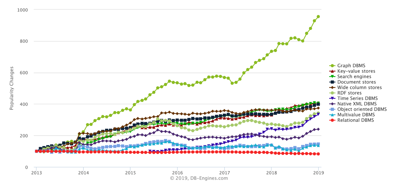
The red line at the bottom indicates regular relational databases (RDBMS) like Oracle and MySQL. The green line, on the other hand, indicates a new trend: graph databases.
In this way, understanding how Oracle and MySQL work are becoming the entry stakes, or anteing up. But a winning hand is more than that – and that’s what graph databases are.
The opioid epidemic
There’s so much information about the opioid epidemic and how it’s harmful. It kills around 130 people a day – and that’s an old statistic.
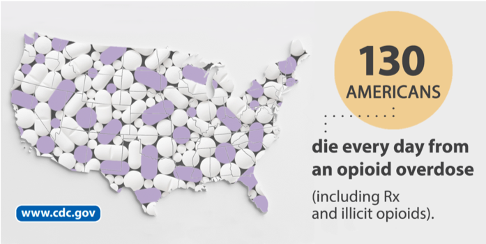
The epidemic hits every income group and every demographic. It’s a nationwide problem that’s particularly concentrated in rural areas, as depicted in the image below.

At its roots, the epidemic is a people problem. We can’t solve that in itself, but we can look at which doctors are working together and colluding with pharmacies to sell millions of dollars’ worth of pills. That’s where Neo4j comes into play – we connect the dots.
When the epidemic started, it mostly involved OxyContin, oxycodone, hydrocodone and similar opioids. Purdue Pharma, a private pharmaceutical company, told doctors that these opioids weren’t habit-forming and were unproblematic. Until as late as 2018, they were still pushing this out to providers, which made opioids cheap and easy to obtain.

The screenshot above is a recent one from GoodRx, a startup that tracks prescription drug prices and offers drug coupons. As you can see, in August 2019, it only costed around $30 to get 180 pills. In general, there’s also no identification required to fill a prescription at these internet pharmacies, which makes these opioids extremely easy to obtain.
Though oxycodone, hydrocodone and acetaminophen are problematic, they aren’t even the most prevalent and harmful drug in the epidemic, though they might be the most well-known.
Take a look at the image below, which shows opioids-related deaths over time, with OxyContin and more common opioids represented by the purple line, heroin by the orange and other synthetic opioids by the dark blue.

OxyContin was originally the most prescribed opioid, but things changed once legislation started cracking down on it.
Afterward, what happened was like squeezing a water balloon – you squeeze it in one area, it pops out somewhere else. In the same way, restricting OxyContin and similar opioids resulted in the rise of heroin – which had a lot of awful side effects – as well as other synthetic opioids.
Our current and largest problem – represented by the black line – is fentanyl. A lot of people are dying because they think they’re taking regular OxyContin pills, when it actually had a little dose of fentanyl.
Look at the image below, which shows just how lethal fentanyl is. The tube on the left shows a fatal dose of heroin, and the one on the right shows a fatal dose of fentanyl.

It looks like 10 small grains of salt, but that’s enough to kill you – it’s unbelievably powerful.
What’s a Graph?
First off, what’s a graph and what do they look like?
The images below aren’t really graphs – they’re charts.

Instead, graphs look like those in the image below. They’re essentially mathematical representations of objects that show their properties and how they’re related to one another.

Graph components are really simple. First, we have nodes, which represent objects, parts, places, things, objects, ideas. Nodes can be anything – credit card numbers, people, cars, classes or presentations.

What’s more important are the relationships between these nodes and why they occur. We might have thousands of reasons why these things are related to one another, but we want to be able to test out certain relationships at any given time. Graphs give us this flexibility.
For each of these sets, we also have flexible key-value pairs. We can add new ones with no schema changes. For example, I might have a new key-value pair because new legislation just came in. Being able to change these things on the fly is what makes graphs distinct.
As with any database, each individual piece of information is usually pretty small, but when you start connecting them, it draws a real picture.
So, even if each node in a graph doesn’t give you much information, when you step back and say, “I’ve got 3000 pieces of information about that person, I’ve got a pretty good idea what they’re going to do next and here’s how I can stop them,” you’re able to influence the future.
How can graphs help?
We also have a lot of tools for figuring out the best way graphs can help:
- Financial crime techniques: identifying fraudulent behaviors, crime rings and resolution/disambiguation.
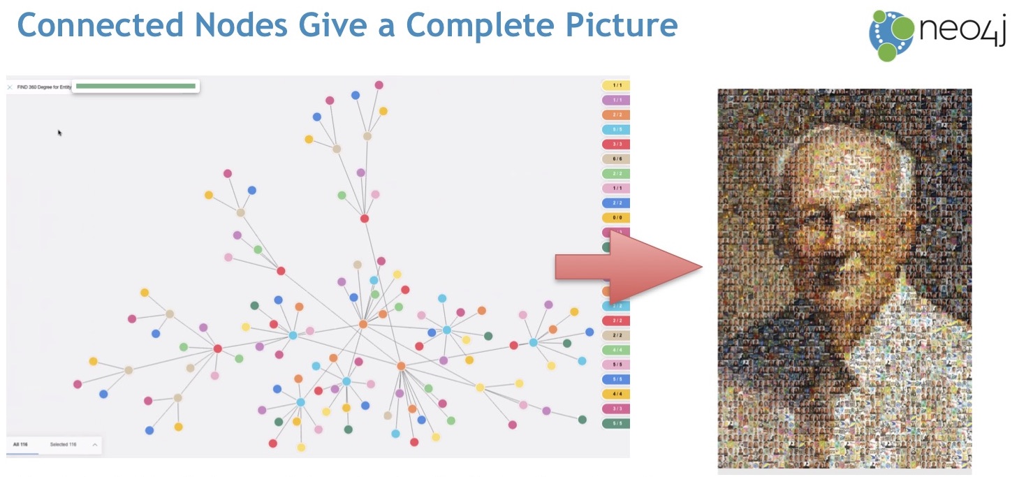
- Customer 360: painting a complete picture of patients and providers.
- Social networks techniques: building social networking graphs (like LinkedIn) and identifying statistical anomalies.
- Graph-enhanced artificial intelligence and machine learning: making machine learning and AI processes run smoother and putting them in context.
Fraud detection in financial services
Let’s delve deeper into a use case by looking at who today’s fraudsters really are.
Fraudsters generally operate in groups, create synthetic identities or steal identities. For example, we can all finesse a fake social security number for $50, but chances are it’s a real social security number that several people are now using. Therefore, being able to keep track of identities is very important.
Most detection techniques are good at finding outliers, but we often want to do something more sophisticated. Take the image below, for example, which shows a fraudulent pattern of five people working with each other.

Any one of the five dots seems perfectly normal. However, when taken together, we see an anomaly. What we want to do is figure out how to put these people together and link them. That’s where graphs come in.
Specifically, when you model a fraud ring as a graph, you start seeing connections, like the image shown below.
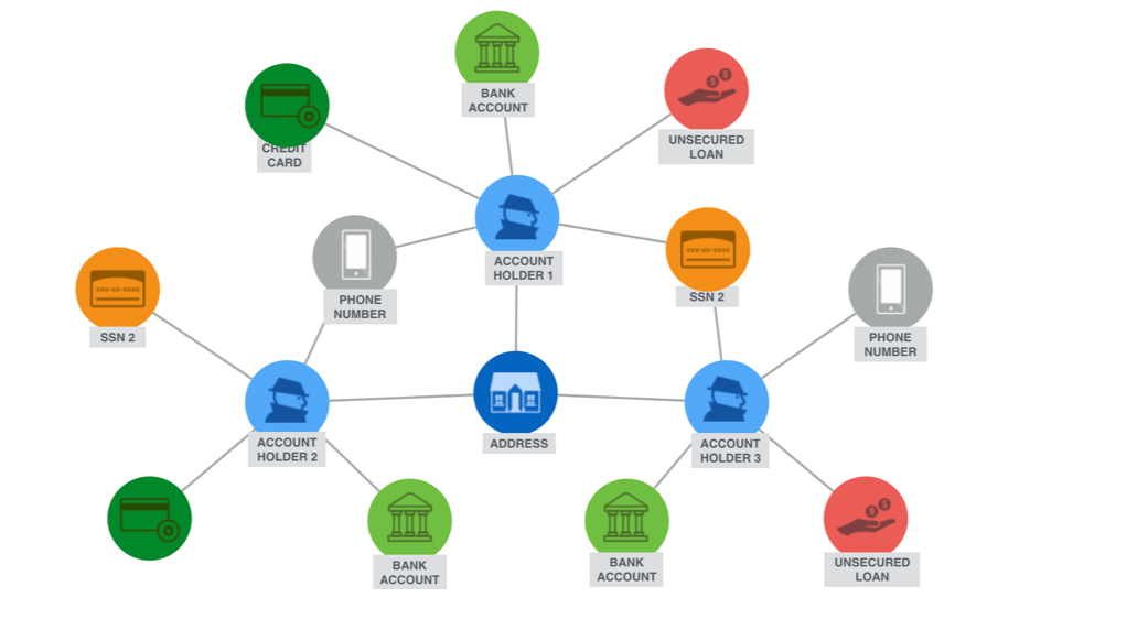
What we’re trying to see in such use cases is how these nodes work together. The image above is a highly-simplified, management-style presentation, but it’s essentially what most of the world’s leading banks use graph databases for.
At its roots, we want to augment fraud detection, specifically by working from basics like endpoint analysis to linking these nodes together and putting people in context.

In financial services, we’re particularly looking for name variations, geospatial proximity and common behaviors.
Graph databases in healthcare
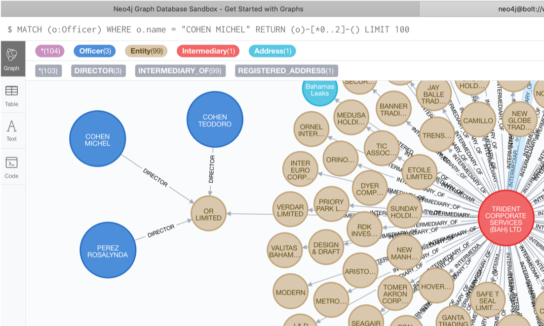
Let’s look at a real example in healthcare, which is shown in the graph below.

The graph illustrates six different people with six different Drug Enforcement Administration (DEA) numbers.
However, they all went to the same big-state medical school, share the same phone number, have the same address or within 50 feet of the address, have admitting privileges to the same hospital and have the same National Provider Identifier (NPI) number from Medicare. In this way, we can see how graphs are able to find the links between these people.
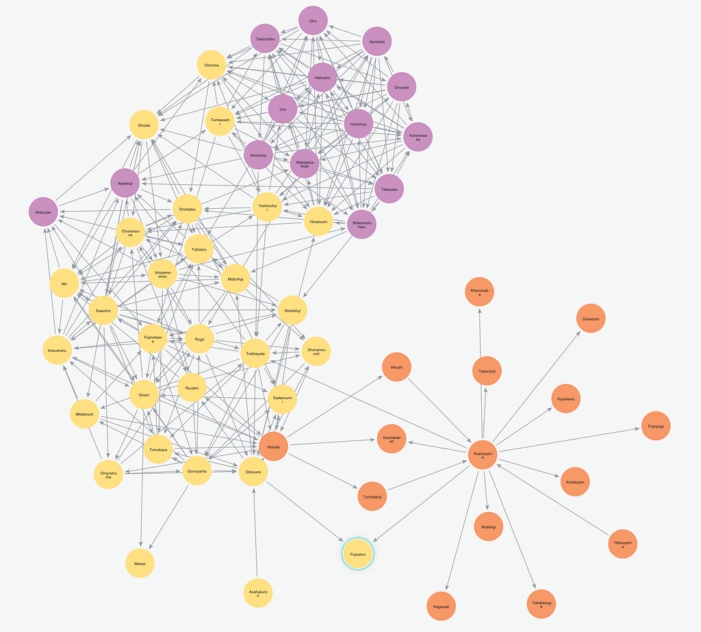
Now, let’s look at the community graph below, which illustrates how doctors are organized into a community.

We frequently use these community graphs for feature extractions to ask if someone’s in a particular group.
The graph below is significant because it spots out the pharmacy in the blue line, which was identified as an outlier. It shows how 42 percent of this pharmacy’s patients live more than 100 miles away.

In this scenario, people were actually taking planes that they actually called the Oxy Express. They would pay people to get on these flights and go to “friendly” pharmacies that would look the other way in order to partake in illegal drug dealing.
Graph algorithms: Harness graph theory to understand your data
Now, let’s look at how we’re using graph algorithms, an important part of graph theory that allows us to better comprehend our data.
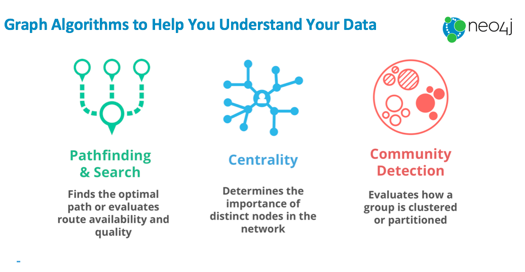
Typically, people use graph algorithms for path analysis. Network path analysis might look at where a package for DHL might go next. We can also apply the same kind of analytics to patients’ journeys. What doctor did they see first? Who did this doctor refer them to? These questions are important in healthcare, particularly the opioid epidemic.
Centrality is also important since it figures out who someone or something is and why it’s statistically significant.
Last, community detection is significant because it helps us figure out how we can subset and partition our graphs.
Centrality
Remember Yahoo’s Alta Vista? It died when PageRank – a centrality algorithm – came along. Though they were both search engines, Google provided results that met users’ criteria, while Alta Vista provided results at random. Every time Google presented results, it was effectively recommending them to you.
Essentially, that’s what graph theory is – creating recommendations.
Take the image below, for example. Here, the yellow dot is significant. Though only a few things are pointing to it, the ones that are pointing to it are important. In other words, we’re results of the importance of the people that are connected to us.

Centrality utilizes these connections to figure this out by simply running through the data many times to see how things are being used.
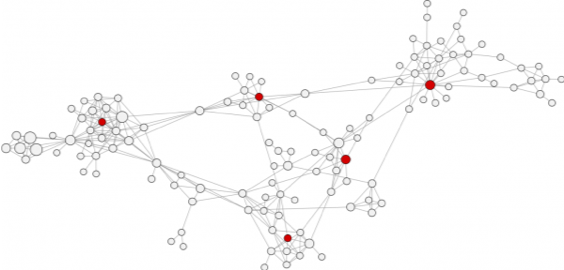
Another centrality algorithm – betweenness centrality – measures the number of shortest paths that pass through a node. Nodes that most frequently lie on the shortest paths have higher betweenness centrality scores and are the bridges between different clusters, as shown by the red dots in the image below.

In a crime network or opioid distribution, this is the person who doesn’t get his fingers dirty. He doesn’t know too many people, but he connects groups. Finding this person is like finding a needle in a haystack.
Closeness centrality, on the other hand, measures how central a node is to its neighbors within its cluster. Nodes with the shortest paths to all other nodes are assumed to be able to reach the entire group the fastest. Such nodes are represented by the red dots in the image below.
Following up with the same example, these people are more like a local dealer. He knows everyone in his little area. Unfortunately, this is where law enforcement frequently tends to focus its efforts because it’s the low-hanging fruit, the easiest to catch. However, they’re not always the ones who cause the most harm.
Let’s simplify things with a Game of Thrones (GoT) example:
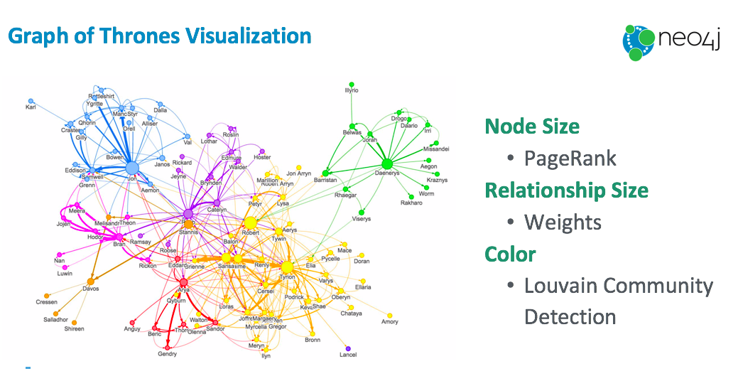
In this graph, we basically use PageRank to get node size, or how important each character is. Relationship size indicates the weight of a relationship.
We also run a basic community detection algorithm called Louvain Modularity, which measures the quality of a community grouping by comparing its relationship density to a suitably-defined random network.
For example, weights are typically calculated based on properties. If you marry or kill someone, the relationship becomes more important. Graph algorithms allow us to calculate and envision these relationships on the spot.
These relationships are simple to figure out. You can get started with sample datasets and perform queries in the Neo4j Sandbox, which includes a built-in guide with tutorials and examples.
Why Neo4j?
I like to dub ourselves as the Formula One team. You wouldn’t use Neo4j to move your apartment from Los Angeles to New York, but we’re spectacular at maintaining agility and flexibility.
With Neo4j, we’re able to find dangerous or suspicious people – in the opioid epidemic industry as well – and analyze their connections on the fly.
If you’re just learning about graph algorithms or want some hands on material, download a free copy of the O’Reilly book Graph Algorithms book and discover how to develop more intelligent solutions.
Share Article


Explore
Related Articles

SumoDB in Neo4j: Chaining Multiple Graph Algorithms in Snowflake — Part 3

Why machines need embeddings: Turning graph structure into features

Finding hidden bottlenecks in flight networks with Aura graph analytics on Databricks