Graphs are feeding the world

Data Scientist, Monsanto
17 min read

Editor’s Note: This presentation was given by Tim Williamson at GraphConnect San Francisco in October 2015. Here’s a quick review of what he covered:
–
Monsanto is a global agricultural products company that develops productivity products – primarily seeds – sold in 160 countries worldwide. Monsanto has been working for the last six years to find new ways to get better inferences out of our genomics pipeline data.
A growing population
Before my time with Monsanto, I was a scientist at the Department of Environmental Engineering at Washington University in St. Louis. I left academia for Monsanto to help solve the problem of feeding a population that is projected to grow to 9.5 billion people by 2050.
Such a large population will also greatly expand the urban footprint at the cost of productive farmlands. As more people leave rural communities to live in cities, more land will be used for urban purposes that were previously used for agriculture. In fact, it’s projected that by the time our population reached 9.5 billion, there will be less than a third of an acre of farmland left to feed each person.
This growing urban population is also much more likely to be middle class, which results in a shift to using more sources of animal protein — more meat, eggs and dairy. These are all more resource intensive to produce, which further stresses the agricultural production system.
And finally, global climate change is having dramatic effects on our daily life, especially with more frequent and difficult-to-predict severe weather patterns.

In December 2014, a group of NASA scientists published an extensive computational model projecting that to truly end and recover from the California drought, it would take 11 trillion gallons of water spread out evenly over the state. This is magnitudes larger than the largest reservoir in the world.
This is the exact same volume of water that was dropped on North and South Carolina in October over the course of five days, which caused extensive flooding during peak harvest season. All that water that California needed was somewhere in the world – but not where it was needed.
Leaps in scientific research
Humanity has tools at our disposal to address the problems I’ve mentioned, one of which is improving the genetics of staple crops – something we’ve been doing for millennia. Approximately 10,000 years ago, the first farmers began the process of transforming teosinte — the wild grass ancestor to modern corn — into the super-optimized, solar-powered power factory that we know today.
They were able to do this because of two key observations. First, when they looked across a field of teosinte, they observed that some plants displayed more desirable traits than others, such as producing more seeds. Second, if they only replanted those plants the following year and let them re-pollinate, the frequency of plants that displayed those desirable traits went up over time.
This is known as artificial selection, or selective breeding. When this accumulates over centuries, you can develop new or optimized crop species that more effectively feed people.
In the mid 1800s, the United States Department of Agriculture began regularly compiling nationwide yield statistics for important staple crops, such as corn.

Bushels per acre is how we measure the amount of grain production in crops like corn. A bushel of corn is approximately 56 pounds of corn seed and an acre of land is about 90 percent the area of an American football field.
From the 1860s until the 1930s, improvements in corn largely stagnated. However, just as advances in modern transistor fabrication technology have allowed CPU processing speed to keep pace with Moore’s Law, our increased understanding of genetics allowed us to increase the production of grains to keep pace with population growth.
In the 1930s, we discovered how to hybridize certain crops to make new varieties. We then discovered molecular biology, and how to isolate particular pieces of DNA that are directly correlated with performance. And in the last 10 or 15 years, we became very good at making targeted modifications to that DNA to get exactly what we wanted from our crops.
Increasing crop yields with graph databases
The next rate change in this curve is not going to be our ability to collect more data; it’s going to be our ability to make sense of that data in faster, more meaningful ways. We are currently reconfiguring all of our global crop grain pipelines – which span eight different commodity crops and 18 vegetable crop families – in order to take advantage of some important advances.
How to we produce genetic grain? Whether you’re at a university or corporate lab, developing better crops revolves around breeding cycles.

A cycle begins when a discovery breeder picks two parents, a male and a female, each of which is chosen because of their desirable traits, such as disease resistance. We also ensure the plant doesn’t have any demonstrable undesirable traits.
Next, we cross those two parents and generate hundreds of thousands to millions of progeny that we then pass through a highly-focused breeding cycle. At every stage of the cycle, we screen for the plants with only specific desirable traits; we select the best and discard the rest. We then plant the “winners” from this stage and let them pollinate each other, and advance their progeny to the next round of the cycle.
At the very end of a cycle, our goal is to have a new plant that displays all the desirable characteristics from its parents, which we use in future crosses or sell to farmers somewhere in the world.
At every stage of the cycle, we rely on two classes of data to inform our decisions regarding which seeds to keep and which to discard. One dataset, genotype data, is inexpensively generated in a lab and provides predictive information about how a plant will perform.
The next set of data comes from field trials, during which we plant the seeds and measure how they perform. Unfortunately, the process of planting, collecting data, and monitoring the trials is rather expensive, largely due to the scale of the trials. For example, we may make thousands of crosses and plant dozens of progeny across five locations, which can cost several million dollars.
There are three ways we can get better plants out of each cycle.
- We can better select the two parents to cross. There are hundreds of thousands of parents – how can we use data science to determine which are the best ones to cross?
- We can ensure that we make the best possible decision at every route in the selection pipeline.
- We can try to expand the pipeline by testing more plants. This is a challenge because we have used almost all of our available land for our field trials.
In this slide, C represents the one plant that came out of the breeding cycle. It has an unbroken tree of ancestors, which include self-progeny generations (in grey) that link back to the two parents that were originally crossed to start its production.

The length of that chain can grow approximately four hops a year as we get closer to finding the best possible parent and outcome. This becomes even more complex if the end parent that comes out of that line is then used in hundreds or thousands of its own crosses. On top of that, we’ve been breeding plants for 20 years and we have 60 years of data before that. Each one of those parents, A and B, has its own rich history of ancestors that were crossed to yield it. It’s easy to see how over time, this really builds up.

Parent C, located at the center of this real dataset, is the oldest known source of a critical corn line in our Research and Development pipeline. There are at least 300,000 plants represented on this graph, and the genetic impact of the parent at the center is felt all across our pipeline.
If we want to make a step change in those three areas above, we need the ability to mine datasets of this size, in real time, for complex and meaningful genetic features. That’s our problem.
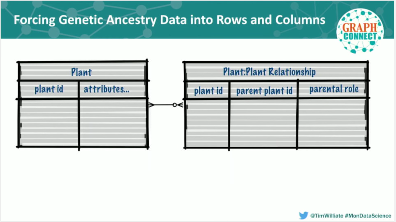
Before graph databases, we somehow made this work by using a relational data structure. Our preexisting relational stores encompassed about 11 joined tables that represented 900 million rows of data. As you can probably imagine, every single read from this system was a fairly unpleasant exercise in connect-by-prior, massive recursive join.
Our goal was to find a tool that could give us the entire tree of ancestors for a single plant. To do this, we wrote the best optimizer tables and recursive join queries that we could and optimized its speed through production caching. But based on our performance curve, it is clear that our goal of “real time” had not been achieved.

On this graph, depth represents a “hop up the tree”, or one level of ancestral depth. Response time measures the execution time to return the dataset. This precisely correlates to when the dataset starts to explode in number of ancestors.
We still need to solve this problem. Fortunately, we realized that genetic ancestry forms a naturally occurring graph. This is a somewhat small, trivialized snapshot of how we actually handled the challenges we faced in pulling our data in real time.

Every bag of seed has a node. With a new node, we track every time it’s planted and every time it’s harvested, which allows us to build an abstraction layer from parent to progeny as deep as we want to go. When we first built the final tester of this graph, it had 700 million nodes, 1.2 billion relationships, and two billion properties.
Going back to where we started, we take our same production sequel, recreate the same algorithm using Neo4j’s traversal framework, use the same conditions and datasets, and run our query again.
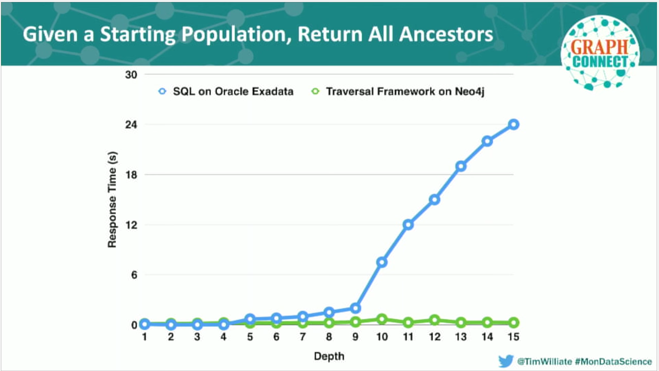
We can now process arbitrary-depth trees at what approximates a completely scale-free performance. And not only can we now do this quickly; we can now build abstractions to get at the features of plants, instead of only being able to track performance. Additionally, we can now analyze the ancestry of one million plants, instead of only one plant, in a matter of minutes.
Building the graph database
From this point forward, we’re going to leave the “what was” world behind, and discuss how we built abstractions.
Our philosophy on delivering data science products in our group is to determine how to encapsulate a dataset using a common biological grammar that is accessible by REST, or any programming language we want. That way we can execute complicated algorithms without having to teach anyone how to do it.
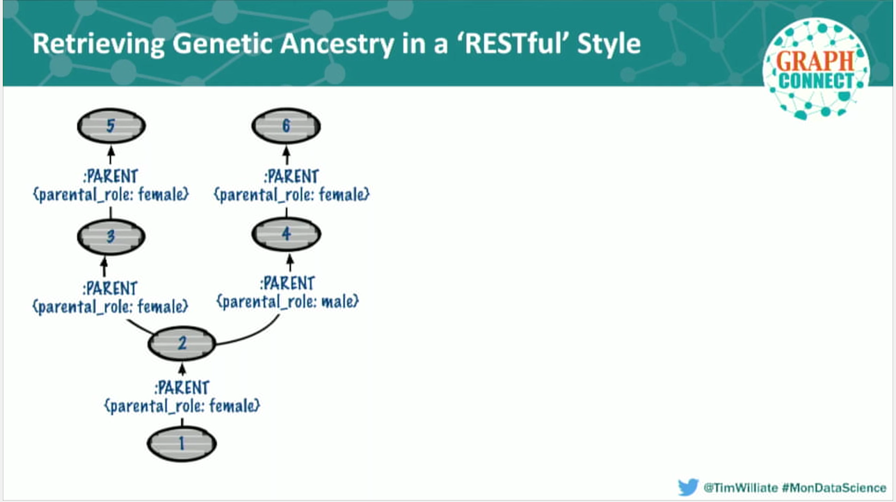
An example is this basic tree. Population one has one singly-linked ancestor and breaks off into a cross, and each cross has its own singly-linked ancestor. In our grammar, we encapsulated returning that entire tree with a simple REST resource: I have population one, and I want to return all of its ancestors in a cogent JSON representation of a tree. Every node and relationship is represented.
This allows anyone to get an entire subgraph from Neo in real time, and they can effectively harness the power of our giant graph without copying the entire database into their machine.
But we also want to track important genetic features. There are a number of milestones in genetics that are important for understanding and maximizing the information that you gain out of a lineage. We wrote grammar that allowed scientists to access that.
A very basic query is: for Plant One, show the most recent binary cross in its ancestry, i.e. when it had two parents. This is a crucial moment in the plant’s genetic history because it marks a recombination event, which is the time in its lineage when two parents with different chromosomes were crossed together to yield a heterogeneous population. In our system, the user only has to request the binary cross, which will return the exact male and female that yielded Plant One.

You can also track the lineage that led to a specific feature. For this, you ask for the ancestors of Population One up until only up until the first binary cross.

In that case, we return the same tree structure but one that’s been pruned to the level of the binary cross. We tried to think of every meaningful genetic and built grammar around it. In September of 2014, we turned the lights on on our internal system, which we called Ancestry-as-a-Service.
Our system incorporates rich, RESTful grammar over an embedded Neo4j cluster that contains the entire genetic history of our pipeline. The REST layer is what’s directly accessible by individual data scientists and application developers.
As it stands today, there are around 30 elements of RESTful grammar in our system. This allows us to cut our pipeline from the oldest known discovery cross to the most recent crop that’s being sold on a field today. There are about 120 applications and data scientists using our system, who together have made well over 600 million REST queries.
The development of this tool dramatically changed our world. For example, one of the applications we developed touched every seed in our pipeline. We observed a 10x performance increase in this application, and a particular data scientist was able to replace one month of analysis time with three hours of crunching using our new system.

Real-time reads require real-time data. It would be inaccurate to call our system real time if we have stale data the minute we build the graph. We knew we couldn’t direct every application to start writing into the graph. We solved this by using GoldenGate, a technology by Oracle, that allows you to generate a change capture stream from the redo logs coming off an Exadata instance.
We wrote a custom adaptor that pipes that change stream and transforms it into something that Apache Kafka can recognize. That change stream continually feeds our graph with 10 million writes a day, and within a second of that write hitting Oracle, it’s reflected in our ancestry layer. We’re using this to slowly slice apart our entire monolith of data and get it into AWS.
We think that this is so useful for companies of our size and situation that we provided open source access to our adaptor.
Tracking more than ancestry data
However, we aren’t only interested in tracking ancestry data. This diagram, the Triforce, represents the Holy Grail of modern genomic science. It allows you to index the observable traits of a plant – its phenotype – against genetic information that is predictive of its performance, as well as the environment in which you measure that performance. It opens the doors on quite a few interesting genetic conundrums that currently exist in modern science.

One of those problems is accessible by considering how we layer genotype data onto our ancestry graph.

For every plant for which we have a set of genotype data, we built a simple node linked to that population. This node acts as a pointer to an external system that stores our genomic data, in our case an HBase environment. This lets us build algorithms that parse the ancestral graph based on the presence of certain genotypic features.

There are three entities in this graph that each have a set of linked genomic data. “Marker Count” directly correlates to the size of a dataset; in this example 60,000 markers would be 60,000, and 300 markers would be 300 facts. It’s very expensive to gather large marker datasets, so we only gather them for plants we are going to use as parents.
Now, if you have the location of all your marker datasets – both low and high-density – along with the exact genetic path between those datasets, you can up-sample the data content of your low-resolution data to be close to what it would have been to measure the expensive dataset.

To build this using RESTful grammar, we ask our database to “prune” the tree once we arrive at the the most recent set of genotype ancestors. The IDs represent the keys that link to the HBase data store with those datasets, so the tree is annotated with all the genomic data that we have on these populations.
Now that we can spit out these genotype annotated ancestry trees from Ancestry-as-a-Service, we built an Apache Spark- and GraphX-based genotype estimation engine over that system.

It consumes a tree of ancestors linked with genotype datasets and it up-samples – estimates – the high resolution genotype of the target progeny.
When it makes this estimate, it uses linked keys to pull in the necessary datasets from HBase, writes the estimated genotypes back to HBase, and communicates to our graph via Kafka that we can take advantage of those new datasets in future calculations. This giant feedback loop gives us the power to estimate the genotype of every single seed that goes through one of our breeding pipelines.
Now that we have high resolution genotype data on our seeds, we can replace the first step in field trials by estimating those genotypes and mining that data genetically for the most effective progeny. This results in better selections down the entire breeding cycle.

It’s must faster – and more cost efficient – to screen the seeds in the lab. We no longer need to plant field trials, saving millions of dollars a year and freeing up land to be used for other purposes. We expand the horizontal scaling of our pipeline by leveraging our data.
Where we’re going next
Geneticists have known about the power of graph analysis for a long time. [Insert Slide 30:11] This example is from a 1921 textbook on poultry breeding, pre-molecular biology. At this point in history, there was no way to describe the inheritability of traits in a meaningful way. Even so, a drew out this graph structure that represents how a progeny’s ancestors genetically contributed to it.

What he described is a set of algorithms called co-ancestry analysis, which form the basis of a very powerful class of genomic selection techniques. The paper on the right – from 2010 – describes a series of graph-based algorithms using co-ancestry analysis to make informative selections on the parents to cross for a certain type of progeny. Again, no one yet had access to a graph database.
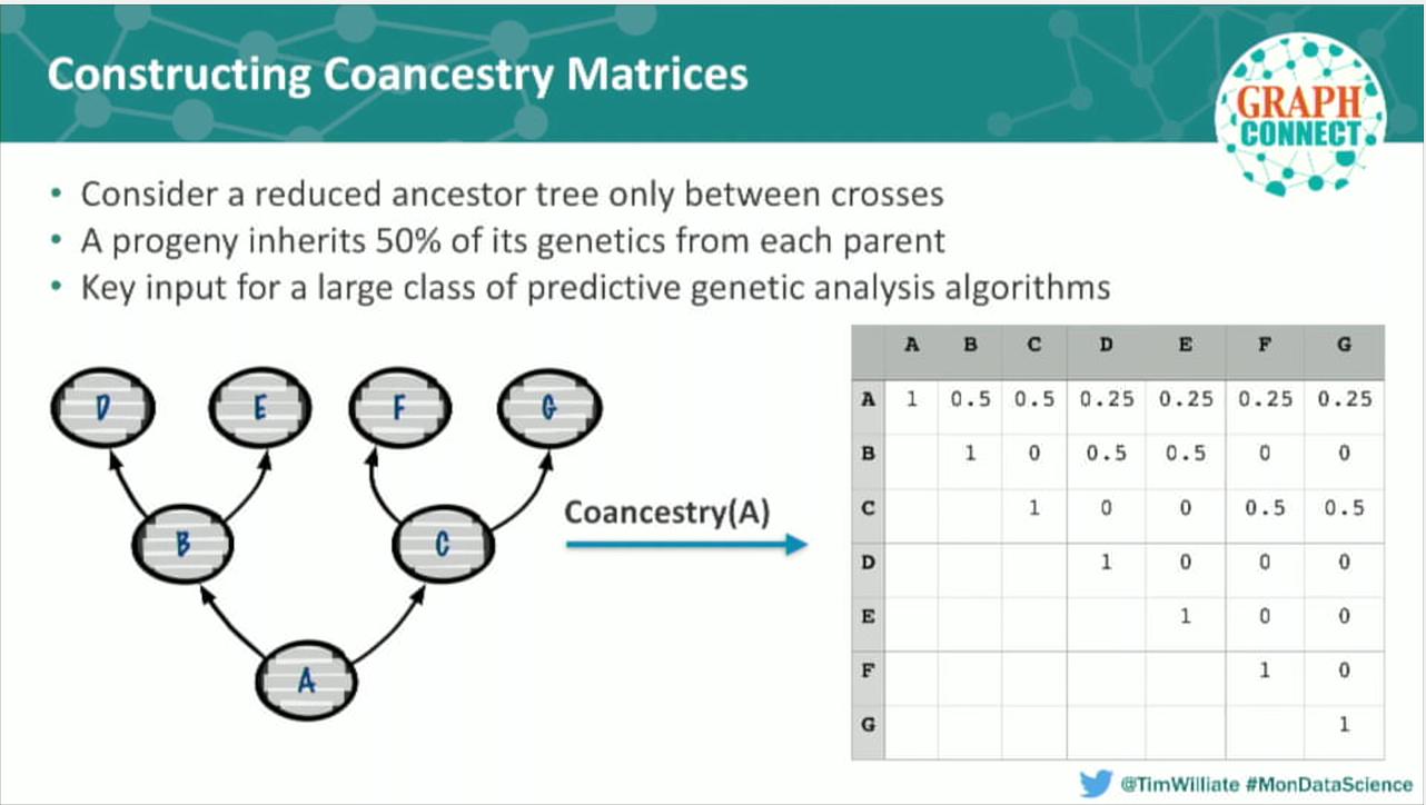
In the case of co-ancestry, we are very close to producing reduced representation co-ancestry matrices that, for any given plant, describe the genetic contribution of each of its ancestors. Again, it’s not foreign to graph theoreticians to have a matrix form of a graph, because it’s a very efficient way to compute. And we use the genomic selection algorithms to place the right plants in the pipeline in the first place.
For further discussion, please feel free to reach out to me on Twitter.
Click below to download your free copy of Learning Neo4j and catch up to speed with the world’s leading graph database.
Share Article


Explore
Related Articles

A workbench for teams to query, explore, and visualize graph data

Why healthcare CIOs can’t afford to scale AI without a knowledge graph foundation
How graph intelligence drives breakthroughs in science and society

Find similar patient journeys with Neo4j Aura graph analytics
Bolster your cybersecurity by visualizing attack graphs with Neo4j & G.V()