Graphs in Time and Space: A Visual Example

Product Manager, Cambridge Intelligence
6 min read
Editor’s Note: This presentation was given by Dan Williams at GraphConnect Europe in May 2017.
Presentation Summary
Graph databases are helping to solve some of today’s most pressing challenges. From managing critical infrastructure and understanding cyber threats to detecting fraud, we have worked with hundreds of developers building all kinds of mission-critical graph applications powered by Neo4j.
In this blog, we’ll explore two dimensions of graphs that, from our experience, cause the most confusion but potentially contain vital data insight: space and time. We’ll use visual examples to explain the quirks (and importance) of dynamic and geospatial graphs, and how they can be stored, explored and queried in Neo4j. We’ll then show how graph and data visualization tools empower users to explore connections between people, events, locations and times.
Full Presentation: Graphs in Time and Space: A Visual Example
What we’re going to be talking about today is how to gain actionable data insights by incorporating both space and time into your graph visualizations:
I do product management for the KeyLines team at Cambridge Intelligence, and since I’m a physicist, I thought a presentation on space and time seemed like fun.
I’m completely new to the world of graph databases, and have only been working with them for a few months now. Before this, I was using my engineering and physics background to work with some of the material scientists on the Orion program.
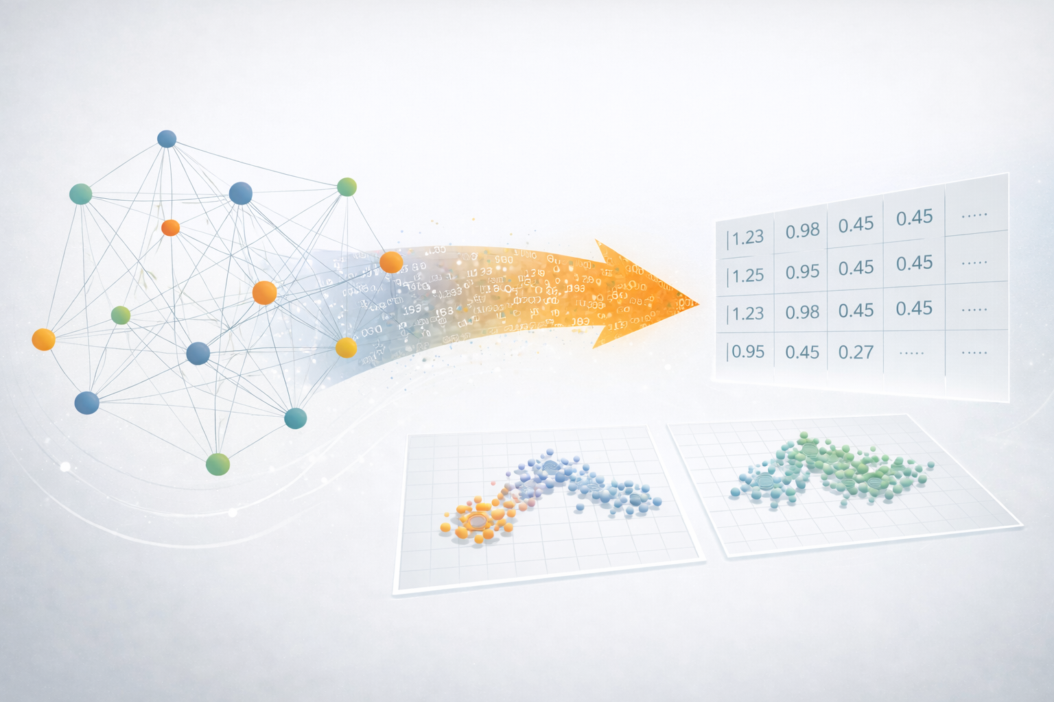
We know that data insights are incredibly important, and visualizations in the context of space and time will help us get to those meaningful insights. Below is an example graph to get us started:
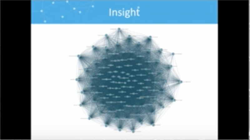
This is a sample dataset that we could have pulled from Neo4j with a Cypher query, but this densely connected network doesn’t provide much helpful information. We can use more helpful graph visualizations to change that.
Graph Visualization
Let’s take a quick step back and talk about graph visualizations. What do I really mean by that? The following is an example of a graph query, in which the nodes represent people and the links represent emails:
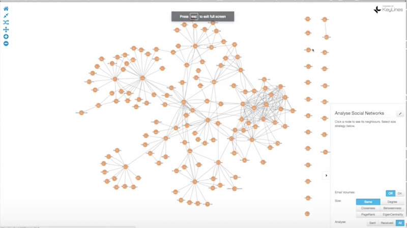
Visualization is all about taking data out of graph queries and displaying it in a useful way. Using this example, we can make the visualization more helpful by making the lines thicker to indicate email volume, and using a centrality measure to change the size and colors of nodes to identify the gatekeepers of information and determine the most influential people in the network:
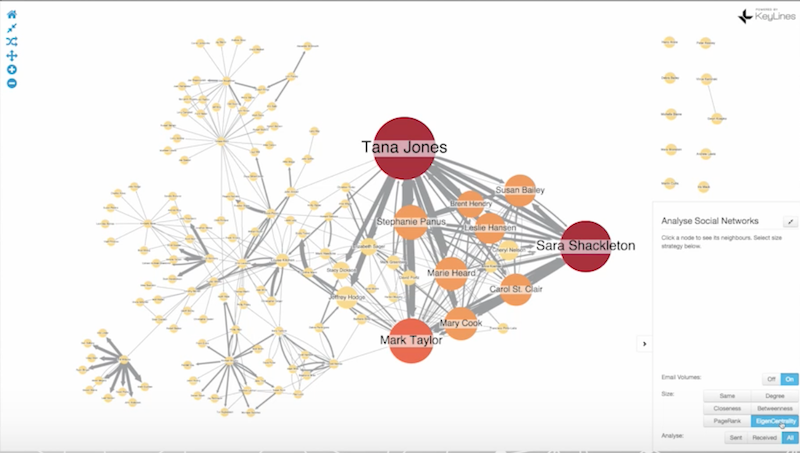
These graphs represent emails pulled in the wake of the Enron scandal, but to truly get any insight from this data, we need to understand the passage of time. Otherwise, how do we know who emailed who first? Was the chaos on the right side of the graph triggered by something that happened on the left side? What was the cause, and what was the effect?
Because Neo4j has an open schema, it can store essentially any type of information, including timestamps. But how do we visualize this and end up with meaningful insights?
Visualizing Data in Time
There are a number of options for visualizing time, including a series of snapshots. Consider the following example, which shows how members of the United States House of Representatives voted and collaborated over time:

This collection of images shows an evolution of behavior over time, with the top left image showing a high degree of collaboration, while the most recent image in the bottom right shows an increasing level of partisanship.
What if we wanted to see how a particular member of Congress changed their voting behavior over time?
In the following example, we combine a graph view with a time view, which is shown as a bar along the bottom of the slide:
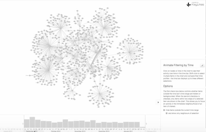
In this example, nodes represent people and links represent phone calls.
The size of the bars in September compared to the following months demonstrate a relatively high rate of activity in that month. We can also zoom in on a particular set of days to see how that changes the graph:
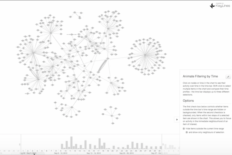
We can animate the graph to see how new cliques form and change over time, or zoom in on a particular person (in green, below) and see how their activity compares to everyone else’s:

We can see that this person initially made relatively few phone calls, but then increased the number of calls as time went on.
So while there’s a lot of dynamic information in our database, getting actionable insights requires some clever manipulations to data visualizations.
Visualizing Data: Incorporating Space
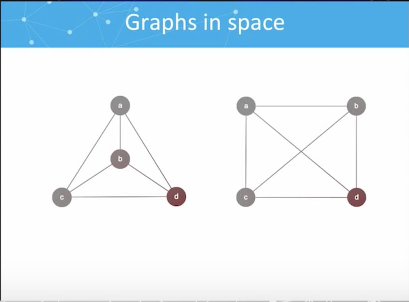
In graph theory, we learn that space shouldn’t matter. Topology is topology, and the following two graphs are really the same:
Unfortunately, there’s a lot of insight that can be gained from space, and where things are physically located in the real world.
Take the following network as an example, which shows flights between airports in the U.S.:
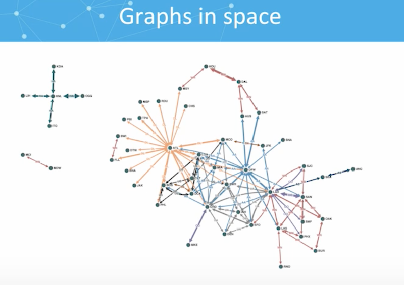
Different airlines are represented by different colors, and based on how these lines are organized around cities, we can also pinpoint hubs. And while we could learn some information from this graph, the more obvious thing to do would be to stick this data onto a map.
Again, the beauty of Neo4j is that you can really store any information you want as a property on a node, including latitude and longitude. Time often leads on the link, while location often leads on the node. In my KeyLines visualization tool, I can switch over to the map mode, reorganize our data and get even more helpful insights:

It’s much easier to identify the hubs, to understand why they’re located where they are, and to identify the large geographic areas served by a small number of airports compared to a very dense geographical area served by a lot of airports, and so on. This is very, very easy to spot – and it’s what people expect.
Insights are all about people. Not everyone who uses a graph database is a graph scientist or a data scientist. People in roles that range from business analysts to police officers need to be able to translate the data into a world they’re familiar with.
Visualizing Data in Space and Time
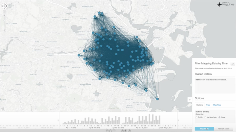
We pull all of these concepts together in the following example. We have a time bar down at the bottom of the slide, and all of our data points on our map:
This is information pulled from the open source Boston Hubway data set, which shows the trips taken on publically-available bicycles over a certain period of time. Data pulled from geographic networks tends to be very dense, as it is in this example, which makes it difficult to spot any meaningful insights right off the bat.
But let’s see what happens when we add time and location. We can select a single node (highlighted in red) and look at the journeys to and from that particular location. If you look at the time bar at the bottom of the slide, you can start to see patterns in the data and how those patterns change over time:
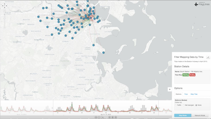
The red journeys are the ones that end at this location, while the green journeys are trips that begin at that location. In this particular location, a lot of journeys end there in the morning and begin there in the evening. Based on that information, you might be able to spot that this is a place of work, where people commute to in the beginning of the day and leave from in the end of the day.
If we pick another station further out of town, we see exactly the opposite pattern: journeys begin there in the morning and end there in the evening:
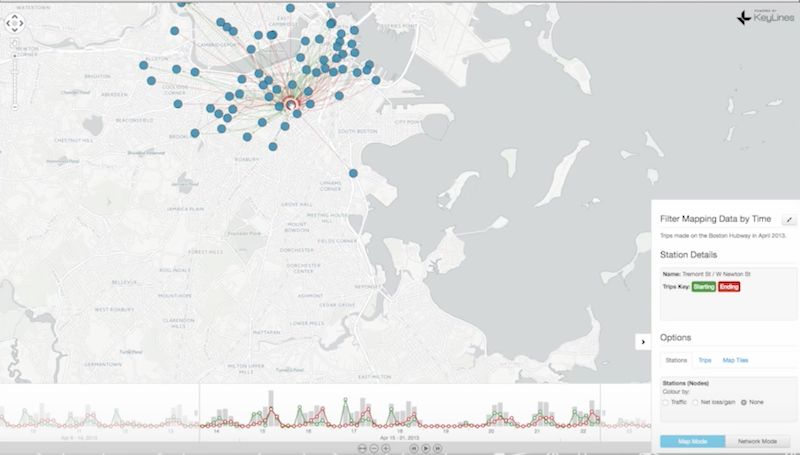
This is how you can combine time and space information to get a whole lot more out of your graph than you would get by just storing latitude, longitude and timestamps.
Keylines and Neo4j
These demos are web browser examples that we put together at KeyLines, which is a component for building visualizations in JavaScript. It’s fully compatible with Neo4j, and is easy to use for these types of visualizations that bridge the gap between your organization’s data and end users who are looking for actionable data insights from graphs.
Grab yourself a free copy of the Graph Databases for Beginners ebook and get an easy-to-understand guide to the basics of graph database technology – no previous background required.
Share Article


Explore
Related Articles

SumoDB in Neo4j: Chaining Multiple Graph Algorithms in Snowflake — Part 3
Why Machines Need Embeddings: Turning Graph Structure into Features