How Boston Scientific Improves Manufacturing Quality Using Graph Analytics
21 min read
Editor’s Note: This presentation was given by Eric Wespi and Eric Spiegelberg at GraphConnect New York in September 2018.
Presentation Summary
We’re going to talk about some project themes that make sense when you’re going about developing a graph project. We’ll dive into the the business problem and discuss the specifics of the business problem.
We are going to cover manufacturing quality, how graphs apply to that problem and how this helped us get some business value through performance improvements and new capabilities. We’ll also talk about the evolution of our graph model. We will discuss where it started and where it’s going.
We’ll discuss how Boston Scientific, how we extract insights from the graph, and then we’ll talk a little bit about additional use cases in future projects like the new Hume platform.
Full Presentation
My name is Eric Wespi. I work at Boston Scientific, my co writer is Eric Spiegelberg from GraphAware. We’re going to be presenting on this manufacturing quality use case that we’ve implemented at Boston Scientific.
Boston Scientific
Wespi: I work at Boston Scientific. My entire career background has been in manufacturing and process engineering. Previously I was at Intel. I lead a data science team that works on a number of different initiatives. My background is in manufacturing and then applying analytics to the manufacturing environment.
Boston Scientific is a global medical device company. We make a lot of different therapies that are aimed at making procedures less invasive and have better outcomes for patients.
There’s a wide variety of products that we make, including pacemakers, stents, artificial heart valves, lots of different things for diagnostics and a lot of things to make us all better. We’re a global company with offices all over the world. We also are integrated in terms of development, design, manufacturing and sales.
GraphAware
Spiegelberg: I’m a senior consultant with GraphAware. I’m based in Minneapolis which is where I’ve spent the last 18 years being a Java software developer and architect. I primarily work with web-based software making use of the Spring portfolio.
I’m a member of GraphAware. We are a consulting company focused on all things graphs. We focus on consulting, training, software development, and all things focused on Neo4j.
We develop our own open-source and commercially available tools, frameworks, and products. That includes over a dozen modules that integrate with Neo4j to provide advanced functionality out of the box.
We’re a Neo4j solutions partner, and we’re a globally-distributed organization. We have team members in the United States, throughout Europe, UAE, as well as Australia.
Before we dive into Boston Scientific and how they use graphs to analyze their supply chain, we’ll talk a moment to just give a little background on how Wespi and I found ourselves presenting this topic. Then we will discuss three themes that have emerged from Boston Scientific’s project.
Background
Spiegelberg: Wespi and I met at GraphConnect New York 2017. He happened to come into the booth, and we had a great conversation about graphs. We discovered that we both lived in Minneapolis, and we decided to get together and discuss opportunities to work together at the following conference.
This was a great opportunity, because it fits the pattern of GraphAware. We like to deliver what we call high-impact consulting, where we transfer our deep and broad extensive experience with Neo4j to our clients to position them to be successful with their graph projects.
Focus on the Business Problem
We’ve got a couple of themes that have emerged from the Boston Scientific project. The first theme is to focus on the business problem.
The analysis of Boston Scientific’s supply chain is nothing new. In fact, they’ve been doing this for years. The improvement of this analysis has recently fallen to Eric and his group, so they embarked on finding new methods and new technologies that could improve the output of the analysis. Tasked with finding alternatives and improve the methods, they set out to find a solution.
As technologists, it’s not uncommon to go off and fall in love with a new shiny object or a new technology. We do this and think to ourselves, “I love this, and this is what I want to work with. Now how can I apply it to my business problem?”
Wespi and his group have actively rejected that mentality and have made a conscious choice to stay focused on their business problem. This has allowed them to maximize the business value that’s been gained by Boston Scientific. This is the business driving technology and not the technology driving the business.
Use the Right Tools
The second theme of our presentation is to use the right tools for the job.
We are not here to try to convince you that a scalpel is superior to a chainsaw or vice versa. The right tool for the job is directly dependent on your use case as well as a whole range of factors that are specific to your organization.
What we are here to tell you is that in our experience, Boston Scientific’s adoption of Neo4j has been a classic case study in using the right tool for the job.
Keep It Simple
Our third theme is to keep it simple.
Boston Scientific recognizes that their business problems are complex enough, and they don’t need to make their life harder by adopting a heavyweight, cumbersome process or technology.
They did not want to have to hire dedicated, specialized staff with exotic skills and specialist skills whose sole purpose was then to feed the technical machine. In doing that, you’re not gaining any value for your business; in fact, you might be doing the exact opposite.
That’s not to say that Boston Scientific’s problems are easy, because in fact, they’re really difficult. However, it is the adoption of a simple solution that enabled unlocking the value in their business that otherwise was hiding in plain sight.
At GraphAware, we work with a wide range of customers and clients across the globe, and we think this gives us a vantage point to observe trends and patterns across the graph community. In working with Boston Scientific, they’ve been a case study in graph adoption.
As I’ve said, they started with a business problem. They discovered graphs, they started exploring it, and ultimately, they decided to get serious and vet the technology. This vetting the technology is a critically important step, because this is where the quantum leap happens. This is where an organization goes from merely being a passive observer of the graph community to being an active participant.
This vetting of the technology is typically embodied by an organization getting their own and actual data into Neo4j. This is a critical step as well, because it forces the organization to evaluate the design decisions and build out their model. From there, they’ve got the data in a graph, allowing them to write Cypher queries, the query language of Neo4j, and those Cypher statements add business value and allow them to gain experience in adopting Neo4j.
At GraphAware, we think we add a lot of experience and expertise in this area, and our goal is to work with clients to help them accomplish their goals, to accelerate their timelines, and ultimately, to improve the quality of the deliverables.
Boston Scientific’s Business Problem
Wespi: Let’s go ahead and dive into Boston Scientific’s use case.
Boston Scientific is a global company. We’re also pretty highly vertically integrated.
We develop medical devices and we produce them. When we manufacture these we often start with very raw components. We’ll start with a resin or metal, and we’ll turn them into these complex devices. That means there are lots and lots of steps involved, and through the nature of starting with these raw materials, there’s a lot of batch processing involved, for many of our products.
With batch processing and with complex manufacturing chains, we have multiple teams. These teams are aligned based on the technology that they’re using, the process technology they’re using and many devices use multiple technologies.
Multiple teams in different countries are involved and because of that, it means we have non-standard analysis methods. We’ve discovered that when there are non-standard analysis methods and you have a bunch of engineers working on the same problems in parallel, a lot of times, things end up in Excel. That’s kind of the root of the problem we’re trying to solve. All these things end up in Excel, and we end up doing a lot of manual spreadsheet manipulation.
We have our supply chain mapping.
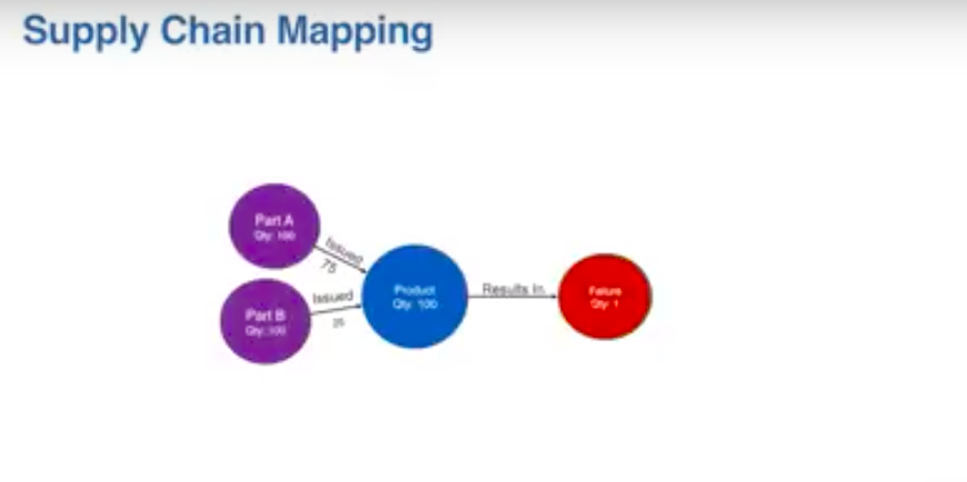
You can imagine a finished good product. We make a batch of some device. Imagine there’s a hundred of those devices, and that’s a finished good, then we do some testing.
After we’ve finished making these things, we do some testing and we might have a failure of some test. One of those products within the batch failed. We want to investigate that, we go and look and see what went into that finished good.
That product batch consists of a couple different batches of some components, some sub-assembly, 75 from one batch, 25 from another batch went into that 100. We don’t know which one was a failure. Then there might be some other kind of component that fed into that for the final step where we create that finished good.
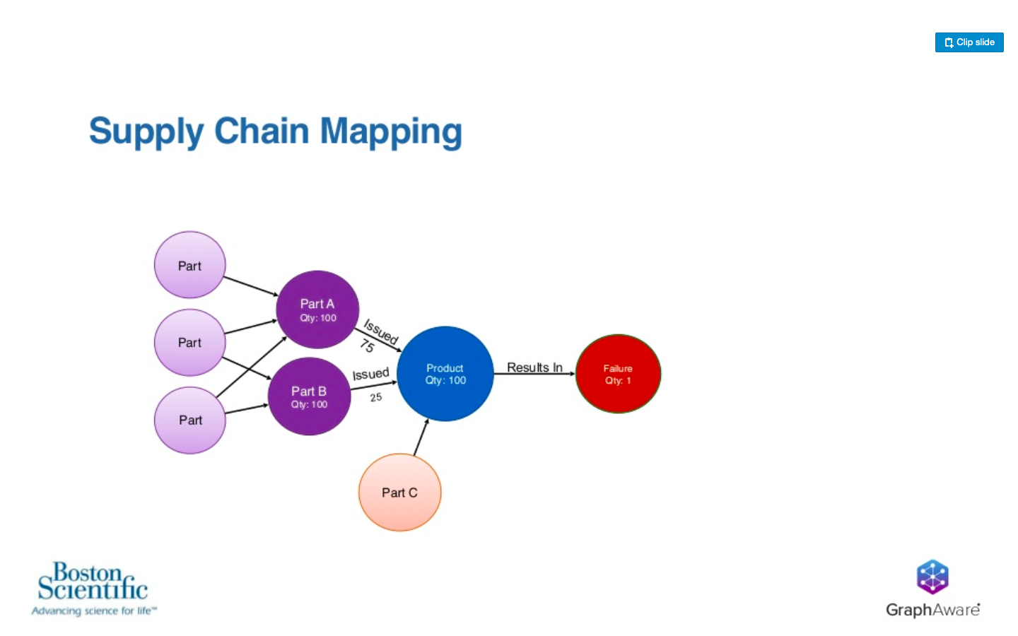
Further upstream, we have other parts going into this and that are also mixing batches and going into this value chain.
Now, I’ve explained this a bunch of times to people, and it’s always a struggle to explain a batch processing manufacturing process to people that aren’t in that world. We came up with an analogy for a batch processing use case, and we’ll refer to that as we keep going. The tastiest analogy I could think of was cookies.
Use Case: Cookie Batch Processing Analogy
Let’s say we’re making a batch of cookies and we want to sell these cookies. They’re delicious cookies. They’re going to sell themselves; they’re amazing.
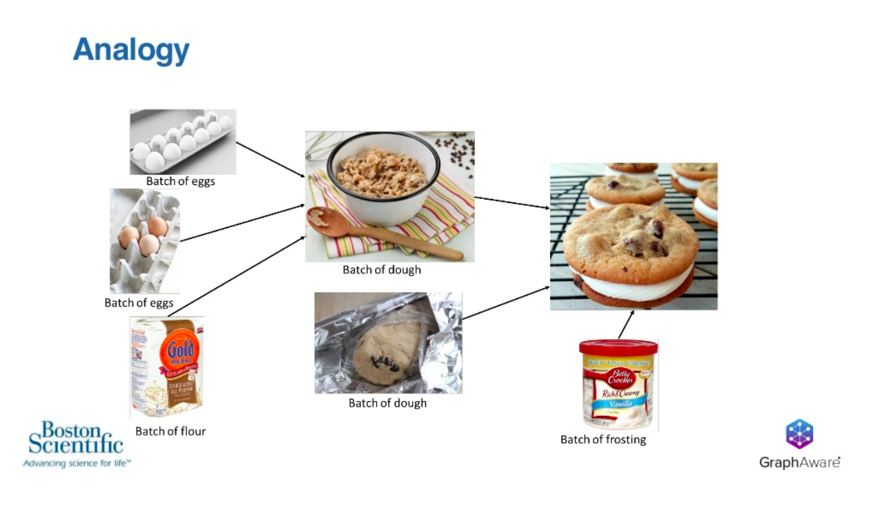
We make all these cookies, and before we sell them, we taste one and one of them doesn’t taste very good. Now, if that cookie doesn’t taste good, we want to figure out why it doesn’t taste good.
In that cookie production, we have batches of frosting and dough – maybe there are multiple batches of dough involved. Then making that dough, we have different cartons of eggs going into that, as well as different bags of flour going into dough.
If a cookie doesn’t taste very good, how do we know what caused it to not be good? It impossible to say which egg went into the cookie, or which combination of eggs went into the specific cookie that I tasted, because of all the mixing and baking going on.
If I understand that relationship and quantify that relationship, I am able to understand over time. We build more and more cookies and make more and more batches, we understand probabilities and assign blame based on that. Our goal here is to understand where in the supply chain something might have happened in making a cookie that didn’t taste good.
Performance Improvements
Spiegelberg: Boston Scientific has gained business value by adopting Neo4j. Let’s go through a couple of areas where that’s the case.
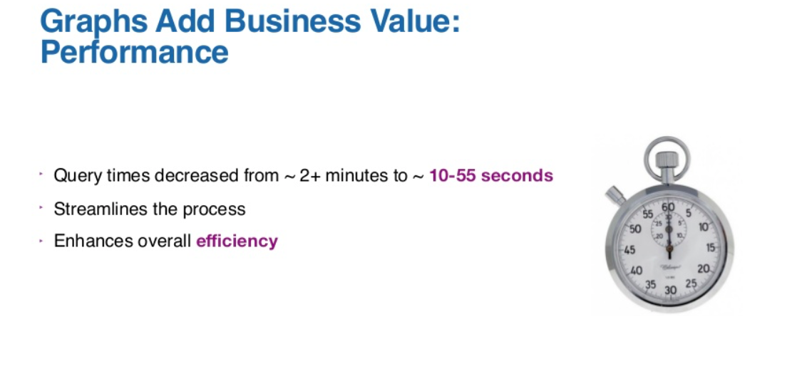
The first area we have gained business value by adopting Neo4j is in performance improvements. The query times of their analytical process has dropped substantially, and this has increased the overall efficiency and helped streamline the entire analytical process.
This is a very good thing. Everybody loves performance improvements. The faster something happens, the better.
Interestingly, in Boston Scientific’s experience, the largest value that they’ve gained isn’t coming from performance improvements; instead, it’s coming from non-functional areas.
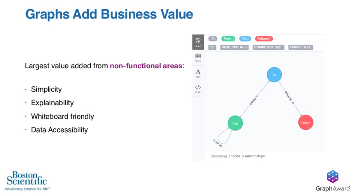
These no-functional areas include the simplicity, the explainability, the white-board friendly nature of graphs and the end result is that the data is much more accessible than it otherwise was.
Let’s take a closer look at the graph that same graph. This is the portion of Boston Scientific’s model that we’re allowed to publicly discuss.
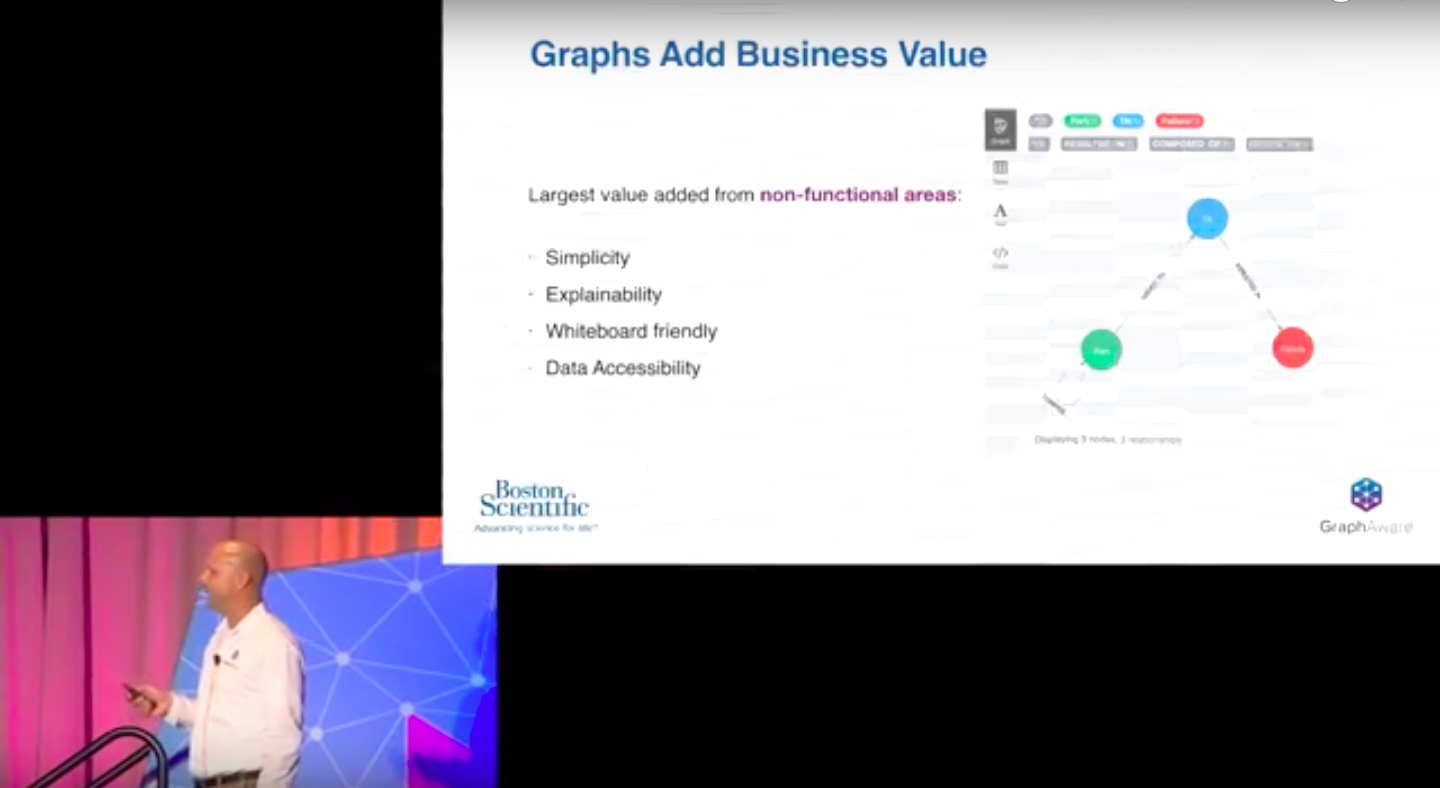
We’ve got a blue node, which is a top assembly or a finished product. In our analogy, this is the cookie, and then the cookie is composed of parts, our green node. Green nodes have a recursive relationship back to them self. This is what lets there be dozens and dozens of parts composing one top assembly.
Boston Scientific has a very rigid QA process, so they taste every cookie, and if they decide that it doesn’t taste good, they can assign a failure to it and relate it back to the top assembly or cookie.
Seeing our graph up here on the screen, our graph is actually incredibly simple. It’s so simple, it would be easy to overlook the fact that what’s being presented here is a life-saving medical device. Boston Scientific sells millions upon millions of these a year.
In terms of the simplicity of the graph, what is just three nodes and three relationships is actually a complex medical device composed of dozens of parts manufactured by Boston Scientific from raw materials.
When you think about the data that’s generating underneath, in terms of their process, the end result is millions of finished goods and billions of parts, resulting in billions of relationships generated annually.
While the model is very simple, it’s the capture and the ease and efficient navigation of this data. These relationships add tremendous value. As for explainability, because the model is so simple, it’s easy to read, write, understand, and therefore, it’s easy to explain to somebody else.
At Boston Scientific, everyone involved with the project across the whole spectrum, maybe from business stakeholders to their technical implementers, are able to understand what they’re talking about, because they’re all speaking the common language.
For those same reasons, these graphs are incredibly easy to draw on the whiteboard, and this allows team members, when they’re discussing actual production problems, to jump up at the whiteboard and draw graphs using the production data. Not only does that have its own advantages, but what’s being drawn on the whiteboard accurately reflects the way that the business understands the problem, the way the technical team understands the problem and the way that the data is actually organized at the system level.
Speaking of data accessibility, we’ve done some research, and we’ve found some surprising statistics that we’d like to share.
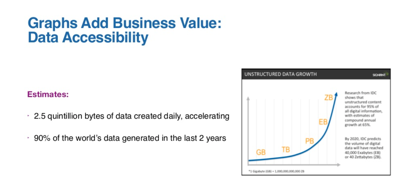
The first one is that it’s estimated that 90% of the world’s data was generated in only the last two years. It’s also estimated that that pace of generation is only going to increase.
It used to be the case that if your business had data, that in and of itself was a competitive advantage. However, based on statistics such as this, it’s easy to conclude that the world is awash in data, and so if everybody has data. You having data yourself is no longer simply a competitive advantage. With that being the case, what is a competitive advantage?
We think the competitive advantage is knowing how to go from merely having data to having wisdom from the data. We found this image that we love from David Summervill. We think it tells a very compelling story.
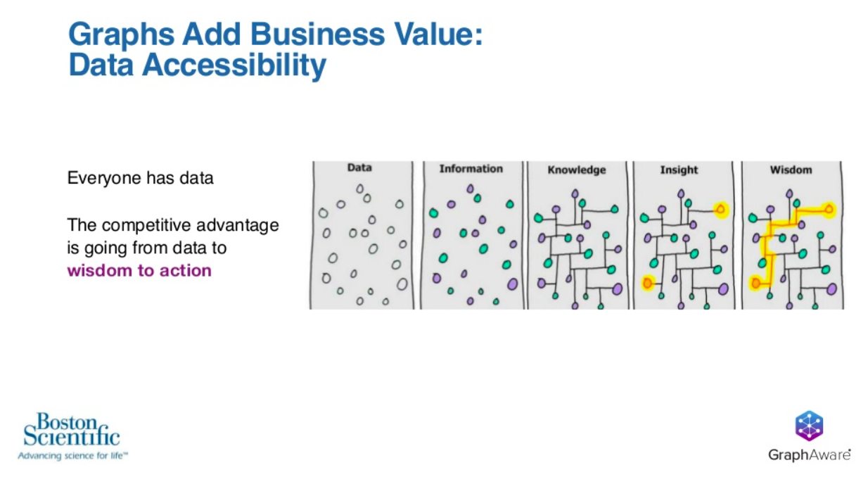
The message is that data alone isn’t power; it’s wisdom from the data that’s power. This wisdom comes from the data’s insights and connections and being able to navigate them efficiently, effectively and reliably so that you are able to act. It’s this competitive advantage today that is the goal of Boston Scientific’s adoption of Neo4j.
New Capabilities
As we’re talking about areas where Boston Scientific has had business value gain, we first covered performance improvements. Then we covered these non-functional areas. The third area is in new capabilities that they’ve gained from adopting Neo4j.
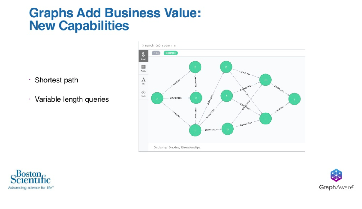
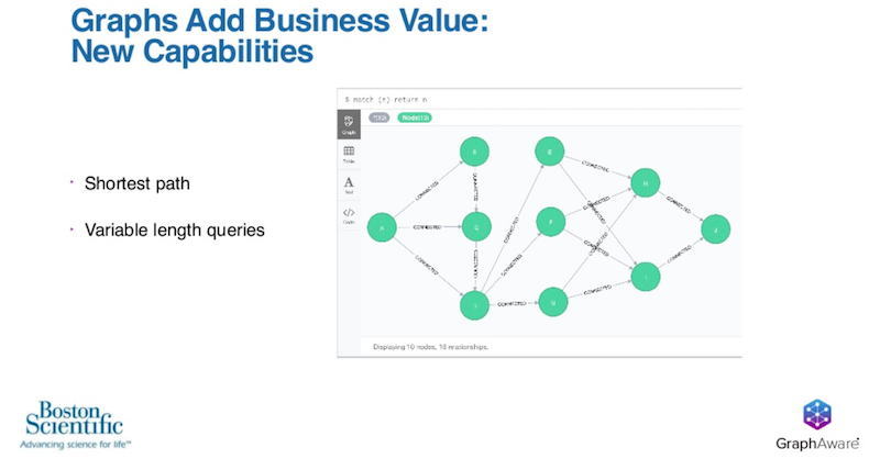
Two of those examples are shortest paths and variable length queries. An example of shortest path would be if we started on the left and we wanted to go from node A all the way to node J on the right. However, we’d like to do that in the shortest and smallest number of hops possible.
This is actually a very common problem across a wide range of industries, including shipping, logistics, transportation, financial industries, networking and so on. The utility of the shortest path is actually incredibly useful to have in your business.
An example of variable length queries would be you may have a particular query that you want to run. You could pick node F, and using a variable length query, you can constrain or expand the amount of data that’s under analysis from N to M hops away, where N and M may be one to five, 15 to 55, or 100 to 155. It’s the ability to constrain or expand that data that’s under analysis that is very powerful.
Interestingly, both shortest path and variable length queries are actually very difficult to solve. This is because the size of the dataset grows. It is by no coincidence, these two problems are also strengths of a graph database like Neo4j.
Shortest path example
Let’s go through an example of how Boston Scientific is making use of a shortest path. To set the stage for that, this is a simple Cypher statement.

This is executing Neo4j’s shortest path command and passing it a pattern. The pattern we’re interested in says, go from node A to node J following any number of connected relationships.
By putting this into the Neo4j console and merely hitting return, you get this graph below, and the problem has been solved.
Boston Scientific is using simple Cypher statements like this to find links between failures.
In this graph, we’ve got two failures represented by the red nodes.
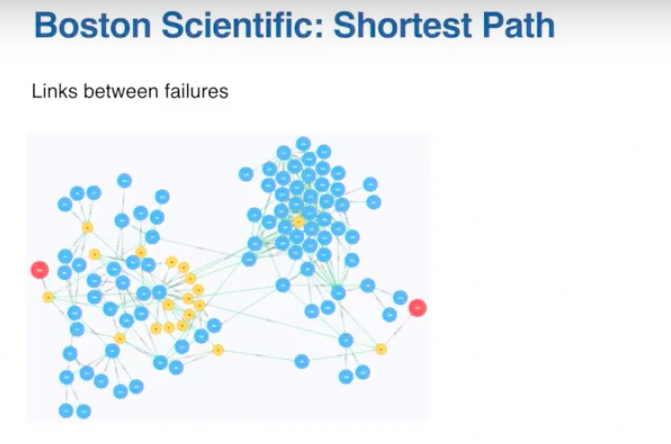
We also have a small amount of data between the two failures. Even though it’s a small amount of data, it’s just enough to make it complicated to figure out what is common between these two failures. Otherwise, this would be a fairly intensive exercise in analysis that could take a lot of time and a lot of resources to accomplish.
By using simple Cypher statements from Neo4j, Boston Scientific is able to go from graph to graph by the execution of a simple Cypher statement.
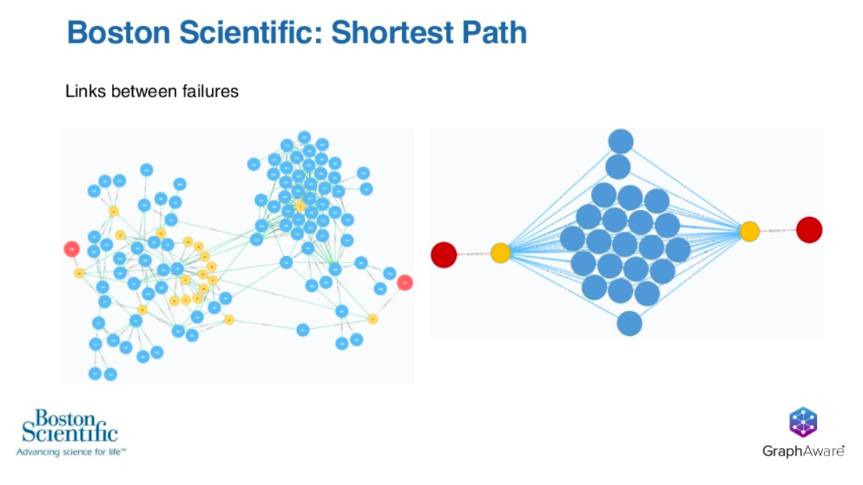
It’s very clear that the analysis on the right is much clearer than anything you could perform on the left. It’s simple Cypher statements such as this that allows Boston Scientific’s analysis to start at step 100 rather than starting at step zero.
Wespi: Shortest paths and path queries are really good for seeing linkages between individual failures and investigating individual failures. However, once you start to look at that in the aggregate, it can get a little bit scary, right?
Looking at this visualization, we see a few things from it.
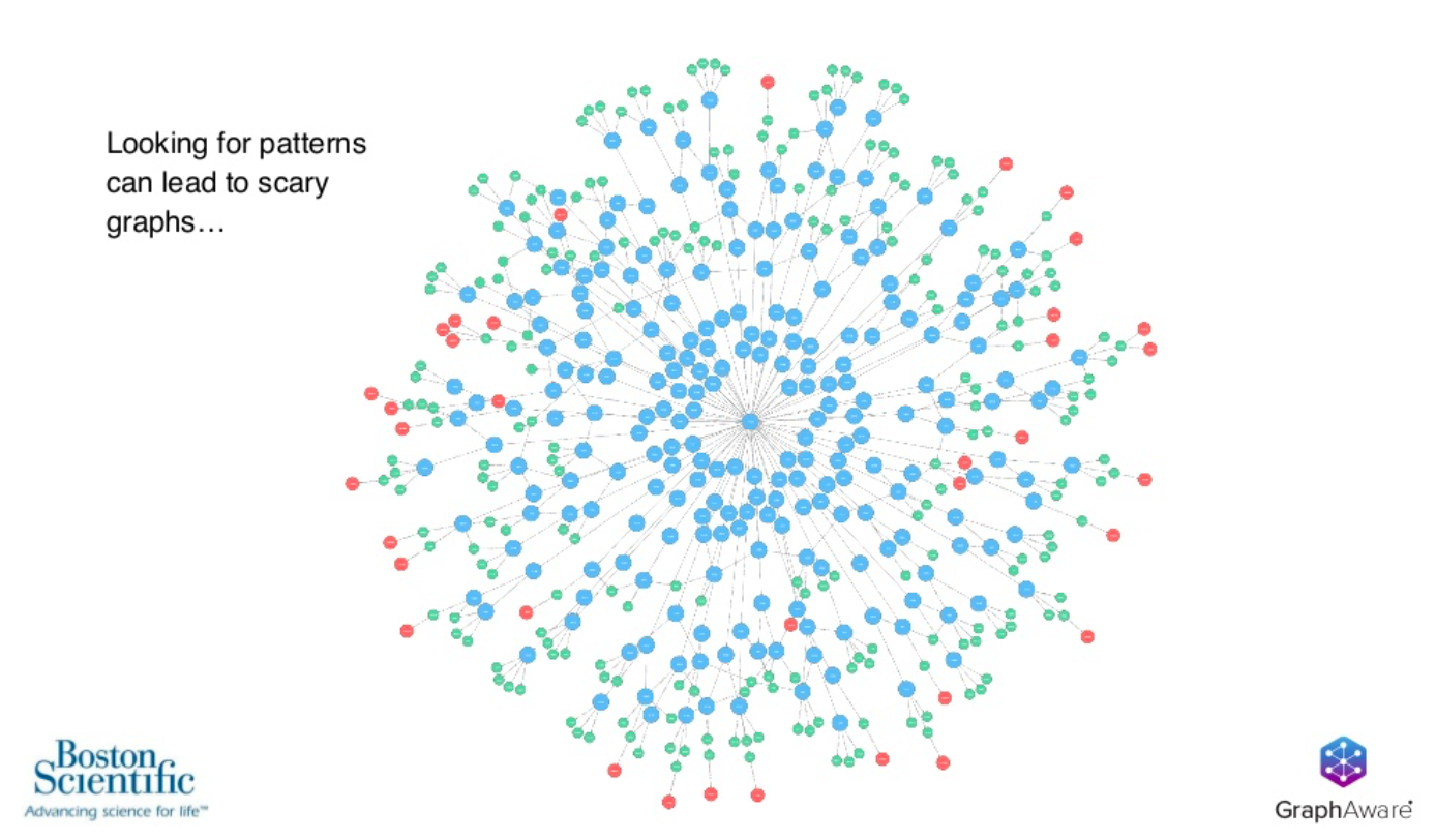
We see that there are a number of these red failures. These are all connected to this one sub-assembly that’s pretty far upstream. The top assemblies are the green nodes here.
We understand that they seem to be connected to this one, but it’s really hard to then quantify that connection or those relationships, just by looking at the nodes in a graph. That’s where we start to try and extract insights from the graph.
We use Cypher to generate, quantify the number of paths, the number of connections that lead to a failure and assign those as properties to all of these individual nodes in the graph.
To do that, every batch or every node in the graph gets a score associated with it. We add up the weights of issuance. That is portions of batches of eggs, that make up dough and portions of dough that make up cookies. Then aggregating all those together gives each individual batch of eggs or flour or dough a score associated with it, and then we do some traditional analysis that would be a little bit more accessible to management and others.
You see here, that type of data.
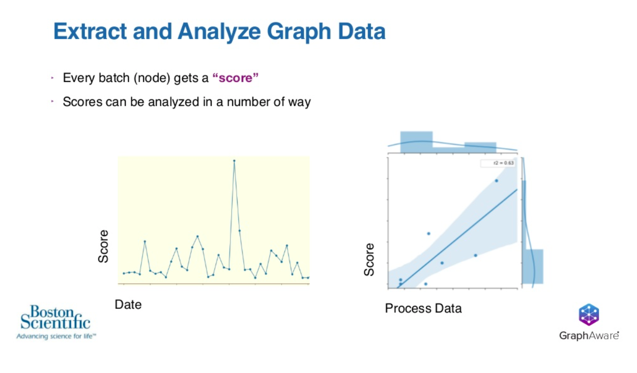
If you look at it on a timeframe have this score that we’ve calculated in Cypher and extract it out, you could say there’s one batch here that seems to be connected.
The Y axis here is the amount of failures that might be connected, so there’s one batch that seems to be connected to a lot of failures.
The second highest amount of failures ran right after it. We now know to start investigating a certain place in time, or we start to integrate that with other process data and start to do some regression analysis or traditional analysis from that.
The message is we’re using Neo4j not really as just a data store, but as a place to analyze data, store those back into the graph, store those new characteristics of the data back in the graph and then extract that for traditional analysis.
Our data science team is based in Python. For that reason, we work mostly in Python. We started off on our journey here preparing data in Python, building and testing a database using a pretty lightweight connector, Py2neo.
We use Py2neo as a connection to use Python to write Cypher statements, build and test that database and then augment the properties.
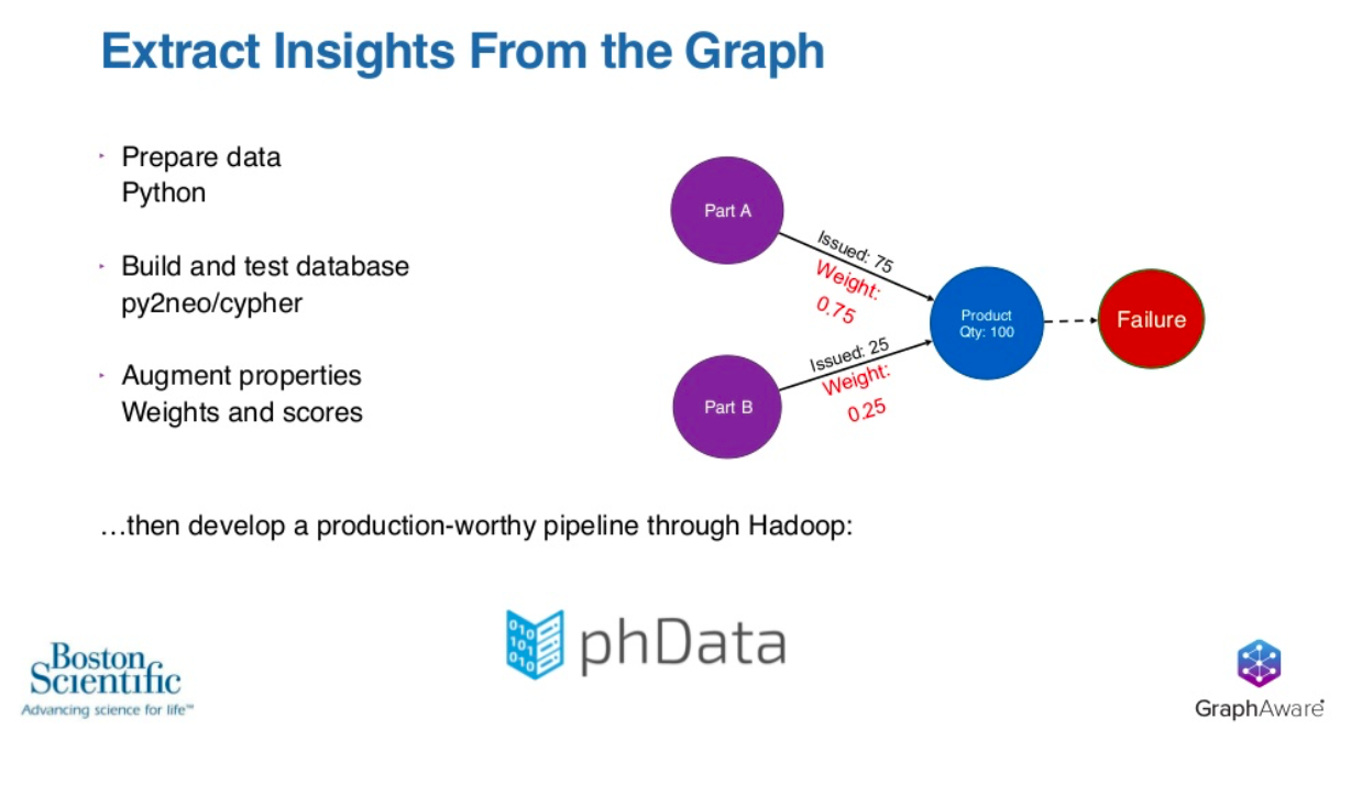
We turn the issuance numbers into weights which are written in red. Then we augment the relationships with a weight, and then we sum those weights for all the paths that could possibly lead to a failure. From there, we take all the failures and store those as properties in a node as a score.
We develop this information in a notebook code environment. We had to develop a pipeline for all this data to kinda go through our Hadoop ecosystem into Neo4j and execute these Cypher statements.
Spiegelberg: Because Boston Scientific’s project has been successful in adding business value, there’s going to be next steps and an additional phase for the project. Any change we make is going to entail evolving the data model. We’ve got a couple lessons we’ve learned that we’d like to share, and then we’ll go through two examples of what those next steps will be.
At GraphAware, we work with a wide range of clients across the globe, and we see traits of Boston Scientific across many other clients getting started in adopting graphs.
Transferring Data
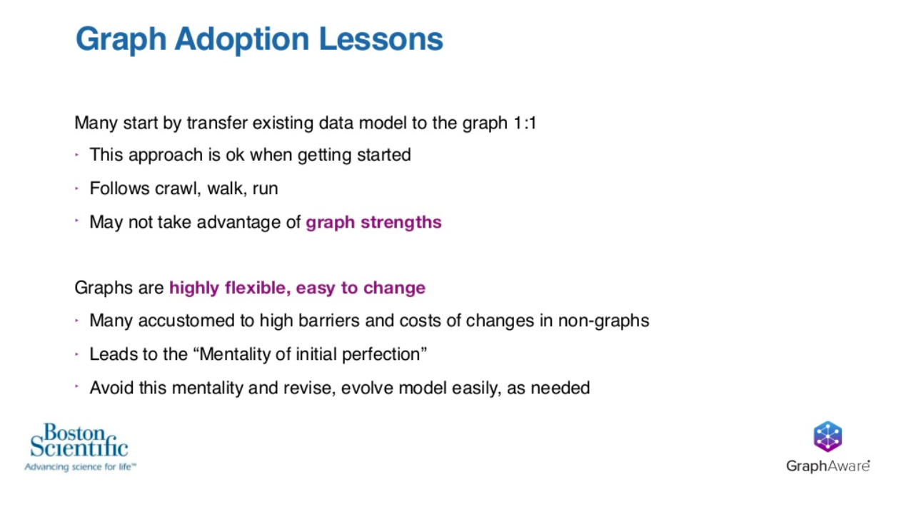
The first point is that many organizations start out by transferring their data into Neo4j very much one-to-one. This is the same way it exists in their source systems. When you’re talking about getting started, we think this approach is okay, because it follows the crawl-walk-run strategy, and anything that helps you get started adopting graphs we think is a good thing.
Beyond the initial first steps, this strategy may not take advantage of the graph’s strengths. You might not be maximizing the business value that you could otherwise be taking advantage of, but in just getting started, it’s a first step.
Mentality of Initial Perfection
The second point is that graphs are highly flexible and very easy to change. Many organizations are moving to graphs. These organizations are accustomed to the high barriers and the high cost of changes of other non-graph systems. This leads to what I like to call the mentality of initial perfection.
The mentality of initial perfection is that feeling of: “Oh boy, I’ve only got one shot, so I’ve got to get this database perfect, and I have to have it perfect before we launch, because once the ship has sailed we’re going to have to live with this system for the whole lifetime as it is, and we’ll be stuck with it.”
However, because graphs are highly flexible and very easy to change, we really try to encourage people to avoid this mentality and break themselves of it. The simple reality is that you are able to revise and evolve your model very easily as needed.
Now, let’s go through two examples of the changes that Boston Scientific is going to do in their next phases.
Boston Scientific: Graph Model Evolution
We return back to the graph that we’ve seen before. We have our three nodes and three relationships. Currently, on the top assembly, this finished product, which is the cookie in our analogy, has a property with the name of a product. This name is a string of text that represents what product line this top assembly is associated with.
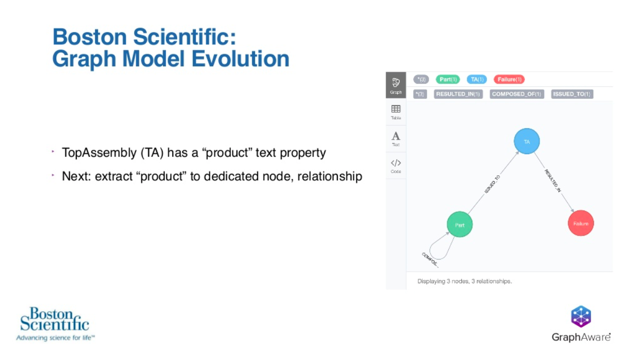
For reasons that Wespi is going to go into shortly, there’s been a realization that there would be business value gained by extracting this property off of the top assembly into its own dedicated node and then creating a relationship from that new node back to the top assembly.
In doing this, we’re going to go from our simple three nodes and three relationships graph to something that looks like this.
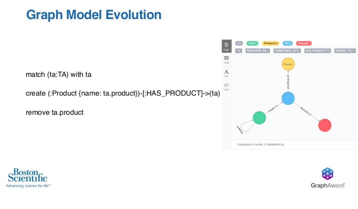
What we’ve added here is the product node that’s represented in yellow. We’ve created a has-product relationship back to the top assembly, and then finally, that product property is going to be relocated from the blue top assembly back to the product node itself. All of this is accomplished by the Cypher statement on that screen.
We think this goes back to our themes of keeping it simple, using the right tools for the job and the end result is that this lets you focus on your business problems and maximize the value you get out of Neo4j rather than working on complex operations of changing your model.
The next step that Boston Scientific is considering is the expansion of the data that’s included in this analysis. We’re going to be adding supplier information and supplier location data. Interestingly, this data has actually always been available to Boston Scientific, and at least in this analytical context, we’ve not been making use of it.
If you’re not making use of the data you have, it is of zero business value. This is actually an exciting step, because by adding data to the graph, they’re adding value to the business. We think this graph then becomes more interesting.
We’ve got a top assembly, the blue node that’s gone through QA, and it has ended in a failure.
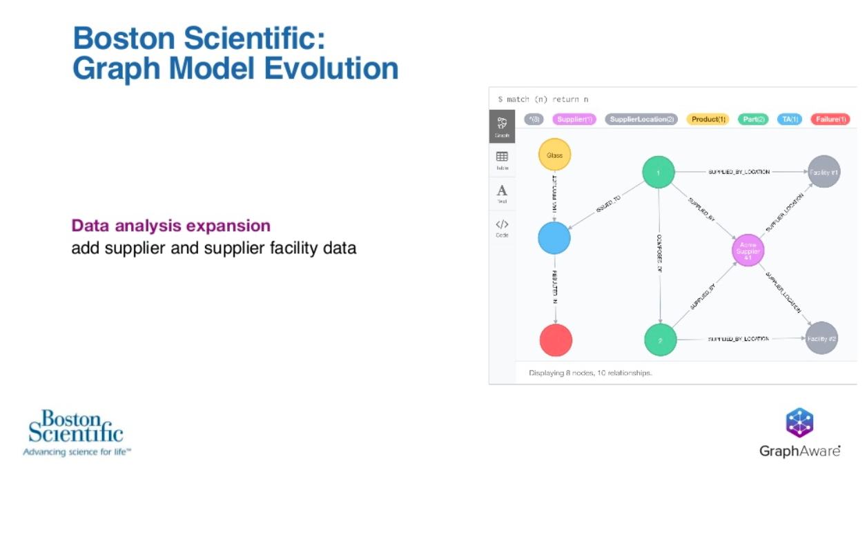
The real question is, why did this end in a failure?
Moving from the blue node on the left to the right side, it’s clear you can see that it’s composed of two parts. It has the two green nodes, and both of those parts have been supplied by the same supplier, the purple node, and yet those two parts were actually supplied by two different facilities.
This could be the key breakthrough in their analysis to understand that perhaps there were conditions at facility one that led directly to the cause and the failure of this individual top assembly. That could be the key root cause that adds the business value, and without that data, they otherwise would never have reached that conclusion.
Wespi: I didn’t grow up on graphs. Our team was coming from a relational database background. We started out thinking all these things should be properties. We just load it as-is, and select certain properties. We thought that was the way to go.
Extracting the product as a node itself was a mental leap for us. Even though it’s a really simple thing to do, it adds a lot of value, because we start to look at things differently. We start to learn from one product to another.
Another thing that we thought of as we were doing this, we’d analyzed one big, high-volume product. We’d say, we got some insights from this. These are some of the materials that are important. These are the specific batches that we need to go look into, and then we’d go off and do another analysis on another completely different product.
Now, those products often are completely disconnected, but sometimes, there are some sparse connections between them. That means we might share the same raw materials way upstream in the graph. What that means is that a really high-volume product that has lots of data that we can learn from can be applied to something like a new product, even one that hasn’t finished production yet.
If we understand by analyzing this graph, that there’s a raw material batch that might be suspect in a couple failures, we can then apply that to some new product that is using that raw material batch, but we don’t have any data yet for it.
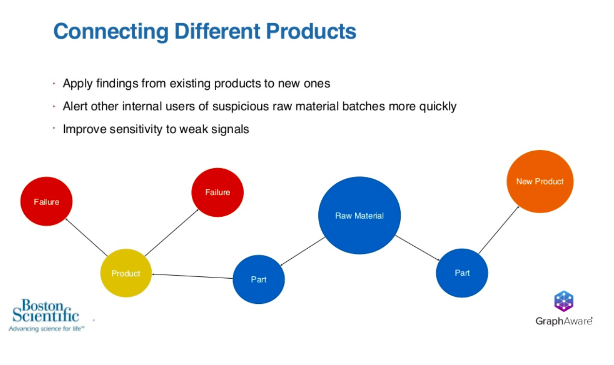
Using sparsely connected graphs that are from unique products, we alert internal users. They’re often in different countries or different organizations. We alert internal users of suspicious batches, and then we improve our sensitivity to weak signal.
We have multiple products that have a really weak statistical signal to us for certain material types, we can combine those together and improve the statistical power of our testing. There’s a lot of benefits to be had there in connecting the different products.
Moving on to where we go from here for next steps is we’re really excited about some natural language processing use cases.
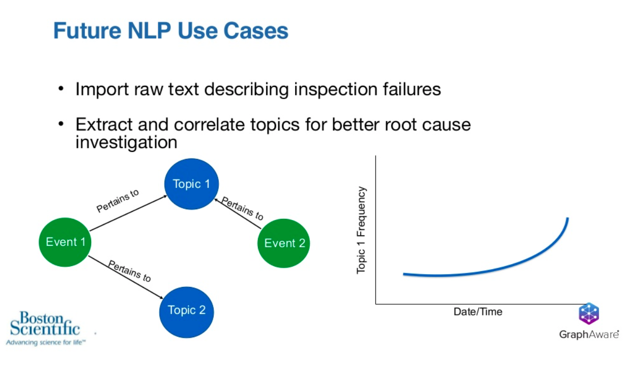
A lot of times when we have failures or other events in manufacturing, we ask people to enter some text to describe what they found, what they might have done about that, and on a macro level, there’s some structure to that. However, on a micro level, if you look at that text itself, by nature, text is not as structured.
We’re excited about the idea of extracting and correlating topics for that text to understand themes that are emerging about investigations rather than having to read through all this stuff.
If we have a couple different events, maybe these are our failures. If we have events associated with them and they pertain to topics, we start trending the frequency of topics as they start to arise, and we understand maybe these events both had some description that talked about some equipment maintenance or something. Then we see that the equipment maintenance topic is trending, and we need to go look into our maintenance procedures on a specific line.
There’s a lot of potential value there that we see. NLP’s not the easiest thing to do when you’re building it from scratch, but we’re excited about working with GraphAware, because they’re experts in that field.
Spiegelberg: That brings us back to the partnership between Boston Scientific and GraphAware.
Boston Scientific has use cases where they take advantage of NLP, NLU and possibly machine learning as well as artificial intelligence. Separately, GraphAware has recognized these trends out in the marketplace, and so we have spent two years doing R&D and product development, and the end result is Hume, our new artificial intelligence platform built on top of Neo4j.


