
Improving Patient Outcomes with Graph Algorithms

Sr. Director of Global Commercial IT Insight and Analytics, AstraZeneca
14 min read
Editor’s Note: This presentation was given by Joe Roemer at Connections: Graph Data Science in April 2020.
Presentation Summary
In this post, AstraZeneca’s Senior Director of Global Commercial IT Insight and Analytics Joe Roemer will talk about AstraZeneca’s journey, specifically the ways in which AstraZeneca is improving patient outcomes using graph visualization and queries.
First, he’ll provide an overview of who AstraZeneca is. Then, he’ll dive in and talk about our graph algorithms proof-of-concept review, which included patient journey similarity and physician connectedness and influence. Finally, he’ll tail-end the post with insights, as well as what’s next for the company.
Full Presentation: Improving Patient Outcomes with Graph Algorithms
Today, I’m going to talk about AstraZeneca’s journey. First, I’ll give you an overview of who AstraZeneca is (I’m assuming it’s not a household name for most of you). Then, I’ll specifically dive in and talk about our graph algorithms proof-of-concept review. I’ll tail-end the post with what’s next for us.
Who is AstraZeneca?
For those of you who don’t know us, AstraZeneca is a global pharmaceutical company. We have around $24.4 billion in revenue and are investing $6.1 billion in research and development (R&D). We have around 70,000 employees, operate in 26 countries and are developing over 167 new molecular entities, which are essentially what become pharmaceutical products moving forward.
Overall, we focus on three main therapy areas across key platforms. As shown below, we help patients in oncology, cardiovascular, renal and metabolic diseases, and respiratory diseases.
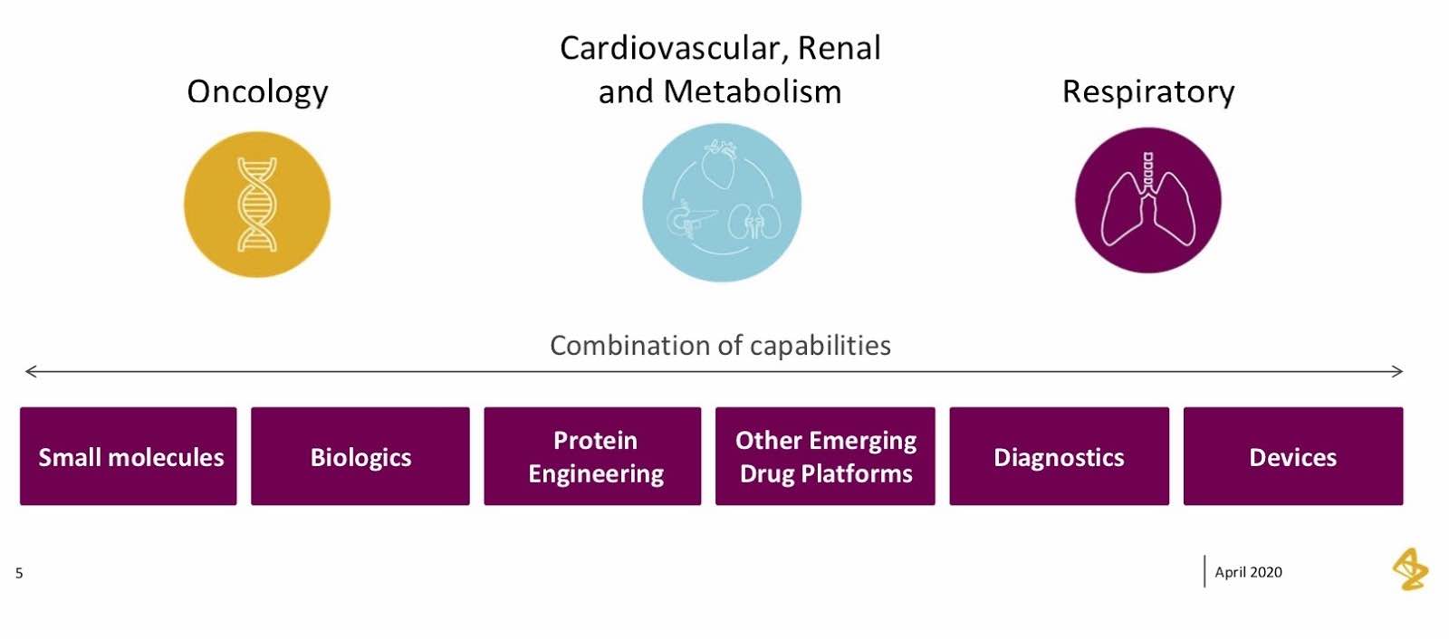
We cover small molecules, biologics, protein engineering – all of the components that make up a life science organization in these three main sectors.
But what honestly gets me the most excited about where I work is our values and the mission we have as an organization. Our core mission is that we push the boundaries of science to deliver life-changing medicines that create value for patients and society. Since I’m in IT, I like to translate this mission into computer science and look for places where technology can drive science. These values became an important part of our work with graph, particularly how we took graph technology to help patients map out their journeys.
Graph Algorithms: Proof of Concept Review
Diving right into our proof of concepts, I’m going to cover our journey throughout this process, how we got to graph and the specific results we covered.
Why did we start exploring graph?
I work as an IT Capability Lead for insight and analytics, so I’m constantly looking out for new pieces of technology that can make a difference to our business, and support insight and analytics. I started reading a lot about graph technology and how it differed from traditional RDBMS databases, including rows, columns and relationships. I also heard about it from applications that help driving, navigation, recommendation engines and fraud detection.
From there, I researched graph technology and enrolled my team in these conversations. It became an idea that started to gain traction within our own team and got them thinking about ways in which graph is applicable to our business.
Interestingly enough, our actual entry point was a market research project. I saw this really interesting traditional market research document that would run call center queries to a bunch of positions. As they were launching brands, they’d often ask physicians questions like “how do you currently treat patients with these diseases? What conditions do these patients typically have and what are you worried about with these patients? How do you adjust treatment? What do you do to adjust treatments for the patients? As they progress through the disease, what specifically are you doing to help them?”
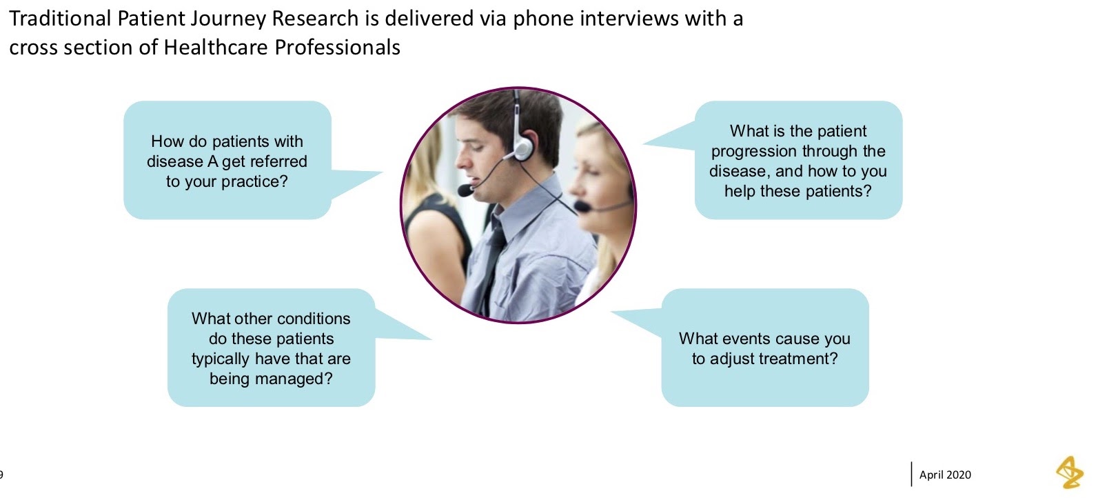
However, the physicians they get a chance to talk to represent a pretty small population, and so they’re only able to obtain a pretty narrow perspective.
As I saw this document, I thought of the fact that we had a lot of rich data that we could bring to bear to see if some of the hypotheses that came out of the market research yielded true when looking at the actual data of these patient journeys. That was our entry point into graph. The first thing we did was talk to brand, who’d already done some of this market research, and see how we could apply graph, answer some of their hypotheses and ask if they rang true within the data.
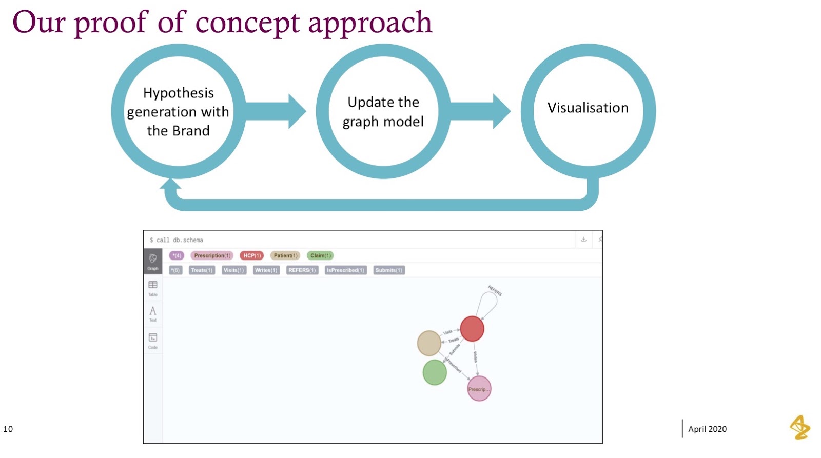
Our Approach
Our approach was quite common. We stepped into graph without knowing a ton about it, but it was most important for us to answer the questions our brand team really wanted to understand.
From there, we built a graph model and visualized some of these questions. For us, the first take on building out the graph model and trying to understand how to think differently was quite hard – it’s definitely not the same as a traditional database, so we certainly stumbled quite a bit here. What we found ourselves doing was iterating through this graph and leaning on people who had experience in graph technology to help shape this model.
What you’ll see below is our very first model: pretty simple relationships between physicians, prescriptions, medical claims and actual patients. We were thinking nouns, verbs and that it all made sense – until we tried to answer more complicated questions. And what we saw was that this graph model had to progress.
We then took the graph model and made version two, where we added in the time relationship in order to see how these things changed over time.
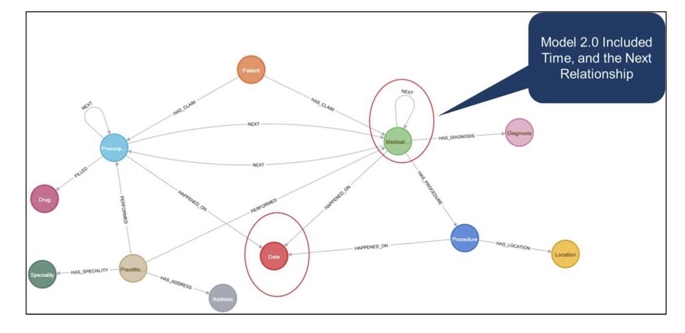
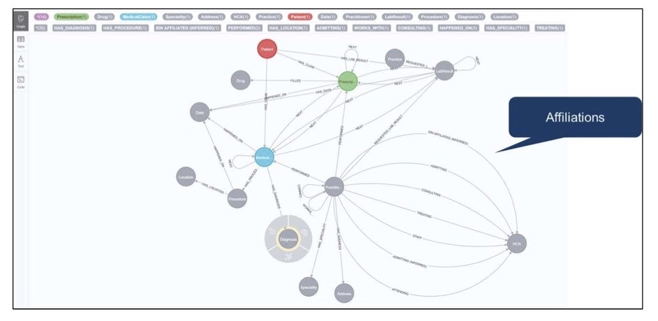
We also modeled some of the relationships between physicians and claims so we could see these journeys happen over the sequence of events they occurred. Showing the visualization and progressing got us to more answers. We ended up with a pretty rich model that included relationships of physicians to health systems and physicians to each other.
However, we had to iterate through this graph model quite a bit. What we found as we continued to iterate was that the questions continued to get more complicated and interesting. They started off pretty simple, like “tell me how many patients have this disease. Tell me how many patients move from A to B,” but they got more complicated from there.
I want to give you a little snapshot of the visualization we built and where we took the initial hypotheses and questions. This visualization really brought it to life for our brand team, and led us to the next stage of the journey, which was all about graph algorithms.
If you look at this visualization, what we’re showing is a single patient and journey through their disease progression.
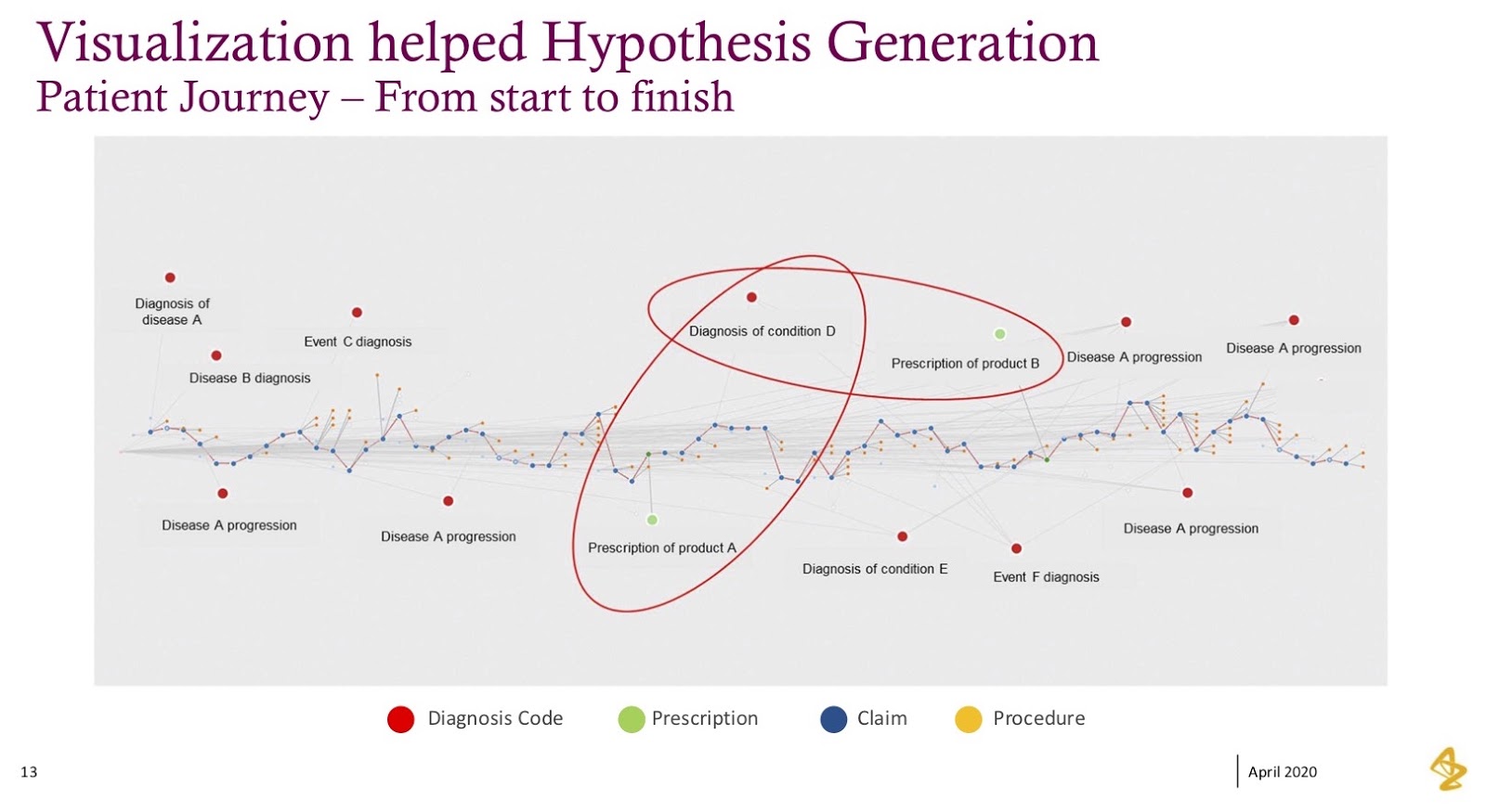
Every blue dot represents a medical claim, every red dot represents their diagnosis and every green dot represents prescriptions. When we laid this out from left to right, it became real; this data became humanized, and what we saw were patterns within this data.
In this example, I’ve highlighted two little sections where the green (prescription) dot is followed by another condition or diagnosis, after which the physician pivoted to a new prescription in response to the diagnosis that happened after the first prescription. These kinds of patterns were exactly what we were trying to understand within the patients, how physicians treated patients and whether our products would help these patients. In many cases, it would yield a better patient outcome.
This individual visualization became an anchoring point; it became a very different way to analyze data. We’d traditionally tried to find these patterns, but it was tough when we had to look at events that have happened in sequence, such as “show me event A, then B, then C,” but then you don’t have D. The graph helped facilitate these analyses rather rapidly.
Algorithms
Once we had this visualization, we ended up answering question after question pretty quickly in graph. But what that really led to, quite honestly, was the next set of complicated questions.
What we had were two main questions that came out pretty quickly in the visualizations and the stories we were going to build from there:
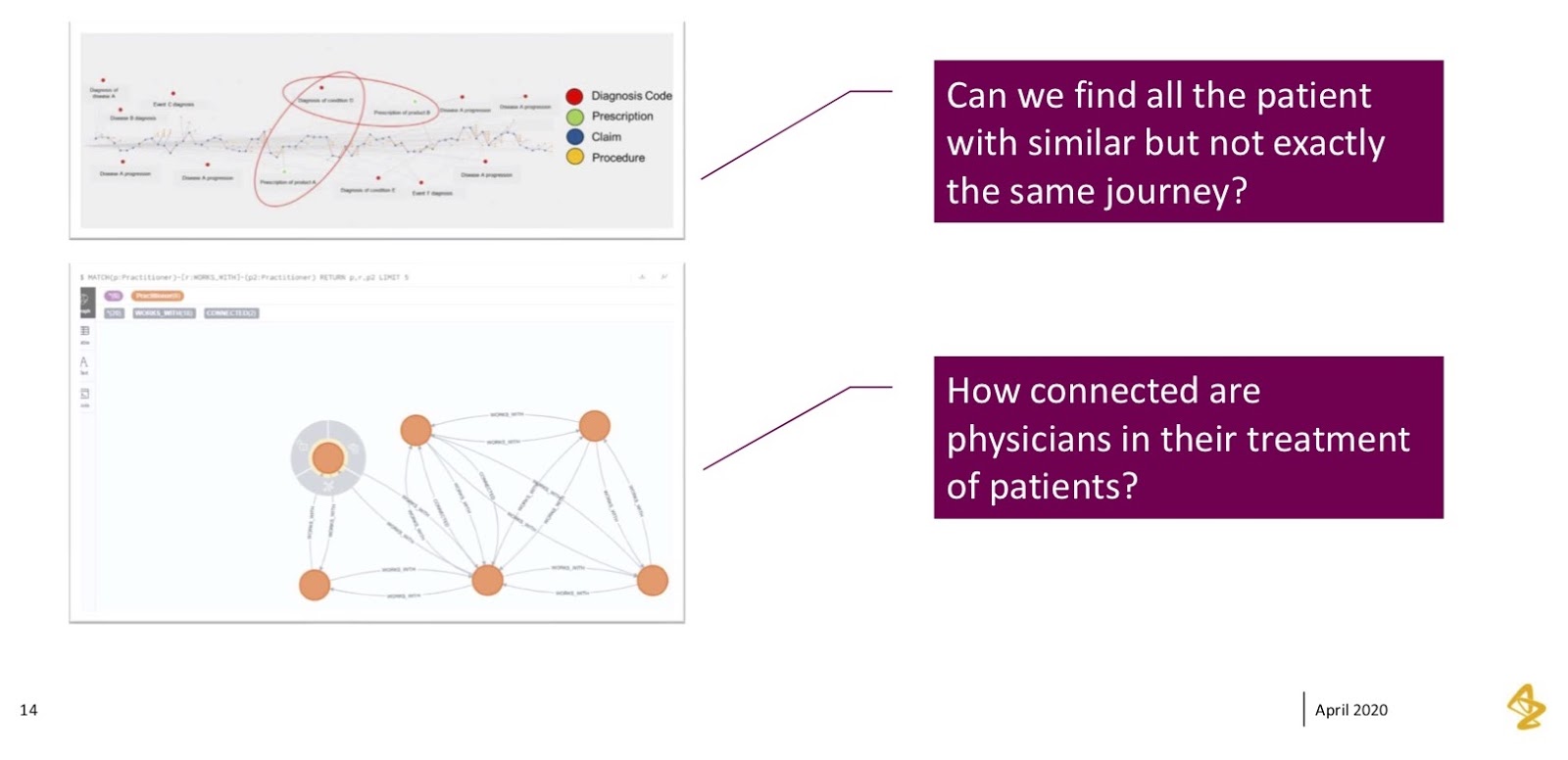
The team loved seeing one individual patient’s journey, but their very next question was “can you find us all the other patients who are similar to this, but not exactly the same?” If you’re familiar with medical diagnoses, you know there’s a lot of nuance in some of these diagnosis codes; a lot of them are similar, but they’re different enough. What we found was that it’d be very difficult to keep analyzing this graph over and over for every possible iteration. They were really challenging us to “find us these patients, but we don’t want to be super specific. We want to be general in these conditions. Can you help us do that?”
The second thing we saw in the data was exploring how these physicians were connected. We saw interesting physician connections, where we’d see a specialist diagnose a patient, but the specialist’s assistant writing the prescription. If you’ve been in the medical industry and seen an operation at a specialized healthcare provider office, this happens often, where you’ll have an initial consultation with someone who’s very specialized and then hands you off to their nurse or physician assistants to close out that call.
We wanted to see how exactly these networks worked. This became a nice anchoring point for what graphs do really well, which is showing connectedness between people and how they work together.
Patient Journey Similarity
I’m going to hone in on patient similarity, specifically what we thought was possible and what we exactly did on this approach. What we thought about was how we could take those patient journeys – diagnosis A, prescription B, diagnoses C, D and E – and translate them into something through which we could find patterns.
We had smart people helping us from a data science perspective. The very first thing they thought of was how this felt similar to a problem they’d seen before; it was a problem they often saw when comparing word-based documents to each other. “Can you find sentences? Can you find paragraphs that are similar – that have the same topics and patterns?”
From here, we took an approach of taking that patient journey and essentially mapping it out to a vector, or a word phrase. Each of those diagnosis codes or procedures became words. The claim overall – comprised of diagnoses, procedures and prescriptions – became a sentence. The patient journey became a document.
We used that method to then find all of the other patients that were similar to that specific patient, but not exactly the same. Then we took this approach and ran it through a graph algorithm – the similarity algorithm – using doc-to-vec, as well as some of the techniques you’d use in natural language processing (NLP).
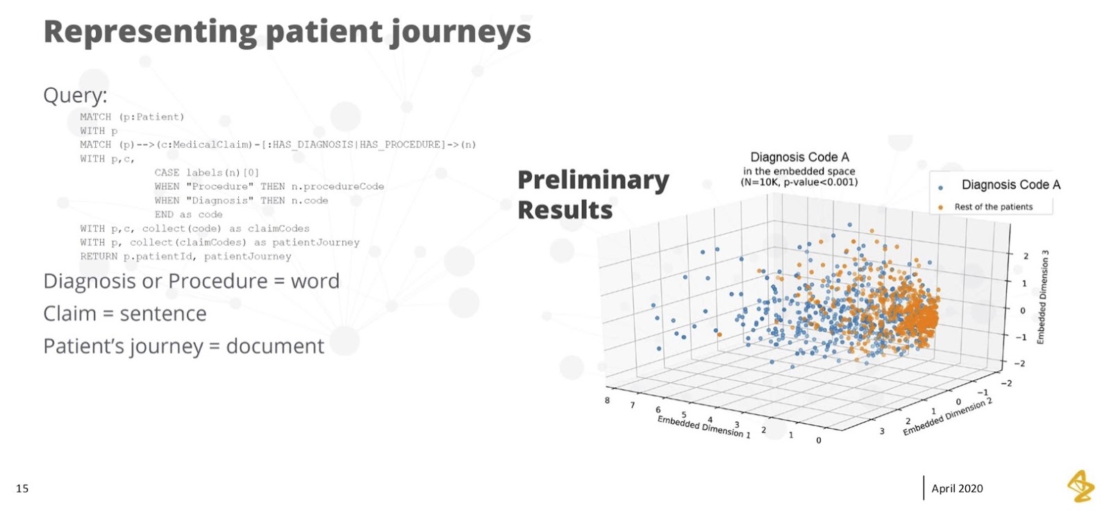
What you can see on the right was that we saw pretty good separation across a couple of dimensions. Here, the orange bubbles on the right are patients that did not have this diagnosis, and the blue bubbles on the left are patients that did have this diagnosis.
Separation is a good thing in this model – it means we had dimensions we could highlight. If we looked at these dimensions, we could find the patients that were similar and ended up with the diagnosis we were concerned about. On the other hand, we could separate them from the rest of the patients and obtain a good prediction of the people that looked a lot like the patient but weren’t exactly the same.
The fact that we could accomplish this in graph was eye-opening. We didn’t come into the project with this perspective at all. It’s one of the things that makes me personally excited about the possibility of graph algorithms. It became possible through seeing the journeys of those claims lined up, taking it to the next level and applying the algorithm to create separation.
Physician Connectedness & Influence
The second big algorithm we wanted to look at was connectedness. We thought of it both as “can we find people that are connected” and “can we find people that are influenced with each other?”
Earlier, I talked about where we saw physicians working together, sharing patients and passing patients, where you’ll often see a primary care physician refer their patient to a specialist. We started to see those patterns.
The picture at the bottom of the image below is a simple example of how physicians work together. We ran many of these centrality algorithms to find out which physicians were most connected to other physicians, where clusters of physicians worked together and how we could visualize a group of physicians that we might want to treat as a single pod. For example, if we had a meaningful conversation with one of the physicians, we could reasonably expect that the whole group of physicians would benefit from those conversations.
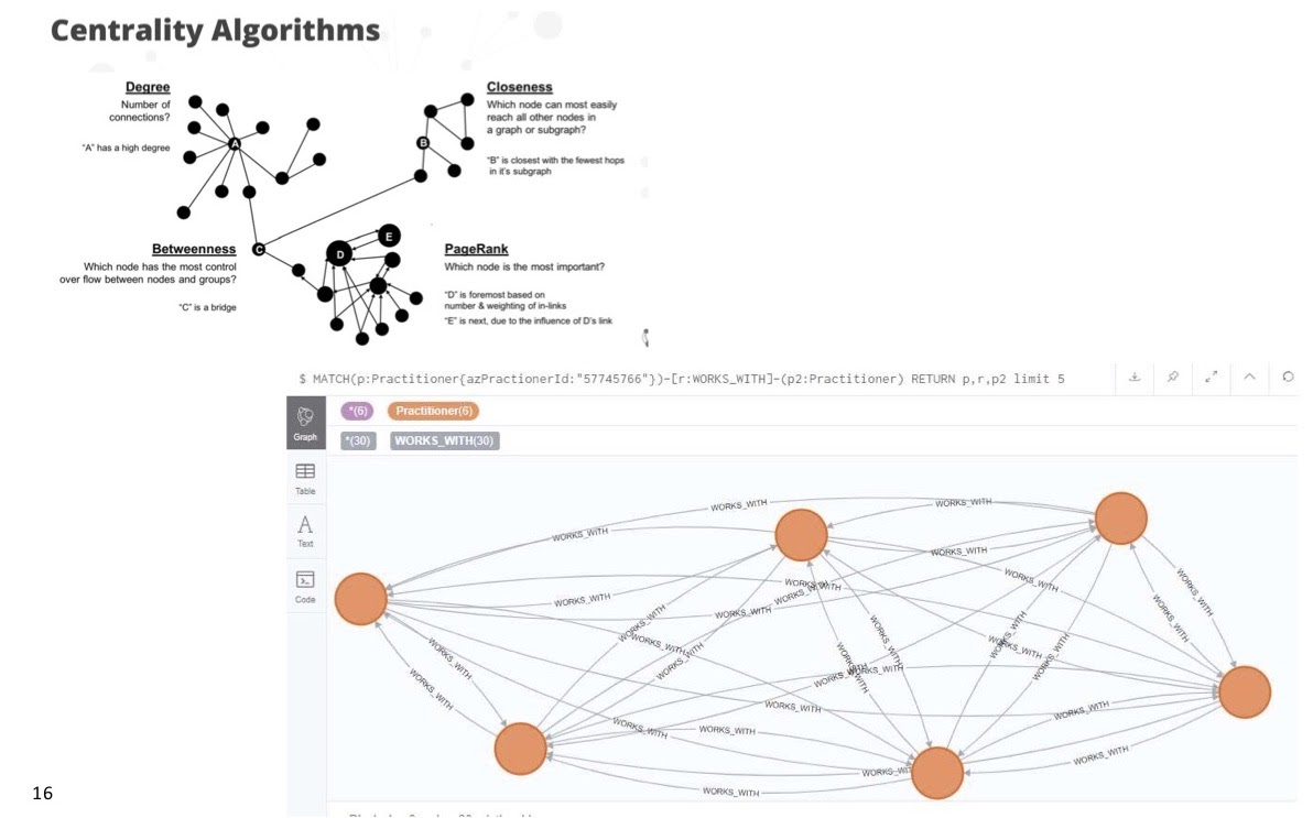
From there, we ran classic clustering techniques in these algorithms, and we found that there were lots of sparsely grouped physicians who worked in pretty close teams.
We were also interested in betweenness. There were times when we might’ve had the chance to have very rich conversations with a couple of physicians, but there was another group of physicians who were perhaps too busy and couldn’t have these conversations with our medical folks or sales teams. We wanted to find those bridge points between the two physicians or organizations. That’s where betweenness became so important.
The betweenness algorithm showed us that there was a pretty important relationship that could certainly help patients by bridging two physicians who might be able to connect with each other and share their own experiences.
I was also super interested in PageRank, specifically which physicians might be influencing each other. If you don’t know a lot about PageRank, think of it as the Google experience. Those who are connected to many other people end up with a larger PageRank. In this case, if we were looking at a physician who’s a speaker, and a whole bunch of other physicians who’ve attended his events, he’s going to have a higher PageRank. Or, if he’s working in a health system with a lot of people, they will all refer to him and end up with a higher PageRank as well.
We conducted very focused conversations with the people we viewed as influential in the network; we listened to them carefully, understood their concerns and leveraged them as core focal points for a much larger network. We were excited about the possibilities that came in these connectedness and centrality algorithms in showing certain physicians who have influence, bridging physicians and seeing clusters of physicians pop.
These were exciting use cases. When we started this project, we didn’t even think they were possible; they became an evolution as we got past graph queries and saw some of those patterns.
Insights
If I were to summarize our insights throughout this journey, I’d first say we found that physicians work in tightly connected groups with patient care spread among their teams. They managed to find patients and work together to make sure they were cared for in the best way. The specialist wasn’t always the anchor point of that conversation; there was a whole team around them, and that was a pretty good insight.
It’s always interesting when you see these insights visually. It almost feels like you should’ve known them at the start, but sometimes you have to actually see it. You really need to see a visualization of how these patients are shared between physicians to obtain a sense of how many physicians might interact with a patient.
Second, we learned pretty quickly that no two patient journeys are the same, but there are a lot of similarities in those journeys. We could use graph algorithms and find patients that had a specific journey type and pattern, but then find others who were close or similar.
One of our most insightful learnings was that graph modeling requires a change of mindset. When we started this journey, we thought we were going to pick up graph with no problems or struggles. We were all drawing on a whiteboard and assigning nodes and relationships; we thought we had an easy path until we started querying the graph, and what we found was that it definitely required a different mindset.
Particularly, consulting with experts was important for us and helped define relationships and nodes differently. This was certainly not possible without input from people who had experience in graph. I’m sure many of you struggled like we did when you first picked up graph, but for us, it was hugely insightful to see different thinking.
Graph is powerful because of its evolution. As I showed you, we started with one thing and it grew and grew. We also keep seeing more and more internal questions. But, this isn’t a problem for graph, whereas it is a problem for some of our other databases.
What’s Next?
There are two main areas we want to focus on moving forward and are looking to use graphs to highlight connections between things that matter to us.
The first thing is that we want to leverage graphs to better understand physicians, where they work in health systems and how they’re connected.
In the picture below, all the green bubbles are health systems, hospitals and doctors’ offices. The red bubbles represent a couple of physicians. Increasingly, we’re seeing that More and where people wor, and the health systems in which they’re engaged in will influence what they can or can’t do, prescribing patterns, protocols and pathways in place.

We wanted to take a look at how physicians are connected to these health systems, whether they work at multiple health systems and how these elements might change the way we engage with them and think about what messages we need to give to them so they can help their patients better.
The second connection was finding influence points and other physicians who had similar experiences and getting them connected to other physicians to tell their story.
We’ve all been in situations where – no matter how much someone from a third party tells you – you need that pure connection or trust. Finding the influence and inflection points is certainly something we’re continuing to explore and seeing how we can leverage these connections to make a difference in the patients.
Finally, we want to continue to focus on the patient journey. The more we map out these journeys, the more they will help our conversations with healthcare providers so they can best care for their patients and provide the medicines that can help the most. For us, this is about finding those patterns in the right patients, as well as seeing the right time in their journey to have conversations.
Getting ambitious here for a moment, I’d also love it if we got to a place where we could take graph algorithms and predict big, meaningful events that our healthcare system is getting bogged down by.
If you think of someone in your life who’s had one of these events, such as a cardiac event, the right treatment and preventative care can make a world of a difference in preventing catastrophic events. I’d love to get to a place where we’re partnering with health systems, working together, avoiding these costly events, and helping prevent hospitalization and readmissions on the chronic diseases that AstraZeneca is focused on.
This is where we’re hoping to take this journey. Thank you for giving me a chance to discuss the proof of concept approach we took, and the journey we took with graph.
Register today to join us for Neo4j Connections: Life Sciences and Healthcare, a full day of online talks about data science from customers and Neo4j experts.
Share Article


Explore
Related Articles

What Are the Different Types of Graph Algorithms & When to Use Them?


What Is Data Lineage? Tracking Data Through Enterprise Systems
