
KeyLines Geospatial Is Leaving Beta! See the First Demo Here

U.S. Manager, Cambridge Intelligence
4 min read
Editor’s Note: Cambridge Intelligence is a Silver sponsor of GraphConnect San Francisco. Register for GraphConnect to meet Corey and other sponsors in person.
The Countdown to GraphConnect
The wait is nearly over…just 7 days to GraphConnect San Francisco!
We are super excited to connect again with the growing Neo4j community and spread the word about graph visualization. What better place than at the biggest gathering of Neo4j graphistas in history?

Here’s a sneak preview of what we’re going to be sharing this year at the Cambridge Intelligence exhibition:
GraphConnect Exclusive: Spotlight on KeyLines 2.11
The audience at GraphConnect will be the first to see KeyLines 2.11.
It’s one of our biggest releases yet – the culmination of thousands of developer hours. We have prepared a raft of new features and improvements, with something for everyone:
- Neo4j graphistas will love the re-vamped Neo4j documentation. It covers every step, from uploading Dr. Who data to seeing your first KeyLines chart.
- Time-pressed developers will appreciate our one-click demo downloads. Download everything you need to start your project in a single zip file.
- Data scientists should enjoy our collection of new graph functionality. A new automatic layout called “lens,” a community-finding algorithm and two new social network analytics (SNA) measures – PageRank and EigenCentrality.
- End-users should enjoy our seven new demos (stop by our stand for a play).
But the biggest news is that KeyLines Geospatial is leaving beta!

The new “Lens” layout combined with a clustering algorithm to find communities in your social graphs.
Location, Location, Location (and Graph Analysis)
We may be biased, but we think the power of graph visualization is huge. There’s so much value in the graph – why not share it with your business users?
Last year, we spoke about the insight opportunity buried in your temporal graphs (watch a video of our talk over here).
This year, we’ve added a new dimension: Geography.
Why Visualize Geospatial Graphs?
Many of today’s geospatial graph projects deal with distance queries or path-finding problems. “What’s my fastest route to the airport?” or “Where’s the nearest five-star restaurant?”
Graphs are the fastest way to answer these questions, yet they are not the only problems geospatial graphs can solve.
KeyLines Geospatial is an exploration tool for geographic graph data, empowering users to ask more sophisticated questions.
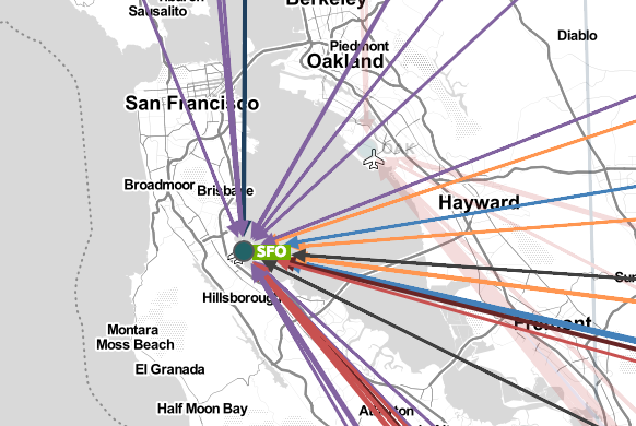
One fun example we will be showcasing at GraphConnect San Francisco looks at data with activity variations associated with both time and location. Our latest demo detangles 60,916 trips made on the Boston Hubway cycle sharing scheme during a single month.
In our visualization, each node is a HubWay station and each link is a journey. On first load into a network view, so many connected nodes just create a hairball:

We can get some useful time pattern information using the Time Bar (at the bottom of the figure above), such as some interesting peaks and troughs in activity.
For example, we can see a significant dip around April 19, 2013, when virtually all journeys stop. A quick Google confirms that dip coincides with the lockdown of Boston and the Dzhokhar Tsarnaev manhunt.
Let’s dig further into the geospatial aspect.
First let’s switch to map mode. This lays our graph over a geographic map:

That’s a little better, but it doesn’t really help us understand usage patterns.
So let’s try coloring the nodes by activity:

Here, we can clearly see one station that is busier than the rest during the month of April, in the geographic center of the graph.
The station is MIT at Mass Ave / Amherst St:

This is especially useful information for those responsible for ensuring bikes are available in high-traffic locations.
If we zoom in we can see more helpful details:

First, we can see that the largest volume of journeys (indicated by link weight) is making the 364.4-smoot journey over Harvard Bridge.
Another useful bit of insight we can glean from this data is which stations are net losers/gainers of bikes. Maintaining level stocks of cycles where and when they are needed is a balancing act.
Let’s change the coloring to show net loss/gain per station:

Beacon St / Mass Ave. is hemorrhaging bicycles, losing a net 225 bikes in April.
They all seem to be heading towards Harvard Square, which ends April with a surplus of 192 bikes:

As you can see, these are all useful details for those planning the cycle distribution truck routes.
See You in San Francisco!
This is a fun and easy to understand a dataset but the visualization techniques shown can be used on any graph, whether you want to understand cyber threats, detect fraud or explore data connections.
Find our team all day at GraphConnect San Francisco – at our exhibition booth, at our lightning talks or during the Cambridge Intelligence GraphParty – to get advice on how to start your own graph visualization project!
Register below to meet and network with Corey Lanum of Cambridge Intelligence – and many other graph database leaders – at GraphConnect San Francisco on October 21st.
Share Article


Explore
Related Articles


15 Best Graph Visualization Tools for Your Neo4j Graph Database

Empowering Open-Source Cyber Threat Intelligence Analysis With Graph Visualization
