


Microservice and Module Management with Neo4j

Software Architect, Vanguard
16 min read
Editor’s Note: This presentation was given by John Lavin at GraphConnect New York in October 2017.
Presentation Summary
Refactoring monolithic applications into microservices requires putting thought into managing code and its dependencies. At Vanguard Group, some of the existing Java archives (jars) have 3 to 4 million lines of code.
The team first tried visualizing the dependencies among jars and services in a desktop tool, then used a spreadsheet as an architecture tool. The team realized that the management of modules and services is really a graph problem and so adopted Neo4j.
Using a Maven plugin, they added in jar dependencies every time they ran a build, then used Nexus to add all their existing artifacts into the graph, along with their dependencies. They then began evaluating the relationships using best practices and building metrics from that. Next they added in information from their architecture spreadsheet to enrich their schema.
The team built out two tools to visualize relationships between jars and enforce best practices such as constraining the number of service-to-service calls to reduce risk. With full visibility that Neo4j offers into the relationships and dependencies among all their code, the team can effectively address technical debt moving forward.
Full Presentation: Microservice and Module Management with Neo4j
This blog is all about how we use Neo4j to manage our modules and microservices:
Vanguard Group is the largest provider of mutual funds. We’re a financial services company. I am an enterprise architect at the Vanguard Group and am helping migrate our monolithic software to services and ultimately to the cloud.
Our founder, John Bogle, was the creator of index funds, and that’s still a primary focus with us at Vanguard. I am in the institutional subdivision of IT managing the business of your 401(k) if your 401(k) is with us. We’re also the second largest ETF company, but we’re closing in.
Managing code is critical. That might be pretty obvious, but when I have conversations with other people, the focus really is more on feature delivery, time to market and getting things out the door. If you don’t make it easy to manage code, it just doesn’t get done.
It’s not unusual for some of our oldest jars to have 3 to 4 million lines of code. We have used multiple design patterns over 10 to 15 years. Sometimes we don’t have any design patterns at all. We have dead code, and we have some difficult to accomplish or incomplete impact assessments to be made.
If you’re familiar with code smells, you’re probably familiar with the shotgun surgery antipattern. We have had these difficulties in our modules in the past, and we wanted to easily manage our Java modules and prevent new code from having the same problems.
Visualizing Jar Dependencies Using Structure101
Our first answer was to use a third-party product called Structure101. It is a tool in which you load your jar files into memory on your desktop. It allows you to visualize and depict dependencies and all the relationships between the jars.
The problem we found quickly with using Structure101 was that it works if you know all the dependencies and the jars that you’re relying on, so you can load them and see them in the visualization. We have a lot of different subdivisions in our IT department, and a development team that’s using a jar file quite often is doing so without their knowledge. It is very difficult to find all the interactions if you can’t even load all the jars into the tool.
When we started building out our services and trying to disentangle our monolithic software, we had so many jars in the libraries in the monolith that it would actually crash Structure101. It could not take the visualizations.
And even if we knew what the jar dependencies were, we knew who was using it, and it still loaded in memory, it was still a highly manual process. We’d have a developer load up the jars, bring it into the tool on their desktop and then act on it. These were problems that the tool wasn’t equipped to handle.
Managing Our Services in a Spreadsheet
As we’re moving from our large monolithic services or monolithic applications to adding microservices and having to deal with services and deployments on top of that, the old libraries and the business logic doesn’t go away. We’re adding this extra complexity on top of our existing software.
To tackle this, we started with managing our services in a spreadsheet. (Doesn’t everything really start with a spreadsheet?) It was compiled over the course of a year, where we tried to inventory the services that we would build if we were given an infinite amount of time and an infinite amount of resources.
However, we don’t have an infinite amount of time or an infinite amount of resources. What ended up happening is that, if the business logic hadn’t changed, we just built a service off of it. Usually, we would take the existing software and deploy it as its own service.
We also had cases where we just wanted to put a new user interface on top of the software. In these cases, we just provided a REST endpoint to deliver a new UI and leave the existing software and business logic that works alone.
What that meant is that we had a lot of different services in a lot of different states, and we’re all tracking it in a spreadsheet. We tried to group things and document the dependencies as best we could in the spreadsheet, but it really wasn’t going to work out long-term.
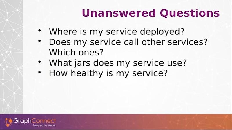
There are other questions that were never answered by a spreadsheet or some other tool.
The basic functions were captured, but there were large gaps (see below). We didn’t know where our service was deployed. We didn’t know what services were being called by other services. We didn’t know what jars and business logic was being used by the services, and we had no idea how we would categorize whether our service is healthy or whether it had a lot of technical debt that we might need to fix later on.
We needed something better.
The Move to Neo4j: Services and Modules Form a Graph
That’s when we learned about Neo4j. And this was our first foray into using graph databases and learning about them.
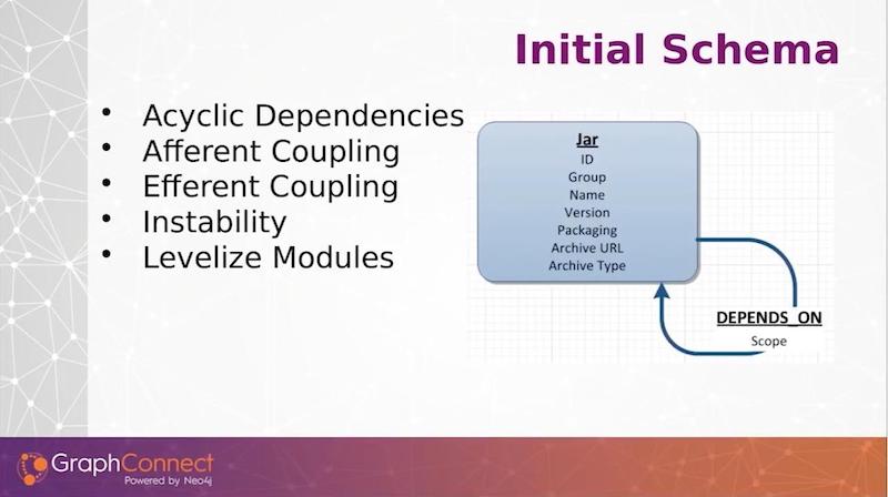
We realized that the management of our modules and services was really a graph problem. We started out very simply, with a simple node and one dependency or one relationship to that node (see below).
We stored our jar dependencies – the group name inversion – and to automate this, we wrote a Maven plugin to run every single time we did a build to gather this information and send it over to Neo4j.
As we build out new artifacts and new products, we’re actually just sending the data for the jars and its dependencies on other modules along to Neo4j.
After we were successful with gathering the data on our ongoing builds, we went back to our artifact repository, Nexus, and ran an automation job. We got the jar data and module data for previously built artifacts and loaded that into Neo4j. This provided us a wealth of information about a simple jar and dependency graph.
Tracking Metrics on Jars
Robert C. Martin wrote a book back in 2003 called Agile Software Development: Principles, Patterns, and Practices.
In Chapter 20, there is an important section on Java package design. Martin was referring to the partitioning of Java packages within a Java module, but we believe that the principles that he espoused for Java packages go for the Java libraries themselves.
In our graph, we implemented acyclic dependency principles. We fail our build if we have any module cycles, no matter how deep we go. If we have different subdivisions using the same jars, quite often we would find they come around and are depending on each other. We wanted to avoid that and fail the builds immediately to enforce good, healthy jars.
We have a couple of other metrics. Afferent coupling is the incoming dependencies to a jar. Efferent coupling is the outgoing dependencies of a jar. Instability is a metric of the outgoing divided by the sum total of both the incoming and outgoing. You can understand the relationships of the Java library based on these metrics.
One other metric, Levelize Modules, is inspired by a book by Kirk Knoernschild called Java Application Architecture. The idea is to understand where the relationships of different modules are in relationship to your entire stack of Java modules.
Knoernschild came up with different levels, where if a jar that you’re developing only depends on external libraries outside of your company, it will be a level one. External modules are level zero. Level one modules depend only on level zero, and level two modules are only dependent on level zero or level one, and so forth.
This is a little bit more fine-grained than if you have different layers in your architecture, such as an entity layer, a data access layer, etc. You can have many different levels within a layer. That gave us some insights on exactly how the modules in our architecture are laid out.
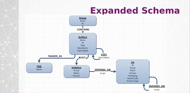
Grouping Jar Libraries with Metadata
Once we moved past getting the data for particular jar libraries in, we then took on the incorporation of the data from the spreadsheet where we were managing our services and began to model that in Neo4j.
At the top of the diagram below, we put services within groups that we want to logically define. And we can have different metadata tagged such as whether it’s in the public cloud or in an on-prem database. We have the ability to dynamically tag any of our artifacts, which are mostly services right now. We have many different attributes that we want to assign to them. We pulled those from our spreadsheet.
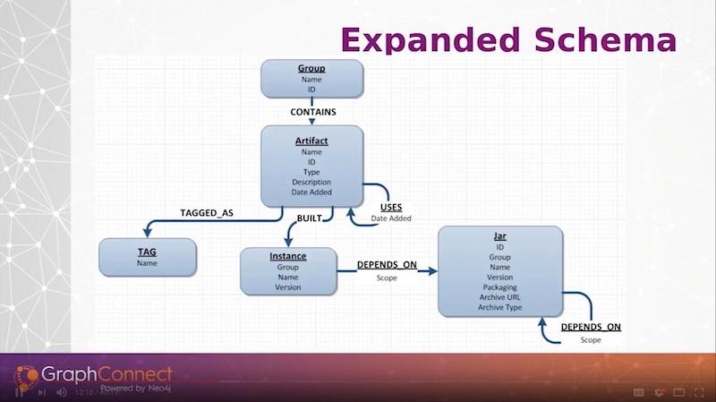
Any artifact is built via an instance. Every single time we build our web services, we will create an instance here through a Maven plugin that is running on the services. We will record the new instance that was just built and record the jar dependencies they are using.
This ties in with our preexisting jar libraries, and we can associate our services all the way down through our jars. Any service can call another service, so we have a USES relationship on the artifact.
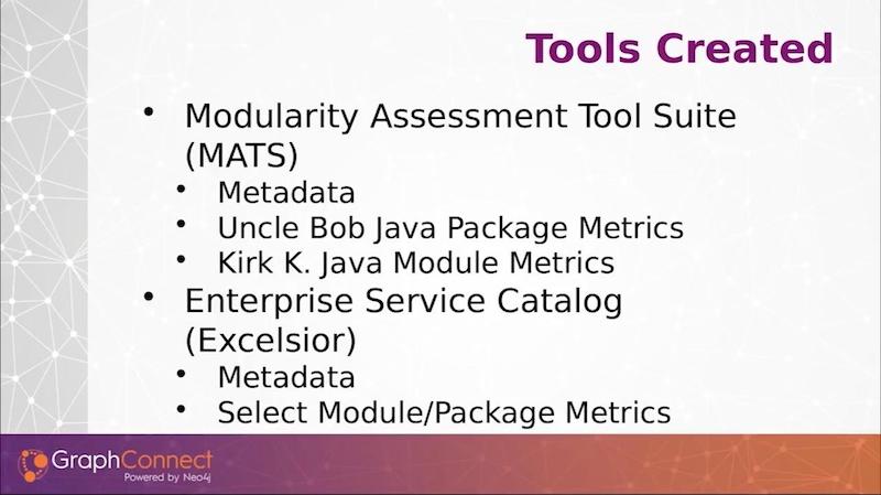
Modularity Assessment Tool Suite and Enterprise Service Catalog
On top of this data, we created two tools. We gathered this data using a Maven plugin, and we created two sets of tools.
The first one we named Modularity Assessment Tool Suite or MATS, which is primarily designed to manage our jar files. The second one, the Enterprise Service Catalog, which we code-named Excelsior, was for the management of what used to be a spreadsheet and is now stored in Neo4j.
We designed a Maven plugin for each tool.
For the MATS, we also have a Sonar plugin. SonarQube is a code-quality analysis tool that provides your code-coverage numbers, your code-smells, all of the nitty-gritty static analysis. And this is really where our tools are playing – in static analysis. We designed a plugin so that we can represent the data that we’re storing in Neo4j in Sonar.
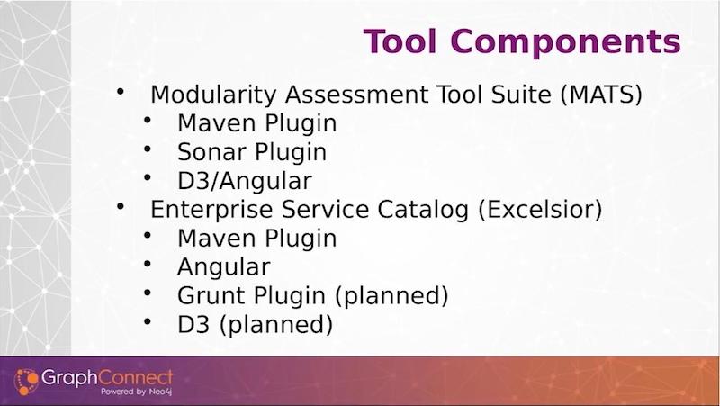
Another thing we designed for the Modularly Assessment Tool Suite is some D3 and Angular visualizations. For Service Catalog, we have another Maven plugin. Our catalog is completely Angular-based. We plan to integrate our Angular UI JavaScript modules in as well.
So, we have a planned Grunt plugin, and we have some D3 visualizations modeled off our Modularity Assessment Tool Suite visualizations planned as well.
Here is a small graph with some example information of how the data might look.
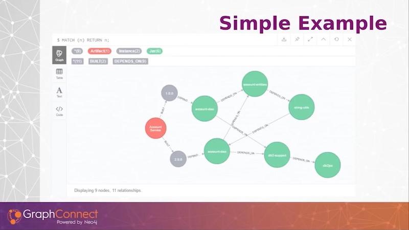
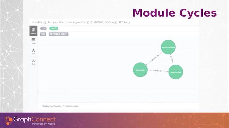
From left to right, I have a single artifact, which is an account service, and it built a 1.0 and a 2.0 version. The green nodes are jar modules. Since this is such a small graph, you can see that I did introduce a cycle in version 2 in this graph. This is the sort of data we’re looking to store.
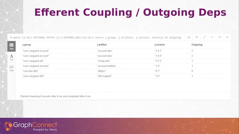
We can find our afferent coupling or incoming dependencies with just a simple query, and this gives us our incoming dependencies on our group artifact and version. I can see how many incoming dependencies there are.
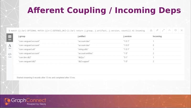
Reversing the query shows the outgoing dependencies. Something that was manual in a third-party tool, and I had to load it in memory, now becomes an extremely simple Cypher query.
Here’s one last Cypher query that just gets me the cycle that we saw on the illustration above.
With just these simple metrics and a little bit of math, we get a lot of these module metrics through simple Cypher queries.
The follow are a couple of our visualizations or metrics that we use. Our Sonar plugin (below) shows code quality metrics.
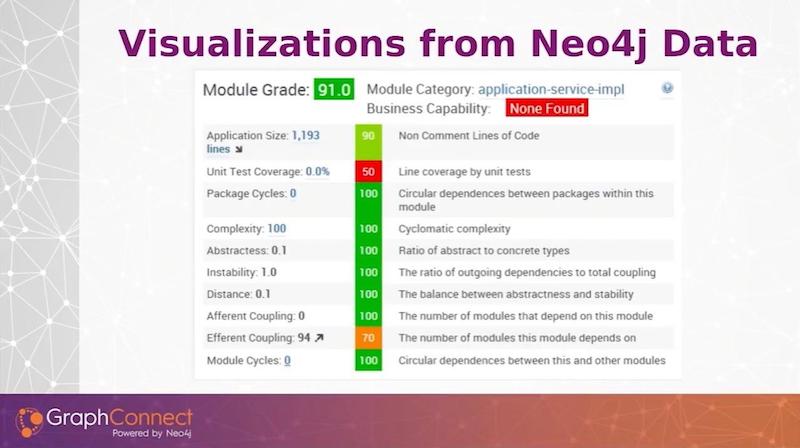
This is not only good for our development team to see their code health, but it is essential to engage our management team in understanding, not only are we delivering on time, but whether what we are delivering is quality or not.
From a management perspective, a single project isn’t as useful as looking at an entire aggregation — of whether or not it’s all of a monolith, all of a product ownership or all of a number of different jars that a particular manager owns.
We created a grade. And based on the type of module it is, we can assess a red, green, yellow to that metric.
Once we assign a grade overall to the module, then we can roll up our grades to give an aggregate grade for a different collection of many different modules. This is really helpful for engaging our management with how it’s trending and whether we’re getting better or worse.
Below is a screenshot from the enterprise service catalog.
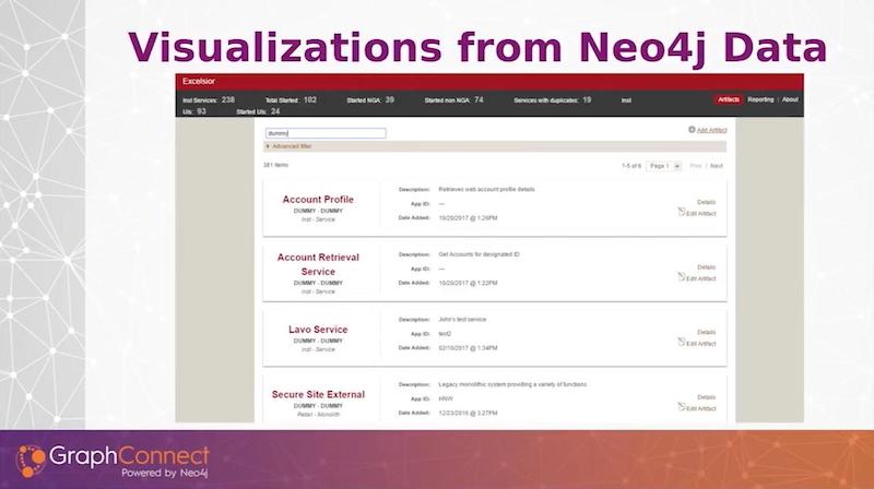
Since managers love spreadsheets, we came up with a visualization of our graph data that is more in spreadsheet form (see below).
We offer a lot of different ways to filter on the data. You can do a full-text search on all the services at the top. But we also have a pull down so you can select services in production or in public cloud, or have certain types of technical debt if you’re tagging your services or jars with technical debt.
You can do queries based on those filters and then shorten your list and render them out.
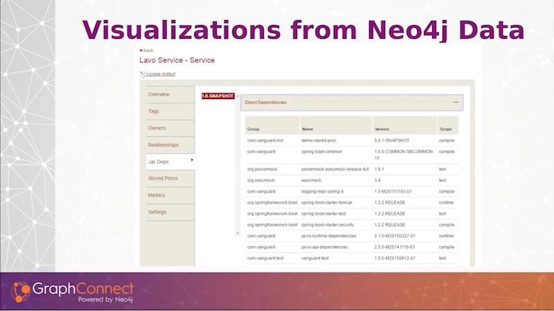
If you clicked on any of the services, a detailed list – the information, the metadata that we have provided – is in groupings on the left tabs.
Selected is the jar dependencies. So if you select a service and you want the jar dependencies, you select the version. Then we’ll query Neo4j and get all of the direct dependencies that service has. If I were to collapse this, the transitive dependencies come in. I do a full depth search on all the artifact dependencies no matter how deep they go.
Now we move to D3 visualizations to depict our modules and service dependencies in a way where we can understand the depth and the fan out of how our dependencies for our services and modules are moving throughout our architecture (see below).
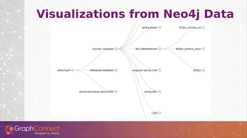
On the left-hand side, I have an example of a Vanguard module and all of its dependencies. In this case, we’re four layers deep with our dependencies that I’ve expanded out.
Static Analysis at Build Time versus at Runtime via an API Gateway
Some tools like an API gateway are looking at your runtime. By collecting this data and storing it in Neo4j at build time, we’re doing a static analysis. We’re doing it statically and looking at the actual code for all the code paths or the dependencies that are declared there.
For the financial services industry, we have services that are only called during certain times of the year, such as statements called every month or every quarter or every year end and tax forms. A lot of the call graph won’t necessarily be populated by anything that’s looking at the active runtime service calls such as an API gateway.
For us to do a complete impact assessment, we really wanted to be able to have a complete look when we’re making changes by using static analysis. Those one-off calls will get swept in if you’re looking at the code. They will not be visible in an API gateway.
This approach is great, not only for impact assessment, but also for production support.
If we’re having an outage where we’re having errors on a particular service or we’re seeing it in certain number of services, we can query on those services and see where it’s going to fan out. Because if one service is dependent on another, we can see where a trouble in one service is going to go in other places in our site. We can see cascading failures, and we can trace them back to particular services that they may have in common.
Containing Service to Service Calls
We want to contain the number of service-to-service calls we make.
We don’t want to say if these were modules instead of services, we don’t want to have service A calling 15 other services to render its data. And if service A at the very front is a critical system that we can’t have down, the more services that are dependent on that, there’s greater likelihood that service is going to be unavailable more often.
What we would like to do is design metrics around this to count the number of services that a particular service is dependent on and put a hard limit on that. If you have too many services being called, that probably means you’ve got your bounded context wrong in your services.
Determining Call Depth
The other thing we want to see is call depth.
We might decide that we don’t want to go any deeper than two or three service calls deep. If there are serial calls from service to service to service, there’s more likelihood that any one of those could kill your entire service. We’re investigating ways to determine appropriate metrics to identify problem areas before we have an outage in production.
Here is a visualization of our modules and the dependencies that those modules have.
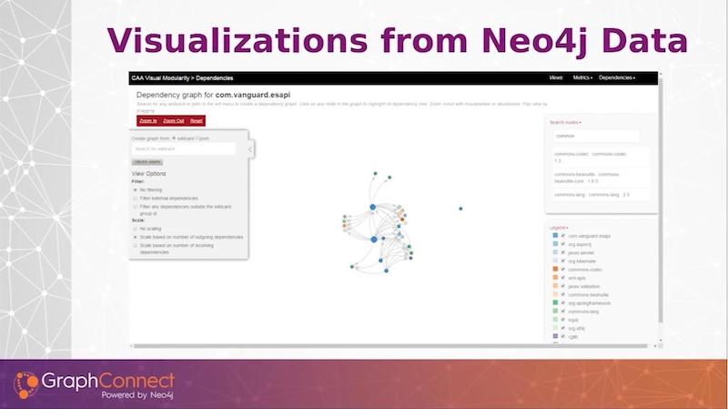
We added some bells and whistles that we found very helpful.
We are able size the dots based on the scale of incoming or outgoing dependencies or their instability or any other metric. The larger the dot, the larger the number of outgoing dependencies. You can actually see where we’re having a little centrality. We can actually see exactly where these modules are playing key roles in other modules.
On the top right above, if I were to depict one of our large monolithic applications with all the jars dependent on it, I would have a hard time finding any particular node. We added a full text-based search that you can search on any module that’s in the graph and it will highlight for us in our depiction.
We have multiple ways to filter. We record external dependencies such as Spring libraries and other Apache libraries. Since we don’t have any control over those, we might not want to visualize them. We have a radio button so we can turn them off and remove them from a visualization.
On the right-hand side, we have a legend that shows the colors of the different groupings of the modules. Not only does this show colors, but that checkbox will allow us to remove different types of modules from the visualization immediately so that we can focus on particular groupings of modules that are important for our particular situation.
Future Plans
In terms of future plans, while we have a Sonar plugin for our module metrics, we do not have a Sonar plugin yet for our services. We also want to be able to look up our web service in our source control SonarQube system and see the metrics for our service right there. This would engage our management team into being able to see these metrics when they’re developing their services.
Whenever we talk to managers, they go right to the center dashboards and they look at the numbers. They see whether it’s trending up or down, and then they make a phone call to their project manager and tech lead and say, “Hey, why are my numbers going down? My boss is going to tell me about it.”
It’s a really great way of pulling these numbers and metrics up, and keeping your code clean just because you’re all looking at it.
We’ll have afferent and efferent coupling. We’re going to look at service-level depth, service-call depth, and the total number of services.
There are some other metrics that we’re looking on capturing and rendering on our center dashboard. Right now, we’re primarily automating our services. We have manually put in our UIs, but we want to develop a Grunt plugin and automate gathering our user interfaces.
At Vanguard, we’re migrating to an Angular JS, client-side architecture. We want to be able to identify what services those user interfaces are calling. We want to build a Grunt plugin, gather that data, and store it in Neo4j.
On the backend, we also want to pull in our data management and governance. And we also wanted to use static analysis.
For this, we’re using BCEL to gather our data access routine. So if we’re using a database, we’re calling tables and columns because we’re still mostly a relational database shop. We want to gather tables, columns, and stored procedures that we call. And we also want to attach it with a jar file and associate that stored procedure or those tables with the jar file that’s using those.
This will give us an end-to-end look at where our data, our critical data and our sensitive data is being used, and where it’s exposed. Also, we’ll be able to identify any problems and ask questions like, “Why are you deploying this social security number over to this UI? Why are you exposing this personal credentials information.”
We have a process to manage our data, but some of the steps are manual. We’re looking to use Neo4j to automate those steps so that we have a much more accurate and complete picture of how our data is being used and where it is being exposed throughout all of our sites.
We have a lot of dead code or libraries that are 10 or 15 years old – big, difficult to manage jar files. We want to eliminate those slowly. We want to be able to take our services and jars and identify where deprecated libraries are being used, and say, “While you’re in this service, let’s get rid of this dead code. Let’s get rid of this old logic that we’ve been looking to retire,” and be able to identify them at a glance with a simple Cypher query.
The last thing we’re doing is that we’re using our service catalog for not only just looking at what is, but what we want to be.
When a project team goes into their planning sprint and their early-working sprints, we use this tool – this is one of our primary use cases – to identify which services we want to be using. We want to provide additional information as far as where those services are being used, what’s partially built out and where they may add their logic so that it makes sense in our overall architectural scheme.
Share Article


Explore
Related Articles

Bolster Your Cybersecurity by Visualizing Attack Graphs With Neo4j & G.V()


Top 10 Graph Database Use Cases (With Real-World Case Studies)
