
Picture This: How AIG Visualizes Propagation of Risk

Assistant Director, AIG
14 min read

Editor’s Note: This presentation was given by Jim Barrett at GraphConnect New York in September 2018.
Presentation Summary
AIG was looking for a way to consolidate their processing. They wanted to see how all of their teams worked, contributed to goals and an efficient way to make changes and see their impact both upstream and downstream. Not only that, they wanted the system to be easy-to-use and make results clear and concise for the end users.
AIG modeled their ideas after Zillow when creating their Integrated Object Environment (IOE). As illustrated in the background analogy, their purpose was to hold information that flows both upwards and downwards. The tool needed to be easy to operate, and it needed to be interactive.
AIG began collaborating with Tom Sawyer Software in an attempt to create a tool that was efficient, that was easy to update and that people wanted to use. Tom Sawyer Software delivered and recommended Neo4j as it is a best-in-class graph database with powerful features.
With Tom Sawyer Software and Neo4j working together, AIG was able to narrow their work to major overlapping components: attributes, diagramming and standards.
The presentation dives into the nitty gritty of the process through a product demonstration and highlights Tom Sawyer Perspectives, an upstream topology example and an example of criticality attributes before getting into a major theme: propagation of contribution.
Finally they highlight examples of graph data visualization being used for physical geography and a factory floor setting.
AIG wonderfully shows in marvelous detail what graph databases can do for large enterprise organizations. The question is not what it can do. The question is how to stay focused on one thing.
Full Presentation
My name is Deborah Baronand I’ll be introducing AIG, their story and Jim Barrett.
Deborah Baron: I think what AIG has done is remarkable and memorable. What they have done is similar to what Zillow has done for the real estate industry.
Background Analogy
Zillow brought us from searching the Sunday paper, paging through real estate sections and talking to people. To a website where you get all the information in one place, look at it from different ways, see how it’s related, get images, get text, get numbers and it makes it easy for the end user.
Zillow holds a complicated array of data, but any consumer could pick that up and understand it. No one among us would ever go back to using the Sunday paper. Because with Zillow, not only do you have all that information in one place, but you also have the ability to look upstream at historical data. You see property values, upgrades and changes to the property and how that impacted property value.
Through Zillow sellers see comps and related properties. Buyers are able to measure the impact of changes you’re going to make to the property. Potentially, you measure the downstream impact of those changes on the value of your property. So this is an apt analogy for what Jim is going to talk about today.
Organizations today are struggling to make simple changes, like from paper to plastic, because they’re burdened under the weight of huge amounts of information. They search through rows and columns of data and digitized text documents, but this mass is impenetrable by mere humans.
On top of that, there are static diagrams. Visualizations are not interactive, and the moment you print them, they’re obsolete. Finally, all of this information is sunk into a complex network of legacy systems. These legacy systems hold information that flows from one to the next. A small impact upstream could have a huge impact downstream.
That impact could have upside potential; it could also have upside risk. The issue is you cannot see the impact, or those interconnected components. We lack that visibility.
I think what AIG is doing with the Integrated Object Environment (IOE) is one of the greatest graph stories I’ve ever heard.
Tom Sawyer Software
Brendan Madden
is the founder of Tom Sawyer Software. He’s been in the graph space for over 20 years. When he got out of grad school, he worked in large network graphs at TJ Watson and then started Tom Sawyer Software.
In our world, we brought in a lot of math and computer science majors, engineers and PhDs to help us build better graph technology. They work with customers like AIG, because they think of things that we’ve never thought of. We have fun collaborating with them.
The kinds of things that we do are very similar to many of the use cases that Neo4j talks about. These platforms are used in financial services and fraud detection. The solutions work in networks, operating environments and infrastructure. They are also expanding to some interesting new areas in terms of architectures and models. At the base is a platform to build applications like the one I am going to be discussing.
Jim Barrett: I’m talking about something that’s been near and dear to me since I was a boy. Below is an airline timetable route map that I collected when I was very young. I was fascinated with the visualization of the potential.

At age nine, I didn’t understand the power of data visualization. However, after studying over text and tables, I appreciate what I didn’t know.
That was this image above: within a single page is the potentiality of mobility.
That’s been my theme throughout my career. It started when I got out of college in 1980. I began in earnest to do diagrams in a way to help myself understand material. Now I do the same thing but in a way to help my coworkers or business analysts understand their work role.
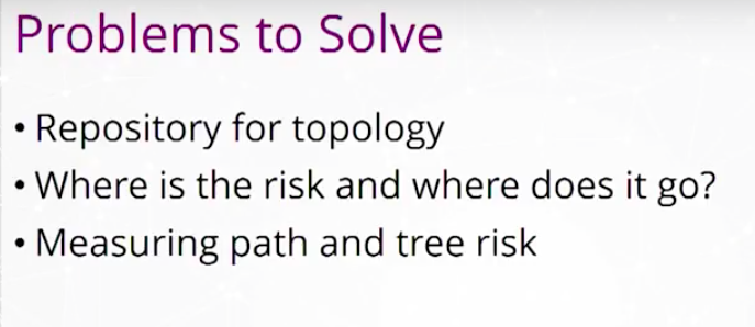
At AIG, we’ve had a few problems to solve. I have those problems listed below. When we realized the potential of what we were doing, we went full-tilt. We wanted to make full use of the attributes as we connect them to the objects and the topology.
Lately, the business leaders of AIG have approached us and said that they need to draw process maps for the whole company, each unit at a time. They also want to associate those process maps with particular applications that hold explanatory data.
Step one is a repository for topology. That’s what the IOE does first and best.
Secondly, where’s the risk and where does it go? I think of risk as a failure to point. Risk would be mostly your IT failures, failure of an application database and failure through risk propagation.
Measuring path and tree risk is our most complicated assignment. We originally started on a relational database years ago. We used it to store our infrastructure diagrams.
We went to the vendor and we said we need to do some pretty complex queries now. Complex queries involve the ability to go 20 hops back on 100 nodes. In addition to that, we need to know some particulars about the topology. The vendor came back and they said that nine hops is the most we could do in a reasonable amount of time and after 10 hops we fall over.
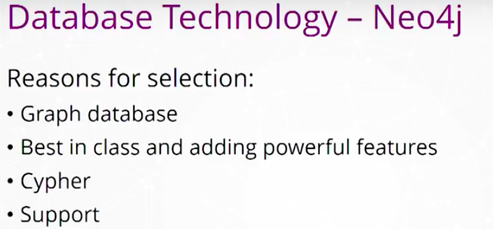
That made us realize, either we need a new technique or we need a new technology. That led us to Neo4j. Neo4j is best in class, and they are adding powerful features like Kettle. Cypher is the language that will most likely be adopted by the ISO to be the GQL, which would be the standard graph query language.
After I found Neo4j, I looked at their graph visualization partners. I looked at all of the fine companies, but one stuck out in particular. That was Tom Sawyer Software.
Tom Sawyer Software’s core competency was exactly what we needed. The data flow diagrams we were looking at were the ones they had been working for a long time.

In something like the IOE, the danger is if the information gets stale. We create a Visio diagram and within moments, it’s out of date. That is a particular problem when you’re advertising to the world that you have the latest and greatest in your topology.
My number one way to mitigate that risk is to give the people something they want to use, not something they have to use. Tom Sawyer Software said they’ve been working along those same lines for two decades. That cemented our relationship.
The Four Components of the Integrated Object Environment
Below are the four components of the Integrated Object Environment. We also included the patent-pending concept by AIG using two technology components: a graph database and a data visualization layer.

You have Tom Sawyer Perspectives for the graph visualization and then you have Neo4j. Then there are two content components, diagrams and attributes.
Data Attributes
Our attributes are what Neo4j calls properties.
Some people call this reference data, structural metadata, or characteristics. It’s all the same for us. Those attributes are used to run queries, to go to different dimensions, to be used in algorithms and eventually to be used in optimization.
Visual Diagramming
Whether you work in financial services, in the brokerage business or in insurance, there’s no one person who really knows the comprehensive, end-to-end diagram structure.
Say you get a bunch of people in the room, and ask: How does this work? Everybody’s trying to get to the truth. How do I send this information and get to the source of the truth? If you are really disciplined at proper diagramming, you will be able to do that. That may mean you have to get to subject matter experts who are outside the room.

Data Visualization Standards
The second key ingredient are the standards.
We developed company wide standards a couple of years ago for analytical infrastructure. This was seen by the business side.
- What are the shapes we use?
- What are the standard shapes?
- What are the best practices?
Then we then take what we learn from the subject matter experts, put it into a standardized Microsoft Visio diagram, knit those together and load it into the IOE.
There are two key ways to differentiate a depiction of data flow.

First, we simplify it. This is incredibly complex. We think about network view, that’s failure at a single point.
We prefer the linear view. Consider financial services companies – like life insurance companies – as consisting of factory floors of databases, information processing tools, delivery tools and models. These are all delivering a calculation to the business to drive profitability, to sell premiums or to ensure compliance.
Product Demonstration
Now we’re going to get to the demonstration of the product.

The below is from a video done of an IOE proof of concept with Tom Sawyer Perspectives application.
I want to work through in order of complexity and touch on the fact that it’s a process map repository. More importantly, I’ll show you how to take attributes and map them to a different dimension. Lastly, we will take attributes and put them into an algorithm.
Tom Sawyer Perspectives
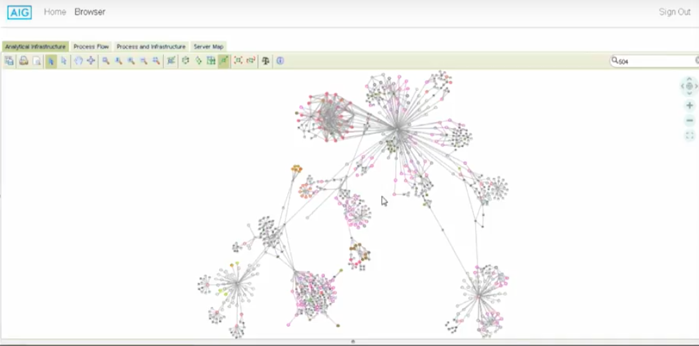
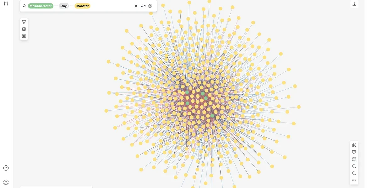
We’re in Perspectives. You’re looking at a 2000-object infrastructure, data, databases, models, information process tools and data delivery tools. Imagine trying to do the below in a Visio diagram.

We’re going to select object 504 and then isolate it. We want to isolate the upstream flows into this object. Then we want to isolate the downstream flows.

Our data flows are captured as nodes in our Neo4. You see they’re color coded. Those colors actually are informed by attributes stored in Neo4j.

We’re now going to isolate this topology from the overall topology. Now you have the opportunity to query just this selected opportunity or this selected topology on its own.
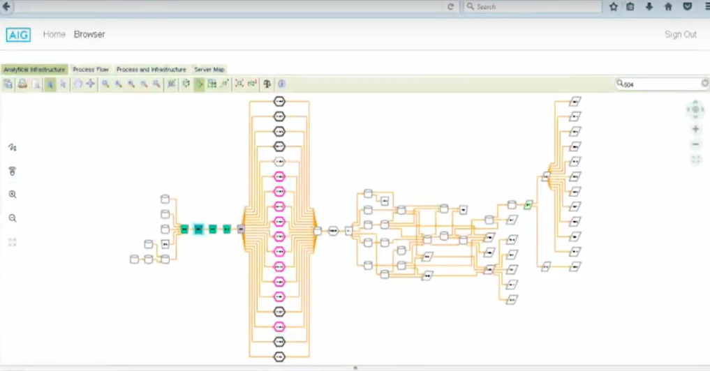
You’ll notice that the above is an end-to-end picture of the source databases. Bringing the database brings data into AIG. With downstream you have the data delivery tools delivering to the final user.
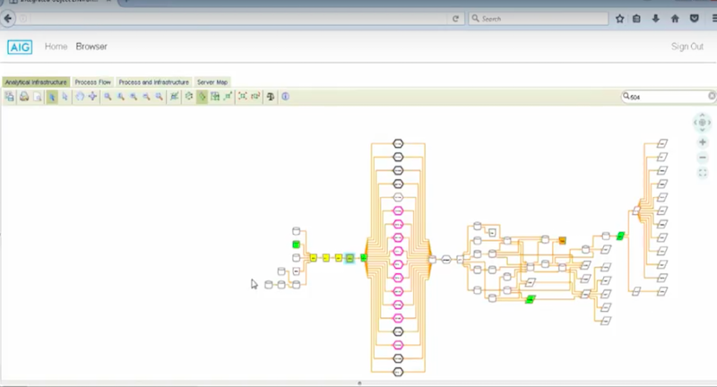
Now we’re going to switch the attributes that we’re color coding on. We’re switching now to a risk attribute that’s found in a number of different authoritative inventories.
These authoritative inventories are managed and governed already. This is not done in the province of the IOE. The IOE takes advantage of the attributes that already exist in the company and then leverages them.
Below is a heat map of the ranked order model risk scores. It also displays application risk scores and database risk scores. You could have a multitude of attributes.

In the case of the proof of concept, we loaded about 50, but we had the option of loading over 300 attributes.
Upstream Topology
Now we’re going to focus on six different tools that are in the far upstream side of this topology.

You’ll notice that 528 is a high-risk tool being supported by four low-risk tools. The first question asks is all the good and effort put into those four tools negated in 528? This means 528 items coming up as high risk or as questionable?
This is something that an authoritative inventory silo table database might not be able to show you. This is because you wouldn’t be able to see the topological connection. By the same token, what about the database? Database feeding is risky because it is potentially feeding poor data quality.
We’ve got a couple questions here and I like the phrase actionable insights, because it fits so well to what the basic premise of the IOE is.
Criticality Attribute and Risk
The next attribute we’re going to look at in the heat map is a criticality attribute. This shows the criticality of the four tools in the center below. These are fairly critical and need to be brought back online within 24 hours after failure.

How critical is this to the users? If it’s really critical, then maybe the green nodes should be yellow, or maybe even red. If it’s not so critical, do we deploy our resources elsewhere?
These are topological, actionable insights that you can’t easily see. Not only that, but as these attributes change in the authoritative inventories, they will change in the IOE. Try doing that in Visio. It would be an endless repetition of Visio diagrams.
Let’s suppose I own the below database, and I’m making a change. That could be a simple format change. I want everybody downstream to be aware of the change I’m making.
I select the object, and right click. Then say, send a notification to everybody downstream. We know for a fact that everybody downstream gets that information from authoritative inventories.
This process creates a real community for end users.
I work with groups, as either a business analyst or a project manager. I need them to understand that this is my world, but what my world does is feed another world. I don’t really know who those people are, and I don’t know exactly what they do with this information.
This gives you end-to-end awareness and accountability. If the data quality I’m getting from one space is not so great, maybe I should look a little further upstream. Maybe the problem is with the data coming into the company.
Propagation of Contribution
We talk about propagation of risk, but how about propagation of contribution?
Let’s say, you’ve been sitting in this job for four years and asking yourself: What exactly am I doing for the company? Graph databases are a way to see where the contribution of the teams and the individuals in the company are going.
Once you hook business metrics up to the downstream side, you are able to see a factory floor, the 500 people on different teams working on various tasks, and you could see that we produce X amount of premium revenue for the company. That would be your propagation of contribution.
Network View
I’m going to talk about our network view. This is another way to look at topology.
I like to think of this as where you see your failure to point risk. This topology pictured below is for a single use. There could be 20 to 30 uses that are shared among hundreds of tools that are all connected to this topology.
The question here is: Of the nodes that receive highly concentrated paths, what’s the risk of those nodes, and who owns them? Is there knowledge sharing going on? Every company loses knowledge share, but is that knowledge documented?
This gets back to the whole idea of diagrams and getting a dialectic of the truth. We’re going to go to using attributes as a method to go into different dimensions.
Physical Geography Data Visualization
We’re now going to a physical geography.
The below are fictitious locations of AIG server farms. This is where your tech risk people would say, now I know my servers are connected to my topology. If something fails in the servers and a part of my topology goes down, who will this affect?
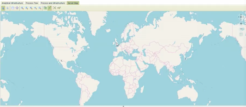
This gives a vertical integration on a different dimension.
Not only that, but this is just one of many dimensions you could use within a single company. Think about organization charts; that’s a dimension, that’s a topology. Think about the way cash flow runs in a company; that’s another topology.
Those attributes, or nodes – if linked to your analytical infrastructure – could go back and forth between different topologies.
Factory Floor Graph Visualization
We’re going to go back to the original view and look at our third and final use.
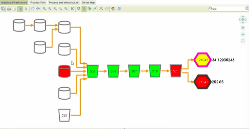
What we’re going to do is take risk attributes and use them in an algorithm to determine what the overall risk is of this topology set.
If we take the complexity of the topology set – or of the tree – and we look at it in comparison with the risk of the tools individually, we come up with an algorithm for measuring the systemic risk of the tree.
The beautiful thing here is, not only could you do this in a current state, but when the data model was built, we added a level of states within the data model. We are working out of current state, but you could have a simulated state.
You copy this topology, put it into the simulated state and ask questions. Suppose we consolidate databases, reduce one of those information process tools, then you see how it changes your risk metric, or your tree risk.
You could have more than one attribute in your equations just like you could have more than one equation.
In the below case, we kept it kinda simple. It’s a proof of concept, but you could get very fancy and ask if a tool is so many hops back. I want to completely ignore the risk because it’s gonna be mitigated away.

When working with attributes you’re dealing with attributes of risk, ownership issues, who the data steward is, how old is it, etc. It’s up to your imagination as to what your queries are going to be.
Staying Focused
I talked to one fairly senior-level exec he said, the IOE is fantastic. He said it could do a lot of things for this company.
“Your problem is not what it can do, “your problem is to focus on something it can do that saves money.” That’s where knowing how the company operates is required.
A common pushback we get is: “You’re trying to boil the ocean. You’re looking at the entire infrastructure of the company.” Our answer to that is, “Yes, we are.” That’s where the real benefit lies. It doesn’t have to be done all at once. Instead, we go piece by piece. Put a piece in, see if it works, get your benefits. Put another piece in, and all the while, you’re learning.
Conclusion
To summarize, I want to say that diagramming is the heart and soul of the IOE.
You have diagramming and the standards that go with it. Then tying the attributes and tying the business metrics to topology and the collaboration. You have to remember that it’s a community tool that measures propagation of risk but also propagation of contribution and using attributes to go into different dimensions. Finally using your attributes for optimization, and this becomes an entry point into artificial intelligence.
Share Article


Explore
Related Articles


15 Best Graph Visualization Tools for Your Neo4j Graph Database

Empowering Open-Source Cyber Threat Intelligence Analysis With Graph Visualization
