Reveal hidden patterns in healthcare data: Graph analytics and the opioid crisis


10 min read

Let’s take a look at a topic that is front and center in all of our lives. We can likely all agree that the U.S. healthcare system has its issues.
Healthcare costs rise year after year as the quality of care and individualized attention we receive declines. Patients are prescribed painkillers as a first line of defense without trying to diagnose the root cause of their pain. While this overprescribing of opioid-class drugs is making pharma companies rich, there’s no denying the resulting abuse, addiction and loss of life is a dire situation.
In 2017, more than 47,000 Americans died as a result of opioid overdose, including prescription opioids, heroin and illicitly manufactured Fentanyl, a powerful synthetic opioid.

What can be done about this trend? After all, we all deserve better healthcare at a more reasonable price. Where is all the money going that we pay in insurance premiums each month? The answer lies deep within the data.
Whether we’re looking at healthcare data from the perspective of a government program office, managed care organization, insurance provider or pharmaceutical company; whether our end goal is to improve program integrity, reduce patient care costs, uncover fraudulent claims or increase market share of a particular drug, the challenge is the same. Healthcare data is voluminous and complex. It’s also feature-rich and highly connected.
Traditional statistical Business Intelligence (BI) approaches are rigid, prone to struggle under the volume, and may fail to uncover key insights buried deep inside the data. This is especially true when these insights are founded on connections within the data, and across multiple data sources.
To deal with the challenges of analyzing millions or billions of rows of data, traditional data analysis techniques often use sampling to reduce the volume of data to a manageable amount that can be processed by their traditional BI tools and techniques. While one can argue a sample is representative of an entire population, that approach creates a risk of overlooking outlier patterns that may be key to uncovering a fraud ring or a tiny community struggling with access to healthcare.
Recent innovations in machine learning (ML) and graph algorithms enable us to effectively and efficiently process these large, connected datasets in a way that’s not possible using traditional methods. We are not hampered by complex table joins, as with relational databases. Since graphs, by nature, are compact, one can analyze the entire dataset, down to the detail level without having to employ sampling or otherwise summarize the data. Graph-based analytical methods like clustering, centrality and betweenness quickly zoom us in to the answers we’re looking for.
Using the Neo4j Graph Platform, we focused on CMS Open Payments data, combined with several other complementary datasets to tell a story.
Triggered by current events, we were interested in exploring more about the development of the Opioid Crisis. In particular, we wanted to determine whether large pharmaceutical companies played a role in influencing physicians and hospitals to distribute large amounts of opioid-class drugs into the population.
For our exercise, we chose to use open, publicly available data to include the following:
-
- CMS Open Payments Data from the Years 2013-2015
This includes information about payments made by drug manufacturers and specialty pharmacies to doctors and teaching hospitals. The payments are for things like meals, entertainment, consulting or speaking fees, etc. Each payment is associated with a particular drug or medical device that they are trying to market.
- CMS Open Payments Data from the Years 2013-2015
-
- Medicaid Part D Prescription Data from the Years 2013-2015
This includes aggregated data for drugs and devices, showing number of doses prescribed by a certain provider over the course of a year.
- Medicaid Part D Prescription Data from the Years 2013-2015
-
- ARCOS FOIA Data
This data tracks the path of every opioid pain pill from manufacturer to pharmacy in the United States from 2006 through 2012.
- ARCOS FOIA Data
-
- The NPPES NPI Provider Registry
The NPI Registry Public Search is a free directory of all active National Provider Identifier (NPI) records.
- The NPPES NPI Provider Registry
-
- The FDA NDC National Drug Code Directory
Drug products are identified and reported using a unique, three-segment number, called the National Drug Code (NDC), which serves as a universal product identifier for drugs.
- The FDA NDC National Drug Code Directory
After some initial cleansing of the data, we loaded the data into a Neo4j graph database using the schema below:
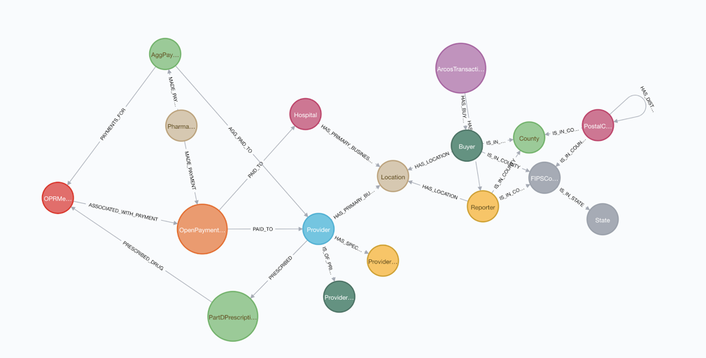
Since the CMS Open Payments Data uses a provider ID that is not the same as the NPI used in the Medicaid Part D Data, we first needed to perform entity resolution to identify common providers. We did this by comparing the providers’ first and last names along with addresses of the office locations associated with each provider.
We geo-coded the ARCOS Data by county and state, based on the zip code of the retail pharmacy or distributor. Although we won’t be exploring the ARCOS data as part of this blog, we thought it would make an interesting follow-on activity to look at opioid distribution patterns geographically across the United States to give insight into problematic geo-locations.
To initiate our study of the data, we used BI-type reporting to see the top physicians who received the highest value of payments related to opioid-class drugs from large drug manufacturers. Subsequently, we could use this information to determine which physicians warrant a closer look.
To do this, we ran a simple Cypher query that shows the top physicians along with the total amount paid, total number of payments, drug name and number of doses prescribed from the Medicaid Part D Data:
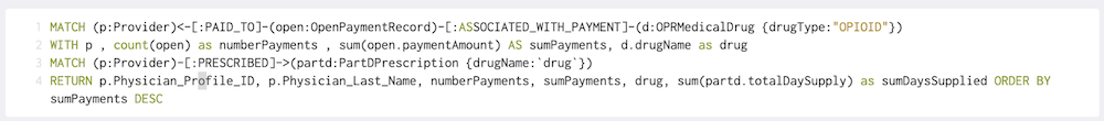
The results show us the highest “paid” physicians we might want to take a closer look at:

It’s interesting that the drug “SUBSYS” comes up as the drug name for all of the top payees. Subsys is a Fentanyl sublingual spray manufactured by Insys Therapeutics that was approved in January 2012 for use by opioid-tolerant adult cancer patients to treat pain. Subsys was a relatively new offering in the 2013-2015 period data we’re looking at, and it’s easy to see why it would be heavily marketed.
Looking at the report, it may be prudent to take a closer look at Dr. Chun, who scores highly for both number of payments received and total dollar amount, and has also prescribed close to 12,000 doses of Subsys. An analyst could examine this particular physician in the graph using natural language searches within Neo4j Bloom, a data visualization tool. Let me demonstrate.
Within our graph, we have represented the numeric CMS Physician Profile ID as an indexed property on the Provider node. A keyword search on the Profile ID 177180 will quickly expose this particular provider without having to search through the 280 million nodes in our graph.

Looking at the list of neighboring nodes, we see that Dr. Chun is an Allopathic and Osteopathic physician who specializes in pain medicine and has received a total of 636 payments from pharma companies over the years 2013-2015.
We also know, from the BI report above, that 224 of these payments were related to Subsys. Next, if we look at the 11 neighboring Location nodes, we can see that all of Dr. Chun’s offices are located in and around Sarasota, Bradenton and Lakewood Ranch, FL.

Let’s select one of the neighboring Open Paymentnodes to examine more closely. You can reveal neighboring nodes in Bloom by right clicking on the node and selecting “Expand.” This action reveals two neighboring nodes, one showing where the payment came from and the other showing which drug it’s related to.
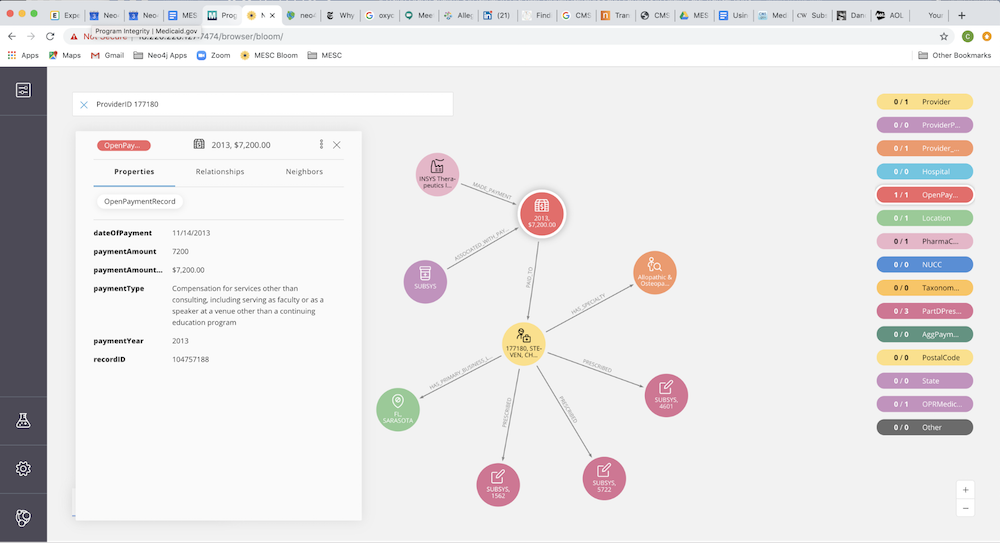
Taking a closer look at the details of this Open Payment, we see that it was paid by Insys Therapeutics, Inc. (the manufacturer of Subsys) for the amount of $7,200 in compensation for “services other than consulting.” This category is a little vague. Dr. Chun could have been a speaker at an event, or this payment could be for something else. Looking further into the data, we see there are repeating payments with similar amounts and descriptions.
Next, let’s examine neighboring nodes containing Medicaid Part D Prescriptions data. Doing this, we can see the amount of SUBSYS Dr. Chun prescribes by year.
So we are starting to get the sense this particular physician and/or his associates or partners may warrant further investigation. At this point, the analyst may want to involve a graph analytics expert or data scientist to explore connections and hidden networks within the graph.
For example, we can continue to look deeper into the data to see what other opioid-class drugs Dr. Chun was getting paid for and prescribed. We can take a look at other physicians in his practice, geographic location or other physicians who were paid by Insys Therapeutics.
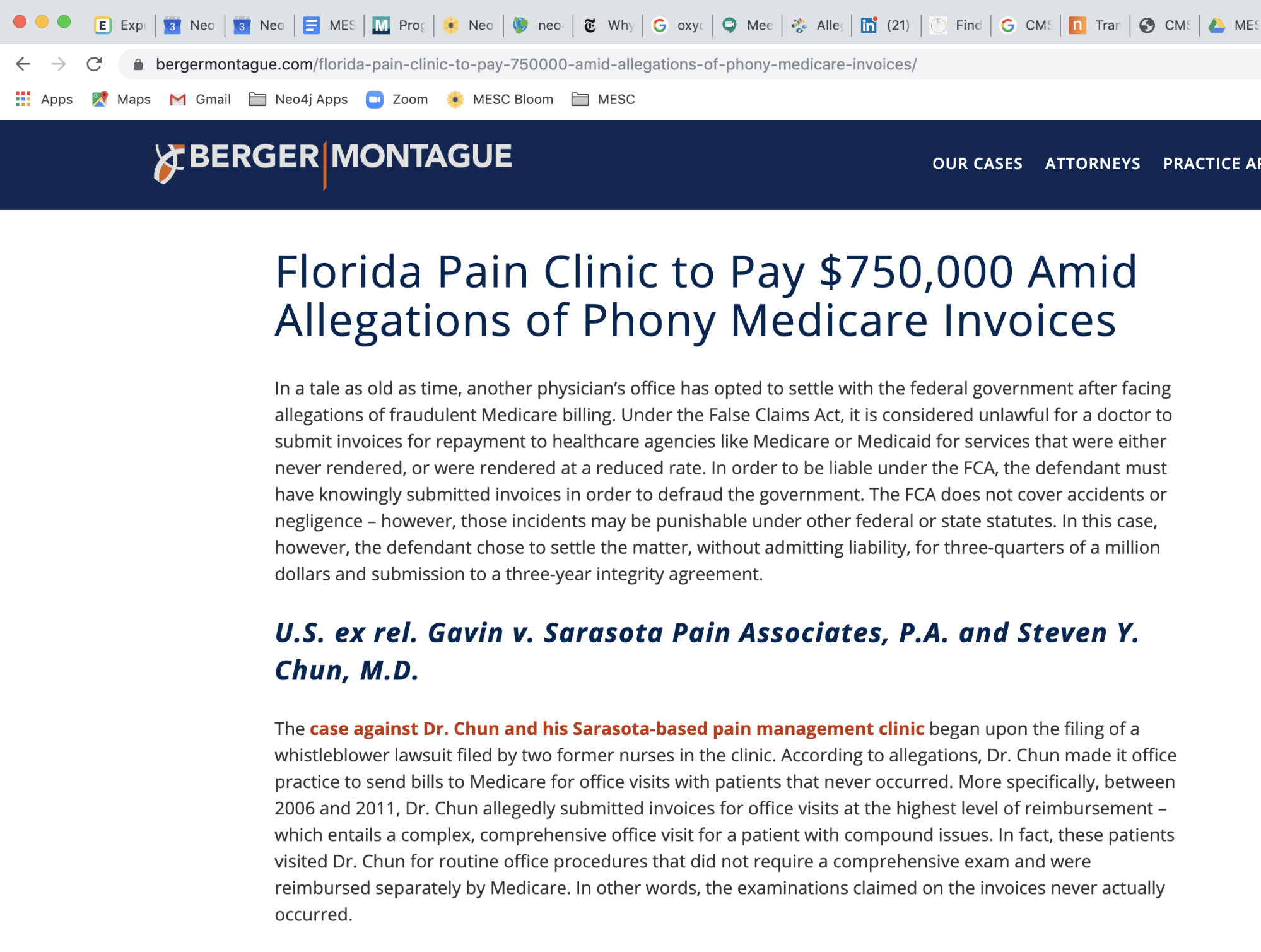
Since we are looking at data from the past, most likely, if there was something of interest here, it has already come to light in the public eye through a news article or litigation. Out of curiosity, we ran a web search on Dr. Chun to see if anything has been published.
Through our web search, we discovered that in 2014 Dr. Chun paid a $750,000 fine to settle a claim with Medicare for fraudulent activities at his Sarasota Pain Associates clinic. Between the years 2006 and 2011, Dr. Chun submitted invoices to Medicare for expensive complex, comprehensive office visits with patients, when the visits were actually for routine office procedures.
[image 9]
We also noticed that Dr. Chun is still a practicing anesthesiologist in Lakewood Ranch, FL. A 2018 article in New York Times Magazine titled “The Pain Hustlers” talks about Dr. Chun (among others) and the shady payments from Insys Therapeutics categorized as “speaker fees” that served as kickbacks to physicians for prescribing the potent opioid Subsys. Dr. Chun was one of their primary payees.

Image via the New York Times
With the power of Neo4j Bloom, along with some openly available healthcare data, we were able to, in minutes, without writing any complex algorithms, zoom in on a physician who turned out to be both an influenced opioid prescriber and a Medicare fraudster.
We’re curious about what other valuable insights might be contained within this graph, and what might we find once we combine the CMS Open Payments and Medicaid Part D data with the ARCOS FOIA data, or with openly available demographic data based on location. Perhaps we may want to add data about associations between physicians in the same medical practice, social circles or partnerships. Unlike relational databases, graph schemas are dynamic. It is quite painless to expand the graph to include other interesting data.
In our next installment of this blog series, we will explore further insights gained by merging complementary data, along with machine learning and AI graph algorithms into the mix.
Learn about the power of graph algorithms in the O’Reilly book,
Graph Algorithms: Practical Examples in Apache Spark and Neo4j by the authors of this article. Click below to get your free ebook copy.Get the O’Reilly Ebook
Share Article


Explore
Related Articles

Neo4j Named “One to Watch” in Snowflake’s 2026 Modern Marketing Data Stack Report
POLE+O: The 5-Type Ontology That Solves the Hardest Part of Building a Knowledge Graph
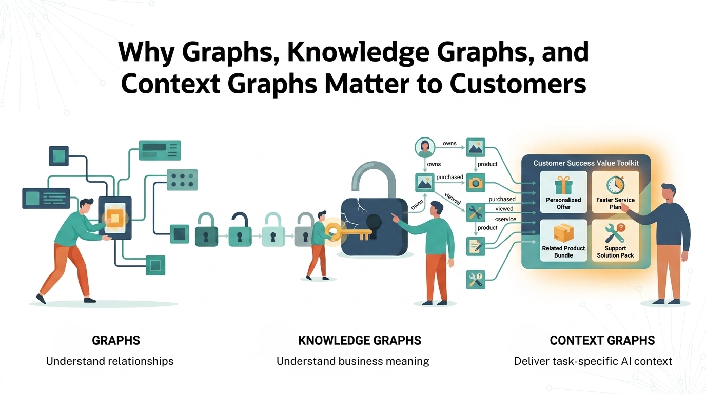
1 of 3: The difference between a graph, a knowledge graph, and a context graph