
Revealing the Life of a Twitter Troll with Visual Timeline Analytics

Solutions Engineer, Cambridge Intelligence
3 min read
Editor’s note: This presentation was given by Katerina Baousi at NODES 2021.
Don’t you ever wonder what the daily life of a Twitter troll looks like? Using Neo4j, I was able to build an application that reveals it. I’m going to introduce you to a different way to visualize your graphs, going from nodes and relationships to an approach we’re calling visual timeline analytics, and show you in a demo the key findings like how they exploit tragedies, hashtags, and fake personas to stir up hatred.
What Is Visual Timeline Analytics
When I say graph visualizations, what image comes to your mind? Probably something like this.
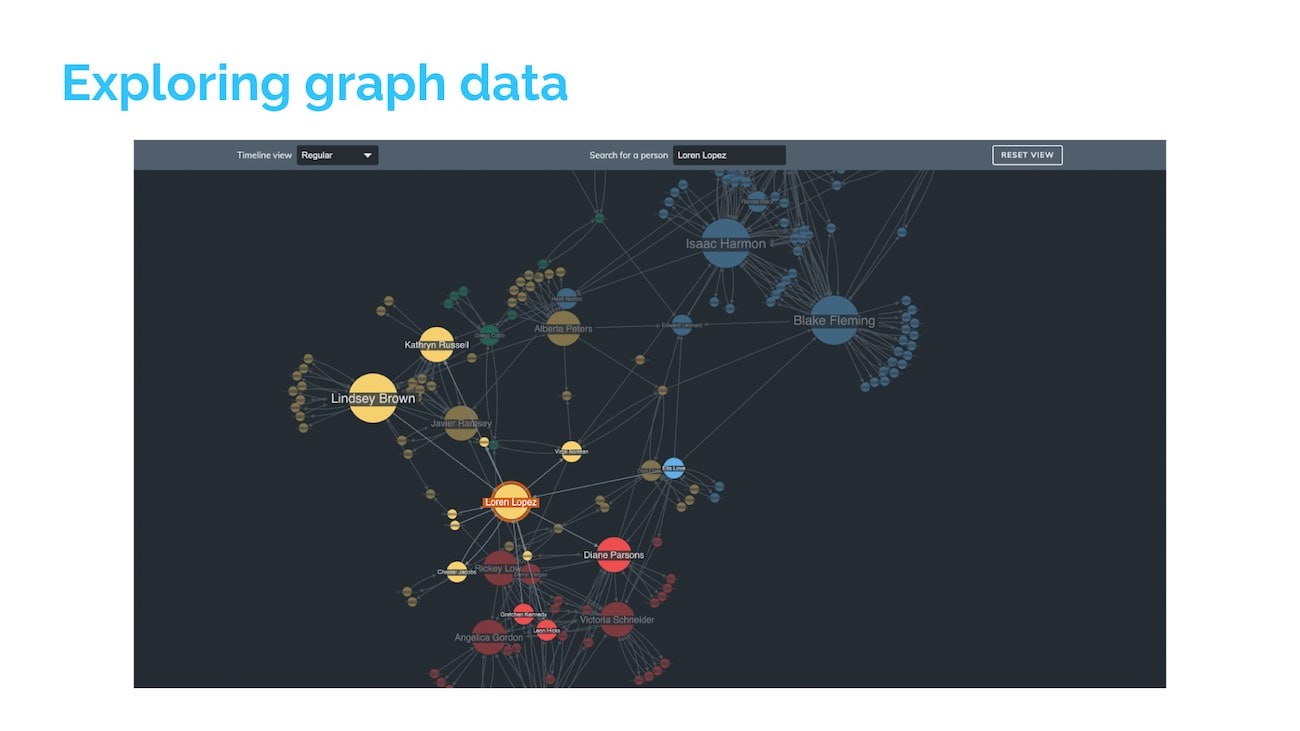
We’re all familiar with the node link approach to graph visualization. It’s a fantastic way to understand graph data. It’s flexible. It’s scalable. It’s intuitive even if your end users have never worked with graph data before.
While this approach can help us see what, where, and how, it can be difficult to understand when. That’s where visual timeline analytics come in.
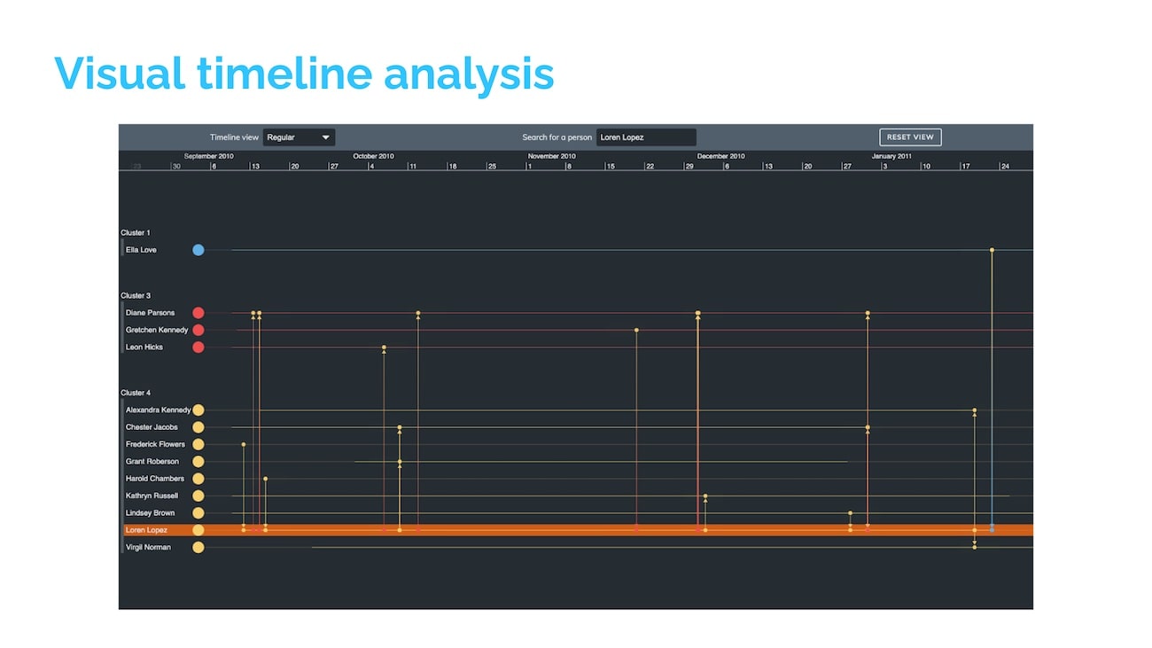
What we are seeing here is a screenshot of an interactive timeline application built with our KronoGraph toolkit. In it, time passes from left to right and it’s populated with entities – in this particular example, the people that exchange phone calls and events and the phone calls that were exchanged between them.

As you can see, this is a great way to explore time-based graph data to see how connected events unfold over time. We can see the transition between the two graph visualization models. Our familiar nodes become timeline entities. The actors of our dataset and the links connecting them become events, the actions performed by the actors either in a specific time or over a particular period of time.
The timeline model is just as flexible and scalable as the node link approach. Timelines and lone link charts also work seamlessly together to provide effective insights to our end users.
To show you the power of visual timeline analytics, I’m going to focus on an example we created for fun. We looked at the Neo4j Twitter dataset and asked: What is the daily routine of a Twitter troll? Before we jump in, I want to discuss the architecture of the application.
Building a Neo4j Integration
In the backend, we have initialized the Neo4j sandbox made available by Ben Popken and NBC News, which contains 400 troll accounts, 20,000 hashtags, and 200,000 tweets linked to Russian attempts to influence the 2016 presidential election. The backend controller is created using Node.js, and the connection between the backend controller and the sandbox is established via a Neo4j driver.

The data from the backend flows to the front end where they are translated into the appropriate format before they are loaded into the KronoGraph timeline component and the ReGraph chart component.

This translation is more well-presented over here where we are looking at the data present in the Neo4j schema, and this is basically translated to events containing the information and timestamps of tweets, entities-split and color-coded into trolls, mentioned users, and hashtags.
Demo
Now it’s time for the live demo of the application:
Conclusion
This was an example of the numerous use cases that benefit from timeline analytics visualizations. Of course, there are many more areas that can actually use this approach to infer more information, more underlying suspicious activity within them, such as cybersecurity, cryptocurrency, law enforcement, and fraud detection.
The toolkits we used for this example include KronoGraph, our latest product, and ReGraph for the chart component. If you’re interested in trying this out on your own, you can contact me directly or visit the Cambridge Intelligence website.
Share Article


Explore
Related Articles


10 Inspiring Projects to Spark Your NODES 2024 Presentation

