Revolutionizing the energy industry with graphs

Founder & CEO, enXchange
9 min read
Editor’s Note: This presentation was given by David Swank at GraphConnect 2022.
Before ENX, I was working at energy utilities, where despite the many systems and technology put in place, there were still many gaps. Those gaps weren’t really about infrastructure but were instead about how to gather and evaluate intelligence around what is occurring in the utility grid.
Microgrids
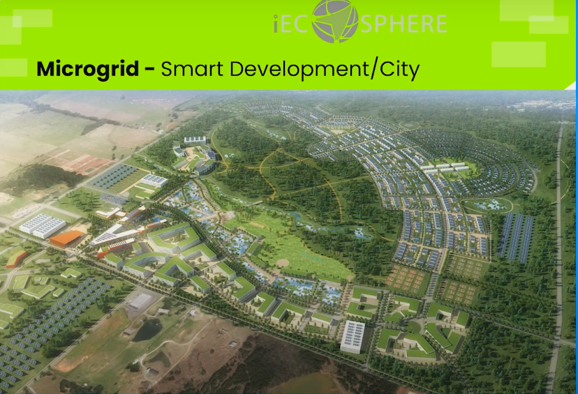
In 2014, my team was creating a microgrid of about 700 acres where we included solar, battery storage, and smart grid technologies. When it comes to being smart, it means we have the ability to make intelligence intuitive and to give infrastructure the ability to communicate with each other.
The major challenge we had in building this grid was the lack of a common platform for everything to connect over. In this industry, we really need to be thinking in terms of how to get electrical power from generation to toaster. This requires understanding transmission beyond the building meter.
ENX: Why-how-what

The electrical market is changing. 90% of the data collected on electrical grids has been collected in only the last 5 years, and 80% of that data is totally unstructured. That means that less than 4% of the data utilities collect is actually being used. Still, the industry is spending hundreds of millions of dollars to generate and analyze this data. The scale of data in electrical generation networks is mind blowing: a smart city will generate 250 petabytes of data in one day, a building alone will generate 150 gigabytes daily, and we’re on track to add 220 million connected devices every hour.
At ENX, we questioned how we could bring all this data together in one space and gain actionable insights from it. Answering this question led us to create a virtual grid from generation to toaster. Our virtual grid follows the same pattern as the physical grid, connecting assets, infrastructure, the people who operate them, and their behaviors.
Google “electricity transmission networks” and what you’ll see looks just like a graph. That’s because the utility network really is a graph. The physical architecture and the database architecture mirror one another.
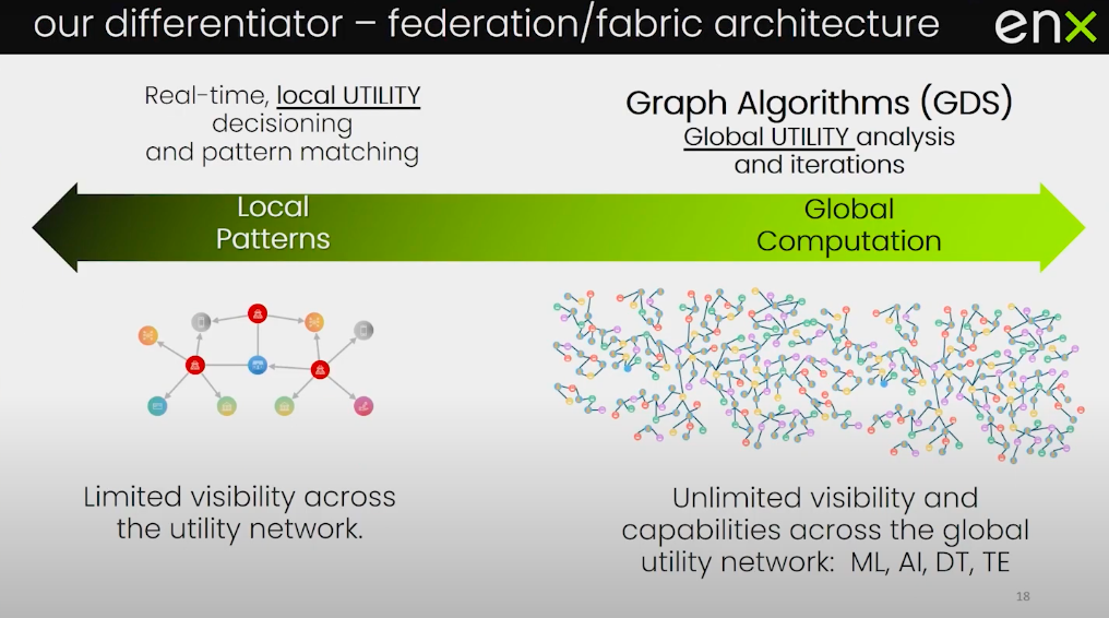
A challenge for making today’s grid as efficient as it can be is that transmission is linear, moving only in one direction. If the grid were bidirectional, power could move in different ways and could allow homes, usually consumers of energy, to become generators, sending electricity back into the grid. By setting up a graph over the entire grid, we can model the impacts and benefits of a bidirectional grid, without having to change any physical infrastructure. When it comes to utility data, all analysis has to be instantaneous and in real-time. We don’t have the ability to tell a consumer that we’ll get their lights on in a week once we figure the data out.
Electrical utilities have always been about getting an electron to a house, and it’s all we care about. We need to make sure we always have enough capacity. On average, we spend 30% more on infrastructure and operating costs because we want to make sure we maintain enough capacity. What we’ve never really done well is forecast the source of electrical demand or measure our generation level against the load required. When we get this wrong, we see rolling blackouts. What we do in our ENX platform is uncover these risks so we can apply prescriptive actions.

Graph technology has enabled us to problem solve inside our ENX Insight Center. Here we can take our virtual utility grid and use our scenario builder to run different scenarios to assess risk, such as line loss, load factor, and vegetation management.
ENX Energy Platform & interoperability
What does it take to build an energy platform? I like to quote an article from Accenture on what it takes for a business to become a champion:
“Platform Interoperability: [Businesses] invest in and scale collaborative platforms while avoiding the build-up of ‘siloed’ solutions.“
“Interoperable” means platforms that have the ability to share data. We have plans to spend much more on electrical infrastructure, but little of that money is earmarked for data integration. We add every asset to the grid if we’re not including it on a virtual data architecture. We’re just building siloed data systems rather than systems of systems.
An energy platform must have the ability to connect all physical assets and devices in one platform. It must have the ability to not just connect physical assets, but also connect people and their behaviors to understand what’s going on. Oftentimes this interoperability is hard to find because companies choose to use proprietary technology in order to create a captive audience. However, graph technologies are forcing more open and agnostic architectures. At ENX, our platform is all about connecting data beyond the generation level to also include storage, usage, and efficiency. While the data for these systems is usually stored independently, these systems do not work independently. The only way for getting electrical networks to work harmoniously is viewing them in a holistic way.
One new power concept is called GEB, which means Grid-interactive Efficient Building. That means a building should talk to the grid and answer and respond to useful questions. What’s happening temperature-wise outside? What’s today’s occupancy level inside?
If a building knows its occupancy, it can intuitively adjust its thermostat to not waste energy.

While people are interested in our platform, what they care most about are their energy bills and assets, the environment, and resiliency. Our platform is designed to visualize and create intelligence across all of these factors to answer the power network questions that most affect us.
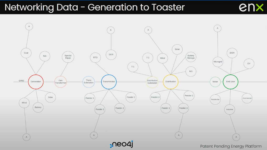
An example of generation to toaster is in the image above, where we’ve been modeling the graph, starting with generation, all the way on the left, to toaster, all the way on the right. Within each of these nodes is a sub graph: a model at the transmission level, a model at the distribution level, and a model beyond the meter. This interconnected model breaks down siloed nodes and brings the information into one system where users can log into our Insight Center and see what is relevant to them. A generator can see a generation. A transmitter can see transmission. Distributors can see distribution.
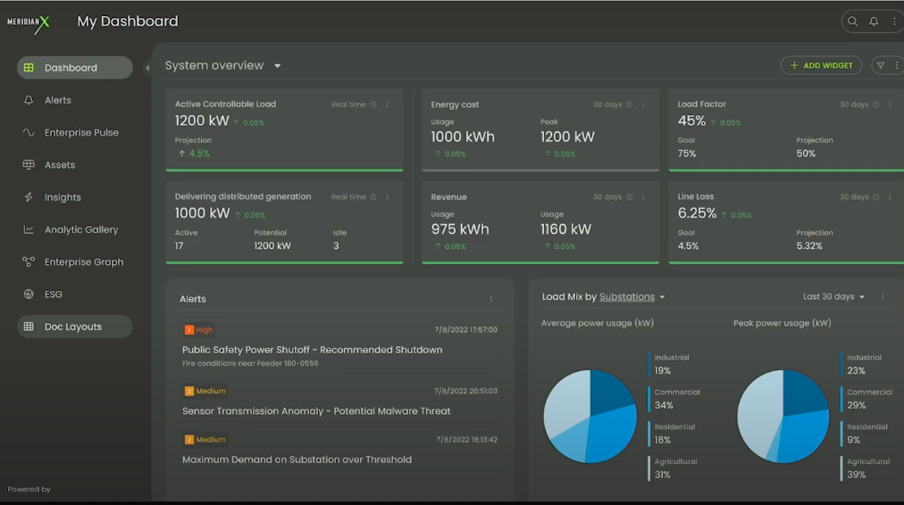
This is a screenshot of our Insight Center home screen, where on the left we have several applications empowering users to create their own dashboard. All in one place you can see the analytics from every single asset or any analysis that you’ve done across your system. You can go into our analytic gallery and choose any analytics associated with whatever part of your enterprise you want to see.
Insight Center knowledge graph
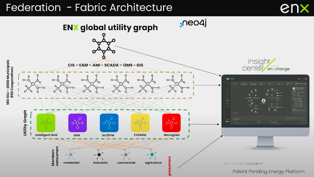
We have been building out a global utility graph and structuring data that comes all the way from customer information systems, energy asset management systems, advanced meter infrastructure, the system controlled data acquisition, outage management information, geographic information, and making sure we structure all of that so it fits utilities’ businesses.
We also provide utilities with the ability to add structured data about new, disruptive technologies: When a solar array comes on your system, we have a graph model that will ingest that data from the solar array. If an EV charger comes on your system, we already have a graph model for it. We can create a virtualized experience of the graph and push all our findings into the Insight Center.
By joining all this data together, we can look at patterns beyond just a local utility and start to look at global capability. By looking at grids in a virtual way, we can do machine learning on that model, compare weather patterns, and compare the impact of different devices. We’re going to continue to see more sensors that can sense different aspects of the grid. How amazing would it be if we could bring that into a global utility graph, comparing it across a larger data set rather than just one local utility?
Transformative use cases with AI/ML
We’re using our virtual network to analyze the Oregon Trails Electric Cooperative and help manage their grid.
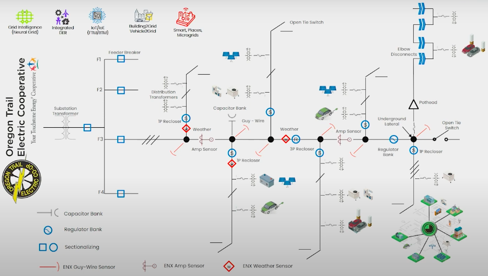
This is a diagram of their grid. If it looks busy, it’s because a grid is a very busy network. It includes substations, feeder lines, weather sensors, and wire sensors. Combining these together allows us to measure the strain on the grid and allows us to anticipate when we need to shut down a substation so it doesn’t start a fire. We can use the graph to find alternatives, so that instead of shutting down a substation for hundreds, if not thousands of customers, they could solve the problem by shutting down a feeder line that only affects a few customers. Are we going to expect to be without power for hours or days? As customers, this is the kind of question we’ll expect our utilities to answer during major events on the grid.
On February 14, 2021, we had rolling blackouts of substations throughout the ERCOT grid in Texas. During this time, the system had to shed 16 gigawatts of power because they lost 35 gigawatts of generation. At the same time, due to the cold weather, 35 gigawatts of heating came online at that same time. People lost power and people even died because of this. To shed some of that load and never shut down a substation could have saved lives. With a harmonious view of the grid, this could have all been avoided. That’s what our platform does. And the reason we can finally do this today is because of graph technology.
Share Article


Explore
Related Articles

Neo4j Named “One to Watch” in Snowflake’s 2026 Modern Marketing Data Stack Report

Zero-Copy Graph Reasoning on Snowflake: Getting Started With Neo4j Virtual Graph