The illusion of consumer choice: A tale of cereal and knowledge graphs

Senior Pre-Sales Consultant, Neo4j
7 min read
Here at Neo4j, we have a motto: Graphs Are Everywhere. This blog series was inspired by all the times I encountered graphs and “graph problems” in my non-working life. Hopefully these posts help you see more graphs in the world. If you’d like to share graphs you find in the wild, leave a post on the Neo4j community site, or send me a tweet (@joedepeau).
I don’t know how I came across it (probably during one of my nightly Flipboard binges), but I recently read an article about “the illusion of consumer choice.”
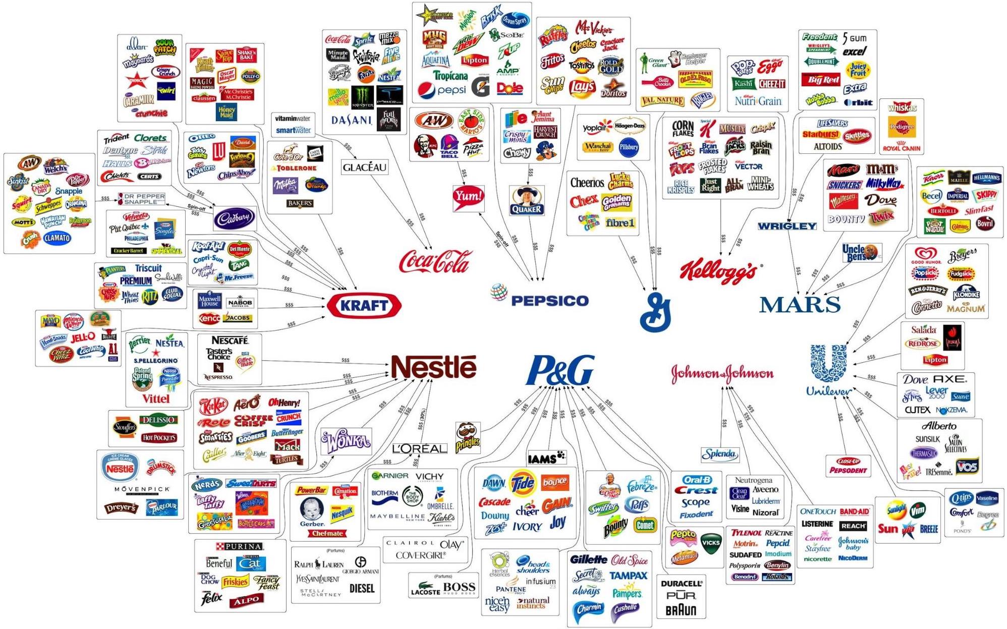
The gist of the article was that a handful of large companies – about 10 – make up the vast majority of products available for purchase in the average grocery store. You might be standing in the cereal aisle, trying to decide among dozens of options. But no matter which cereal you choose, chances are your money ultimately goes to one of a very few companies.
What really caught my eye, though, was the infographic that accompanied the article.
Image courtesy of nutritionreview.org
You know what I thought when I saw that, right? Hey, that’s a graph!
Of course, I figured it’d be interesting to load this information into the Neo4j graph database and see what we might be able to do with it.
First, I had to do a bit of research – the above infographic is slightly out of date, and some brands have changed ownership since it was created. I dug around Wikipedia, reviewed the brands list on each company’s website, and found a few more recent infographics. I took all the information I found and fed it into Neo4j.
Here is what these 10 companies look like as nodes in a graph, related to the 359 brands I also created:
MATCH path = (:Brand)-[:OWNED_BY]->(:COMPANY) return path

You can see company nodes in red, and their brands in blue. I edited the visualization a little to restrict results to the original 10 companies from the infographic (I’ve added a few more companies, but we’ll come on to that later).
That’s a pretty good list of brands, covering a lot of product types: health, beauty, drinks, cereals, pet food, baby care and more. And I could definitely see how much of the food I buy really does come from these 10 companies.
I learned a few other things as well. I had no idea that Maille, the high-end French mustard company (who sells the most amazing Black Truffle Mustard with Chablis White Wine, just sayin’) is owned by Unilever? Unilever also makes Colman’s, the classic English mustard. [Insert Brexit joke here.]
In the interest of trying to follow a “scientific” approach for adding more data to my graph, I went on a reconnaissance mission, visiting two grocery stores nearest to the Neo4j London office – Tesco Express and Sainsbury’s Local. The goal was to see just how many products came from the 10 aforementioned companies.
I decided to focus on cereals for my test. Each store sold a good range of cereals – surprising, since both are pretty small city-center retail spaces! I made a note of every cereal that was available (excluding store brand cereals). I then put these cereals into Neo4j, which gave me the following graphs:
// Cereals for sale in Tesco Express
MATCH path = (:Store {name: ‘Tesco Express’})<-[:SOLD_IN]-(:Product)-[:PART_OF]-(:Brand)-[:OWNED_BY]->(:Company) RETURN path

// Cereals for sale in Sainsbury’s Local
MATCH path = (:Store {name: "Sainsbury's Local"})<-[:SOLD_IN]-(:Product)-[:PART_OF]-(:Brand)-[:OWNED_BY]->(:Company) RETURN path

// Cereals for sale in both Tesco Express and Sainsbury’s Local
MATCH path = (:Store)<-[:SOLD_IN]-(prod:Product)-[:PART_OF]-(:Brand)-[:OWNED_BY]->(:Company)
WHERE (prod)-[:SOLD_IN]->(:Store {name: 'Tesco Express'})
AND (prod)-[:SOLD_IN]->(:Store {name: "Sainsbury's Local"})
RETURN path

You can see a few more company nodes in these graphs than were included in our original infographic. I noticed cereals for sale from Weetabix and Associated British Foods, so I included those brands and companies in the graph for completeness.
There’s a pretty sizeable overlap in the cereal offerings at each store, with only a few available in one store only.
Taking a look at all the products that are available for sale in either store, we get this view:
MATCH path = (prod:Product)-[:PART_OF]-(:Brand)-[:OWNED_BY]->(comp:Company)
WHERE (prod)-[:SOLD_IN]->(:Store)
RETURN path

We can see straight away that Kellogg’s had the most products for sale in Neo4j’s local grocery stores. Doing some simple math, the breakdown of brands looks like this:

Honestly, that’s not as drastic as I was expecting!
Two-thirds of the cereals for sale at these nearby grocery stores are from the 10 companies in our original infographic, and one-third are from other companies. Of course, this was only a small bit of personal research, and I might get different numbers from a larger grocery store (or by combining results from many stores around the world). Still, a very interesting result!
One more thing: While doing my research for this blog post I gathered some documentation about each of the 10 companies from our original infographic.
MATCH path = (Documentation)-[:RELATES_TO]->(:Company) RETURN path
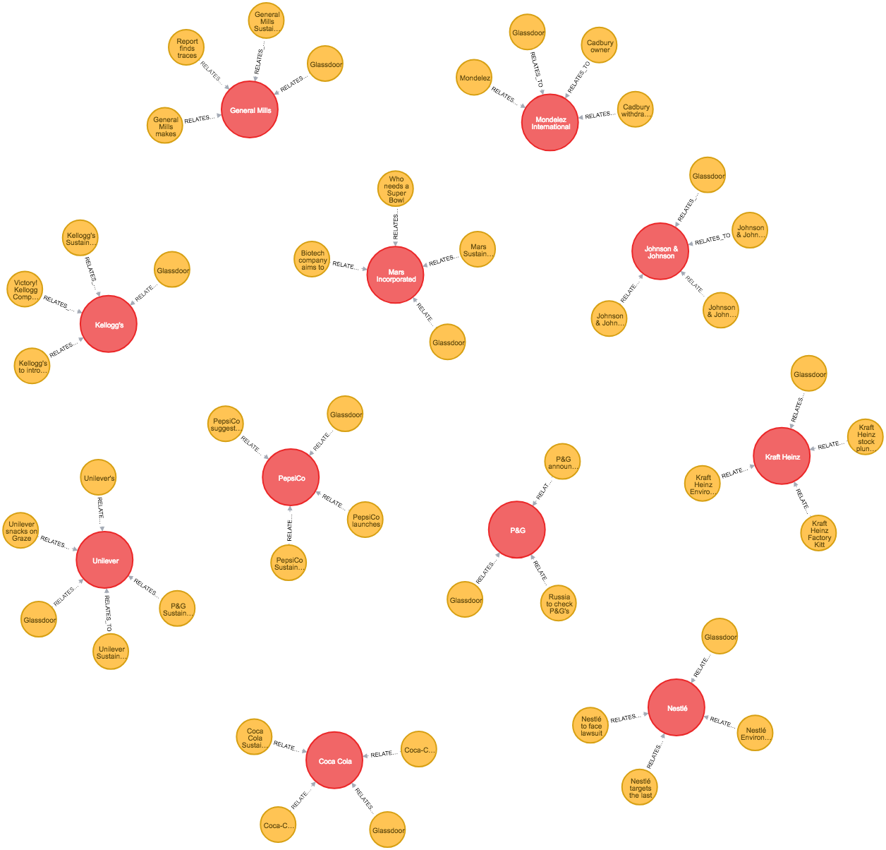
[IMAGE 8]
This is just a small sample of the information available on the web for each of these companies – a link to the sustainability pages on each of their websites, a link to their Glassdoor review page, and some random news articles plucked from Google search results.
My thinking was that – as a consumer, standing there in the grocery aisle trying to decide which product to buy – it might be nice to know a bit more about the companies making these products.
Do they pay a reasonable amount of corporate taxes in the country you live in? Do they support diversity in their work force, even to the very top of their organization? Are they working to support fair trade commerce or reduce plastic pollution?
Everyone has issues that they care about most, and being able to spend your money with companies whose values align with yours can be a very good feeling!
Anyway, all of this research has made me hungry – and has also made me realize how much I miss sugary American cereal. You can’t find Peanut Butter Cap’n Crunch anywhere in the UK, I’ve tried. So I’m off to crunch my way through a bowl of something right now. Until next time, happy shopping!

Like my previous post, this is another example of a knowledge graph – except this time, instead of mapping knowledge about tea we’re mapping knowledge about products, brands and the companies that own them. This is a similar concept to “ultimate beneficial ownership,” a term often used in the financial services industry to indicate a person or company which is the “ultimate beneficiary” of another company through potentially complicated ownership structures and financial transaction patterns.
It’s also similar to the way data was structured and used by the ICIJ in their Panama Papers and Paradise Papers investigations. Like our previous tea graph, the knowledge graph in this post could be used to power search engines or make product recommendations – perhaps based on what’s available in the grocery store you’re in, what companies you prefer to do business with and what values you want those companies to embrace. There are even apps aimed at the conscientious consumer. You might want to try one of them, like Buycott, to learn more about how you can “vote with your wallet.”
Share Article


Explore
Related Articles
Hybrid Search in Neo4j: Full-Text, Vectors, and Graph Topology with Cypher


A workbench for teams to query, explore, and visualize graph data
Neo4j Named “One to Watch” in Snowflake’s 2026 Modern Marketing Data Stack Report