The Customer Journey Is a Graph


7 min read

Editor’s note: This presentation was given by Matt Butler at GraphConnect 2022.
Bonsai Data Solutions and Cambridge Intelligence have worked together to help clients understand their customer journey. Bonsai is a business intelligence and data advisory company, and we’ve partnered with Cambridge Intelligence to help us build customer journey graph applications that support retail firms, startups and healthcare companies to modernize their marketing and business intelligence.
Customer Journeys
There is a key question behind customer journeys: Why did a customer make a purchase? At the end of the day, every one of my clients is really trying to answer this question. Business and marketing teams spend millions of dollars on advertising, promotions, coupons, data, orchestration, and execution– all to acquire and grow customers. Businesses understand the importance of this investment and are therefore desperate to understand what is working and what is not working.
Understanding what’s working and what’s not working in your marketing is not a new problem, but it’s a notoriously tough problem to unpack. In fact, there are entire industries built around solving this problem. There are two typical solutions to the problem of measuring customers: top-down and bottom-up. I’ll start by explaining those two approaches and then share how what we’re doing at Bonsai is fundamentally different from these two approaches and how our approach is better.
Top-Down Approach
If you have a background in statistics or math, you have heard of people doing a top-down analysis of how an action leads to a business outcome, such as sales, revenue, or customers. The typical way companies do this is to take all their data, summarize it, and basically smoosh it down into big macro totals using tools like statistics and multivariate regressions. For example, think of metrics like daily total sales or Nielsen’s GRP measurements for television views.
What is good about this? Statistics are rigorous and allow you to infer really interesting things, like how the weather impacted your sales. What is the disadvantage? Well, it’s expensive to pay for a statistician. Even more of a challenge is taking all that data and processing it to make it simpler, losing the useful richness that exists in the raw data. This leads to very general conclusions that aren’t always the most applicable, especially because the data can be months old by the time the analysis is complete.
Bottom-Up Approach
Digital analytics is the bottom-up way to approach this measurement problem. This measure is really common among industries which have a presence on the web, because they collect data every time somebody clicks on the website or responds to an email. If you’ve worked with Google Analytics or have used digital advertising on Facebook, Amazon or Google, then you’re familiar with this detailed, touchpoint level data. Our tool, Pyxis, incorporates this rich data and finds granular correlations of how activities lead to outcomes, like if someone clicked and then purchased later. Pyxis can track this in real time, allowing businesses to make fast decisions.
What is the negative to this approach? The data here is huge. Typically, data from different marketing systems are siloed, making them more manageable. However, with this approach, we combine the data to get the full context of what drove a sale. For example, this morning I bought a coffee from Starbucks. It’s very likely that Starbucks was told that a Google ad, email program, or loyalty program helped that sale. All these marketing programs are taking full credit for the sale. As far as these silos are concerned, there are three sales. Of course, the finance team knows there was only one sale, but which program caused it? None of this siloed data has any way of answering that question. In fact, they’re not even set up to answer that question.
Shared Challenges Across Both Models
The top-down and bottom-up approaches share some measurement challenges. For example, both have issues joining data. They both often miss critical dimensions and oftentimes there is no way to chain events together for a single customer. This chaining together of events is how we like to think about user journeys. Oftentimes, even if you have a way of joining data together using cookies or IP addresses, you won’t be able to join that information to radio ads in the same location.
There is also the question of how many times a marketing activity has to occur before a customer makes a purchase decision. For example, prospects often open emails about the things they’re looking to buy, but they might interact with this email and others like it many times before they ultimately make their purchase. The decision to make the purchase could have been made early on, but in digital analytics today only the last time they open an email before purchasing is given credit for the sale.
Are the Approaches Graphy?
Initially, neither of these two approaches struck us as being graphy. For example, if JetBlue airlines sees that we bought a flight from Boston to Austin on June 6th, what data are they looking at? Usually, it’s aggregate data: how many people are doing this? What are they paying in fares? Do I need to add another flight? This is not really a graph. Graphs are not about aggregations, but about the individual data elements themselves. The same is true for the bottom up approach. I can see what an individual customer is doing, but my analysis is not a graph because it only cares about aggregates, not what individual customers are doing.
These aggregates are useful and do allow me to improve my business, but seeing in detail the rich journeys individual customers take allows you to form a graph of what’s occurring and present that information as detailed customer journeys, user by user. This is exactly what we built in Neo4j Bloom and our own tool, Pyxis.
Bloom & Pyxis Demos
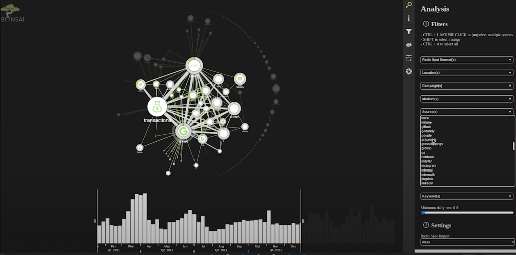
Pyxis is designed for business intelligence analysts who need to understand exactly what they’re looking at and want full control over what they see and how they interact with the graph. Pyxis allows them to control the UI from the interactivity standpoint and its look and feel.
We added a giant transaction node in the middle of the chart. There is no node in Neo4J called transaction because that’s not how we modeled the data, but from our users we found that this is what the user wants to see. This flexibility and structure allows users to customize the interactivity around paths and how users traverse their way through the graph.
Key Visual Feature: Grouping Nodes
The aggregation piece here is key because typically businesses don’t care what individual customers are doing unless they’re extraordinarily heavy purchasers. With aggregation, it allows us to answer from individual customer behavior what the group is doing. Grouping all those users together we can see how that group is connected to other things on the chart.
Key Visual Feature: Path Highlighting
Path highlighting allows us to see the typical journey for specific types of customers and prospects. Here we’d be able to visually see how they work their way through the marketing touch points to ultimately become customers.
Key Visual Feature: Performance
Performance is a challenge for any data application of this scale. If companies are collecting data on every single click and interaction that customers have, that can be a huge volume. Usually, you don’t actually want to display all of that to the end user, but in some circumstances, you do– especially if you can take advantage by grouping them in a simplified or summarized visual model. Pyxis has a great rendering engine to allow for those large charts when this visualization does make sense.
Win #1: Traditional Media Measurement
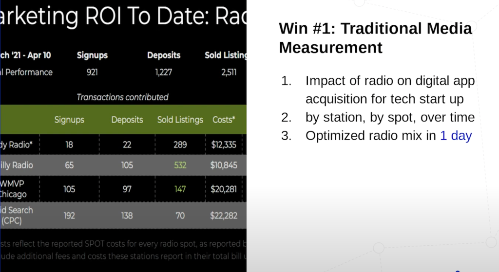
Time and again, we’ve seen that analytics projects that used to take companies 90 days to do instead take only a day in Pxyis. In addition, Pyxis can answer other questions our customers weren’t able to over these 90 days, including the effect of radio and what spots are working well.
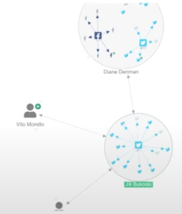
Win #2: Promos and Media
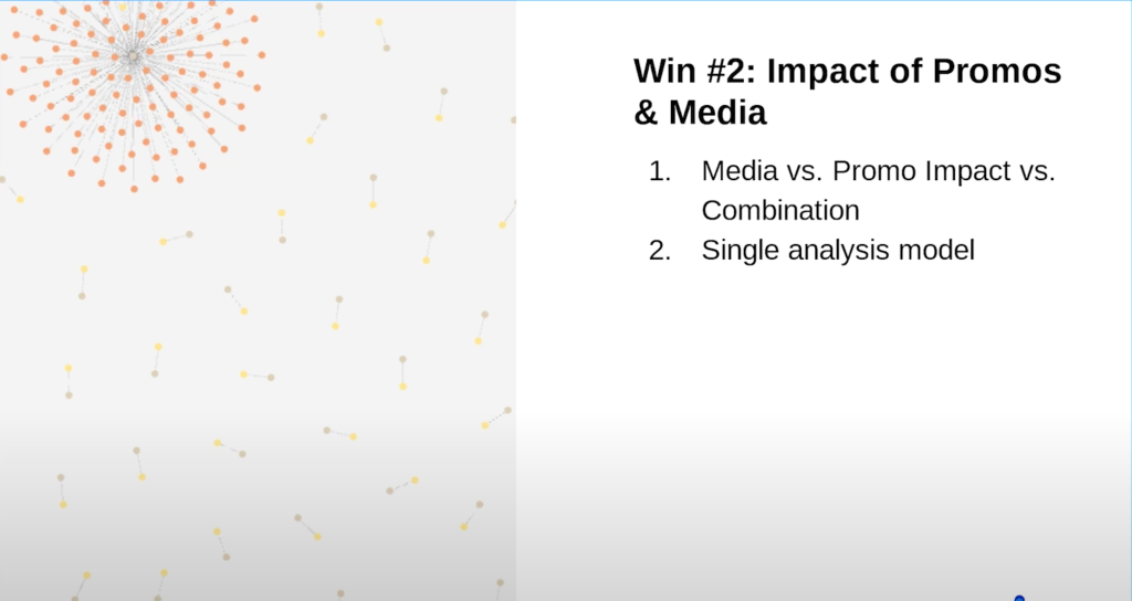
For promotions and media, using Bloom and Pyxis, we can understand the set of users affected by a promotion. In the above image, the red dots are people who redeem the promotion and were also affected by marketing. Traditionally, these two actions are looked at independently, but we look at them together.
Win #3: LTV and In-Period Impact Analysis
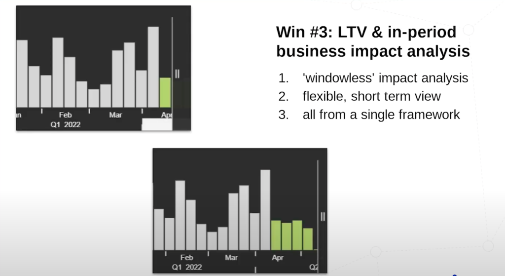
Then we have the time series– being able to look at short term and long term in the same view.
What’s Next for Pyxis?
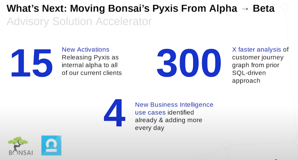
We’re currently releasing Pyxis to our internal clients in an alpha and getting into a beta this year. We’re really excited because we’re seeing a lot of success on speed and have been building up more business use cases for this kind of graphy marketing tech.
Learn what graph data platforms are and how they help you connect your customer journey.
Share Article


Explore
Related Articles


What Are the Different Types of Graph Algorithms & When to Use Them?