Graph Data Science for supply chains – Part 1: Getting started with Neo4j GDS and Bloom

AI Research Engineer, Neo4j
17 min read
Actionable insights in minutes, using Neo4j Graph Data Science and Bloom to intuitively visualize and extract supply chain insights around operational load, flow control, and regional patterns.
Supply chains are inherently complex, involving multiple stages, inputs, outputs, and interconnectivity. Looking at supply chain data in raw form (tables) can be daunting, and extracting valuable insights can be difficult and unintuitive. Luckly, supply chains are intrinsically structured as a graph – a network of stages and interconnecting arcs, which in graph terminology we would refer to as nodes and relationships respectively.
Fortunately, graph-based approaches explicitly model the rich interconnected nature of supply chain data. Using products like Neo4j, stakeholders can immediately visualize the network and intuitively explore and analyze the data. By further coupling this with Neo4j Graph Data Science (GDS), practitioners are empowered to rapidly conduct more advanced inference and gain insights which would otherwise remain obfuscated and challenging to uncover in other data models.
In this running blog series, we explore how Neo4j and GDS can be practically applied to supply chain and logistics use cases with specific technical examples.
This is the first blog in the series, where I will be demonstrating how graph technology provides insights for a freight forwarding logistics network. The data is obscure and unwieldy to deal with in its raw form. It is also heavily anonymized with dates and locations retracted. However, once we get it into Neo4j, you will see that, despite all this, the data almost instantaneously starts to tell a story as insights reveal themselves naturally through the network structure and things become transparent.
This blog will focus specifically on getting started with experimentation and visualization of supply chain data using Neo4j Graph Data Science and Bloom together. I will introduce some basic measures for operational load, flow control, and clustering that can help you better understand your supply chain structure and different interdependencies and risks within it.
While the focus of this blog will be visualization and experimentation, the next couple blogs will dive deeper into leveraging GDS and Neo4j to better operationalize our analysis as well as analyze the effect of the network structure on performance and risk in a more quantitative manner.
It is important to note that while the specific example in this blog is highly focused on logistics and freight forwarding, this same methodology can be applied to other types of supply chain problems like inventory management, manufacturing, Bill of Materials and more.
Source logistics dataset
To explore the application of graph data science to supply chain logistics, we will use the Cargo 2000 transport and logistics case study dataset. Cargo 2000 (re-branded as Cargo iQ in 2016) is an initiative of the International Air Transport Association (IATA) that aims to deliver a new quality management system for the air cargo industry.
The below figure shows a model of the business processes covered in the IATA case study. It represents the business processes of a freight forwarding company, in which up to three smaller shipments from suppliers are consolidated and then shipped together to customers. The business process is structured into incoming and outgoing transport legs, with the overall objective that freight is delivered to customers in a timely manner.
Figure 1: Transport and Logistics Process used in the Cargo 2000 Case Study
Each of the transport legs involves the following physical transport services:
- RCS (Freight Reception): Freight is received by the airline. It is delivered and checked in at the departure warehouse.
- DEP (Freight Departure): Goods are delivered to an aircraft and, once confirmed on board,the aircraft departs.
- RCF (Freight Transport/Arrival): Freight is transported by air and arrives at the destination airport. Upon arrival freight is checked in and stored at the arrival warehouse.
- DLV (Freight Delivery): Freight is delivered from the destination airport warehouse to the ultimate recipient.
A transport leg may involve multiple segments (e.g., transfers to other flights or airlines). In those cases, activity RCF loops back to DEP (indicated by the “loop-back” arrow in Figure 1).
The case study data comprises tracking and tracing events from a forwarding company’s Cargo 2000 system for a period of five months. From those Cargo 2000 messages, 3,942 business process instances (end-to-end shipments from incoming to outgoing, comprising 7,932 transport legs and 56,082 service invocations were reconstructed. The data includes planned and effective durations (in minutes) for each of the 4 services of the business process outlined above.
Dataset anonymization
For confidentiality reasons, message fields that exhibit business critical or customer-related data (such as airway bill numbers, flight numbers and airport codes) have been eliminated or masked. The dataset also does not contain any datetime or geolocation information. DEP (“departure”) and RCF (“arrival”) services have specific airports associated with them, expressed through a “place” id in the dataset. However, due to the anonymization, this place id is masked with a sequential integer id rather than the airport IATA code or other real-world identifier.
To make analytical findings a bit easier to parse and recall, I will add fictitious names to each airport in the dataset before ingesting the raw data into a graph. This will allow us to refer to airports by a names like “Davisfort“ and “Richardberg” rather than a raw number that may be hard to remember.
Initial tabular dataset statistics
The case study dataset is provided in tabular form. While containing a lot of valuable information, the dataset feels difficult to parse through in this format, at least for me. Below is a snapshot of what it looks like.
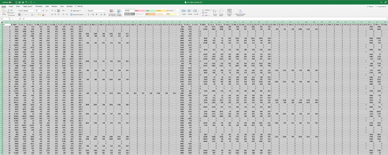
Figure 2: Source Data in Tabular Form
Every row consists of a business process instance, an end-to-end shipment from entry of incoming legs to delivery of outgoing leg. Many/most shipments do not utilize the maximum number of legs and segments (some numbers broken down below), resulting in many null values, represented by a “?” in the table. In data science terminology, we would refer to this as “sparse” data.

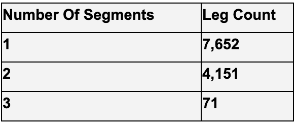
Figure 3: Leg and Segment Statistics
Graph data modeling and ingest
Given the multi-hop interconnected nature of air freight forwarding, this data seems really conducive to analyzing in a graph, especially given the sparsity involved.
The first step for any graph data science project is data modeling: deciding on a graph data model or “schema” that represents the business processes with nodes and relationships. In general, you want to
- represent nouns like locations and checkpoints with nodes, and
- represent verbs, like service invocations or actions with relationships
This keeps the model intuitive and will also come in handy later when we want to do path calculations, route optimization, and what-if analysis.
For this data set, the below data model will serve well.
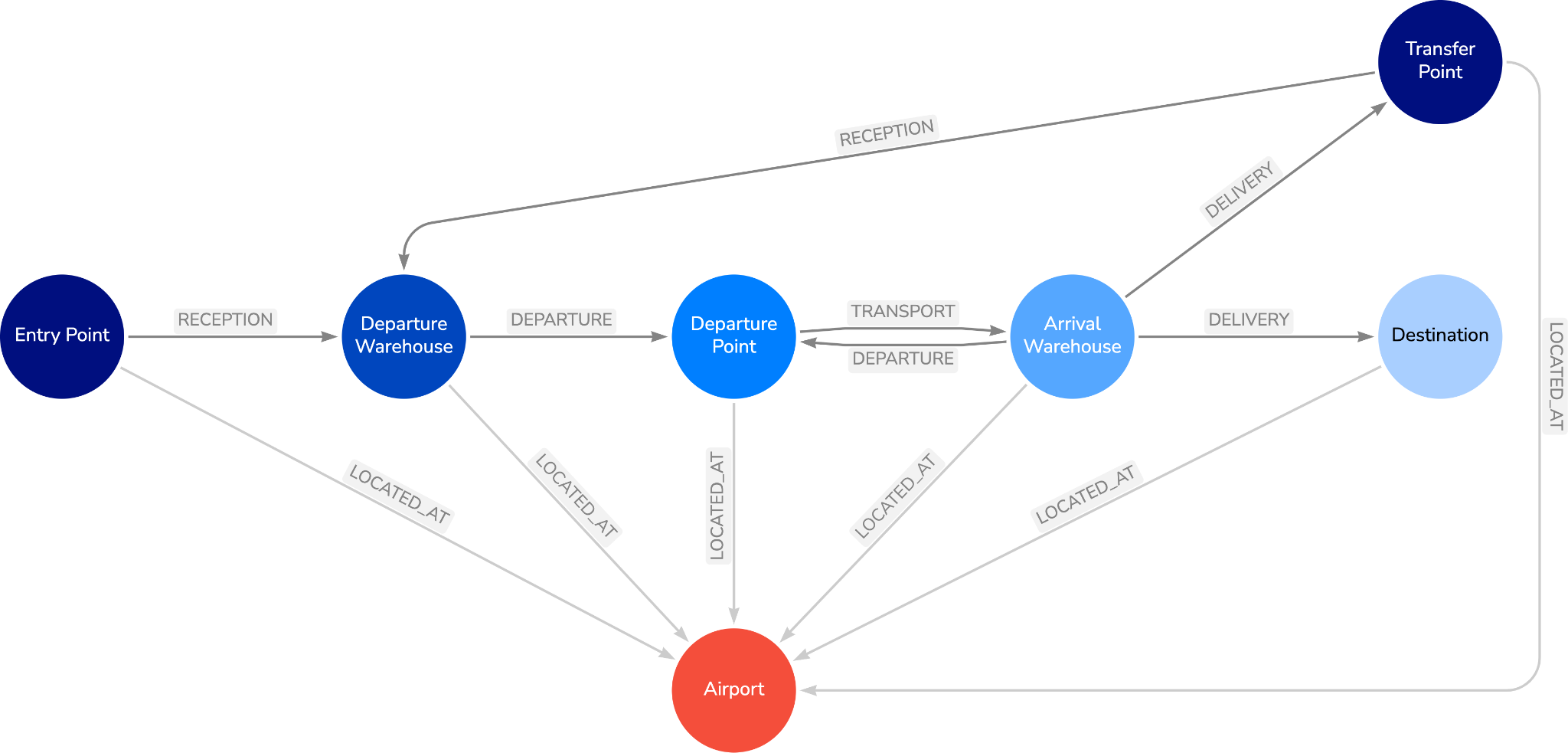
Figure 4: Graph Data Model
In this graph data model, the four transportation services are represented by relationships with stage and checkpoint nodes in-between. Each checkpoint node is then connected to an airport representing its location.
To keep this graph model simple and robust, incoming and outgoing legs are not modeled with separate relationship types, instead, a ”TransferPoint ” node type marks the transfer between incoming delivery and outgoing reception. Likewise, for multi-segment shipment legs, sequential segments are represented by freight departure coming directly from the arrival warehouse checkpoint as opposed to continuing to delivery or looping back to a departure warehouse.
There are also some important Node and Relationship properties included in the data model.
- All the relationships, except the
LOCATED_ATrelationship, have ashipmentIdproperty corresponding to the end-to-end shipment process (row in the source data set) it belongs to. The property is indexed to allow for fast retrieval in queries - All nodes will have an
airportIdproperty with a uniqueness constraint. This asserts that every airport has only one node for each type checkpoint as well as just a single airport node representing it in the graph.
Graph ingest
Once the data model is decided, you can ingest the data into a Neo4j graph using basic data transformations and Cypher. I accomplish this with a Python notebook here if you are interested in the steps I used.
Exploring end-to-end shipments with Neo4j Bloom
Once the data is ingested, a typical starting point for any data science project is exploratory analysis. Below, I use Cypher queries and Bloom to begin to understand the air freight forwarding data.
I can easily visualize unique end-to-end-shipments in Bloom using Cypher search phrases and the search bar. I saved my Bloom Perspective in GitHub if you are interested in replicating these visualizations.
For example, say you are interested in visualizing shipment 12. You can plug “Path for Shipment 12” into the search bar to retrieve the result.
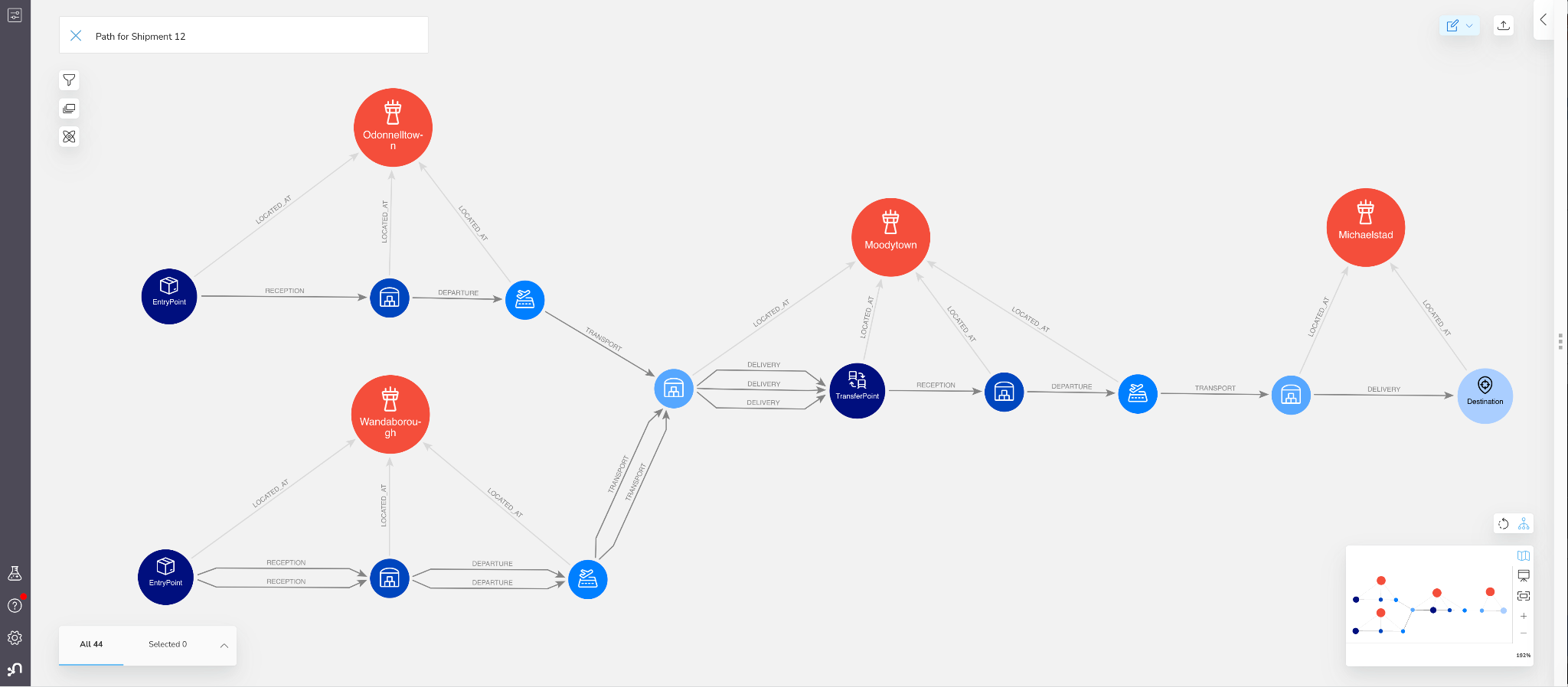
Figure 5: End-To-End Shipment Path in Bloom
You can see how much clearer the data presents itself now. This path shows 3 incoming shipment legs, one departing from “Odonnelltown”, the other two from “Wanborough”. All legs are single segments. Once all the shipments arrived in “Moodytown”, the freight was transferred to an outgoing leg which delivered to the final destination in “Michaelstad”.
Understanding influence & risks in supply chain stages
Most real-world supply chains aren’t perfectly uniform: there are usually certain steps or stages that are critical for ultimate delivery. With a bill of materials, this could be a specialized part or supplier; for manufacturing processes, it could be a specific core step with lots of inputs and outputs. In our freight forwarding logistics example, the critical step is transfers at airport locations that are highly central to shipment routes.
Central, and potentially high risk, stages in supply chains are common but they may lead to
- higher and/or more volatile operational load
- significantly higher risk to the supply chain. This is because trouble in these stages can be more likely to cause bottlenecks or otherwise carry over to other critical business processes.
When you can visualize your supply chain, these risks often stand out – without any fancy data science needed! However, we’re often required to use more quantitative and wholitistic approaches to identify, and measure, risk: that’s where graph algorithms come in handy.
Exploring operational load and flow control with Graph Data Science
We started off our analysis by visually exploring the supply chain data. We can get more sophisticated by applying graph algorithms, in order to find patterns, anomalies, or trends. Bloom allows you to run graph algorithms over the data in a scene, and automatically applies rule based styling to help interpret the results. This can be a powerful way to get started with graph algorithms quickly: it’s a no-code approach to experimentation.
To make our visualizations easier, we are going to collapse the graph model. We will do this by creating a new relationship called SENDS_TO between airports. The relationship will have a flightCount parameter that counts the number of TRANSPORT relationships going between airports.
MATCH(a1:Airport)<-[:LOCATED_AT]-
(d1:DeparturePoint)-[r:TRANSPORT]->(d2:ArrivalWarehouse)
-[:LOCATED_AT]->(a2:Airport)
WITH a1, a2, count(r) AS flightCount
MERGE (a1)-[s:SENDS_TO]->(a2)
SET s.flightCount = flightCount
Once we do that we can go into Bloom and look at all the airports with the SENDS_TO relationships between them.
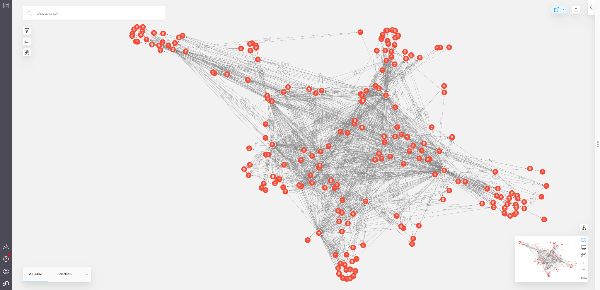
Figure 6: Network of Airports in Bloom
While the view provides an interesting high level picture, it doesn’t give us a lot of new information yet.
To start enriching our supply chain data, we can start by running graph algorithms on the in-scene data directly from Bloom. We will start by using centrality algorithms. This family of algorithms can calculate the importance of nodes (here, stages) based on the structure of the graph.
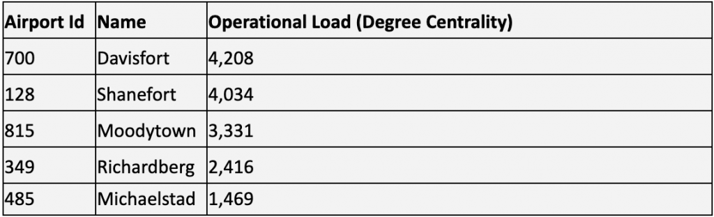
One of the most popular algorithms to understand operational load is degree centrality. This algorithm counts the number of relationships for each node. If we configure the algorithm to use freightCount as a weight and select an “Undirected orientation” this will effectively count the total number of departing and arriving flights for each airport.
Degree centrality measures the operational load for stages in your supply chain. Stages with high operational load have to manage larger inflows and outflows and may be forced to reconcile conflicting schedules and priorities more often. All else held constant, stages with higher operational load tend to require more resources to run effectively.
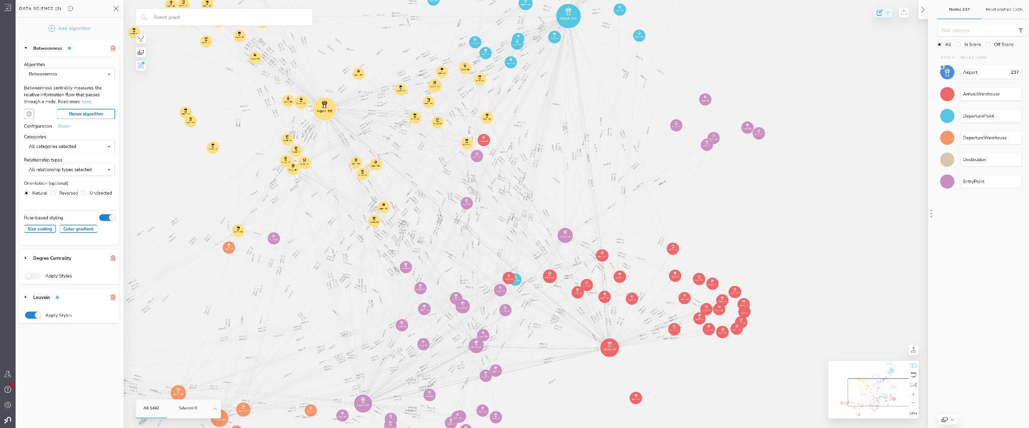
Below are the results of applying degree centrality to the airport network in our Bloom scene.
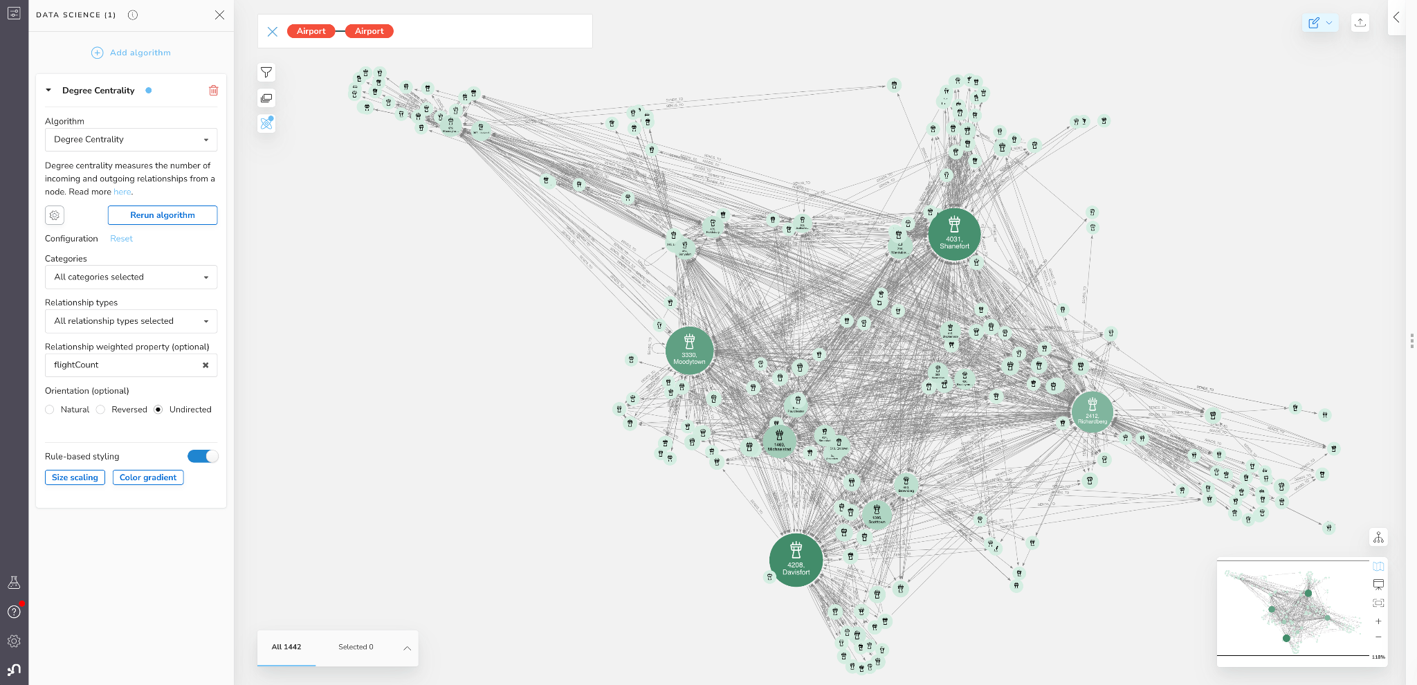
Figure 7: Degree Centrality (Operational Load) in Bloom
We can see that 4-5 airports really stand out here. They are
While degree centrality can tell us about operational load, it only measures the local activity associated with the stage, not necessarily the control or influence the stage has on the entire supply chain network. For this we can look at another algorithm called Betweenness centrality. Technically speaking, a node’s Betweenness centrality is calculated by counting how often the node rests on the shortest paths between all the other nodes in a graph. It is generally a good metric for describing how well a node bridges different regions of the graph together.
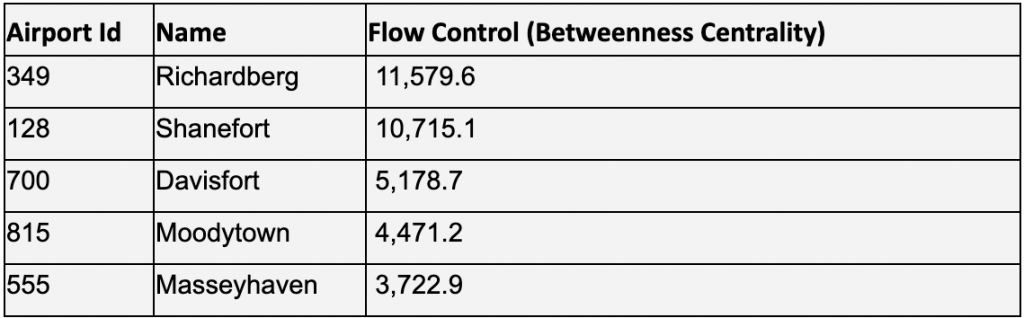
> Betweenness centrality measures the flow control for stages in distribution and logistics networks. Stages with high Betweenness centrality have more control over the flow of material and/or product because they connect many other stages together that may otherwise be disconnected or connected through much longer less efficient paths. All else held constant, stages with higher flow control present higher risk for causing bottlenecks in supply chains if they encounter delays or other issues [4].
Below we apply the Betweenness centrality algorithm in Bloom. Unlike degree centrality, we will keep the natural relationship orientation so we capture the direction of freight shipments.
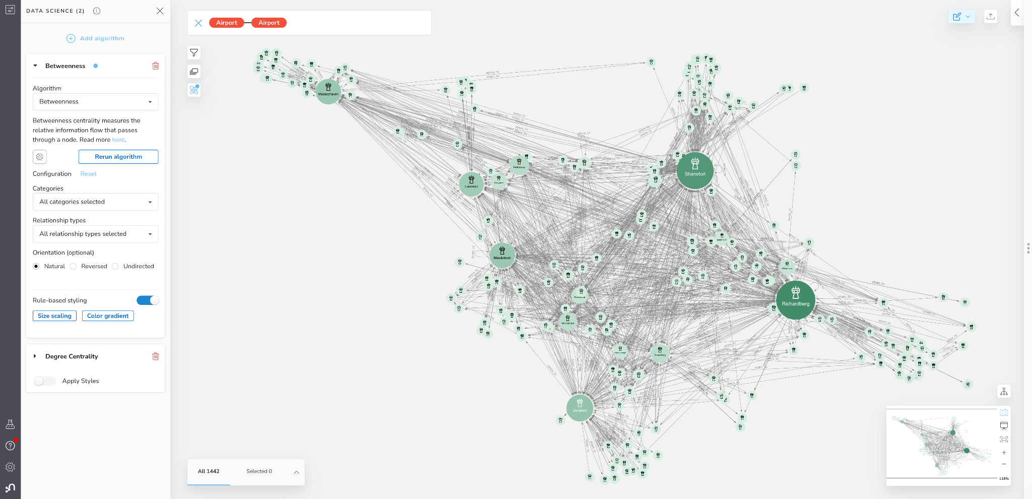
Figure 8: Betweenness Centrality (Flow Control) in Bloom
More often than not, degree centrality and betweenness will be positively correlated, however, it isn’t perfect. We see here that the ranking of top airports is a bit different, with Richardberg now having the highest score, and Shanefort being a close follow. The highest scoring degree centrality node of Davisport is in third place and has less than half the betweenness centrality of second place Shanefort.
Understanding local networks with Graph Data Science
Centrality algorithms can measure the importance of stages in our supply chain. Another aspect we may want to consider, particularly for distribution and logistics networks, is how flows may naturally cluster into distinct well defined regions. This can be driven by geographical proximity, economic (supply/demand) features, or other structural factors. This clustering strongly affects flow control and risks on local/regional levels. For example, stages within a particular region often depend more heavily on each other. Additionally some stages will have a stronger effect on flows within a region while others will be more instrumental in flows coming/going with different regions. In a graph, we can use community detection algorithms to find clusters of the supply chain that are densely interconnected.
To analyze whether this regional clustering exists in our supply chain network, and if so, identify and label the stages within them, we can use the Louvain algorithm. Technically speaking, the Louvain algorithm runs recursively to optimize a modularity score – essentially seeking to assign nodes to communities such that they are as densely connected within the community as possible relative to other random nodes in the graph.
In the context of distribution and logistics networks, Louvain Community Detection finds regional interdependence within the network by identifying groups of stages which have highly interconnected flows between them. All else held constant, Stages within the same community have a stronger interdependence on each other relative to stages outside the community.
Below is an example of the Louvain algorithm run within Bloom. Building on our centrality score scene above, where nodes are sized based on their importance, we can color nodes based on their community membership. Nodes in each community are assigned different colors, and we can clearly see some structural patterns emerging.
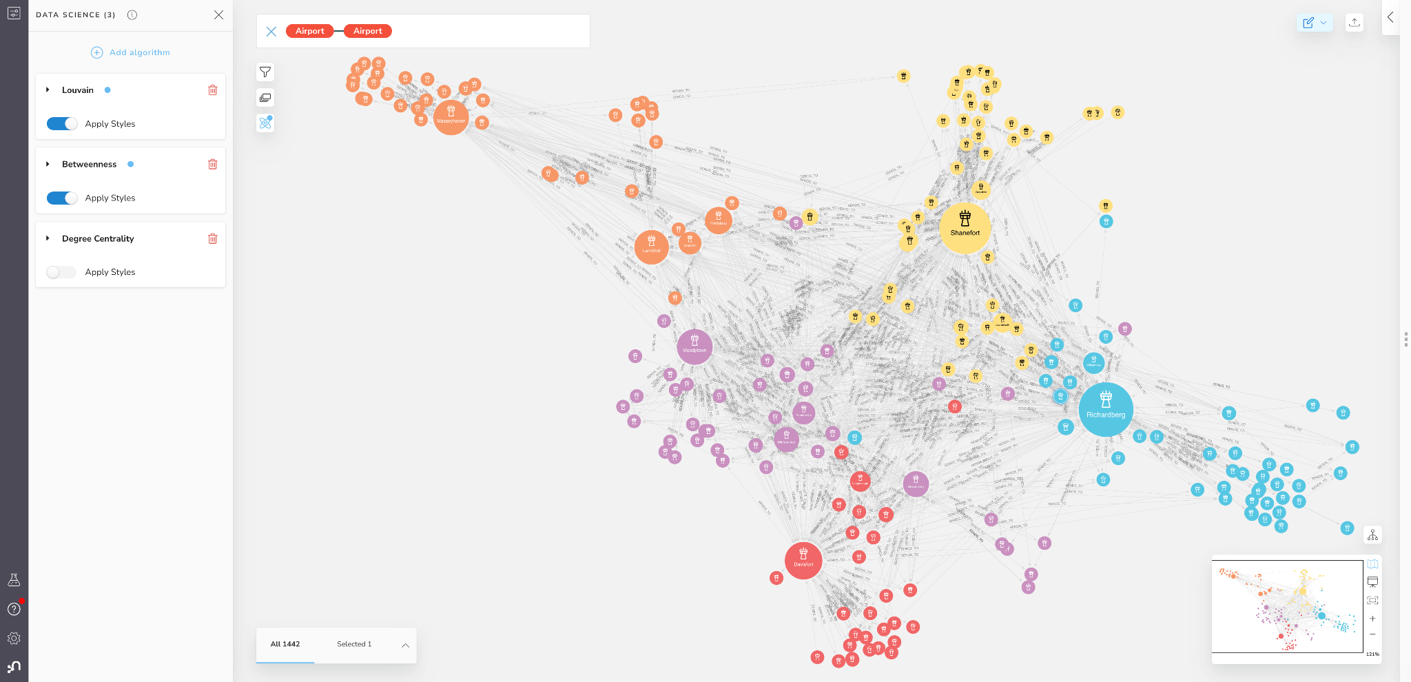
Figure 9: Louvain Communities in Bloom
You will see that Louvain found 5 large communities or “regions” within our logistics network. Louvain will label these communities numerically, but to make them easier to describe I will name each region after its highest betweenness centrality node:
- Masseyhaven region top left in Orange
- Moodeytown region center left in purple
- Davisfort region bottom left in red
- Richardberg region in center right in blue
- Shanefort region top right in yellow
If we zoom in on the Masseyhaven region we will see that there are four airports that all other airports in the region connect to and which seem to dominate the regional flow control: MasseyTown, Lambfort, Fieldsbury, and Sonyafort.
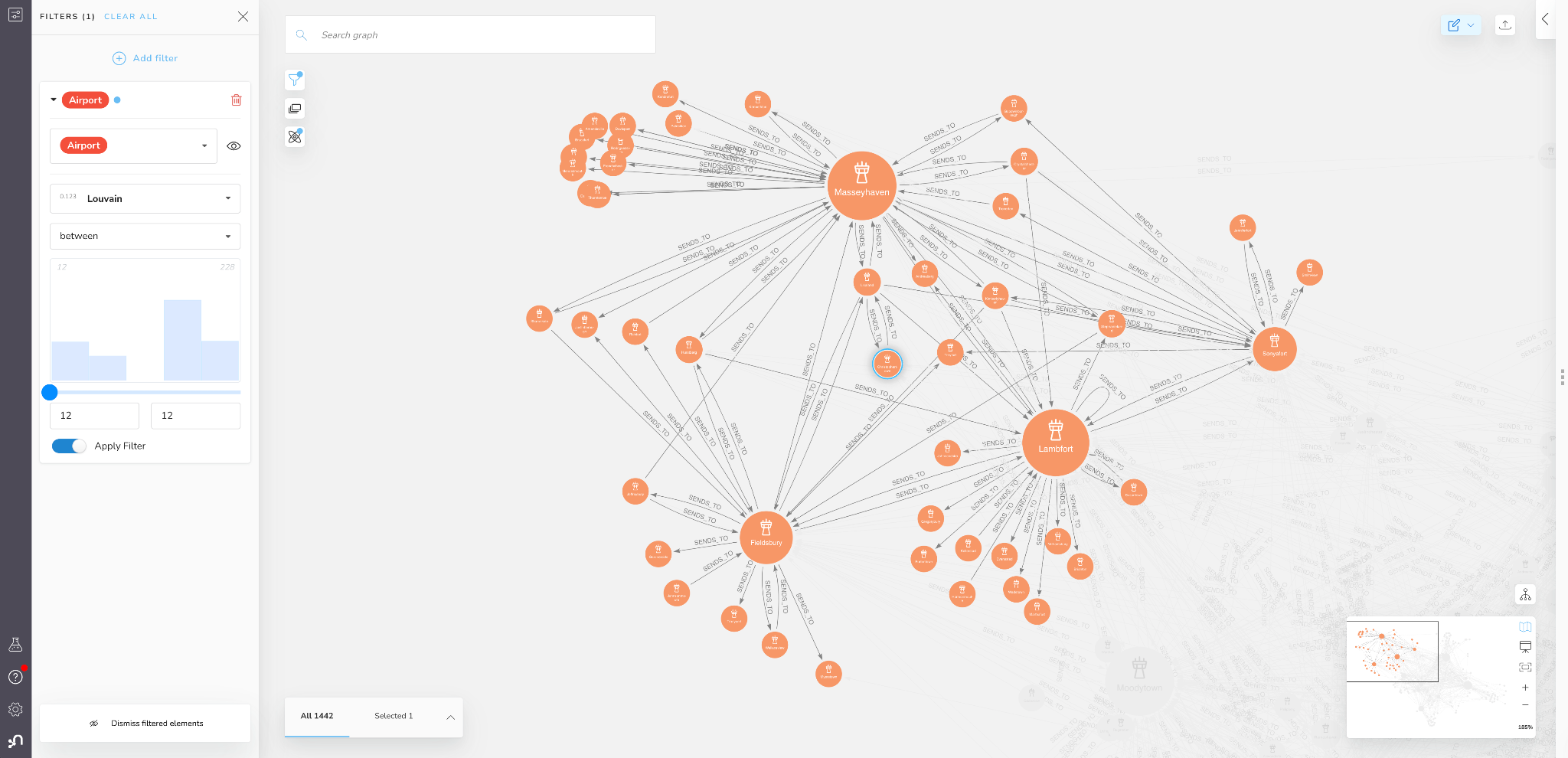
Figure 10: Masseyhaven Region (Louvain Community) in Bloom
You can also see that many other airports in the region are mostly (or exclusively) connected to just one of these four central ones, making those airports even more dependent on a single other airport in the region. If you know much about airline routing, you can see that this neatly recapitulates the hub and spoke model of air transit.
We can use these views to analyze flow between regions as well.If we zoom out of the Masseyhave community, we can see how its connected to Davisfort
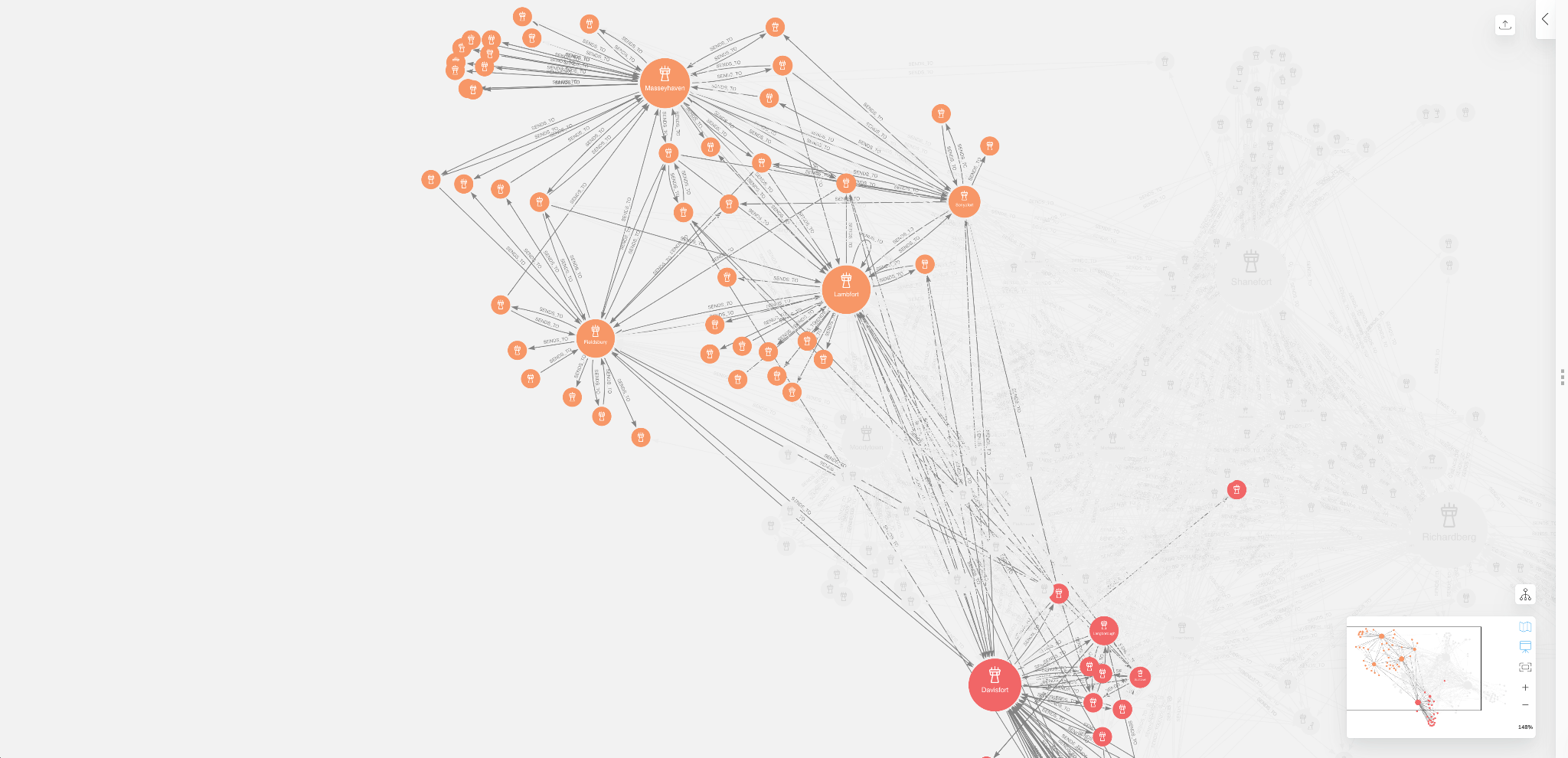
Figure 11: Flows Between Masseyhaven & Davisfort Regions in Bloom
You will notice that even though the Masseytown airport has the highest operational load and flow control, Lambfort, Fieldsbury, and Sonyafort actually control most of the flow between the Masseytown and Davisfort regions. As such, goods that require transport between Masseytown and Davisfort regions will be more dependent on airports like Lambfort and Fieldsbury even though they have less overall operational load and flow control compared to other airports in the logistics network.
No geospatial data needed!
It is important to mention as well that we were able to learn all of this information about air freight networks without any geographical identifiers. Since these are airports, there is likely correlation between physical distance and transport relationships. Due to the capabilities of graph algorithms and visualization tools like Neo4j GDS and Bloom, we can use historic data to infer the regional dependencies and flow patterns even when we do not have access to geospatial information.
Until next time….
In this blog we explored the use of Neo4j GDS and Bloom to visualize and analyze a logistics network. We established some useful algorithms to understand influence and risks in our supply chain. Namely:
- Degree Centrality -> Operational Load
- Betweenness Centrality -> Flow Control and Bottle Neck Risk
- And Louvain -> Regional Interdependence
While the Cargo 2000 case study data was a bit difficult to parse in its tabular form, it became much more transparent once ingested into Neo4j as a logistics network. Despite the heavily redacted nature of the source data, GDS and Bloom together provided an intuitive no-code interface which enabled us to easily identify and visualize the locations with highest operational load and flow control, along with the natural clustering/regional structure of the network.
If you are interested in this sort of analysis and want to go deeper, stay tuned for the next section of this series where we will take a more production-ready approach by running algorithms directly from Python. We will introduce a couple more algorithms and explore how to investigate the effect of operational load, flow control, and other critical metrics on supply chain performance and risk.
Share Article


Explore
Related Articles

A workbench for teams to query, explore, and visualize graph data

SumoDB in Neo4j: Chaining Multiple Graph Algorithms in Snowflake — Part 3