
Storing massive amounts of data in a NoSQL data store is just one side of the Big Data equation. Being able to visualize your data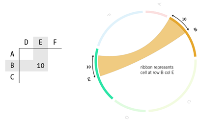 in such a way that you can easily gain deeper insights, is where things really start to get interesting. The Datablend blog has been exploring various options for visualizing directed graphs, including Circos. Circos is an amazing software package that visualizes your data through a circular layout. Although it’s originally designed for displaying genomic data, it allows to create good-looking figures from data in any field.
in such a way that you can easily gain deeper insights, is where things really start to get interesting. The Datablend blog has been exploring various options for visualizing directed graphs, including Circos. Circos is an amazing software package that visualizes your data through a circular layout. Although it’s originally designed for displaying genomic data, it allows to create good-looking figures from data in any field.
Keywords: Big Data • Circos • graph visualization