
When Graph Meets Big Data: Obstacles and Opportunities for Visualization

CEO, Kineviz
5 min read
Love the buzzword or hate it, “big data” is an inescapable reality. Whether it’s for business intelligence or bioinformatics, recommendation engines or risk analysis, the volume, variety and velocity of data is only going to increase.
Graph is an undeniably powerful tool for working with big data. Unfortunately, one of graph’s greatest strengths – intuitive visualization – is restricted by an essentially fixed resource: screen size. Even a large monitor only accommodates a few hundred nodes before the graph’s structure becomes difficult to parse.
Too Damn Dense
My first startup, in 2012, leveraged social networks as a trust backing for the sharing economy. (It was also great practice for Buzzword Bingo at GraphConnect 2018). We looked at the graph signatures of many real and fake social network accounts. Although it’s difficult to quantify the difference between these accounts, the difference in patterns presents clearly when visualized.
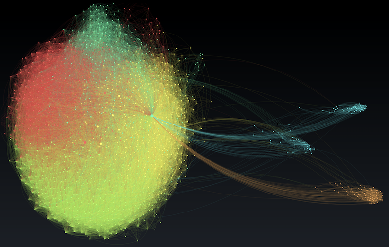
We had no luck with the popular crowd, though. For example, the graph below depicts a user with ~2,000 friends. The graph layout, with different colors representing separate communities, was done in 2D with Gephi.
Although it’s beautiful and does reveal a few distinct clusters, it also reveals the shortcomings of this approach. Most glaring is the giant blob of nodes on the left where everything overlaps. 2D layouts do effectively separate discrete clusters, but it’s hopeless if those clusters are interconnected.
What we’re left with is a graph visualization that only shows, well, the graph. If I want to cluster by parameters, like number of connections, level of activity, location, etc., I can’t do much beyond re-assigning color or size. It’s not easy to visually sort and classify nodes.
Of course, we can bring the data to a separate application to produce 2D scatter plots of those attributes, or spread the nodes on a map. But we’ll lose the connection between those charts and their relationships that are so intuitively captured by the graph.
Furthermore, I can’t easily shift between the (u0:User)-[:friend_of]-(u1:User) perspective above to representations of say:
(u:User)-[:mentioned_in]->(p:Post)(p0:Post)-[:mentioned_same_user_with]-(p1:Post)(u0:User)-[:mentioned_in_same_post_with]-(u1:User)
Into the 3rd Dimension
Two years later I founded my current startup, Kineviz. Our first client, Box, brought us in to visualize collaboration on their file sharing platform. These “Collab Graphs” were commissioned for the BoxWorks customer conference, where attendees would use gesture controls to interact with the graph on a large screen.
To take full advantage of the gestural interface, we decided to perform the layout in 3D. The first thing that struck us was how this 3D graph with 3,000+ nodes didn’t look nearly as dense as a 2D graph of 300 nodes!
Clusters separated visually without losing interconnections. Intuitively, it made sense that high dimensional information benefits from a high dimensional visualization (given that each connection in a graph counts as a dimension). The linear increase from 2D to 3D amounts to an exponential increase in the amount of data that can be comfortably laid out.
Minority Reporting with VR
3D data visualization is hardly new, and it’s not without its drawbacks. On a 2D screen, depth information is lost. And any screen-based visualization suffers from the disconnect between examining a local structure while maintaining the global context (aka the Google Maps problem: zoom into street and you lose context of the city. )
Back in 2014, the Oculus DK2 virtual reality headset had just shipped and we were eager to try it out. Because we’d developed the Collab Graphs in WebGL, the foundation of the WebXR standard, we were able to bring it into VR without too much trouble. Partly because it would be cool, but also, partly because we had an intuition this might address the shortcomings of 3D on a 2D screen.
The result was the inspiration for our hybrid VR and 2D data visualization platform, GraphXR. If you haven’t tried VR, it’s hard to convey just how well it mirrors the experience of physical space. Much as you know whether someone’s standing behind you right now (boo!) or where the door is without having to turn and look, VR grants you situational awareness of a complex pattern without having to constantly zoom in and out or jump between views.
A great deal of research remains to be done before we can make definitive claims about the efficacy of VR data visualization, but anecdotally, users of our first generation tool reported between 15x and 150x(!) speed gains in analyzing their data.
It’s worth mentioning that, while the future is bright for Extended Reality (XR is the superset of VR and Augmented Reality), we have yet to see the benefits of VR dataviz carry over to AR.
The current generation of AR headsets suffers from a narrow field of view, effectively limiting your viewing area to a screen. Because content never enters the viewer’s peripheral vision, it’s not loaded into the brain’s spatial buffer like we think we’re seeing in VR. This limitation will undoubtedly be eliminated in future generations of AR headsets.
The Big Picture
These are exciting times to be a data nerd, especially if visualization plays a significant role in your work. I’ve only covered a handful of the challenges and solutions to visualizing large graphs.
Bloom and Neo4j’swhole ecosystem of data visualization partners offer a range of strategies for working with big data. Skyrocketing GPU power enables Graphistry to address large graph layout problems, while companies like 3Data and Virtualitics explore the possibilities of VR data visualization. Like big data and graph adoption, the options for visualization are only going to grow.
Kineviz is a Silver Sponsor of GraphConnect 2018. Use code KIN10 to get 10% off your ticket to the conference and training sessions, and we’ll see you in New York!
Share Article


Explore
Related Articles


15 Best Graph Visualization Tools for Your Neo4j Graph Database

Empowering Open-Source Cyber Threat Intelligence Analysis With Graph Visualization
