Graphs in automotive and manufacturing: Unlock new value from your data

Senior Pre-Sales Consultant, Neo4j
28 min read
Editor’s Note: This webinar was given by Joe Depeau in June 2019. For more webinars like this one, check out upcoming and on-demand video content in the Neo4j Webinar library.
Presentation summary
At Neo4j, we believe that graphs are everywhere.
In this post, we’ll take a look at graph database technology within manufacturing in general, and more specifically in the automotive industry. We’ll start with a general overview about graphs – specifically Neo4j – for anyone new to this area. Then, we’ll dive into a rundown of some of the types of data that an automotive or manufacturing company might have. Often, this lives in different systems and covers various areas of the business. We’ll talk about how all of this can be linked together using a graph.
Next, we’ll look at specific use cases that combine this data into a graph, specifically examples on supply chain management, warranty analytics, customer 360 view, knowledge graphs and a few others that are less specific to automotive and manufacturing but still apply to those industries.
Lastly, we’ll explore real-life case studies of how our graph database has helped transform the way companies view and utilize their data.
Full presentation: Graphs in automotive and manufacturing
Thanks for reading our post on graphs in the automotive and manufacturing industries. My name is Joe Depeau and I’m a Senior Pre-Sales Consultant at Neo4j.
Introduction to graphs and Neo4j
Let’s start off with an overview: What is a graph database? We’ll define it by comparing it to relational databases, which have been around for decades.
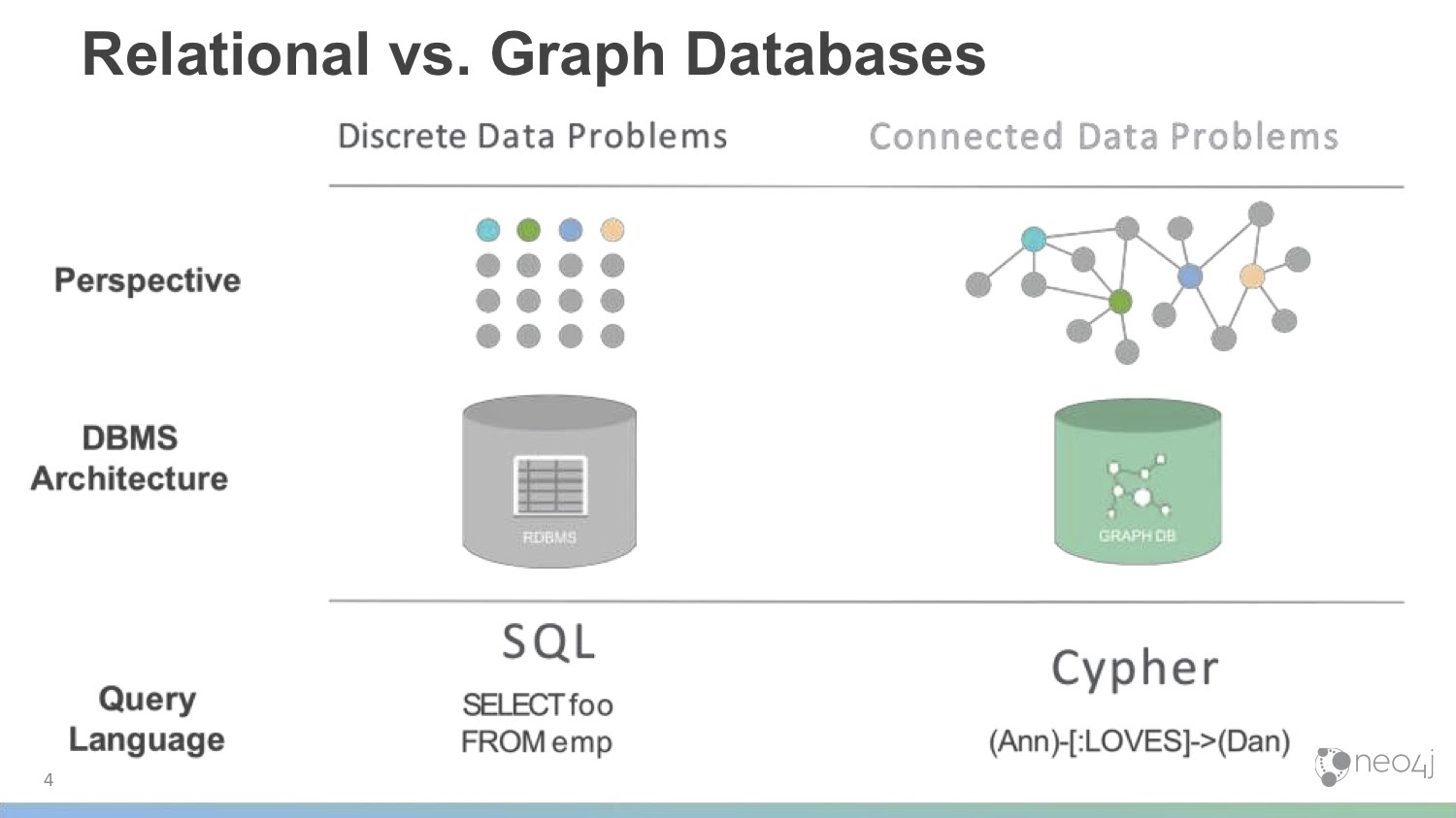
Relational databases are table-oriented with rows and columns. Every row is a thing, and columns are attributes of those things. You can link together different tables or types of objects in your database using joins, foreign keys and linked tables, and query the database using SQL. It’s very similar to Excel, and very common among data storage and processing models.
Neo4j takes a different approach to data. It’s a graph database, meaning that it focuses on the connections between data. Rather than storing everything in a square shape of rows and columns, everything is linked together dynamically and directly. There are no joins or linked tables; when you write data to Neo4j, you link it directly to the things they’re related to. This allows you to follow those relationships easily and intuitively, especially when you talk about performance at scale on very large data sets.
We’ll take a look later at some examples to really bring the idea of connected data to life.
Unlike relational databases, who use SQL, Neo4j uses the query language Cypher. It’s specifically designed to work with graph data and the patterns that come up in that connected data.
The graph database approach is especially powerful in today’s era, which often contains high volumes, high velocities and high varieties of data. You might also have data stored in all sorts of places in your business, including numerous physical data silos on different lines of business. In this way, it’s extremely powerful to be able to combine all this data and understand the relationships that are inherent but might not be very visible.
We think that graph data will drive the next wave of competitive advantage. Companies who take graph approaches to their problems are seeing lots of benefit. Later on in this post, we’ll take a look at the automotive industry and discuss how we can use this connected data to drive that competitive advantage and unlock new value out of your data.
About Neo4j
Neo4j is the number one database for connected data. We’re a native graph database: from the file system all the way up, it’s all graph. There’s no translation layer or different underlying model; we store data as graphs, we process data as graphs and we present data as graphs.
We do this in the same way you’d expect any other enterprise-grade database to do it. We can do it at scale, we can do it reliably and we are ACID-compliant. It’s a very agile environment in which to work. Starting with a small Neo4j installation and growing it as you have more data and use cases is all quite easy to do.
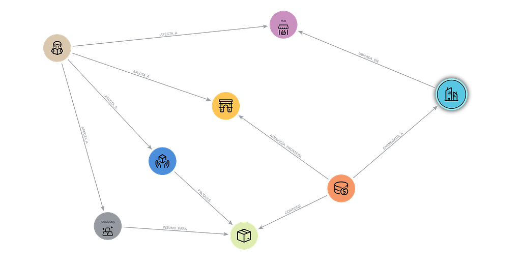
I’ll quickly introduce an example of what a graph database looks like so it makes sense when we look at some of our examples later. A graph database is really made up of three main elements:
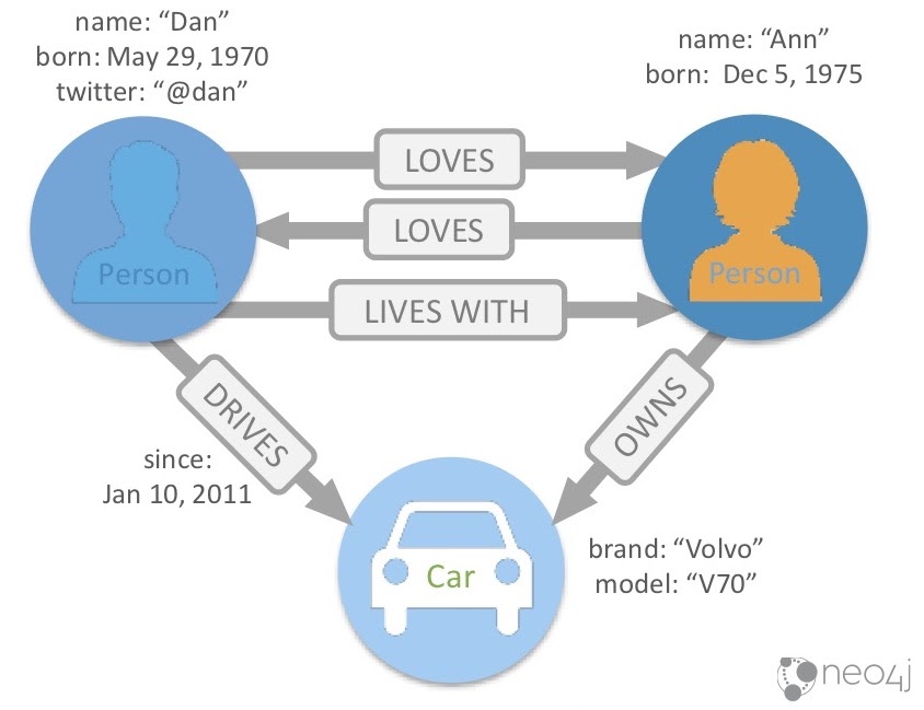
First, we have nodes, which are usually things, nouns or objects. Here, we’re representing them as circles. Nodes can have labels, which makes them easier to classify. In this example, we have two types of nodes: two Person nodes and one Car node.
Next, there are properties, which are name-value pairs that go on nodes and relationships. You can see that the person on the left has a name property, which is “Dan.” He also has a born property, which is May 29th, 1970, as well as a twitter, @dan. On the right, we have another node: “Ann,” who was born on December 5th, 1975.
We don’t have Ann’s Twitter handle, but that’s okay. In a relational database, you’d have to stick a null value in that column, since every row needs to hold the same number of columns. But in a graph database, if you don’t have a particular property type, you don’t have to add it to that specific node. Neo4j doesn’t enforce every node to have the same properties and types.
Finally, the real power comes from combining these nodes and properties together with relationships, which shows how our nodes are related to each other. Here, we have a number of relationships between these two people: Dan LOVES Ann, Ann LOVES Dan and Dan LIVES WITH Ann.
When you write a relationship to the database, it always has a direction. Sometimes the direction is important and sometimes it’s less so. Here, we see that Dan LOVES Ann, and its direction moves from left to right. It’s important to know that Ann also LOVES Dan, which is why we have another relationship going the other way. Note that it would be possible for Dan to love Ann, but sadly not for her to love him back.
Dan also LIVES WITH Ann, again moving left to right. It would be impossible for Dan to live with Ann and Ann not to live with Dan, so in this case we don’t need a relationship going in both directions.
You can also see that you not only can have properties on nodes, but also relationships. Here, we see that Ann OWNS the Volvo at the bottom here. Dan DRIVES that car, and has driven it since January 10, 2011. This specific relationship has a start date, but it could also have an end date or any number of other properties.
These three things – nodes, relationships and properties – are what make up the property graph model. They’re the building blocks for complex and rich data sets that we can then query to gain new insights.
Automotive data overview
Now we’ll take a look at some of the types of data that an automotive or manufacturing company might have. Though we’re specifically focusing on the automotive industry in this particular discussion, there’s quite a bit of overlap between the automotive industry and other industries. We just chose to go through automotive use cases because they’re generally easier for people to understand and allow us to delve into more detail.
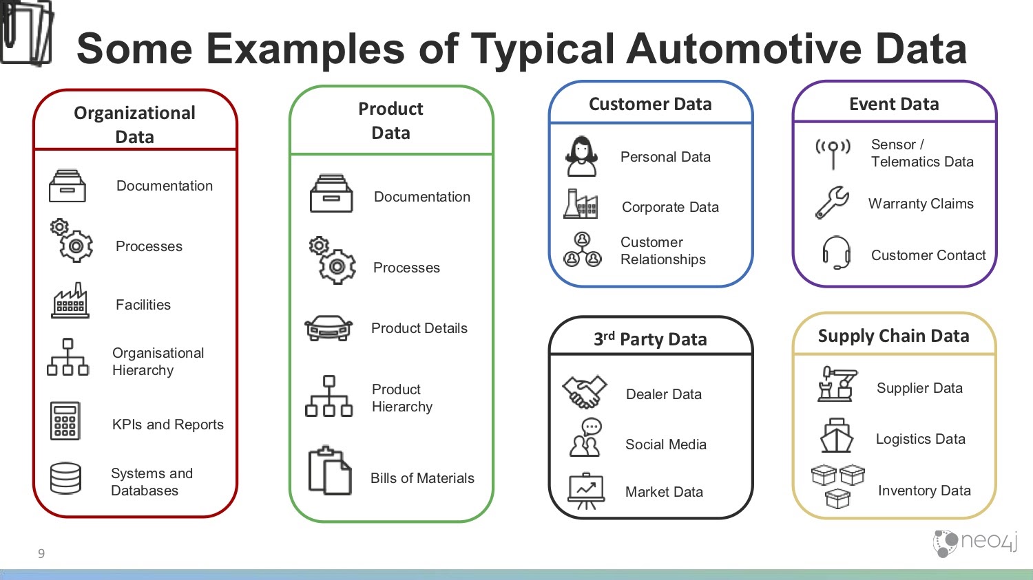
The first type of data we have is organizational data, or data that’s internal to your company. Within your organization, you likely have lots of documentation, processes and information about different facilities, factories and warehouses. You might have an organizational hierarchy, not just in terms of people management but also in terms of how departments or lines of business fit together and interact.
KPIs and reports are also quite important. It’s where many impactful decisions are made. In this way, it’s helpful to understand how that data is generated and where it comes from.
Organizational data also includes your systems, databases and IT infrastructure – anywhere in which data and documentation are held.
Next, we have product data , which is information on what you make and sell. This includes documentation, processes for how you deal with customer contacts and claims, and how you build your products.
Product data also includes product details: everything about the product that you or your customer might want to know. Additionally, you might have a product hierarchy – families of products or brands – in which you have quite a complex setup between your products.
Then there’s bills of materials (BOM), which could almost be a category in itself. If you wanted to draw a BOM, which includes all the components and how they fit together, it would naturally form a graph. We have bills of materials alongside the products that help you keep track of the materials that go into your various products. Of course, there can be multiple BOMs. Quite a lot of data can be held in there.
We also have customer data, which can be a little tricky. Since many customers come through dealers, most automotive companies don’t have a direct relationship with many of their customers. However, we’ll look at whatever data you do have about customers – which could include personal or corporate data – as well as the relationships between your customers.
Next, we have third-party data. This includes dealer data, or data about your partners and the dealer network you work with, as well as social media posts and other public information from Instagram, Twitter and Facebook. Third-party data also includes market data, which covers data about your competitors, press releases, news stories, information about your suppliers, macroeconomic data and tariff information.
Then we’ve separated out some specific event data, which are things that happen in time. You might have sensor/telematics data, which is only growing as the concept of IoT and attaching sensors to everything takes off. Every time you or your dealers interact with a vehicle, you might have a chance to obtain some of the sensor/telematics data. Event data also includes individual warranty claims, which would come through the dealer. Additionally, this includes customer contact, such as calls to your call center, emails or individual contacts between you and your customers.
Finally, we have supply chain data. This might be information about your suppliers, about where you buy raw materials or parts. This also includes logistics data – how these things move about, what your options are, how long they take and what the cost is. Additionally, I’ve included inventory data, which is data you have about the parts or materials in inventory.
This isn’t a comprehensive list of all the data a manufacturing or automotive company might have. However, it’s certainly indicative, and provides us enough information to then drill into an example of how we might be able to combine these different pieces of data in a graph to achieve certain use cases.
Use cases
Now we’ll delve into a few specific graph use cases within the automotive industry. We’ll look at supply chain management, warranty analytics, customer 360 and knowledge graph examples.
Supply chain management
We’ll start with a supply chain use case, specifically looking at some of the ways we can combine the data we’ve already talked about to manage our supply chain, obtain an overview of and interact with that data to make decisions.
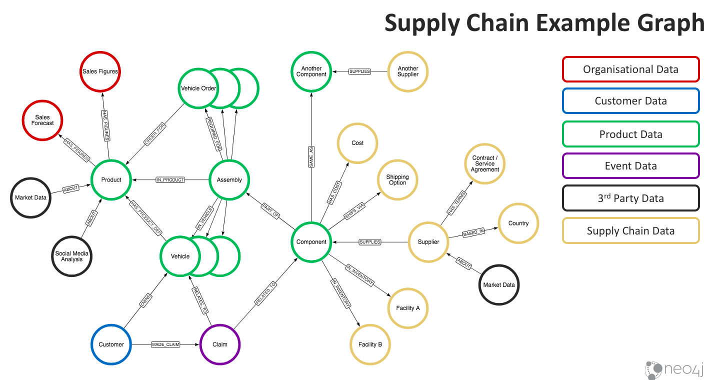
In the yellow, we have information about suppliers, from whom we buy components. We also see the components’ costs and shipping options. Here, we already have inventory in facility A and B. When we look closely at the relationships, we also see that the component we’re talking about here is the same as Another Component. You might have different names for these components because they come from different suppliers, but the form fit function is the same and can be used interchangeably.
In the middle of the graph, we have a basic way of demonstrating a BOM. As you can see, we have a Component that’s part of an Assembly. It’s likely much deeper in a real BOM, but this gives you a feel for how you might take individual components, combine them and work your way up the tree. It’ll also help you understand how many orders you’ve already taken and vehicles you’ve already sold include the component, which brings us deeper into our product data set.
Our BOM, component assembly groupings, information about orders and vehicles already made and the product they go in can all be chained up to a view of the product line. Ultimately, this allows us to understand the supplier and its impact all the way up through to orders and products. We can then take a look at sales figures for what we’ve sold already as well as a sales forecast for what we expect to sell, helping us to comprehend how we might want to make purchase decisions.
For example, we can take what we have in inventory, subtract that from demand (on the left side of the graph), the number of orders we have to fulfill and the number of orders we’re forecasting we’ll need to fulfill. Then, we can make a decision between different suppliers based on shipping costs, costs of parts, contract agreements, the impact of tariffs and so on. The graph, therefore, gives us an end-to-end view of demand through to supply and provides lots of options for how we can manage it.
Down in the lower left (the Claim and Customer nodes), we have a link to another use case. Here, we have a number of claims that are related to the component, where there might be numerous customers who’ve made similar claims related to faults in that same component. We can then approach suppliers if we think there might be a fault in the component we’re getting from them. The graph gives us the data we need to trace customers and claims through to the components from a particular supplier, and helps us understand whether we have other options for replacing those components or buying from a different supplier that perhaps won’t give us faulty components.
Let’s briefly discuss the ways we might use this type of graph. First, it improves ordering and procurement processes. Having this data at hand and understanding these relationships at the data level speeds up the process of procurement, ordering and understanding what you need to buy based on forecasting. We’re looking at instant access and insights because we have that full view, all the way from demand (left side of the graph) to supply (right side of the graph).
This type of graph also helps us save money on orders. Especially if you have a longer view of demand, how it compares to your inventory and how much you’re going to have to buy in a particular time period, this type of graph could let you leverage economies of scale. Maybe you’re currently making smaller orders more regularly because you can’t execute this long-term view across that whole supply chain. However, if you were to have that longer view (which the graph can help you visualize), you can then buy in bulk, make more intelligent buying decisions and save money.
Moreover, you can optimize your inventory using the graph. Again, when you know how many available parts you have, where they are, how long they’ll take to get to you and what vehicles they’re going to have to go in (in terms of your forecast), you can then move your inventory about so it’s in the right place at the right time. You can use this to fill demands rather than making fresh purchases and leaving your inventory sitting where it is. This could certainly refine your inventory planning so you don’t hold quite so much. After all, you have that view of your forecast and how it’ll play out in terms of how many parts you’ll need. Then, you can plan your inventory effectively and not buy or store more than you’ll need.
Lastly, the graph can help you with comparative analysis of suppliers and their products. When you have that view of the suppliers against all the parts and components you’re using, you can compare them to warranty claims and see the fault rates from different suppliers. You can also understand how they compare in terms of logistics and determine whether there are any tariffs or regulatory compliance issues you might have to face. When you have this whole view, you can make a much more informed decision about which suppliers you work with and which of their products you purchase.
Warranty analytics
Now, let’s talk about warranty claims and claims analytics.

At the heart of this graph is event data relating to the Claim. This claim is for a particular Fault, which could ultimately be associated with particular parts or components. We can then understand how many similar occurrences have happened by looking in the graph for other claims of the same fault. Depending on the number of claims it has, we can deduce whether that part is faulty.
From there, we can ask questions about the faulty part: how many other vehicles is that part in? Can we predict how many of them might be likely to fail based on the number of claims against them? How rapidly are these claims coming in? Can we predict if we’re likely to receive more claims? Is this going to be an expensive issue? How can we resolve it more quickly?
We can then take a look at the Supplier whom these parts are coming from. Again, this links to our previous use case, where we talked about supply chain management. It can help us figure out how to trace claims back through to suppliers and start a conversation with suppliers whose parts are faulty.
We can also take a look at Customer and Dealer behavior, which is related to claims and faults. Dealers and automotive manufacturers are more partners than anything else; since fraud is a strong word, we don’t necessarily want to use the phrase “warranty fraud” here, though we might think there could be cases where the claim might be inflated. Nonetheless, we can start looking for outliers in these claims – whether dealers’ claims for that particular fault are out of line with everyone else’s – and whether this means they might not be following the Documentation or making repairs correctly.
We might also see patterns of claims. Maybe as the warranty comes to its final four months, we see a burst of cosmetic issues or specific faults consistently being addressed within that time frame, all of which we might want to investigate.
Again, we have telematics and sensor data, which illuminates some of these faults and helps us understand if there’s a particular pattern of driver behavior or other things happening in the car that lead up to a particular fault, which we can then forecast for.
Of course, we also need information about the Vehicle in question to obtain a full view of anything that’s gone into it. For example, we might have the vehicle’s history of repairs and know what parts have been in there over time, so we can understand the impact that history has on this individual claim. We’ll also need to know how that car is configured and what makes it different from other cars, plus basic information about that particular product.
Finally, we have Social Media Posts at the bottom of the graph. You could take a warranty claim investigation into account if you find social media posts about something that happened, or perform sentiment analysis on social media posts leading up to that claim. This can illuminate the history and context for the claim.
So, how can we use this type of warranty analytics graph? Can we find patterns in the graph that indicate inappropriate claims or warranty fraud? Absolutely. Once we find those patterns, we can keep an eye out for them and examine whether this claim is inflated, or if there are patterns that lead up to this particular claim. In this way, we can act proactively before the situation reaches the points of the inappropriate claim.
We can also use this graph to predict future claims. When we understand the pattern around the claim – be that telematics data, sensor data, other repairs that have led up to the claim or parts that have been involved – we can prevent these claims from happening in the future. This helps you manage your warranty risk and, in serious cases, your recall risk.
From there, you can further understand how big the problem is likely to be, how quickly you can put an engineering fix in place so it’s not built into new cars, how big the population is that’s likely to be affected and steps to deal with this situation.
Again, the graph gives us a much better view of whether supplier issues might be at play and helps inform how we react to them.
Customer 360
Next, we’ll take a look at customer 360 view, which is a hot topic across most industries. The goal here is to develop a holistic view of your customer so you have ready access to the information you have about them, and understand how it fits together.
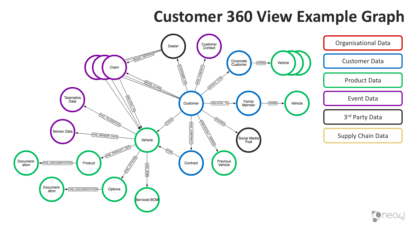
Of course, at the heart of the graph we have our Customer. Through the graph, we can understand its relationship to other customers; for example, this customer might work for one of your other corporate customers, or they could be family members. We have contract information, and we can also see not only information about their current vehicle – its current BOM, how it’s serviced, options they have, product definition and so forth – but also the information they have about any previous vehicles they built.
Moreover, we can see what vehicles they’ve purchased historically, the options those vehicles have and past claims. This graph could also include sensor data, telematics data, claims data and any customer contacts.
Pooling together this data from your different systems helps you understand that customer and the products they purchased from you. You also obtain a view of what they like, what they don’t like and how they’re related to other people – even down to social media posts.
So what can you do with this data? How can you put it to use? First, one of the fundamental things customer 360 is meant to do is improve your customer experience. For obvious reasons, customers become very frustrated when they interact with you and you don’t have the information about them that they expect you to, such as their claims history and the car they drive. Being able to interact with them intelligently definitely improves their experience.
Can you also use customer 360 to identify high lifetime value customers? Absolutely. When you understand your customer’s behavior, you’re able to see both past and current context, and distinguish between customers who might buy a new car two years, are at the top end with lots of options and make very few claims, and customers who might buy their car much less frequently, make a lot of claims and have maybe posted bad things about you on Twitter.
This also entails combining your information to obtain a view of how likely your customer will buy future products based on their past behavior, all of which allow you to focus on serving your high lifetime value customers especially well. Likewise, if you have a high-value customer and also have information about her husband (who’s also a customer but doesn’t personally look like a high-value customer), you’ll also want to give him excellent service, because their lifetime value as a unit is very high.
Additionally, the customer 360 graph detects and prevents churn. You can identify customers who are likely to churn in the same way you identify high-value customers: by looking at past behavior, finding patterns of claims, looking at social media posts and examining any customer interaction that might’ve led to a customer not renewing their contract or buying another car from you. From there, you can watch for instances of that pattern forming, identify potential churn and make decisions about how you want to interact with that customer and whether you want to go to great lengths to prevent that churn.
Similarly, you can use this graph to improve upsell and cross-sell by identifying which people are likely to buy and compare that to others who have bought similar products from you. In this way, you can make recommendations about what other options or features they might want to add, or sell them the next step up in a line of car based on what you’ve seen both in their individual behavior as well as the behavior of others in the graph.
Knowledge graph
Finally, we have the knowledge graph. Knowledge graph is an all-encompassing term, but we’re seeing many uses for it – not just in this industry but across many others. Essentially, the idea is to take your company knowledge and combine it to see how it all links. It often generates new insights because that data was previously never linked together before, and provides a way to persist this so it’s not just in engineers’ heads, but also on bits, on paper or on a file system somewhere.
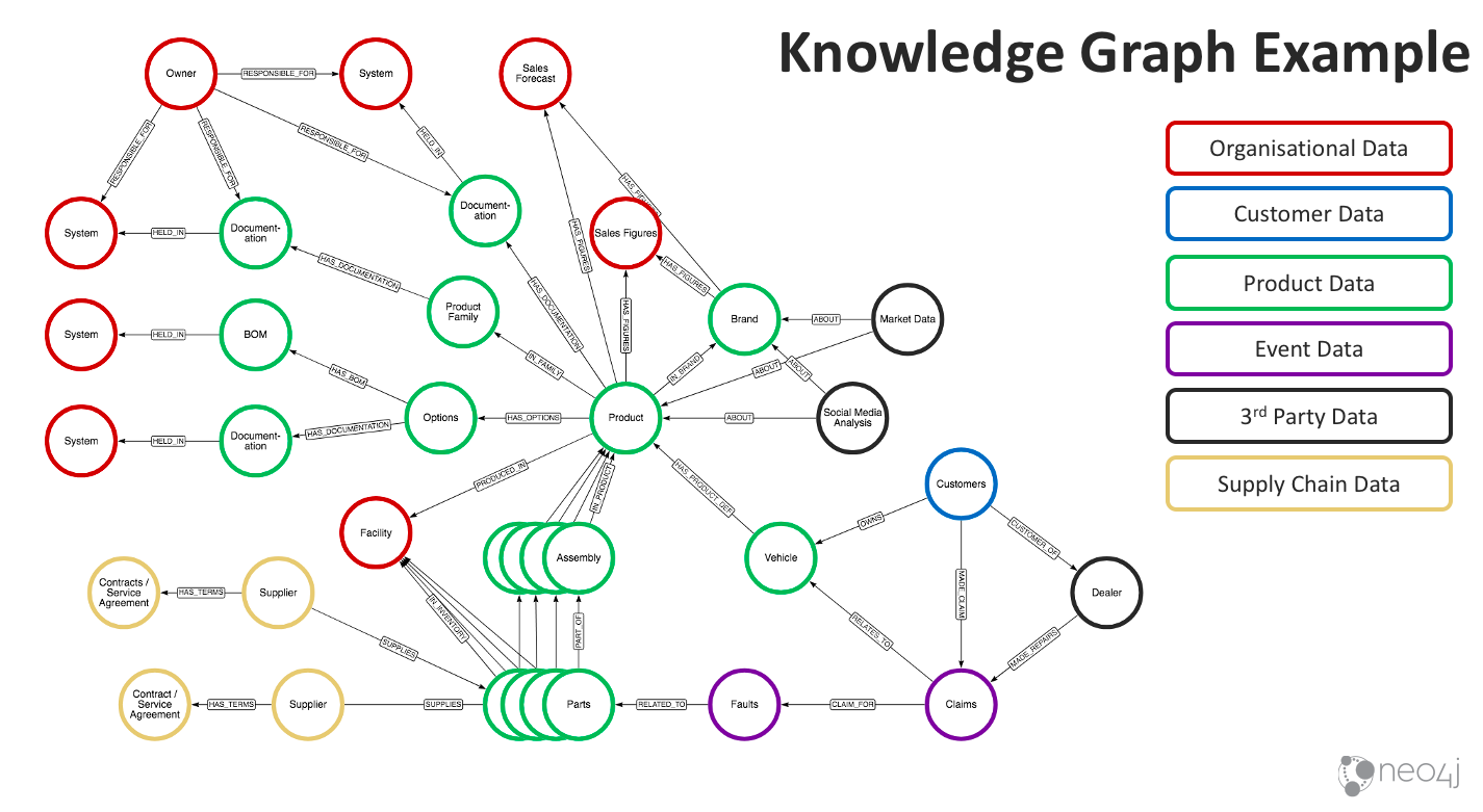
The graph above looks at a product-based internal knowledge graph, though we could extend this to include more organizational data, HR data and so forth.
We have a Product at the heart of this graph, through which we can understand the different variations of a product and how the product families fit together. Ultimately, we can follow the documentation links to find out where this documentation is stored and perhaps who owns and is responsible for it. This can also enable search engines, making it easier to find the information you’re looking for that might only live on a file system, isn’t tagged in any way or isn’t linked together. Putting it into this view makes the information much easier to work with, which can be a real time-saver.
Near the bottom of the graph, we again have a BOM view of a product, including the Parts and Assembly through which we can see where the product is made.
Moreover, we can see the supplier information for the parts. In this graph specifically, we have more claim and fault information. We also have marketing data and social media analysis, which might be related to your brand or individual products. Bringing this information together – along with sales figures and forecasts – and making it linkable helps you understand a full view across all these different sets of data.
How can we combine this to make use of a knowledge graph in this industry? Can we use it to improve your products and services? Absolutely.
You might have documentation, design documents, notes and decisions stored for many years across all sorts of offerings. When you have access to all this information in a place that’s searchable, it gives you the opportunity to take everything into account as you’re designing and building new products. What worked in the past? What was the solution to problem X that you’re facing now? You can even look at suppliers and understand how they map to different faults, thereby improving the things going into your products to reduce those faults. All of this can be understood by looking at the knowledge graph, specifically at the combinations and relationships between the data.
In the same way, you can improve your product time-to-market. When you have the right documentation and understanding at hand, you’re able to finish your design cycles and engineering faster. It also means your engineers, as well as those who are looking for this data, won’t waste their time searching for data. Instead, they can quickly get the information they need, allowing them to focus on their actual jobs.
Moreover, we use this graph for customer-facing uses. If you create a portal that contains information, documentation and historical information about your products, you can expose it externally and provide this ease of use for that information directly to your customers, again improving their experience in the process.
Of course, there are other use cases that are less specific to the industry but nonetheless applicable across a number of industries:
- Identity and access management
- Infrastructure and network
- Master and metadata management
- Regulatory compliance
Case studies
Now we’ll quickly take a look at a few case studies of companies that use Neo4j in some of the ways we’ve talked about.
First there’s Volvo Cars, who uses Neo4j to understand the connections between every component in their vehicles and how that maps to a customer’s needs.
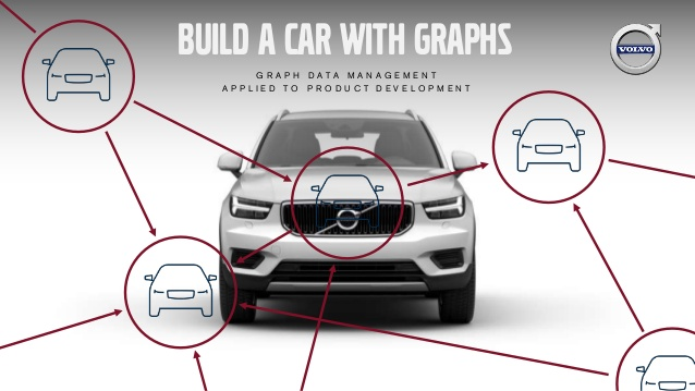
Volvo Cars uses Neo4j to not only view the BOM for the sake of being a BOM or to meet particular engineering metrics, but also to understand how everything in the vehicle meets a particular customer’s need. This is quite an interesting use case and likely involves quite a lot of highly connected data.
Second, we have the U.S. Army, who utilizes Neo4j for supply chain optimization. You might not think of them as a typical manufacturer, but they certainly need to understand how to make repairs, what spare parts they need and where those have to go. Of course in this sort of use case, lives are at stake. Having the right components and making the right repairs in the right place at the right time literally saves lives. In this way, the Army employs Neo4j to understand their bill of materials, manage their supply chain and make decisions faster.
Then we have Schleich, who uses Neo4j to do integrated product data management throughout the value chain. This involves looking at supplier information, the materials that come from different suppliers and how it all moves through their entire production line. Again, this gives them central access to the knowledge they have about their different parts, what goes into their different products and how that matches up against regulations for particular materials in various countries.
Next, we have NASA, who perhaps isn’t someone you’d think of as being a traditional manufacturer. In fact, their engineers and scientists actually use Neo4j for a lessons learned database. They’ve loaded decades of documentation into a database and made connections between that information with Neo4j to understand the content of these lessons learned, what it relates to and its metadata. In turn, all of this is used to power searches. Their engineers and scientists can now go back to those lessons learned and understand how previous problems were fixed.
One of the outcomes NASA highlights is how they used the search engine to find an issue for the capsule they’re building for Orion, the mission to take man to Mars. The fact that they were able to find this information so easily literally saved two years and a million dollars from this effort because they didn’t have to reengineer too much. They were able to find the data that they needed straight away using the graph.
Last, we have Lockheed Martin, who uses Neo4j for product 360. Earlier, we talked about customer 360. Product 360 is the same idea but looks at the data that sits around their product and how it fits together. Having this 360-degree view of the product has generated a lot of efficiencies, as well as new insights that Lockheed Martin can use to improve their products.
Conclusion
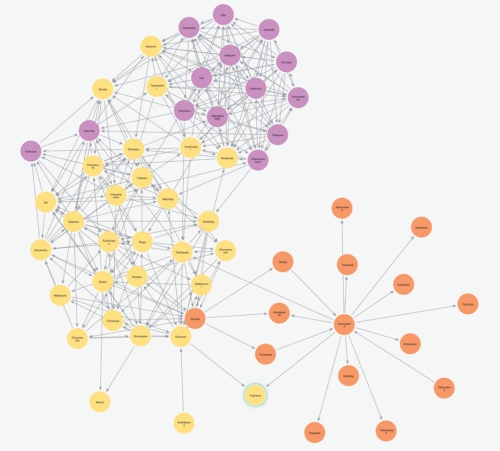
In this post, we’ve looked at simple examples through small graphs that I drew by hand. But, the real power of this comes when your data looks like this:

When you need to find the patterns within a massive data set that’s highly interconnected, this is where Neo4j really shines.
Download this white paper, Sustainable Competitive Advantage: Creating Business Value through Data Relationships, and discover how your company can use graph database technology to leave your competition behind.
Share Article


Explore
Related Articles
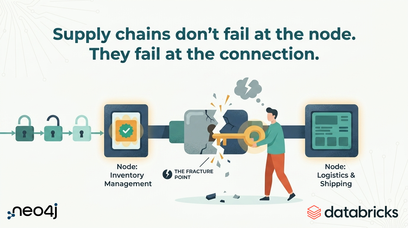
Supply chains don’t fail at the node. They fail at the connection.

SumoDB in Neo4j: Chaining Multiple Graph Algorithms in Snowflake — Part 3
What’s invisible in your supply chain could cost you