Going meta: Exploring the Neo4j graph database…as a graph

Technical Sales, Cambridge Intelligence
6 min read
The graph data model is inherently visual. Try explaining a graph to someone new. You’ll inevitably draw a picture, or wave your hands around to convey what you mean by ‘nodes… links…. and more nodes’. People think in graphs, and they interpret graph intelligence visually. That’s what makes graph visualization such a powerful tool.
Graph visualization is deeply intuitive and harnesses the brain’s unrivalled ability to spot patterns. It’s also flexible enough to apply to virtually any dataset. If there’s an interesting relationship in your data somewhere, you’ll find value in graph visualization.
To prove it, I thought we’d go a bit meta.
In this post, I’ll use KeyLines’ graph visualization power to explore the Neo4j GitHub community. It’ll show how KeyLines makes your graph data more accessible, insightful and valuable.
Our stack
First we’ll look at the technologies we’ll use for this GitHub exploration tool:

KeyLines and Neo4j integrate seamlessly. With a Neo4j backend, we can cache a copy of our data locally for faster response times. It also gives us access to powerful graph query and analysis functionality.
Neo4j and KeyLines play nicely with the new kid on the block too – GraphQL. The Facebook-backed query language is a specification for pulling data efficiently and in a more ‘type aware’ way than REST. Particularly exciting is its capacity to support nested queries, reducing the number of calls our app needs to make.
Loading a GitHub account
Let’s kick off our visual exploration by searching GitHub for the world’s most popular graph database:

Loading Neo4j’s 20 most recently updated repos
With each KeyLines interaction (a search, a click, a double-click, etc) we’re setting off a set of actions:
- Send an event to the service provider.
- The service auto-generates some Cypher to query the Neo4j database:
MATCH (User {login:"christian-cam"})-[PullRequest:PULL_REQUEST]->(Repository) RETURN User, PullRequest, Repository - If the response is blank, it sends a GraphQL query to the GitHub API:
query ($login: String!) { user(login: $login) { id name avatarUrl login company pullRequests(first: 50, states: [MERGED], orderBy: {field: CREATED_AT, direction: DESC}) { nodes { id title number commits { totalCount } repository { id name owner { id login avatarUrl } } } } } }, {‘login’: ‘christian-cam’} - The GitHub API returns some data, which is cached in our Neo4j instance. It’s then loaded into KeyLines and styled according to your customization code.
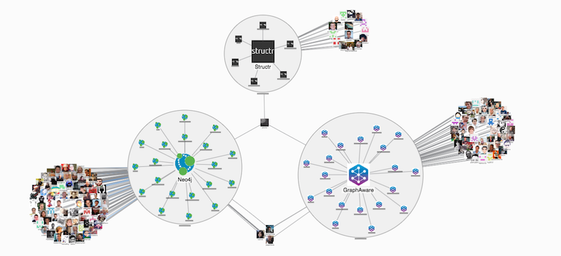
The Neo4j GitHub org contains 26 repos, hundreds of users, and millions of pull requests and diffs. It’s a vast data set that we couldn’t hope to understand in its raw format. Thankfully, graph visualization will help us distill thousands lines of data into an interactive chart.
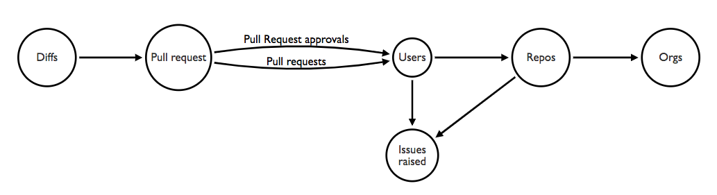
My graph data model. It looks complex, but KeyLines will help us explore it manageably
Understanding the structure with automated layouts
The beauty of graph visualization is its ability to convey complex graph structures that you can understand right away. Automated layouts are critical. Each of KeyLines’ seven graph layouts will reveal different features of the network.
The structural layout helps to reveal distinct communities. Here’s the Neo4j GitHub community:
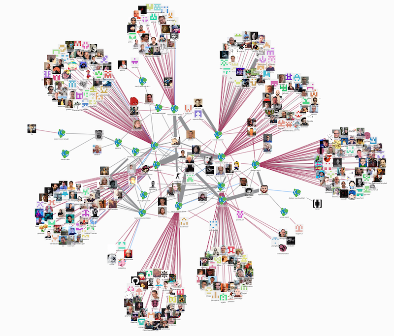
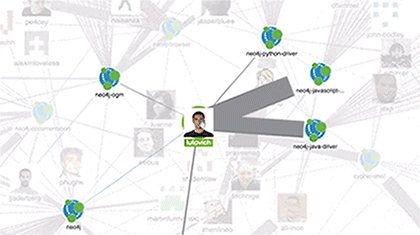
We can see that each repo has a distinct community of contributors – some large, some small. At the heart of the GitHub community, we have a core of contributors acting as bridges:

Some of Neo4j’s cross-repo community heroes
I’ve used a simple color code to indicate the type of connections between people and repos:
- Grey = pull requests
- Red = issues raised
- Blue = pull request reviews
Pull requests have been bundled into weighted links to avoid chart clutter. With this view, one account that stands out is lutovich, especially in some of the driver repos.
Double-clicking on lutovich reveals their most recent commits:
This ‘expand and layout’ approach is a powerful way to explore large graphs. It puts the user in the driving seat, so they can explore details at their own pace.
Filtering the graph by time
A prominent feature of my GitHub app is the KeyLines time bar – a neat component for exploring temporal networks.
On first load, the spike of pull requests around September stands out. There’s no surprise that this was around the time of Neo4j 3.2.5 and 3.3 beta.

Pull requests (grey), issues (red) and reviews (blue) all see a spike in September 2017
Let’s zoom in to that time period on the chart:
A GitHub pull request spike in September
We can see a great deal of development effort going into the core product, plus the the Neo4j Browser, docs, OGM and a couple of drivers – insight that we couldn’t see in our initial graph view.
Social network analysis
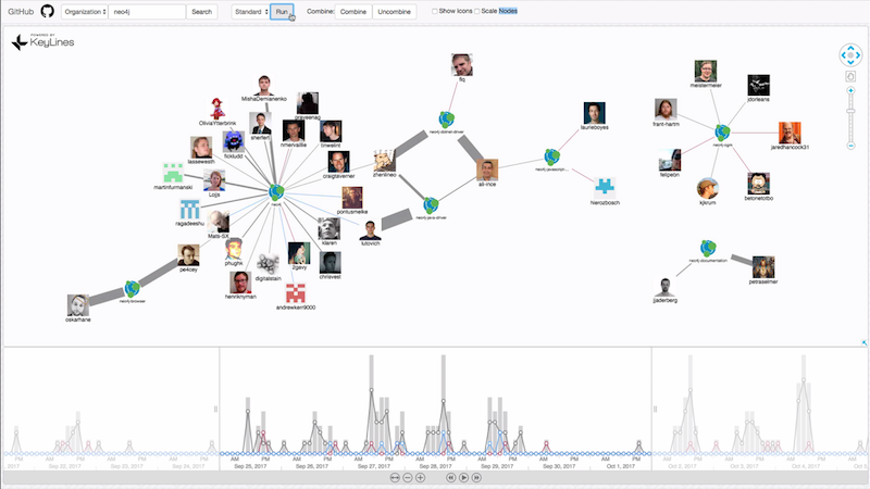
So we’ve zoomed into our graph’s details – now let’s try exploring outwards. Here I’ve added a few Neo4j partners with GitHub accounts:

Our starting point is familiar. KeyLines’ standard layout spaces nodes around the chart, revealing three distinct clusters with some collaboration between. But the chart is still fairly cluttered.
KeyLines’ new and improved combos functionality is a powerful way to declutter a graph, highlighting the most important nodes and links. Here’s what happens when we combine our repos and run the standard layout:

In two clicks we’ve transformed a cluttered chart into a clear graph visualization. We can instantly see Neo4j’s GitHub community contributors, and the bridges between the different projects. This approach can be applied to any kind of graph dataset, revealing trends and patterns that would otherwise be hidden.
Try it yourself
Inspired to try some graph visualization? We’re happy to help! You can see the power of KeyLines new combos functionality and find working examples of KeyLines with Neo4j on our SDK site, or follow the tutorials on our blog.
Cambridge Intelligence was a Silver sponsor of GraphConnect New York.
Check out videos from all of the sessions now posted on GraphConnect.com with more being posted every day!
Share Article


Explore
Related Articles

Connected Intelligence: Operationalizing Production-Grade Graph Solutions Across Enterprise Networks

A workbench for teams to query, explore, and visualize graph data
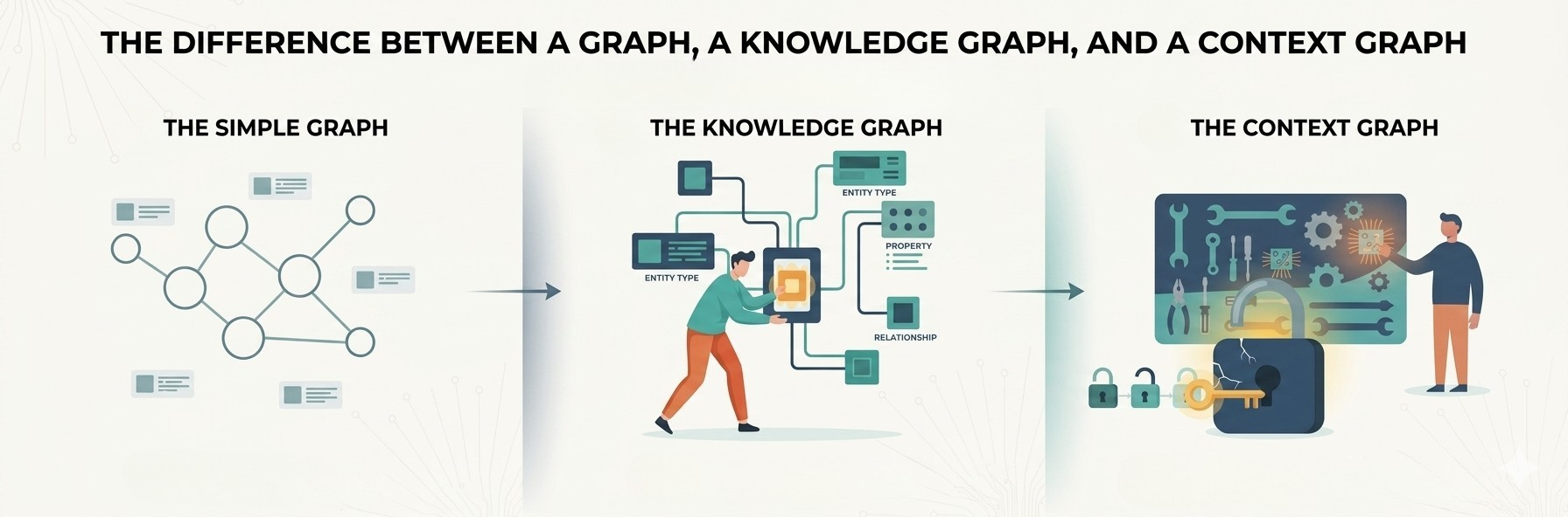
1 of 3: The difference between a graph, a knowledge graph, and a context graph
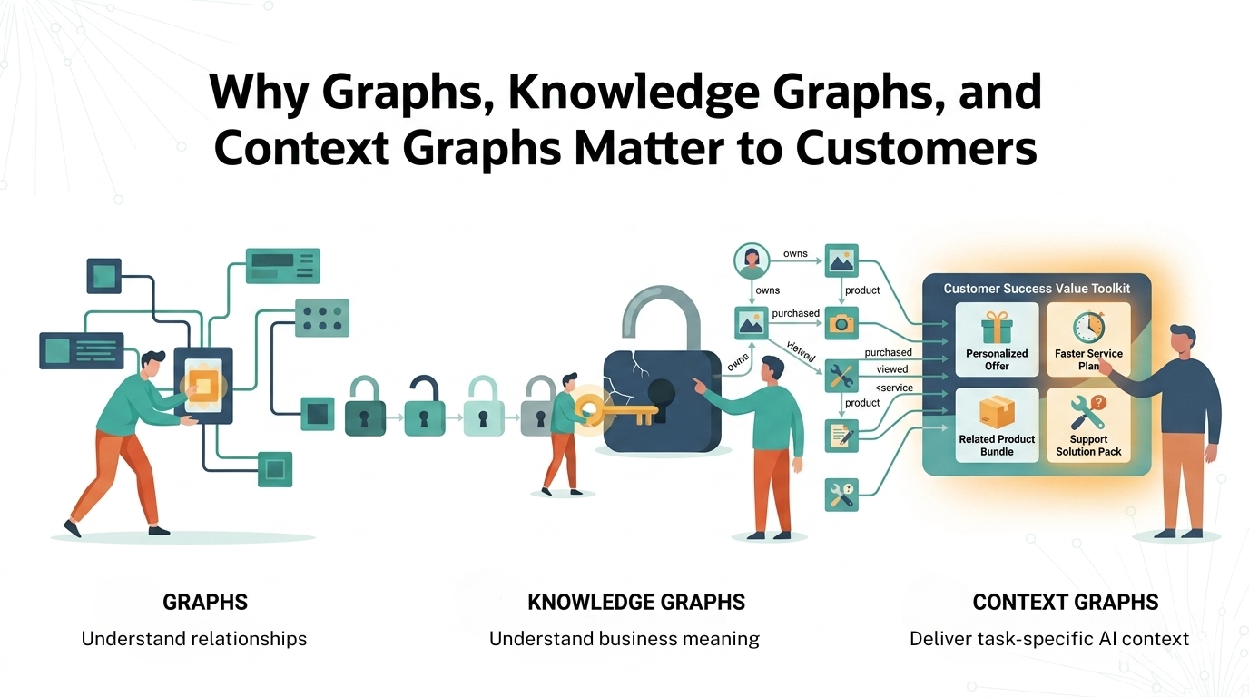
2 of 3: Why graphs, knowledge graphs, and context graphs matter to customers
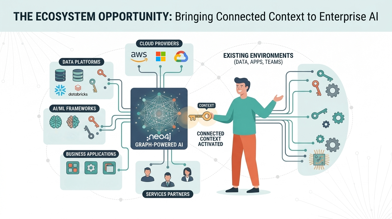
3 of 3: The graph ecosystem: Bringing connected context to enterprise AI