
How NASA Finds Critical Data through a Knowledge Graph

Chief Knowledge Architect, NASA
11 min read

Editor’s Note: This presentation was given by David Meza at GraphConnect San Francisco in October 2016. Here’s a quick review of what he covered:
- What is a knowledge architecture?
- What are the benefits of a knowledge architecture?
- The power of transforming data into knowledge
- How NASA converted their documents into a knowledge graph
- Interactive graph visualizations
- What’s next for NASA?
- How can your company benefit from a knowledge graph architecture?
–
What we’re going to be talking about today is knowledge architecture and how we use that to graph NASA’s special repositories:
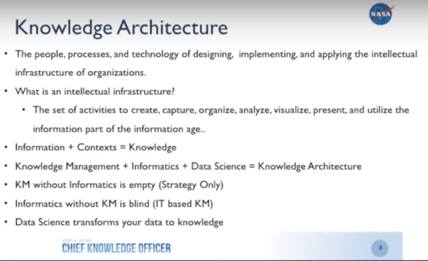
What Is Knowledge Architecture?
Knowledge architecture combines the different disciplines of knowledge management, informatics, and data science, which we use to extract knowledge from our “Lessons Learned” database. By the time I finish this presentation, I hope you’ll see why knowledge architecture is important and have a framework for taking it back to your organizations — managers, investors and funders — and show them how this can implemented within your organization.
Back in 1999, Peter Drucker said, “The most important contribution management needs to make in the 21st century is to increase the productivity of knowledge work in the knowledge worker.” Since that time social media has exploded, the Internet of Things (IoT) has taken off and we constantly have more and more data available. This makes it more important than ever to increase the productivity of our knowledge worker. How do we do that?
Challenges
First let’s go over some of the challenges your organization will likely have to overcome.
At NASA we have around 18 to 20 different locations with a total of 80,000 employees, and have been collecting data since the late 1950s/early 1960s. This data includes hundreds of millions of documents, reports, project data, lessons learned, scientific research, medical analysis and more stored in a nationwide database. And this volume of data keeps growing in terms of variety, velocity, volume, value and veracity.
But our biggest challenge is the accessibility of this information due to the silos between departments and also within our individual groups, products and programs. We have to try to break down those silos, which is exactly the capability that graph databases provide.
How to Get from Data to Knowledge
To convert data to knowledge, a convergence of knowledge management, informatics and data science is necessary. Knowledge management is used for strategy, informatics provides the pipeline to create storage capabilities with applications to transmit data from where it’s stored to end users, and data science provides the algorithms and methodologies that allow you to convert that data into actionable knowledge for your end users.
When you combine the three, you end up with what I call data-driven visualization. It’s important not to try and fit your data into a visualization; let your data drive how you visualize the information.
Below is a quick summary slide of what I just went over:
Why Knowledge Architecture?
I first started at NASA about five years ago with the task of examining knowledge management within the organization. The first thing I did was interview people and attend meetings, and at one of those meetings between a taxonomist and an IT developer, we were discussing how to improve search through taxonomy — a discussion the two had had many times before.
The taxonomist wanted to see the metadata but the developer resisted, so the taxonomist explained that access to metadata helps review the taxonomy for classification purposes, while the developer explained that they already had metadata storage covered.
While they both agreed on the definition of metadata, they were really talking about two different things. The taxonomist was talking about the metadata of the documents — the title, who created it, when it was created — while the developer was talking about the metadata of the database itself.
The Power of Transforming Data into Knowledge
Knowledge architecture is really a group of individuals within an organization that can serve as knowledge management liaisons for strategy, informatics, architecture and data science. All of this together allows the organization to speak the same language across silos and share information so the company can move forward.
Why is this important? Former CEO of Google, Eric Schmidt, said “We have an opportunity for everyone in the world to have access to all the world’s information. That has never before been possible. Why is ubiquitous information so profound? It’s a tremendous equalizer. Information is power.”
I’m going to play with semantics a bit and say that information is not the power, but knowledge is power. You could have all the information in the world, but if you can’t convert that into actionable knowledge, you really don’t have anything.
As Voltaire said, “With great power comes great responsibility.” You have to use that power to transport information into actionable knowledge for your end users and to give them something they can actually work with so they come back. If you build applications that are not useful to your end users, those applications are going to die.
I’m going to share a story about why I built this application for my engineers. One of the first thing our young engineers are taught is to go to the Lessons Learned database for information about different past projects. This includes what happened during those projects, the lessons learned from any mistakes or successes, and what actions were taken. The goal of this is to learn from the past, prevent the same mistakes in the future, and cut down on project time.
One of these engineers had 23 key terms he wanted to search, so he went to our standard search application — which at the time was a famous PageRank system — to look for these different key terms in all 20 million documents. But the Lessons Learned Database was made up of less than 1% of those 20 million documents. This meant he had to go through a huge list of information to find what he was looking for, which was extremely inefficient.
He came to me for a solution, and I had the IT department index the Lessons Learned Database so that the engineer could run his key terms against it. A couple of days later IT came back with an Excel spreadsheet with 23 tabs – one for each keyword – with lists of thousands of different documents that the engineer had to look through just to see if any of the information was valuable to him.
We knew there had to be a better way.
I started by looking at our Lessons Learned Database. (For the purposes of this presentation I’m using our public database, the Lessons Learned Information System (LLISDB), because we can’t share our sensitive data.)
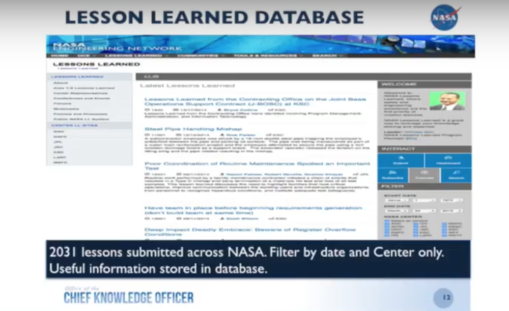
This database is very similar to what we have on-site but you can only filter by date and by center, a search that I exported into a CSV file and imported into Neo4j. While this was helpful, it was time consuming because it required continuous searches. We needed a better way for our end-users to access this information.
Converting Documents to a Knowledge Graphs
So what did I do? I started looking at how to take my documents and convert them into graphs:
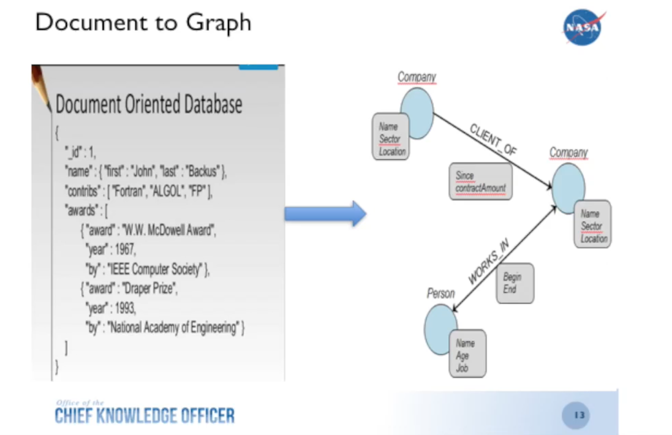
I’m currently in the second or third iteration of this and use MongoDB to hold the lessons learned and automatically create a graph through that connector with Neo4j.
But when I originally did this type of work, I took the metadata straight from the CSV file and converted it into a document database. With that visualization, the data is presented in a way that allows your brain to more easily pick up on patterns.
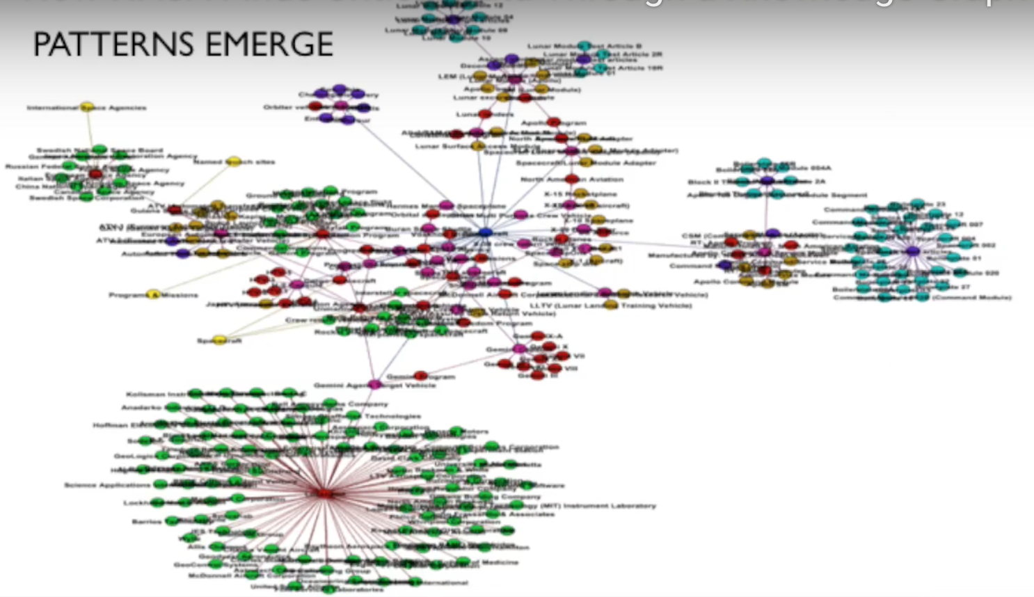
The graph below represents our ontology, which I’m showing to demonstrate that patterns become apparent very quickly:
Now let’s backtrack a little bit. We have a Lessons Learned Database, which is part of the knowledge management strategy. This is a strategy for how we collect, store, and share information — a part of our storytelling and ability to access information.
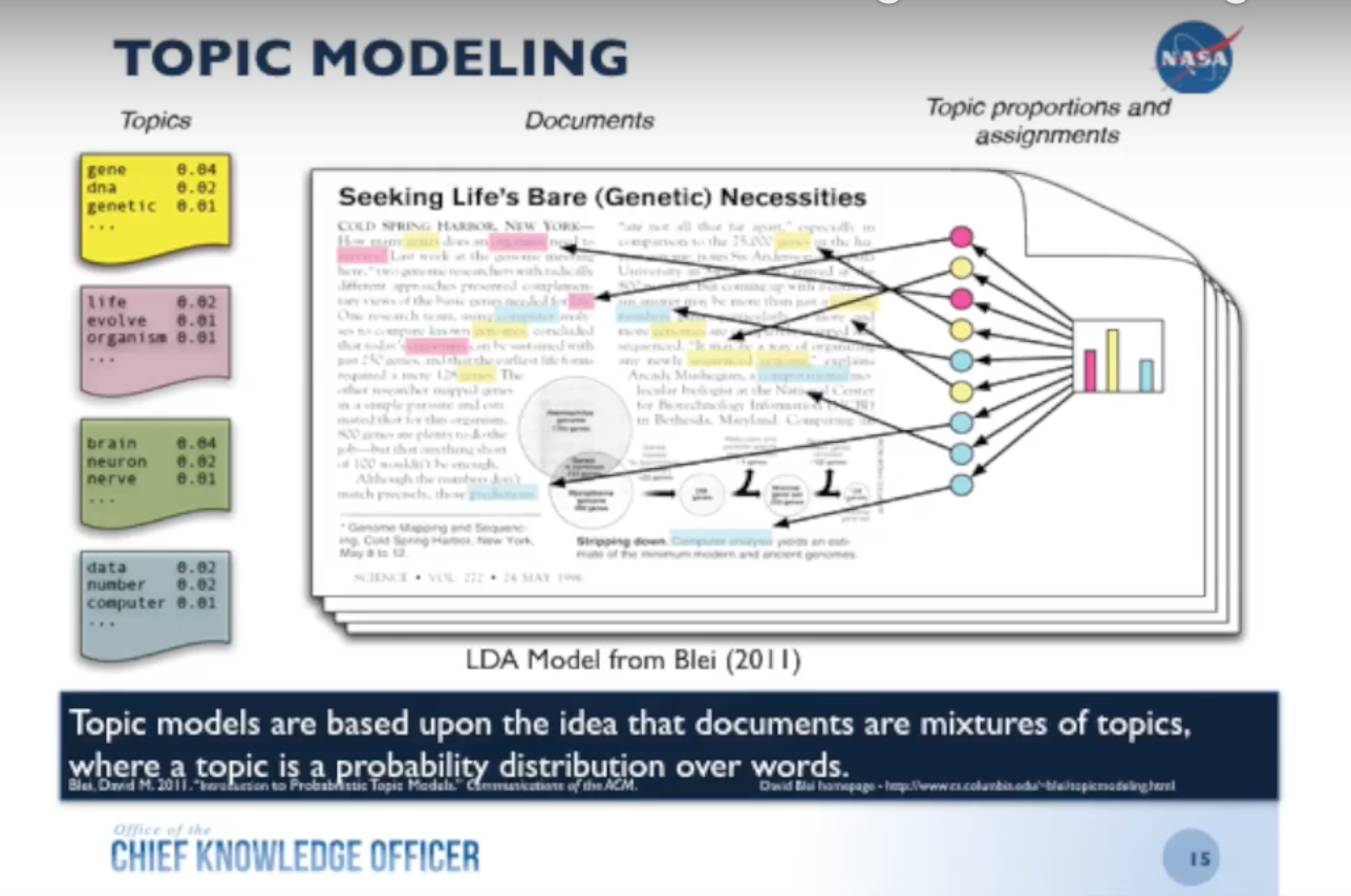
I took all the text out of the lessons and ran them through a topic modeling algorithm — latent Dirichlet allocation (LDA) — which returned about 27 topics. So now I have an additional piece of metadata that I can add back to the lessons: the topic.
On top of that, because there was a lot of metadata associated with these types of lessons, I was able to correlate the topics based on their self-assigned categories. Now, not only do I have the lessons with their topic, I also have the correlations between the topics so that I can easily see how one topic relates to another:
Once I do that, I’m able to showcase different topics and their correlations which I can throw back into the database and add to the columns. This also allows you to look at trends, which are very important because the mistakes we make at NASA can be a matter of life or death.
Below are some topic trend charts. Take a look at Topic 14, which talks about material, thermal, excess, contamination and temperature – all of which refer to the thermal tiles underneath the shuttles:
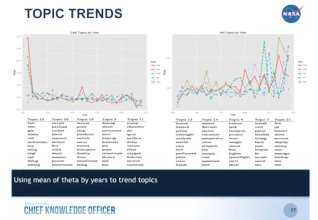
We started adding lessons in about 1990, and they went up and down until around 2003 when we had a shuttle disaster that resulted because of these tiles. If we had had this information beforehand and understood the trends better, we might have been able to prevent the disaster from taking place. So that is one of the really powerful results from applying data science back onto your unstructured data.
The Next Step: Interactive Graph Visualizations
You can also visualize the topics, which we did using the R package latent Dirichlet allocation visualization (LDAvis):

This is an interactive data visualization that shows all the different generated topics as well as the terms within those topics. It’s really helpful for an analyst, but not very helpful for end users.
We still had to develop a model that would allow us to showcase the data to our end users. Below is the simple graph model we developed:
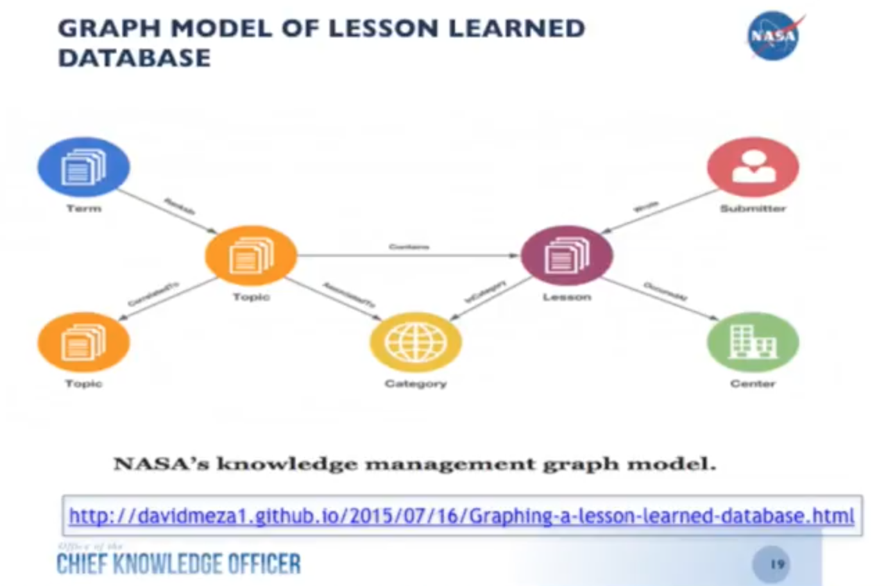
This is a simple graph data model that refers to specific repositories, which we focus on because we have so many different groups at NASA that each has its own set of relevant data. We have our lesson (purple node) which was written by a submitter (red node) at a specific center (green node). It’s in a certain category (yellow node) and is contained by a topic (orange node) which is correlated with another topic and contains a number of terms (blue node).
I wanted to keep things really simple for our engineers so they could quickly perform searches and pull the information they needed. If you want to learn more about how I set this up and try to reproduce it, you can check out my write-up on GitHub.
This is what the dataset looks like after I imported it into Neo4j:

I’d like to thank Nicole White, who taught me a lot through her videos and instructions on how to import CSV files into Neo4j. Utilizing a lot of her work, I was able to import that dataset from the CSV file, and created this quick little database here.
The above dataset has a topic of fuel valves, which has lessons in green associated with categories. You can see that there were a lot of lessons at JSC in this particular area. This shows us some patterns which from a management standpoint might indicate that these issues might need be explored more fully.
But that’s just the beginning of what we can do with this. We can also look at the lessons within individual topics:
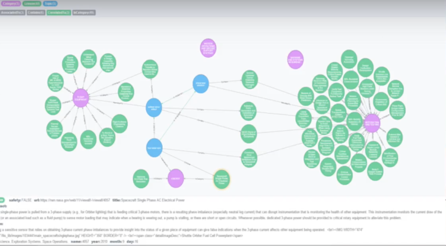
These topics are associated with certain categories that each have certain lessons. As an engineer, I have to be able to jump from one part of my system or subsystem to another, and this allows us to see the connections between my subsystems.
As a project manager, I have to understand my entire system even though I have disparate team members. I may have one person working on the battery subsystem, another one working on the fuel tank subsystem and another working on the lighting subsystem, but they all live in their own world and usually don’t talk to each other. The manager has to be able to look through this information and pull it all together.
In order to do that, I had to develop an application that’s useful to end users. When I first started using Neo4j about three years ago, I started reading a number of different books about a number of different graph visualization applications. For this project I selected Linkurious.
Watch the below demo to walk through a graph visualization demo of a fuel tank lesson:
What’s Next for NASA?
We’re working on getting this into MongoDB so that we can provide users with the ability to input lessons directly into the database. We’ll also run a text analysis to find text reuse or similarity that will allow us to catch documents that may actually be similar but are so far apart we might not have caught them. We might even look at entire paragraphs or sentences within those lessons, as well as sentiment.
We’re focused on another project to examine all of the comments astronauts have made on International Space Station expeditions over the last 15 years. This includes comments on what went right, what went wrong, what they liked and what they didn’t like. We have a database of around 90,000 comments, and while this may not sound like a lot, it was really difficult for a person to sift through these comments to find trends.
We decided to start with sentiment analysis and splitting comments into “good” and “bad.” You’ll be glad to know most of the comments were good, but probably because of the political correctness of the astronauts. They don’t want to say anything too bad because they want to go back up into space.
But we’re able to look at all of this text and try to find meaning out of everything that’s been said, which the knowledge graph management piece allows you to do. After all of these years working in IT, I realized that you need to have the combination of knowledge management, informatics, and data science in order to make good business decisions. Miscommunication or a lack of communication can cause a lot of problems that can be avoided by knowledge architecture.
How Can Your Company Benefit from a Knowledge Graph Architecture?
What could you do at your company if you had all of the benefits of a knowledge graph architecture?
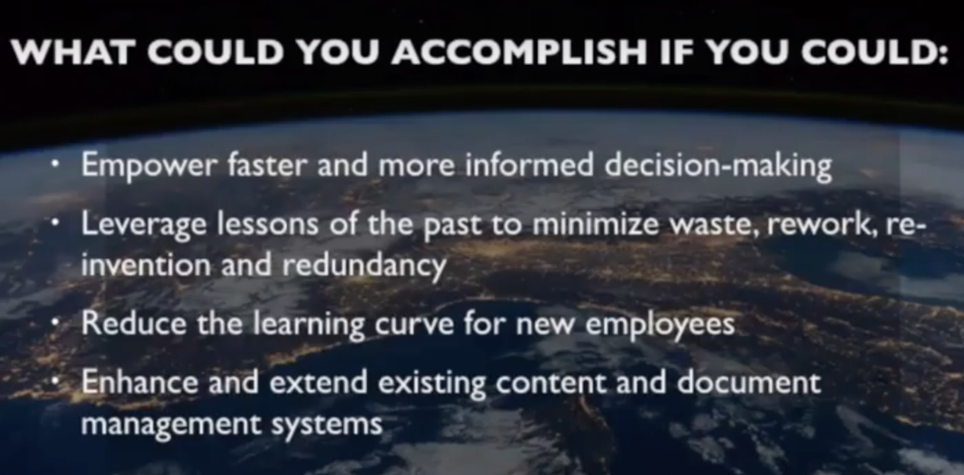
When you start looking at what kind of documents you have and how you’re able to transform those into actionable knowledge for your end users, you can improve your decision making. Of course, you can also leverage lessons from the past, because we tend to make the same mistakes over and over again.
The number one lesson learned is that we’re constantly looking at how to redo our Lessons Learned Database. One of our problems is that we don’t read the database when we’re having issues, so we need to figure out a better way to do that. But part of knowledge management is the ability to take that know-what into know-how for the end user, and transmit that knowledge to the next generation.
Things like this allow us to get that information to them a lot more quickly and easily, which allows us to enhance the extent of our existing content and document management system. We need to increase our metadata within our information system to be able to do more analysis on top of that. The more metadata we have, the better off we’ll be.
Share Article


Explore
Related Articles

How to Improve Multi-Hop Reasoning With Knowledge Graphs and LLMs


