Predictive analysis from massive knowledge graphs on Neo4j

Distinguished Professor of Computer Science
23 min read
Editor’s Note: This presentation was given by David Bader at GraphConnect New York in September 2018.
Presentation summary
David Bader, at the time of this talk, was a chair member at Georgia Institute of Technology of Computational Science and Engineering. In his presentation about predictive analysis, he gives a brief overview of the real-world problems and data he and his team are combatting with graph.
Graph is implemented in social networks, transportation systems, storm evacuations and also in the fields of academic research, science, physics, chemistry and astrophysics. Bader makes specific references to his use of graphs for analytics and surveillance. He illustrates how graph first found value in twitter during the H1N1 virus panic of 2009 and expands to modern day where a full set of tweets were put into the U.S. Library of Congress.
Even with technology as advanced as graph it is still important to double check. When we think about graphs, we have to look at other places where it may give insights you wouldn’t ordinarily see.
STING
is the Spatio-Temporal Interaction Networks and Graphs group at Georgia Tech that works on solving real-world problems. These problems include matters of national security, such as securing events like the Macy’s Thanksgiving Day parade or the Super Bowl with the help of DHS, the FBI and NYPD. The STING database is built on top of Neo4j and combines different data sets from partners, open data sets, newspaper reports and even handwritten notes.
Connecting data with predictive graph analytics runs on Neo4j in collaboration with PageRank and Gephi and evolves as the analysts inputs more data. The graphs are not fixed, they essentially “learn” with the user.
With predictive graph, Bader aims to predict catastrophic events before they have occurred without having to have experienced a similar tragic first. The future of graph is to anticipate past patterns of behavior and simultaneously detect new threats.
Full presentation
I’m David Bader and I am a chair member at Georgia Institute of Technology of Computational Science and Engineering. I’m really pleased to talk about Predictive Analysis from Massive Knowledge Graphs and some of the work that we’re doing with Neo4j.
Real-world problems and data
The Georgia Institute of Technology is fantastic. We’re building a new building to be called Coda, which is going to be dedicated in the Southeast U.S. to data sciences and engineering. My school will form the core of that building in collaboration with other companies that we work with.
My research area has been trying to solve real-world problems that involve data. In the process, we have worked on some of the most challenging and demanding graph analytic problems, ranging from health care to massive social networks, and extending to transportation systems like how to evacuate a storm.
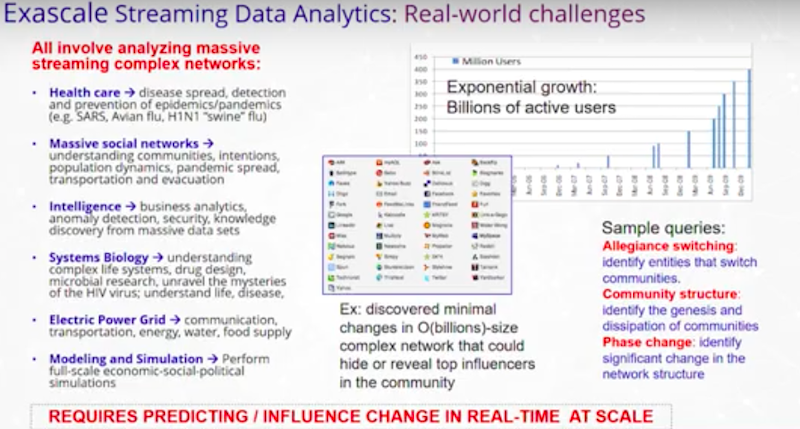
This is a challenging application space. There are lots of real-world problems that affect the human condition that we’re trying to engage with. Often, we have data sets that overwhelm a single computer and we need to have answers in milliseconds. We’d like to have the answers even before we thought of what those questions are.
Some sample queries try to understand communities within populations and individuals that may be core in some community. However, over time, those communities may move to be core in another community. As new information arrives, how do those communities change over time?
For instance: “Am I losing customers? “Why are they leaving?”
We also work on a lot of applications where we’re looking to identify new patterns that we haven’t seen before. In cyber security, we deal with threats and giving attribution to different types of attacks, some of which we may not have seen previously.
All of this requires predicting and influencing change in real time at scale. That’s the hallmark of the research that we’ve been doing. I often describe things in terms of a social network where it’s easy to talk about people and their relationships. However, we know that we use this metaphor to apply to a variety of problems related to network traffic, business intelligence, DNA and so on.
Where we implement graph
Graphs are really pervasive in my line of work – academic research, science, physics, chemistry and astrophysics.
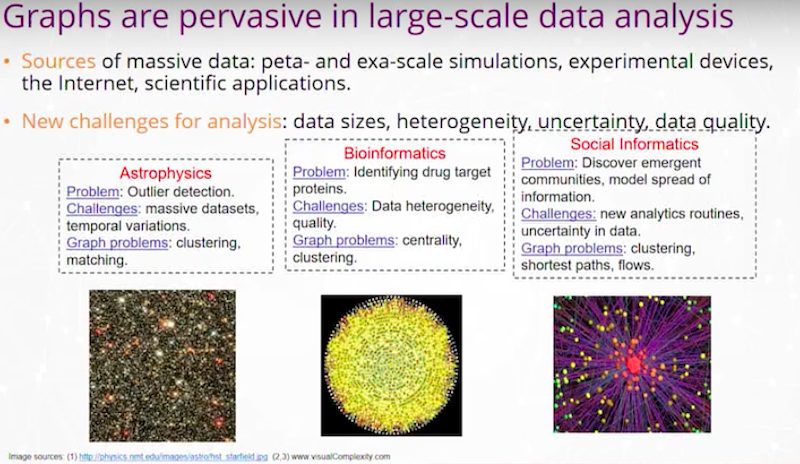
We see graphs all over the place. My job as a graph analyst is to take these real-world problems, look at the graph abstraction, and then help build out algorithms and tools that help solve these problems.
I have an example from detecting quasars in astrophysics. We may have two digital images of the sky over time. We’re looking for changes that could be a quasar. We want to detect it very fast and move a telescope within minutes to try to catch that celestial event. In this event, we may be looking at temporal variations in the image and a graph problem, like graph clustering or matching between those images and those bodies.
I have an example of a problem in bioinformatics where we’re trying to identify drug target proteins. We have a protein interaction network where we’re looking for proteins that are central, using Betweenness Centrality or other Centrality Network algorithms, or clustering of those proteins.
For social informatics, we may be looking at shortest paths between individuals in a social network or flows of information through an organization.
Today, a lot of work is done on forensic analysis of these data sets. However, as we go forward, we’re going to be tapping into these data streams where we’re trying to make decisions on the fly.
That’s really the face of these challenges. As our data gets larger and larger heterogeneity develops. We become uncertain on different qualities of the data that we have. At the end of the day, we would like to make better decisions that drive our business or organization.
I think these data analytics are really going to define the next set of companies. They are going to be able to monetize and have better efficiencies within their organizations and how they deal with others. This area of graphs is really going to change the world.
Graphs for analytics and surveillance

These are two public images. The top represents the hijackers on September 11th. It was claimed that if you could have done graph analytics at that time, you would have been able to detect the hijackers, the ring leaders and the different cells on the planes by using algorithms like Centrality.
On the bottom is another example of a type of graph analytic. This is observed information and a pattern that you know is suspect. Two individuals who live together, they’re observing a workplace. One rents a truck, the other buys fertilizer. They may be up to no good. What you’d like to do is find different versions of that type of pattern within a large data set. This is called subgraph isomorphism, or more commonly known as graph matching or motif finding.
These are challenging algorithmic problems, especially in the face of growing, massive data sets.
Graphs and Twitter
We are the first to take a full set of tweets that were public and put them into the U.S. Library of Congress. A decade ago, we took tweets from around September and October 2009, and we put them into a supercomputer over here called a Cray machine.
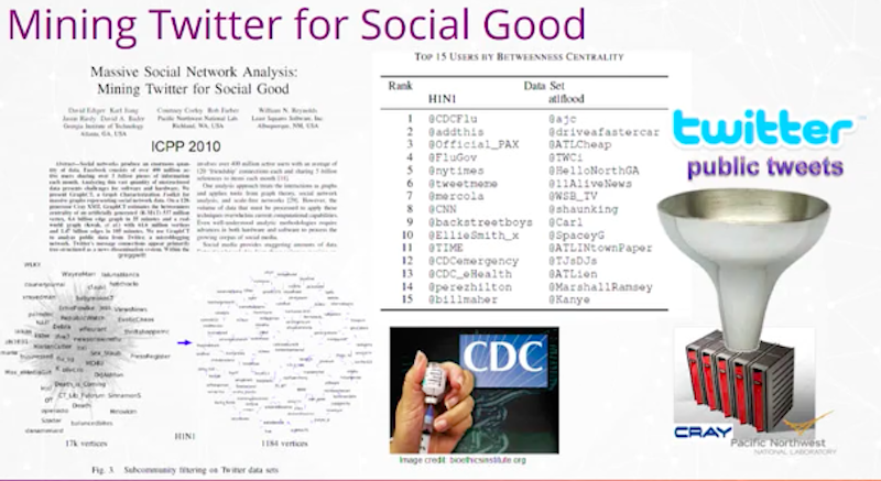
Some of you may recognize the name Cray. We worked with Pacific Northwest National Lab on terabytes of information. What we were trying to figure out was, is Twitter good for anything? Could we get any good out of tweets? At this time, we weren’t sure. Everyone was wondering, “How do you get value out of tweets?”
We took two events in that period. On the left, you see H1N1. In 2009, there was a scare that this new variant of virus, H1N1, was going to have double-digit mortality around the world. This was scary and people didn’t know what to do. There was a panic that ensued around air travel. People feared we would see massive deaths coming out of this.
We decided to take all the tweets, use the followers, followees and some of the keywords of the content, and build a graph. From that graph, we ran Betweenness Centrality as an ad hoc measure to see what were the most influential handles we could find on Twitter related to this event.
I have about 15 Twitter handles and some of them are obvious. This is where people were getting their information from about the virus.
You see the CDC is number one. That’s the U.S. Centers for Disease Control and Prevention. This is where you would expect many people to turn. Number four is flu.gov and a couple of these are the CDC later in the list. You also see commercial media like CNN, New York Times, Time Magazine, and you’d expect those also to be very influential as to how people are learning about it.
The power of graphs is more than that. On a breaking event, how do you know who to listen to? How do you know who is the source of information and the most influential? And it turned out that one of the top ones on this list, you’ll see it number three, @Official_PAX.
It turns out that this was the Penny Exchange, Penny Arcade. These were primarily adolescent male game players who were in Seattle at a meeting of this conference where they’re playing games and they were one of the first groups in the country, in the U.S., to contract H1N1. They started tweeting with each other about the symptoms.
That was one of the primary sources of understanding how deadly H1N1 was and what the symptoms were. You never would have thought about tuning into that in advance. Like, tuning your radio dial to a source for news – that’s the power of graphs.
I was giving a talk a number of years ago in India and a student must have been the biggest fan of the Backstreet Boys. I was asked, “Why are the Backstreet Boys up there?” And so, I scratched my head a little bit and said, “You know, I have no idea. I’m going to have to go research that.”
We went back to the data, we did some analysis. And this is the case where graphs are very good at giving you information, but you have to look at the data models and understand there’s always anomalies. It turned out the Backstreet Boys had released an album and so fans would be tweeting about the new album and H1N1 together. This crossover is just an interesting phenomenon.
Double checks and reality checks
When you have data and these real-world problems, you get some information from graphs. However, you always have to go and check what you have and always do a reality check when you’re working with these data problems.
We have also worked on finding resiliency in the U.S. power grid.

This graph is the power grid.
In the U.S., we primarily have an eastern power grid and western power grid. We work with Pacific Northwest National Labs in partnership to look at the resiliency of the power grid that’s represented as a graph problem. We know that single failures on our grid could lead to massive blackouts of whole regions.
On the right is a problem that we worked on looking at the human proteome. We ran Betweenness Centrality on the proteome to find proteins that weren’t the most interactive. They were like a needle in the haystack, but they were the most connected in some sense in a Centrality measure. It turned out one of the proteins we identified that had the highest Centrality had been implicated in breast cancer.
When we think about graphs, we really have to look at other places where it may give insights that you wouldn’t ordinarily see and use those graphs as a way to help solve real-world problems.
Sting
My lab has been doing the STING program for 25 years.
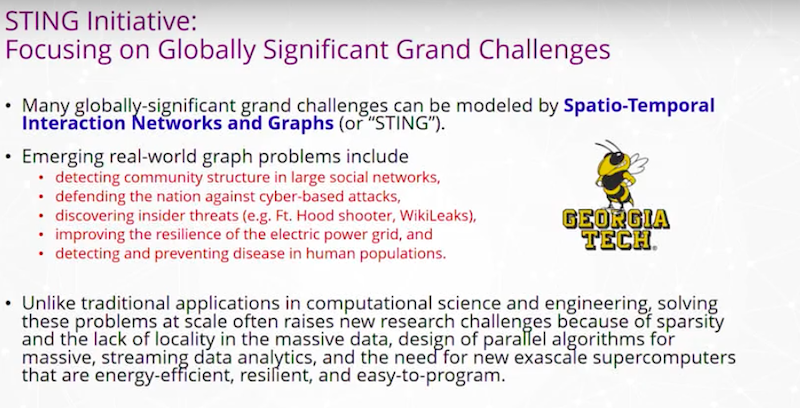
The Georgia Tech mascot is the yellow jacket. STING stands for Spatio-Temporal Interaction Networks and Graphs. We work on real-world problems that can be modeled by graphs that change over time, often where the vertices and edges have spatio-temporal locations, properties, time stamps and other features.
We have worked on a DARPA program that was aimed at solving problems. Major Nidal Hasan was an Army psychologist and also a Fort Hood shooter. He had a clearance, he was part of what you’d think of as those trying to look out for the mental health of others. And seemingly one day, he came in and shot and killed a number of people.
How, in a system, do you deal with insider threats where you have an individual who may change over time and do nothing wrong before some egregious event happens? Those are the types of problems that we try to look at. These problems are hard. We often have information that becomes large and we have to build new algorithms and even new computers to be able to solve these problems in real time.
We’ve helped engineer new computer architectures and partnered with companies like Intel, Qualcomm, NVIDIA, IBM and Cray, to build new computers. Often there’s components you then see as you’re using your smart phones in a number of years, those technologies trickle down. I hope someday we can run all of our Neo4j applications on our smartphones.
STING was built as a solution for analysts, who may use Neo4j. The graphs would get to a point where they had trillions of entities and the analysts need a response time in milliseconds. These graphs are connecting to a fire hose of information.
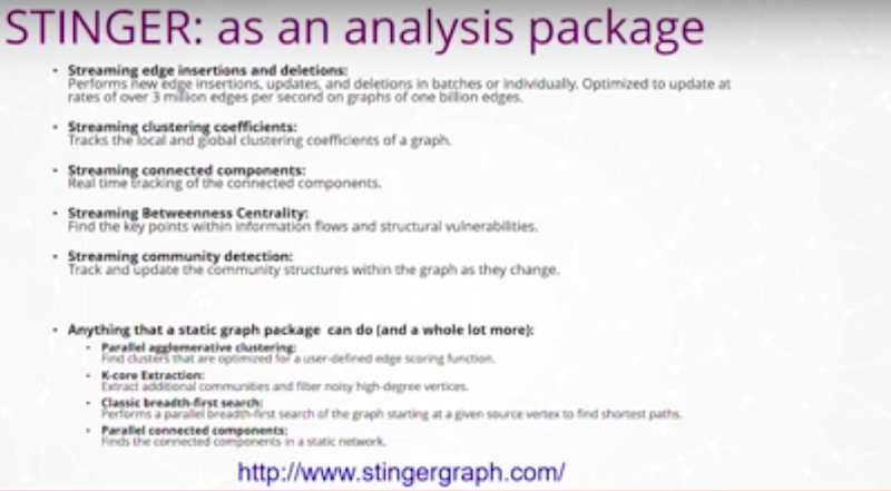
We’ve worked on early algorithms looking at properties that you may run in Neo4j today. For instance, Connected Components, Shortest Paths and Community Detection.
How do you track those changes as your graph is changing underneath you in real time? How do you detect, flag and report changes that are significant to your customers and users?
I wanted to jump into some depth on a problem that we’re doing for Homeland Security.
Matters of national security
This is a current work in progress where we have analysts who are taking natural language reports in multiple pages with references, footnotes and figures. Then they’re being charged with trying to protect special events.

For instance, in New York City we have the Macy’s Day Parade, or the Super Bowl that happens around the country. We would like these types of events to be safe. There’s some very important work that’s being done to ensure that the local law enforcement is aware of what’s happening and that you remain safe as you go to these events.
Analysts manually discover and rediscover relationships among the reports and the open data sets that they have access to. I should say, everything is typically kept open so that it is shared with local law enforcement, with the public and is able to be used. This is an open type of problem and graphs are a natural and important structure for connecting this knowledge together.
Our approach was to help Homeland Security build a knowledge graph.
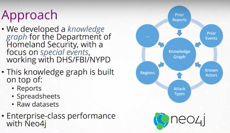
We’ve ingested prior reporting, events, newspaper articles, different types of attacks and tried to hook this together in a graph. We worked with DHS, the FBI, NYPD and others. We built the graph on top of spreadsheets, raw data sets, handwritten notes, reports, et cetera, and then incorporated this into a Neo4j instance.
The knowledge graph, after it’s been created, looks at the relationships between the reports and events, and then we maintain it.
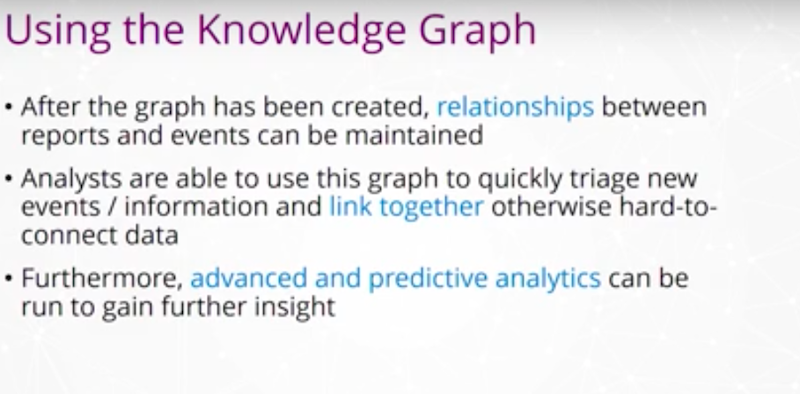
An analyst looking at the Super Bowl doesn’t have to go back to old reporting to figure out what was a threat at last year’s Super Bowl or the last 10 Super Bowls. They’ll be able to just connect that type of information. With regional threats it is the same method. Analysts will be able to use that knowledge graph to tie together the information in such a way that it’s natural to find similar types of events over time.
We are helping the analysts have more operational efficiency in the work that they do. Their time is extremely valuable, they’re solving a very important problem that affects everyone in this nation, and we are trying to do everything we can with graphs to assist them.
We also want to move from forensic analysis. Once something bad happens, everyone says, “Oh, I see it in the data.” I am able to trace back within data and say, “Yeah, you should have caught this, you should have caught that, you should have caught that.” It is much easier to find a known event rather than predictive analysis of events that have not happened yet.
You have to be correct every single time and be able to tell the future for things you may not have seen before. This includes people you have not come in contact with before and different types of threats you haven’t experienced before. That’s what makes this a really challenging space to be in. We’ve been using graphs in this space for years to rapidly tie different data sets together and be able to write the graph algorithms to answer those questions as rapidly as possible.
The data sources that we use for the Homeland Security knowledge graph really come from three different data sets.

The first data set is a collection of reports that’s provided by partners. That’s a couple dozen reports. Then we use some open data sets. The University of Maryland has a Center called START with a Global Terrorism Database. This goes back decades with a database and schema that’s very well-defined of different events. There’s tens of thousands of events in that database.
There’s also a list which is basically a spreadsheet, with about 211 known Homegrown Violent Extremists coming from research out of University of Nebraska Omaha. They’ve gone through newspaper reports and other information to find homegrown extremists in the U.S. and it includes what they did, whether or not they were captured, what type of attack they had, are they alive or dead, and what else is known about them.
We decided that we would ingest this as unstructured text.
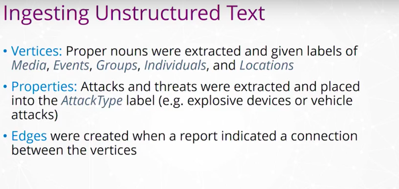
We would turn this into a graph with vertices. The vertices would be different media, events, groups, individuals and locations. Then properties of the types of attacks and threats were given as an attack type. For instance, explosive devices, vehicle attacks, et cetera.
Then, whenever we had a report that connected an individual or group with a different type of attack, we would place edges into that graph.
What we got was a lot of different pieces.

Here is an entry from Wikipedia:
On November 28, 2016, a terrorist vehicle-ramming and stabbing attack occurred at 9:52 a.m. Eastern Standard Time at Ohio State University’s Watts Hall in Columbus, Ohio. The attacker, Somali refugee Abdul Razak Ali Artan, was shot and killed by the first responding OSU police officer, and 13 people were hospitalized for injuries.
We take unstructured text and create graph objects from it. For instance, they’re colored differently to represent the different types of vertices. We have a person, the attacker, we have two different attack types, a vehicle attack and an edged weapon, a location, Ohio State University. To put this information together, we build a graph.
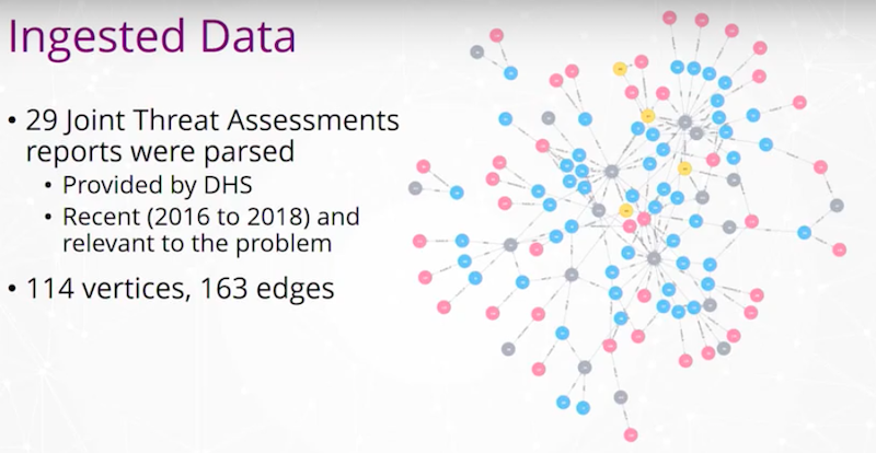
From the threat assessment reports we initially built a graph with 114 vertices and 163 edges. The graph is not very big, but it contains some very valuable information. Different colors of the vertices represent different vertex types from locations, individuals, groups and so on.
We took that as our starting point and then we worked into that a Global Terrorism Database.
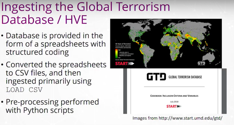
This database has about 120,000 events, each as a row. We looked for the domestic events within that database. It has approximately 70,000 or so events. We converted from the database schema into a CSV file where one row represented an event. Many features of that event exist as cells on that row. With Neo4j, we loaded in our starting point and did some pre-processing with Python scripts.
This is an openly available data set available from the START Center at the University of Maryland. Then we looked at our graph schema and ingestion.
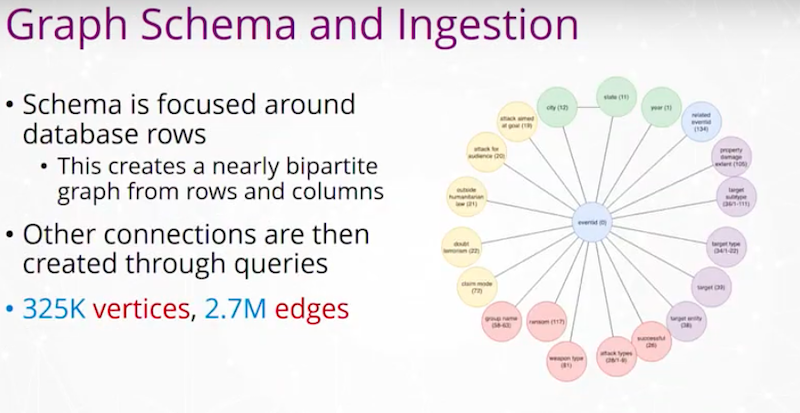
How do we combine these different data sets that we had? We came up with a mapping of fields from those original databases or the reports. We looked at what our graph schema in Neo4j would be, and eventually we built out a graph with about 325,000 vertices and about 2.7 million edges. Again, I mentioned as we have information that ties together the people, places and things, and the attacks and so on that we put edges between, we added those edges into that graph.
From this, we were able to use very simple queries from Neo4j, that I’ve represented in the example queries, to help analysts.
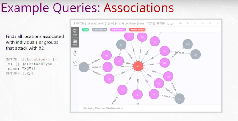
We may have a query to find all locations associated with individuals or groups that attack with a different attack type or weapon. Here, it just says X2 to represent one of those attack types.
We have our query over here to do that association query and just a result over here. Here’s X2 in Neo4j and the locations surrounding it that are related to that type of attack. That’s a very simple query and we’ve done a bunch of these.
Motif finding
An analyst may ask, “Find all locations associated with individuals “or groups that attack with both X2 and X3.” That’s like the Wikipedia entry above where there was both an edged weapon attack and a vehicle attack together. Here we find individuals who were given a lavender color in the graph. Some of these are individuals that are implicated in using both of those attack types. This is a simple example of motif finding.
We have Shortest Paths between individuals.
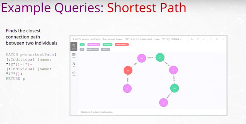
Find the closest connection path between two individuals. Here, the query’s on the left and the two individuals are these two ends of this chain where we’re trying to find a connection in that data between those individuals.
Before, you would have to page through different reports, notice different identifiers, go through different databases, and a lot of times, these connections are missed. As we move into this graph space, we readily find these connections that would go undetected or would otherwise take many hours for discovery in the past.
Connecting data
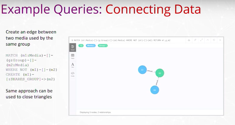
This is where we create edges between two media used by the same group. Here’s Neo4j and a query that is able to do that.
We’ve also run PageRank and other types of importance rankings to vertices in the graph.
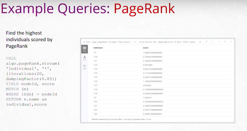
For instance, find the highest individuals scored by PageRank. Here is a simple output of vertices that are the individuals and what PageRank is.
This graph is using Gephi for a visualization. This is a community detection algorithm called Louvain that’s running on the U.S. events and the colors represent different communities.

I have in the middle the vertex importance with Eigenvector Centrality and PageRanks of some of the more influential or important actors based on these rankings. If I look at Eigenvector Centrality and look at the groups of some of them.
The first one isn’t known but I pull out groups; anti-abortion extremists, left-wing militants, white extremists, black nationalists, the Animal Liberation Front. We’re able to figure out, in these types of queries, some of the groups that are more central or maybe more influential within this data set.
Predictive graph analytics is really getting in front of the data and in front of the problem. With many input graphs, the data is only partially available so we are either streaming in data sets or we have missing information. We would like to have more, but we have to make quick and rapid decisions based on the data that we have.
Also, these graphs are changing over time. They’re not fixed graphs. We’re always trying to understand what’s changing and what’s happening. Unimportant vertices in the past may, over time, become highly important and we would like to be able to find those.
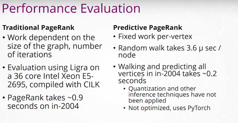
Predictive graph analytics is really the technique where we aim to predict what will happen to an analytic when the data gets filled in or inherently changes.
We have an example of running PageRank
and having a predictive PageRank where we may use a training model with transfer learning to train on random graphs and then evaluate it or run it on real graphs.

This highlights the process that we take for doing the type of training. We did random walks, which have a natural connection to PageRank, and we developed a neural network system that predicts PageRank using these walks.
We run all of this work, trying to get answers rapidly and fast.
The hope is that we are able to run all of these types of graph queries in time on the order of milliseconds to seconds even for some of the largest graphs in the world.
Conclusion and acknowledgments
To conclude, I want to thank a number of people.
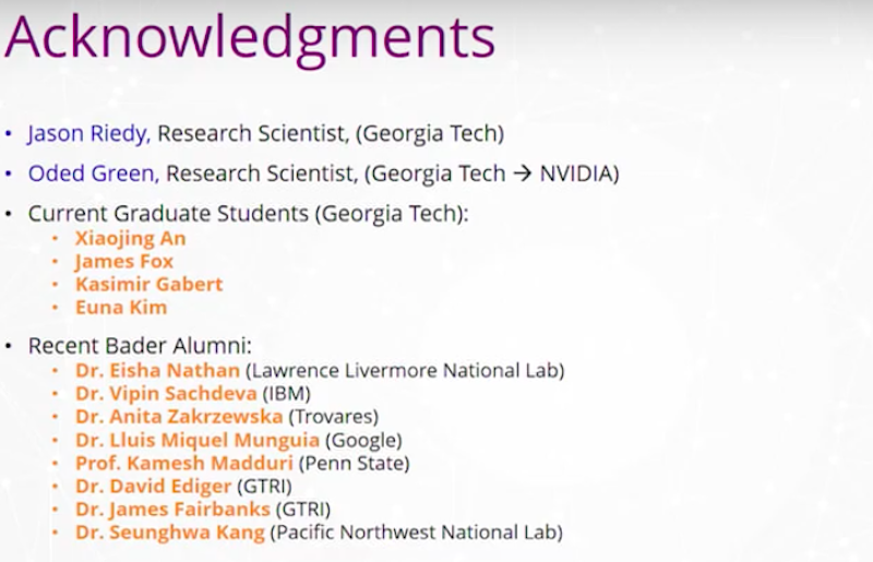
I want to thank some research scientists Jason Riedy, Doctor Anita Zakrzewska and Oded Green. I want to thank a number of graduate students currently and a few graduate students. I want to thank the students who have been working in this graph space.
We’re delighted to be with with Neo4j and I really appreciate your attention on learning about Predictive Analysis from Massive Knowledge Graphs on Neo4j with me.
Share Article


Explore
Related Articles


A workbench for teams to query, explore, and visualize graph data
Neo4j Named “One to Watch” in Snowflake’s 2026 Modern Marketing Data Stack Report
POLE+O: The 5-Type Ontology That Solves the Hardest Part of Building a Knowledge Graph