
Using Neo4j to Investigate Connections in the U.S. Healthcare System

Senior Manager, Content, Neo4j
5 min read
Editor’s Note: This presentation was given by Yaqi Shi at GraphConnect San Francisco in 2016.
Presentation Summary
In this presentation, Yaqi Shi describes the process of developing Health-Graph, a model of how some of the key elements in the healthcare system are connected. With a background in the Chinese healthcare system, Yaqi was bewildered by the U.S. system’s complexity, which inspired her to make this model.
Her process of developing a data model using open data provides a basic introduction to graph data modeling, as do her examples of addressing the challenges of data integration.
She concludes with a demo of some of the queries that her model affords, for example, showing the systematic flow of money between lobbyists and legislators, and how often, and by whom, frequently prescribed medications are prescribed.
Full Presentation: Using Neo4j to Investigate Connections in the U.S. Healthcare System
This post is about using Neo4j to show how some of the key elements of the healthcare system in the United States are connected.
Introduction
I am currently studying health informatics at the University of San Francisco; I also have a bachelor’s degree in medicine from China. I was very fortunate to have an internship with Neo4j and am now working on the Health-Graph project, which is the basis of my presentation.
Before we start, I’d like to mention that all the code from this post is housed on GitHub. Feel free to grab any information you think would be helpful for you. I also documented the project development in detail on the Neo4j blog, which may also be of interest.
Why Make a Model of the U.S. Healthcare System?
Why did I choose to do a project on healthcare?
When I first started my master’s program at USF, I was surprised by how differently the healthcare system in the United States works in comparison with how it works in China. For example, there are a lot of different stakeholders and different regulations. I was overwhelmed by the differences.
The image below shows a few of the stakeholders in the United States, such as providers, patients, pharmaceutical companies, medical device vendors, payers, and policymakers, and the list can go on.
I also realized that each stakeholder generates a lot of data every day. I wanted not only to understand how the healthcare industry works, but I also wanted to acquire some interesting insights from the data available out there and to be able to integrate the data.

I encountered a few challenges. First, there are many different roles in the healthcare system. Second, I found that how they relate to each other is complicated. And third, that there is a lot of data. In April 2016, I was introduced to Neo4j, and you can imagine how excited I was because Neo4j allows me to visualize the relationships between different healthcare stakeholders and handles data integration.
Developing a Data Model
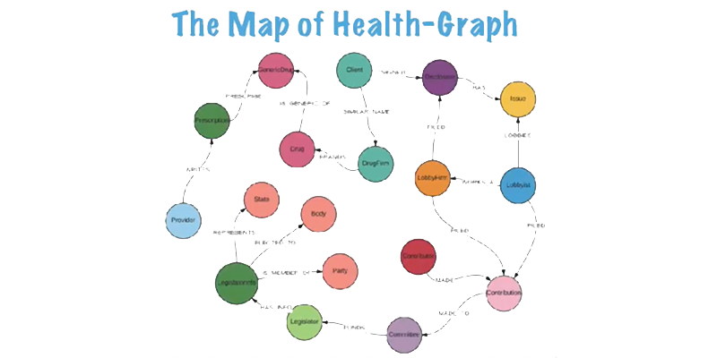
Next came a lot of research on how the elements of the healthcare system relate to each other. Below is the first version of Health-Graph model.
I’d like to quickly walk you through this initial model. It starts from the Provider node, where a prescription is written for a generic drug. A drug firm will brand a drug, and a drug firm will probably also sign some disclosure with a lobbying firm.
The disclosure would have different kinds of issues around healthcare or Medicare. Those issues are being lobbied by lobbyist. The lobbyist will also make a contribution to different committees, and the committee will find a legislator.
Also, there will be information on the legislator, such as which state they represent, which party they belong to and which body are they are elected to.
So this is the data model of the Health-Graph, and this is the information you can query. Next, I looked for data sources.
The Data Integration Process
This is the list of the data that I integrated into my Health-Graph.

This list shows the sources and the different types of data. If you have any experience working with open data, you probably know that it’s not the cleanest data ever.
In fact, one of the biggest challenges I encountered was integrating the data. Because it comes from different sources, it usually doesn’t have unique identifiers or a foreign key to connect it. As illustrated in the image below, the challenge is to find the grey connections.

I found two solutions. The first one is to use public APIs.
First Solution: Using Public APIs

In the image above, what I’ve been trying to do is to connect the node Prescription with the node Drug. I stored the generic name under the genericName nodes. You have probably heard of Rxnorm, which is part of the National Institutes of Health (NIH) National Library of Medicine and provides a unique identifier for clinical drugs.
So I send the generic name in both prescription and drug to RxNorm. That gives me a unique identifier: rxcui. I also stored the rxcui as a property under the Prescription node.
I also created an intermediate node here called GenericDrug, which has exactly the same generic name as the GenericDrug name node, and store the rxcui there as well. At this point I can connect those three nodes based on the rxcui and the genericName.
Second Solution: FussyWussy
The second solution is FussyWussy stream matching.
What I’m trying to do here is to connect the known client with the known drug firm based on the theory that if the company’s name looks similar to the client’s, I will create a relationship. The lever that I use in Python is called FussyWussy, which returns the matching score between two strings.
The image below shows an example of two strings being compared. The second string is a substring of the first one.
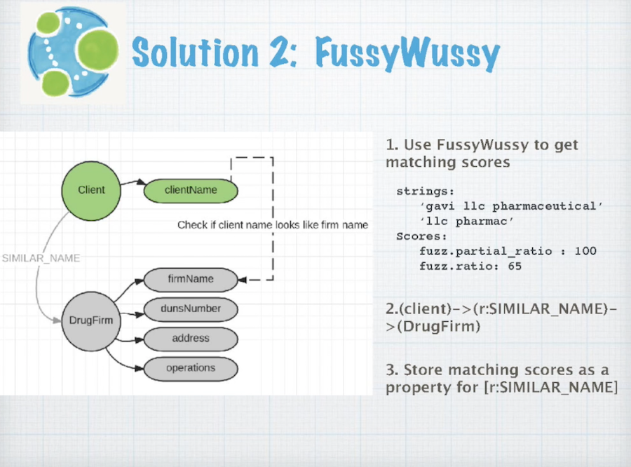
Calling the first function partial_ratio returns a score of 100. And calling the original function returns the score of 65.
Obviously, no one can identify they are the same string unless they are the same company, so I decided to choose the cut-off value of 70 because most of the companies’ names look similar if they have a score over 70. So I create a relationship if the score is above 70 for this node.
Demo: Some Health-Graph Queries
Now let’s look at a demo of the Health-Graph. Watch the video below for the full demo.
That’s the demo for the health graph and I am sure that if you have the data that you are interested in, you probably will run into the same issues that I did, such as how to integrate your data and how to do the data modeling. But this presentation is just to give you an idea of how you can use Neo4j to handle any industry you’re interested in.
Share Article


Explore
Related Articles

How to Improve Multi-Hop Reasoning With Knowledge Graphs and LLMs


