Clustering Graph Data With K-Medoids

Senior Data Scientist at Neo4j
7 min read
K-medoids is an approach for discovering clusters in data. It is similar to the well-known k-means algorithm.
Both approaches require the analyst to select the number of output clusters before running the algorithm. This number is called k. Both algorithms assign each dataset member to one of k-clusters based on which cluster has the closest center to the assigned member.
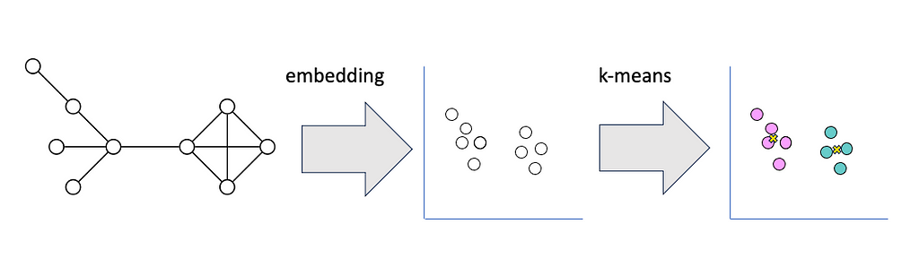
The key difference between the algorithms is the way these centers are defined. In k-means, the centroid that defines each cluster is a point in vector space at the mean value of the feature vectors for the items in that cluster.
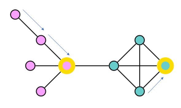
In k-medoids, the medoid that defines the cluster is itself a member of the dataset. The algorithm tries to optimize the selection of medoids so that the total distance from all data points to their closest medoid is as small as possible.
K-medoids offers some advantages over k-means for graph data. K-medoid clusters are easy to explain. The medoid becomes an archetype for the cluster, helping stakeholders understand the differences between clusters based on these central reference points.
Because the k-medoids only requires us to know the distance between pairs of items in the dataset, we can apply k-medoids directly to graph data by calculating the shortest paths between pairs of nodes.
To use k-means on graph data, we need to represent the graph’s topology in vector space. We can do this by applying a node embedding algorithm like Fast Random Projection to express each node’s position in the graph as a vector. We can then calculate the distance between each vector and the cluster centroids using Euclidean distance. The embedding step adds some complexity to the model and decreases explainability.
The main drawback to using k-medoids on graph data is the expense of calculating the shortest distance between all pairs of nodes in the graph. Because of this bottleneck, we can only effectively apply this technique to graphs of a few thousand nodes or less. For larger graphs, Fast Random Projection with K-means is a much more efficient choice.
The Neo4j graph data science library includes several excellent community detection algorithms such as Leiden, Louvain, and Label Propagation. These algorithms are fast and identify communities of densely connected nodes in the graph. However, they also tend to produce a long tail of small communities in less connected portions of the graph.
I have found that stakeholders sometimes struggle to interpret these small communities. They prefer a partitioning scheme that assigns each node into a limited number of communities because they can take action based on those assignments.
The Example Dataset
To demonstrate k-medoids, I created a graph of the US passenger rail system Amtrak based on information I found on Wikipedia. Each node represents an Amtrak station. Relationships represent routes between stations.
I couldn’t find the actual track distance between all stations on Wikipedia, so I calculated the approximate distance “as the crow flies” between stations using Neo4j’s point.distance() formula. You can download a dump file containing a backup of this dataset along with the accompanying jupyter notebook from the Github repository for this article.

The kmedoids Python Package
Neo4j’s Graph Data Science tools don’t include k-medoids as an algorithm. The classic Partitioning Around Medoids algorithm developed by Leonard Kaufman and Peter Rousseeuw is available from several Python and R packages.
I used the kmedoids Python package because it incorporates the improved FasterPAM algorithm recently developed by Erich Schubert and Lars Lenssen. The kmedoids package expects as input a distance matrix containing the distance between each pair of elements in the dataset. We will use All Pairs Shortest Path from Neo4j Graph Data Science to generate the distance matrix.
Find the Giant Component
If we want to use the length of the shortest path between a node and the medoid to assign nodes to communities, such a path must exist. Any node is a candidate for being a medoid, so our graph must be a connected graph to use the k-medoid approach.
If all nodes in a graph are not connected, there is usually a giant component that encompasses most of the nodes in the graph. When you visualize the graph, the giant component often looks like a big continent with a few isolated islands floating around the edges.
Breaking down a large graph into weakly connected components is an important first step in community detection. Once we see the connected components, we can further segment the largest components with community detection algorithms if necessary.
In our Amtrak dataset, it turns out that the Downeaster line running from Maine to Boston’s North Station does not connect directly to the rest of the Amtrak system. Riders must use other forms of transportation to transfer to Boston’s Back Bay or South stations to reach the rest of the network. We will exclude the Downeaster stations from our analysis.
To find the largest component in our Amtrak graph, we start by creating a graph projection in Neo4j’s graph catalog. See the project notebook to see how to connect to Neo4j from Python. The projection called “amtrak” will include all Station nodes and all CONNECTS_TO relationships, along with the distance properties for those relationships. The relationships are treated as undirected.
g_amtrak, result = gds.graph.project("amtrak",
                                     "Station",
                                     {"CONNECTS_TO":
                                      {"orientation": "UNDIRECTED",
                                       "properties":{"distance":"distance"}
                                      }
                                     }
                                    )
The function find_giant_component() runs weakly connected components and updates the nodes in the graph projection with the component id. We stream the ids back from Python and determine which id corresponds to the largest component. This id is used to filter the original graph to create a new projection containing the giant component.
def find_giant_component(projection, wccProperty, subgraph_name):
    # Mutate the graph with wcc id so we can use it for filtering
    gds.wcc.mutate(projection, mutateProperty=wccProperty)
    # Write the wcc id to the graph so we can use it for filtering in Bloom
    gds.graph.nodeProperties.write(projection, wccProperty)
    # Get the id of the giant component
    wcc_df = gds.graph.nodeProperties.stream(projection, wccProperty)
    biggest_component_id = wcc_df['propertyValue'].value_counts().idxmax()
    # Filter the projection to the giant component
    subgraph, result = gds.graph.filter(subgraph_name,
                                projection,
                                f"n.{wccProperty} = {biggest_component_id}",
                                "*")
    return subgraph, result

g_amtrak_connected = find_giant_component(g_amtrak,
                                           "wccId",
                                           "g_amtrak_connected")
Create the Distance Array
The All Pairs Shortest Path calculates the distance between all pairs of nodes in the graph. The algorithm is faster than calling the shortest path algorithm for each pair of nodes individually, but it’s still an expensive operation.
For a graph with a size of n nodes, we’re attempting to calculate n(n-1)/2 distances — a lot of paths for a large graph. The time required to run All Pairs Shortest Path puts a cap on the size of graphs for which this k-medoids approach can be effective.
I have successfully tested it with graphs up to several thousand nodes, but not more than that. For a graph the size of our Amtrak dataset, All Pairs Shortest Path is no problem.
The function get_distance_array calls allShortestPaths from the GDS library. The concurrency parameter determines how many parallel processes the algorithm can use. I ran this on an AuraDS instance with 5 CPUs, so I set the concurrency to 5. The allShortestPaths procedure returns a data frame with one row for each pair of nodes. We use the pandas pivot function to transform the tall data frame into a square matrix, with each column and row representing a node, and the values at the intersections of a row and column representing the distance between that pair of nodes. The function returns both the distance array and the index that relates the position in the matrix to the corresponding node id in the graph.
def get_distance_array(projection,
                       relationshipWeightProperty=None,
                       concurrency=4):
    all_pairs = gds.allShortestPaths.stream(projection,
                                            relationshipWeightProperty = relationshipWeightProperty,
                                            concurrency=concurrency)
    distance_df = all_pairs.pivot(index='sourceNodeId', columns='targetNodeId', values='distance')
    distance_array = distance_df.fillna(0).values
    return distance_array, distance_df.columns

amtrak_distance_array, amtrak_index = get_distance_array(g_stations_connected,
                                                         relationshipWeightProperty="distance",
                                                         concurrency=5)
Test Values of K
There is not necessarily a right or wrong value of k for an unsupervised machine learning task like k-medoids. However, some values of k will yield communities that are more internally cohesive and distinct from other communities.
The kmedoids package includes a calculation for medoid silhouette. This is similar to the traditional silhouette score used with k-means. Traditional silhouette compares the distance from each point to all other points in it’s cluster and the second-closest cluster. Medoid silhouette compares the distance from each point to the medoid of its cluster with the distance from the point to its second-closest medoid. The average medoid silhouette score across all nodes in the graph gives us a way to compare the quality of different k-medoid results. Medoid silhouette scores can range between 0 and 1, with higher values representing better results.
The function test_values_of_k() runs k-medoids for each value of k in a list. It calculates the medoid silhouette score for the resulting partitioning. We can use a plot of the results to find a value of k that has a good silhouette score while keeping a small enough number of communities to be interpretable.
def test_values_of_k(k_list, distance_array):
    result_df = pd.DataFrame(columns=['k', 'loss', 'silhouette'])
    for k in k_list:
        km = kmedoids.KMedoids(k, method="fasterpam")
        c = km.fit(distance_array)
        silhouette, _ = kmedoids.medoid_silhouette(distance_array,
                                                   c.medoid_indices_,
                                                   False)
        result_df.loc[len(result_df.index)] = [k, c.inertia_, silhouette]
    result_df.plot.scatter(x='k', y='silhouette')
    return result_df

amtrak_result_df = test_values_of_k(range(2,16), amtrak_distance_array)

The resulting plot shows that if we selected only two medoids (probably one on the East Coast and one on the West Coast), we would be able to divide the graph into clusters where most nodes would be far from the opposite medoid.
However, I am interested in retrieving smaller, more detailed clusters than that high-level division. The graph shows that the silhouette score is pretty flat between k=3 and k=7, but we see a jump when k=8. We’ll choose k=8 for our final k-medoids run.
Write Results to Neo4j
Now that we have selected the value of k, we can run k-medoids and save the results to Neo4j. The function write_kmedoid() runs k-medoids based on the distance array.
We run a Cypher statement to set a medoid property on the medoid nodes that are returned. Next, we run a Cypher statement to set a property on each node that represents the community assignment. The function returns the medoid indices and labels for further analysis.
def write_kmedoid(distance_array,
                  array_index,
                  k,
                  medoid_property_name,
                  cluster_property_name):
    km = kmedoids.KMedoids(k, method='fasterpam')
    c = km.fit(distance_array)
    medoid_ids = [array_index[i] for i in c.medoid_indices_]
    gds.run_cypher(f"""
                    UNWIND $medoidIds as medoidId
                    WITH gds.util.asNode(medoidId) AS medoid
                    SET medoid.{medoid_property_name} = True""",
                   {"medoidIds": medoid_ids})
    gds.run_cypher(f"""
                    UNWIND range(0, size($labels)-1) AS i
                    WITH $labels[i] AS label, $nodeIds[i] AS nodeId
                    WITH label, gds.util.asNode(nodeId) AS member
                    SET member.{cluster_property_name} = label""",
                   {"labels": c.labels_, "nodeIds": list(array_index)})
    return c.medoid_indices_, c.labels_

amtrak_medoids, amtrak_labels = write_kmedoid(amtrak_distance_array,
                                              amtrak_index,
                                              8,
                                              "medoid",
                                              "partitionId")
Analyze K-Medoid Results
We can visualize the k-medoid results in Neo4j Bloom. I created a perspective that uses rule-based styling to color each Station node according to the unique values of the partitionId node property. I added a second rule-based style to make the size of Station nodes where the medoid property is true to be 4x the size of other nodes.
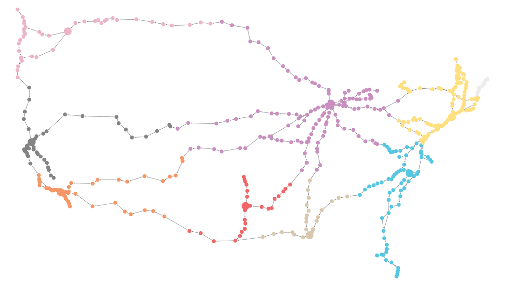
The visualization shows clusters centered at the following medoid stations.
╒═══════════╤═══════════════════╕
│partitionId│name               │
╞═══════════╪═══════════════════╡
│0          │"Sacramento"       │
├───────────┼───────────────────┤
│1          │"Los Angeles Union"│
├───────────┼───────────────────┤
│2          │"New Orleans"      │
├───────────┼───────────────────┤
│3          │"Chicago Union"    │
├───────────┼───────────────────┤
│4          │"Spokane"          │
├───────────┼───────────────────┤
│5          │"Cary"             │
├───────────┼───────────────────┤
│6          │"Fort Worth"       │
├───────────┼───────────────────┤
│7          │"New York Penn"    │
└───────────┴───────────────────┘
We can create a silhouette plot that represents the medoid silhouette score of each node. We sorted the plot by community and in descending order of medoid silhouette score. You can infer a lot about community quality from visual inspection of the silhouette plot.
I usually like to see the shape of the communities’ plots have blunt ends representing a group of nodes with similar, high silhouette scores at the core of the cluster and a steep tapering representing a smaller number of nodes at the periphery of the community. I prefer plots shaped like butter knives versus steak knives.
The function create_silhouette_plot() runs themedoid_silhouette() function with the samples parameter set to True so that we return a medoid silhouette score for each node. I adapted the code for creating the silhouette plot from Mukesh Chaudhary’s post in Towards Data Science.
def create_silhouette_plot(distance_array, labels, medoid_indices):
    score, samples = kmedoids.medoid_silhouette(distance_array, medoid_indices, True)
    fig, ax = plt.subplots(1,1,figsize=(10,8))
    y_ticks = []
    y_lower = y_upper = 0
    for i,cluster in enumerate(np.unique(labels)):
        cluster_silhouette_vals = samples[labels ==cluster]
        cluster_silhouette_vals.sort()
        y_upper += len(cluster_silhouette_vals)

        ax.barh(range(y_lower,y_upper),
                   cluster_silhouette_vals,height =1);
        ax.text(-0.03,(y_lower+y_upper)/2,str(i))
        y_lower += len(cluster_silhouette_vals)

    # Get the average silhouette score
    ax.axvline(score,linestyle ='--',
    linewidth =2,color = 'green')
    ax.set_yticks([])
    ax.set_xlim([-0.1, 1])
    ax.set_xlabel('Silhouette coefficient values')
    ax.set_ylabel('Cluster labels')
    ax.set_title('Silhouette plot for the various clusters')

create_silhouette_plot(amtrak_distance_array, amtrak_labels, amtrak_medoids)

The rather spiky silhouette plot for the Amtrak network shows that for most communities, there is not a dense group of nodes near the medoid. Instead, we see nodes moving farther from their medoid and approaching their second-closest medoid at a steady rate. This makes sense for a transportation graph with stations evenly distributed along rail lines. The relatively flat silhouette of cluster 3 results from multiple different midwestern rail lines that converge in Chicago, Illinois. Stations on each line can exist at a similar distance from the medoid. The steepness of cluster 4 results from only three rail lines converging at Spokane, Washington, in the relatively sparse northwest. Much of the width of cluster 5 is to the left of the dotted green line, which represents the mean silhouette score for the dataset. That indicates that the community around Cary, North Carolina, is less closely tied to the medoid than other communities.
Try on a Graph of Genetic Data
The sparse Amtrak graph works well for illustrating the k-medoid concept because the clusters are clear visually. However, typical graphs that you might want to try this technique on are probably more densely connected.
I downloaded a dataset of data about the genes of the roundworm C. elegans from The Network Data Repository with Interactive Graph Analytics and Visualization.
Based on silhouette scores, I chose a k of 14.

The Bloom visualization of the cluster results is more complex than the Amtrak visualization, but the cluster structure is recognizable.

You can use the filter feature in Bloom to highlight the members of each cluster.


The medoid silhouette plot shows stepwise changes because the algorithm was run with unweighted relationships. The distances between nodes are integers representing the number of relationships in the shortest path. The flat profile of cluster 3 comes from the large number of nodes that are direct neighbors of the medoid and have no other relationships. The gap between the bars for cluster 1 and cluster 0 exists because there are several nodes assigned to cluster 1 that are the same distance from the medoid for cluster 1 and another medoid, giving them a medoid silhouette score of 0.

Conclusion
I hope k-medoids becomes a useful clustering strategy in your toolkit for small graphs. The explainability that results from medoids, the ability to control the number of communities, and avoiding the complexity of an embedding step might make it a good fit for your next project.
Clustering Graph Data With K-Medoids was originally published in Neo4j Developer Blog on Medium, where people are continuing the conversation by highlighting and responding to this story.
Share Article


Explore
Related Articles


How to Improve Multi-Hop Reasoning With Knowledge Graphs and LLMs