Building interactive Neo4j dashboards with NeoDash 1.1

Product Manager, Neo4j
5 min read
In November 2020, I released the first version of NeoDash – a graph app to build Neo4j dashboards in minutes. Since then I’ve received a lot of great feedback from users who built their own dashboards (check out this one!), and I got to work on extending the app with your suggestions.
Now, 7 months later, I’m very excited to announce the next big release – NeoDash 1.1. The latest version of NeoDash comes with a ton of new features to make your dashboards more dynamic, structured, and exciting.
What’s new?
This post will walk you through the main new features of NeoDash:
- Interactive multi-page dashboards
- Map visualizations
- Embeddable web apps (Neo4j Bloom) & extended markdown support
There’s also been many minor stability improvements, which you’ll find on the project’s GitHub repository.
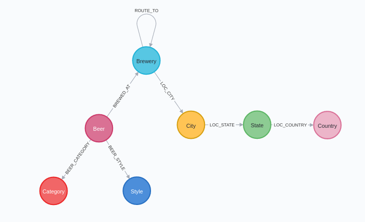
To demonstrate these new features, I made a dashboard to plan my next brewery tour. I’ll be using the data from the Beer & Breweries GraphGist, which tells me all about beers and breweries in different parts of the world. You can download the dataset here. I’ve added a screenshot of the schema below:
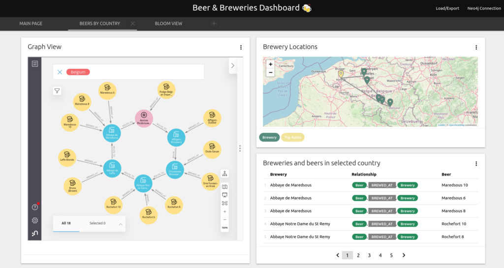
1. Interactive & multi-page dashboards
First, I’d like to do a bit of exploration of the beers and breweries in different countries. I want to see, for each country, which breweries serve beers in a style I enjoy. For this, I use selection boxes, which let me easily specify Cypher parameters:
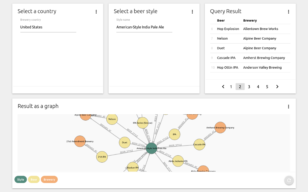
On this page, I can select two parameters, a brewery country and a beer style, which are stored as $neodash_brewery_country and $neodash_style_name. The selected parameters are then used by the other reports to get results from the database:
MATCH (s:Style)<-[:BEER_STYLE]-(b:Beer)-[:BREWED_AT]->(br:Brewery) WHERE
      br.country = $neodash_brewery_country AND
      s.name = $neodash_style_name
RETURN b.name as Beer, br.name as Brewery
You can use the selected parameters across all queries in your dashboard. Reports get automatically updated when new values are selected.
After some exploration of the data, and a gentle push from my Belgian colleagues, I choose Belgium as the destination of my tour.
Next, I want to create multiple pages that visualize my trip. In NeoDash 1.1, you can add as many pages as you’d like to create a more cohesive structure, as well as prevent long pages with an overload of data.
2. Map visualizations
Now that I know which country to visit, I’d like to see the brewery tour on a map. In NeoDash, geographical visualizations can be created automatically from nodes with latitude/longitude properties, or when you use Spatial data types. As an example, consider the next two queries:
// All breweries that aren't top rated
MATCH (b:Brewery)
WHERE NOT b:`Top Rated`
RETURN b
// A brewery tour in Belgium
MATCH (b:Brewery)-[route:ROUTE_TO]->(b2:Brewery)
WHERE b.country = "Belgium"
RETURN b, route, b2
NeoDash will pick up the latitude and longitude properties from the Brewery nodes, and create a map view:
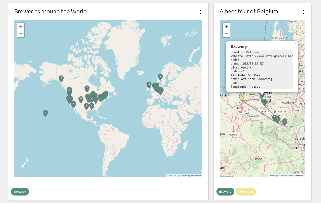
Nodes are assigned a color automatically based on their labels. Just like in the graph visualization view, these colors can be overridden by using a Cypher parameter. Additionally, both nodes and relationships can be clicked to inspect their properties.
3. Embedded applications & better Markdown
Finally, I’d like to see a nice graph view of the breweries and the beers I’ll be trying out.
In NeoDash 1.1, you can embed web apps directly into reports using iFrames. In my case, I embed Neo4j Bloom directly into my dashboard. The image below shows how I use a Bloom visualization next to a table with distances between the breweries:
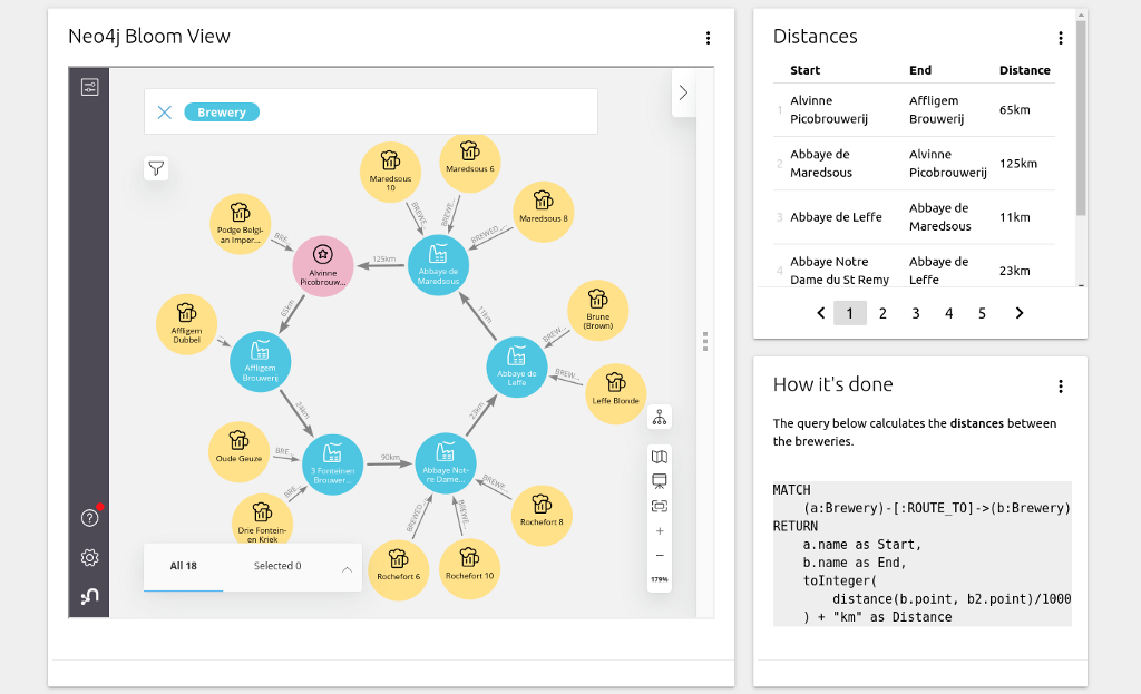
Important: you must run Bloom from a web browser to be able to get this working. Here’s what to do to set this up yourself:
- Create a Neo4j Aura instance (I’m using the Aura Free Tier).
- Open the Aura Console, find your database, choose Open With, and select Neo4j Bloom (Beta).
- Copy the URL from the tab your browser just opened.
- In NeoDash, create a new “iFrame” report. Paste the Aura URL in there, and you’re ready to go.
You’ll also see that the screenshot above contains a report with a code block. This is part of the extended markdown support, which also includes a better display of ordered and unordered lists.
Wrapping up
You can try NeoDash from the Graph App Gallery, or by running the online demo.
I recommend you check out some of the other great work that’s been done on dashboarding Neo4j:
- Jennifer Reif’s post on using Retool with Neo4j GraphQL.
- Adam Cowley’s work on charts, a graph app with a ton of visualization options.
- David Allen’s blog post on the Neo4j BI Connector for Tableau.
- Graphileon, a low-code graph application builder for the enterprise.
As always, please reach out with any questions or recommendations. If you’re interested in building user-friendly dashboards, you should also check out this cool article on dashboard psychology.
Building Interactive Neo4j Dashboards with NeoDash 1.1 was originally published in Neo4j Developer Blog on Medium, where people are continuing the conversation by highlighting and responding to this story.
Share Article


Explore
Related Articles
Hybrid Search in Neo4j: Full-Text, Vectors, and Graph Topology with Cypher