Creating Super-Charged Neo4j Dashboards with NeoDash 2.1

Consulting Engineer, Neo4j
4 min read

As graph databases and graph data is getting more traction in the world the need for specialized graph powered visualization tools to provide feedback to end users is needed.
A variety of tools are already available to visualize force-directed graphs but as it turns out these are only a small part of the puzzle. In practice, many more visualizations are needed. This is where NeoDash 2.1 comes in.
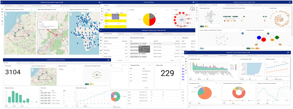
NeoDash is an open-source, low-code Dashboard Builder for Neo4j. It lets you build an interactive dashboard with tables, graphs, bar charts, line charts, maps and more, in minutes.
The latest NeoDash release comes packed with a lot of new features, for instance:
- A dashboard gallery has been added with sample dashboards on public datasets.
- New visualizations for your reports like sankey charts, choropleth map and some hierarchical charts.
- Finally, an improved user experience and new ways to export data out of dashboards.
To try out NeoDash, try it in your browser, or install it into Neo4j Desktop. Check out the project’s Github repository for details on other types of deployments, as well as pointers for extending the application. Enjoy!
NeoDash Dashboard Gallery
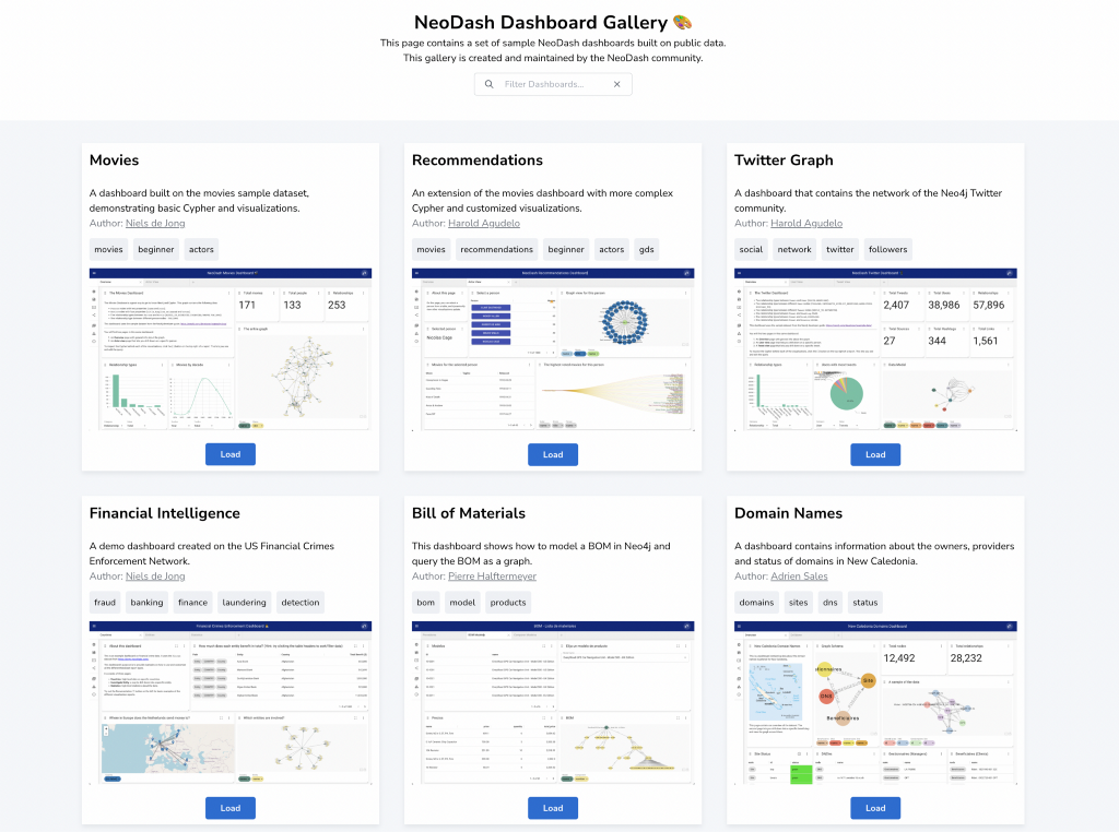
If you’re looking for inspiration on building a Neo4j dashboard, check out the brand new example gallery. With a growing list of dashboards to try out, there’s one available for a variety of use cases. Try it online here:
https://neodash-gallery.graphapp.io
Have a public dataset & dashboard to share? Reach out to us and we’ll add your dashboard to the gallery.
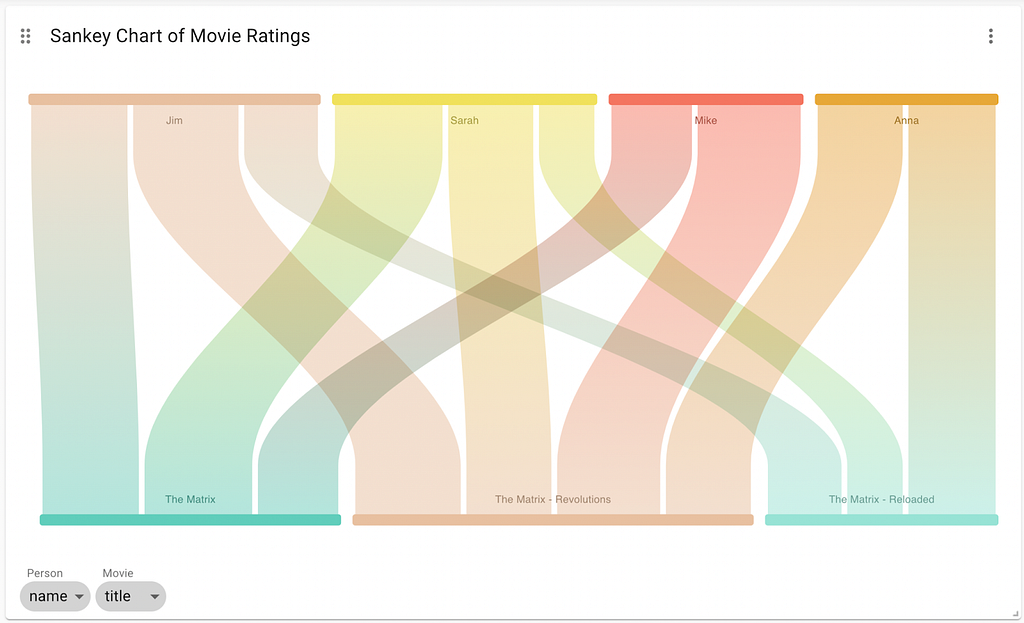
Sankey Chart
The sankey chart is used to depict flow from one set of values to another. In a sankey chart, there’s usually a many-to-many relationship and you want to get an overview of the dominant and less dominant flows between these entities by looking at the width of the connections.
The sankey chart in NeoDash supports drawing nodes and edges directly as a flow diagram. In the image below we have a sankey chart where different persons have rated some movies. By looking at the picture we can see that Jim rated ‘The Matrix — Revolutions’ higher than ‘The Matrix — Reloaded’. With interactivity enabled, users can hover on the connection to get the exact rating value. Try out the sankey chart on a public movie database here.
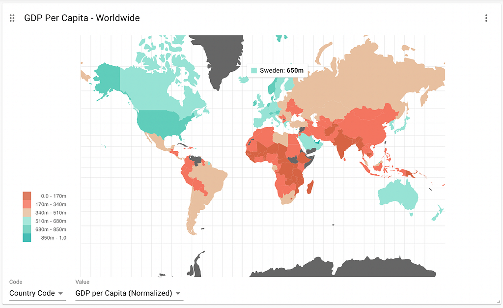
Choropleth Map
A choropleth map is used to overlay geographical areas with numerical data. In most cases, this means applying a color to a country based on a value scale. With NeoDash, you can assign colors to countries based on the ISO 3-letter country codes. Creating the visualization below is as simple as two lines of Cypher:
MATCH (c:Country)
RETURN c.code, c.value
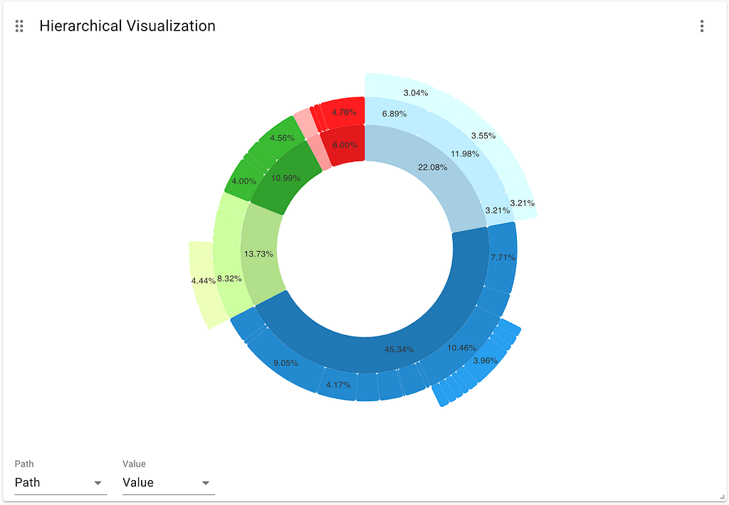
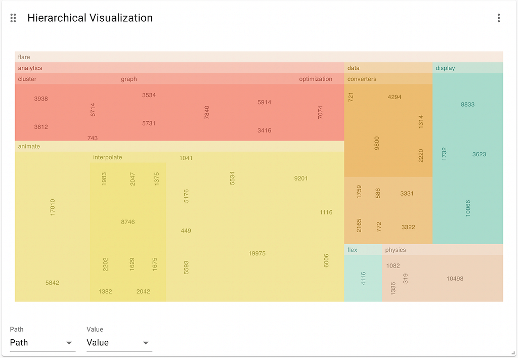
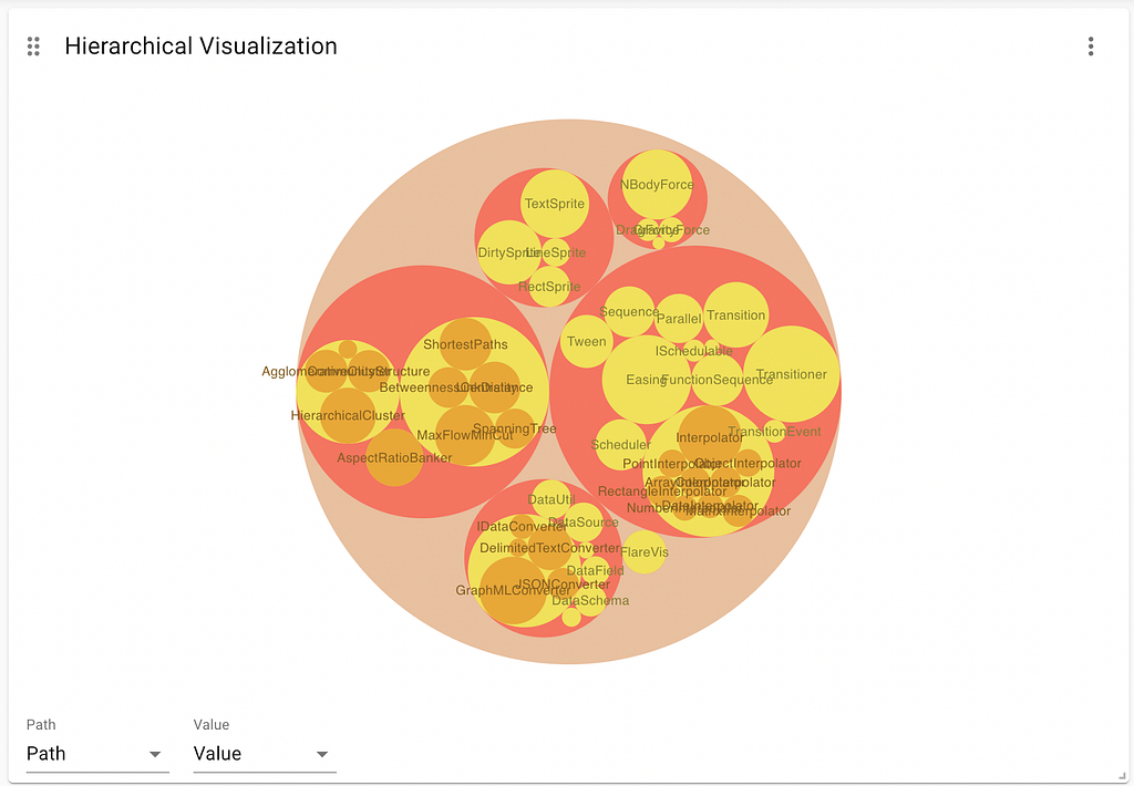
Hierarchical Visualizations
A force-directed graph is a great way to display graph data. However, in many scenarios, users would like to see their data as a hierarchy. There are three new ways of displaying hierarchy-based visualizations in the new version of NeoDash:
- Sunburst: render a tree as a collection of concentric circles growing outwards.
- Treemap: displays multi-level hierarchical data using nested rectangles.
- Circle Packing: A variation of the treemap, but using nested circles.
Depending on the depth of your tree, you might want to choose from these three visualizations. Check out the documentation on how to create a hierarchical visualization on your own graph.
Dashboard Features
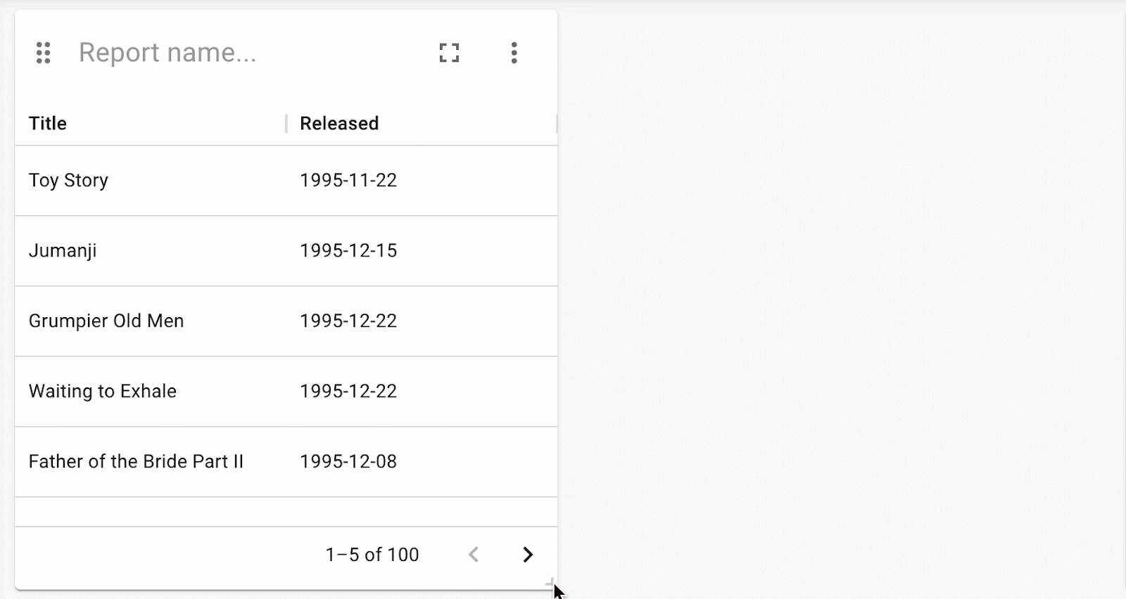
To make it even easier to build a dashboard, NeoDash now supports a drag and drop layout. To move or resize a report, grab the handles on the top-left and bottom-right and update the layout:
Other user experience changes include:
- Cloning reports in a page.
- The option to enable image downloads for each report.
- Downloading a CSV file from table reports.
Details on all of these features are available in the brand-new documentation portal.
Wrapping Up
Eager to learn more? This year, NeoDash will be a part of the NODES 2022 Online Developer Conference on Nov 16–17! NODES 2022 is a virtual conference of technical presentations by developers and data scientists solving problems with graphs. Best of all, it is 100% free to join — and a great place to meet other graph visualization enthusiasts.
If you want to know how a presentation will look like at NODES 2022, have a look at the previous presentation from GraphConnect 2022:
More cool features are on the way! Stay tuned. If you’d like to be up to date on the latest around NeoDash, subscribe to the Neo4j Developer Blog.
Creating Super-Charged Neo4j Dashboards with NeoDash 2.1 was originally published in Neo4j Developer Blog on Medium, where people are continuing the conversation by highlighting and responding to this story.
Share Article


Explore
Related Articles


How to Improve Multi-Hop Reasoning With Knowledge Graphs and LLMs