Graph Visualization with Neo4j Using Neovis.js

Developer Relations Engineer
5 min read
Leveraging Graph Algorithms for Data Visualization
Update: The O’Reilly book “Graph Algorithms on Apache Spark and Neo4j Book is now available as free ebook download, from neo4j.com
In this post we explore how to create graph data visualizations that use the results of graph algorithms like PageRank and community detection. After running some graph algorithms using the neo4j-graph-algorithms library we’ll use the JavaScript graph visualization library Neovis.js to create visualizations that can be embedded in a web app, fetching data directly from Neo4j.
Goals of Graph Visualization
There are different motivations and tools for creating graph visualizations. This includes tools for exploring the graph — the type of interactive visualizations you might see in Neo4j Browser. Or visualizations for showing the results of some analysis. These can be interactive (something to be embedded in a web app or even a standalone application), or static, meant to convey specific meaning that might be used in print or a blog post.
This post will focus on one tool that addresses some specific goals of graph visualization. This tool is Neovis.js and is used for creating JavaScript based graph visualizations that are embedded in a web app. It uses the JavaScript Neo4j driver to connect to and fetch data from Neo4j and a JavaScript library for visualization called vis.js for rendering graph visualizations. Neovis.js can also leverage the results of graph algorithms like PageRank and community detection for styling the visualization by binding property values to visual components.
Graph Visualization + Graph Algorithms
There are three common ways that graph visualizations can be enhanced with graph algorithms. Specifically this involves styling visual components proportionally to the results of these algorithms:
- Binding node size to a centrality algorithm, such as degree, PageRank, or betweenness centrality. This allows us to see at a glance the most important nodes in the network.
- Visually grouping communities or clusters in the graph is done through the use of color, so that we can quickly identify these distinct groupings.
- Styling relationship thickness proportionally to an edge weight, in social network data this might be the number of interactions between two characters, in logistics and routing data it might be the distance between two distribution centers and is useful for pathfinding algorithms (such as A* or Dijkstra’s).
Getting Started with The Dataset
We’re going to use the Russian Twitter Trolls sandbox as our dataset. This dataset contains tweets from known Russian Troll accounts, as released publicly by NBC News. You can create your own Neo4j Sandbox instance here.

In graph data, often some of the most interesting relationships are inferred, and not directly modeled in the data. The User-User retweet graph is an example of this. Which users are retweeting which other users? Who is the most important User in this retweet graph? Are there groups of users that frequently retweet each other?
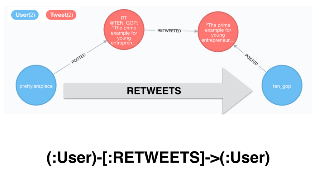
To find the most important users and communities using this retweet network we will first find all Troll users and create a RETWEETS relationship connecting directly the users in the graph. We store a count property on the relationship representing the number of times that the user has retweeted the other:
Once we’ve created these RETWEETS relationships we can run PageRank over this part of the graph (we could also use a Cypher query to run PageRank over the projected graph without explicitly created the relationships):
Since we specify write: true above this will not only run PageRank but add a pagerank property to the nodes contains their PageRank score. We can then query using that property value to find the top ten Troll accounts by PageRank score:
And finally we can run a community detection algorithm on the retweet network, in this case label propagation:
This will add a community property to the nodes, indicating which community the algorithm has determined the node belongs to.
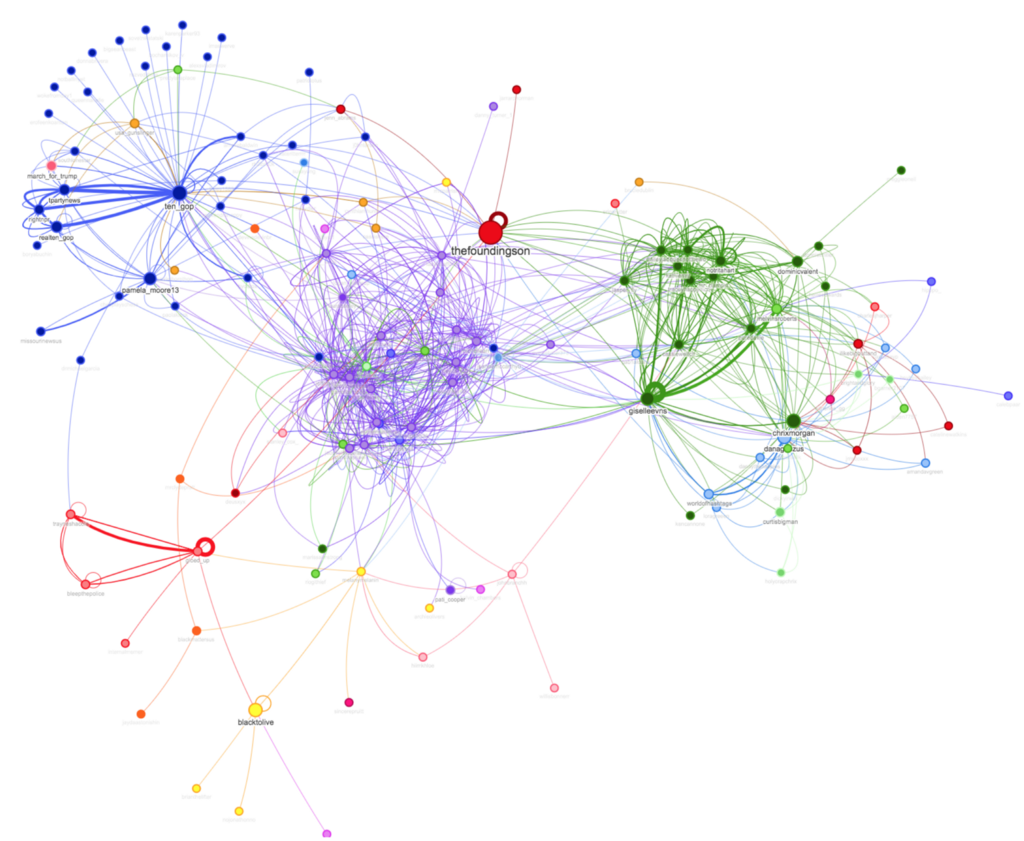
So we’ve now run two graph algorithms (PageRank and label propagation), but how do we make sense of the results? A visualization can help us find insights in the data.
Creating a Graph Visualization with Neovis.js
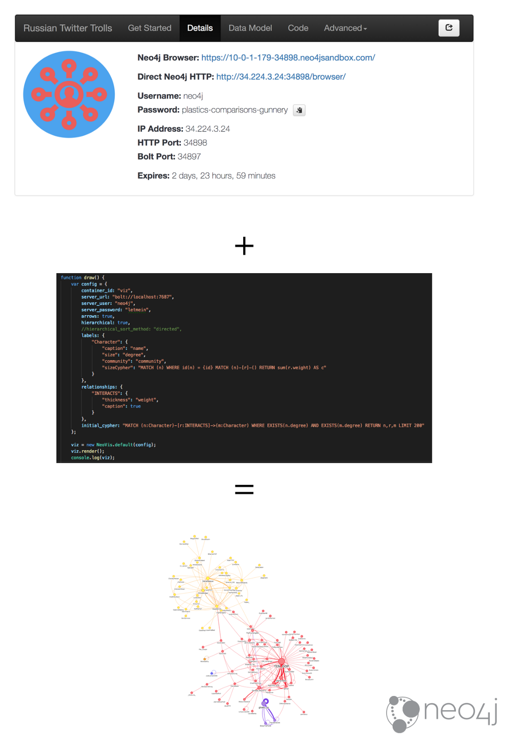
In order to create a visualization with Neovis.js we first need to connect to Neo4j. In the details tab of our Sandbox instance we can find the connection details for our Neo4j instance:
The server connection string, username, and password will be included in a config object that we’ll pass to the constructor for Neovis. We’ll also need to specify what node labels we want to visualize and how they should be styled (which properties determine node size and color).
Neovis.js works by populating a <div> element with the visualization, so we’ll need to specify the id of that element in the config object, as well as how to connect to our Neo4j instance, and which properties to use for determining node size, color, and relationship thickness. Here’s the code to generate a graph visualization of our retweet network from our Neo4j Sandbox instance, using the pagerank property to determine node size, community for color, and the count relationship property for relationship thickness:
And here’s how our visualization looks:
There are a few more configuration options which you can read about in the project documentation.
Resources
- Neo4j Sandbox: neo4jsandbox.com/
- Neovis.js GitHub page: github.com/neo4j-contrib/neovis.js
- Neo4j Graph Visualization Developer Page:
neo4j.com/developer/guide-data-visualization/ - Neo4j Graph Algorithms: neo4j.com/developer/graph-algorithms/
Graph Visualization with Neo4j Using Neovis.js was originally published in Neo4j Developer Blog on Medium, where people are continuing the conversation by highlighting and responding to this story.
Share Article


Explore
Related Articles


How to Improve Multi-Hop Reasoning With Knowledge Graphs and LLMs