NeoDash 2.0 – A brand new way to visualize Neo4j

Product Manager, Neo4j
5 min read

Visualizing graph data is often key to the success of a Neo4j project. As part of my job, I always find that the best way to convince people of the value of graphs is to let them see and interact with their data. Next to a neat graph visualization, tables or traditional charts are an immensely powerful way to make your data visible. Put this all together in an interactive graph data visualization dashboard, and you’ve got an amazing way to tell a graph story.
I developed NeoDash as an open-source dashboard builder to help you speed up this process. With some simple Cypher queries, NeoDash lets you directly visualize your Neo4j data as graphs, bar charts, tables, maps, and more. You can group your visualizations together in a dashboard, add interactivity, and share your dashboards with others.
This post will go over the big changes in the new 2.0 release.
Want to try out the application right away instead? Use NeoDash from your browser, or install it into Neo4j Desktop.
Check out the project’s Github repository for details on other types of deployments, as well as pointers for extending the application. Enjoy!
What’s new?
The 2.0 release of NeoDash version comes with a ton of changes. Firstly, the application was rewritten completely (from scratch) to be more stable and performant. You’ll now be able to run NeoDash to report on your production database in real-time.
The next sections will zoom in on the four main features that come with the new dashboard builder:
- A fancy new dashboard editor
- More powerful visualizations
- Easier customization & interactivity
- Improved saving/sharing of dashboards
A new dashboard editor for Neo4j
The NeoDash editor is a web-based application for building and viewing dashboards. It connects directly to your Neo4j database using the Neo4j JavaScript driver.
Your dashboard can consist of a number of pages, each of which can have several reports. For each report, you specify a Cypher query that is used to create a visualization. For an interactive introduction to the editor, check out the video below:
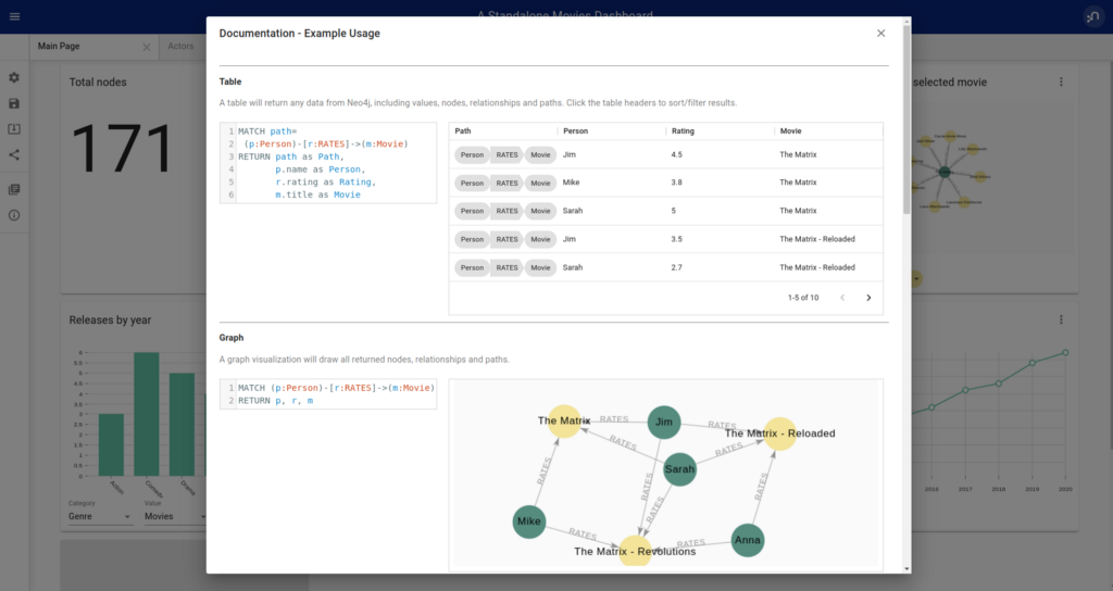
A big improvement to the 2.0 editor is the in-built Cypher editor for writing the report queries. This editor has live syntax highlighting, as well as checks for validating your query.
Other new features include integrated documentation with query examples (see screenshot below), as well as easier customization of reports. More on this later.
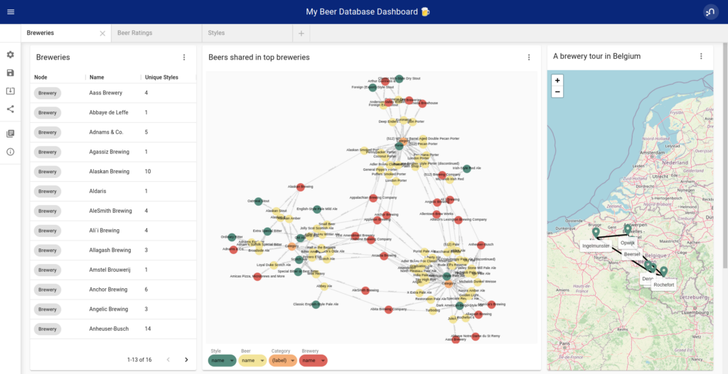
Powerful visualizations
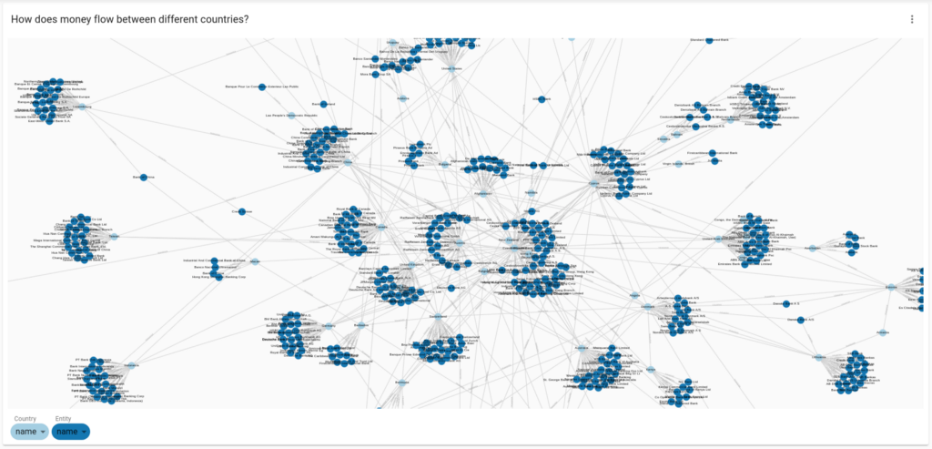
NeoDash 2.0 can render your query results in tables, bar charts, line charts, maps, and more. The new release comes with a canvas-based graph renderer (react-force-graph) that can handle drawing thousands of nodes/relationships, as well as support easy custom styling of nodes and relationships.
The bar and line chart visualizations are now based on Charts, which supports a variety of styling options and increased interactivity.
Drawing geodata? Try out the improved map report, which lets you draw any Neo4j Spatial Values using OpenStreetMap.
Customization & interactivity
Starting with NeoDash 2.0, many report types come with an ‘advanced settings’ option that allows you to customize the visualizations. Customizations can be purely aesthetic (the color scheme used by the visualization) or impact the way that the results are processed. The image below shows how advanced settings can be used to create a stacked bar chart:

Interactivity can be added to the dashboard by means of ‘Parameter Select’ cards. These will allow dashboard viewers to dynamically specify parts of the Cypher queries that populate the reports.
Check out the video above for instructions on how to set up these types of interactions.
Saving and sharing dashboards
Once you’re done building your dashboard, you can save it directly to the Neo4j database. This will create a Neodash_Dashboard node that holds a text representation of the dashboard you put together.
From the ‘Load Dashboard’ screen, everyone with access to the same database can load your dashboard into NeoDash.
If you want to show off your new dashboard, you can generate a direct link to a standalone dashboard. These can act as a nice proof-of-concept for a Neo4j front-end. A standalone dashboard will automatically connect to a Neo4j database, disable editing, and hide the NeoDash editor. Users can then view all reports and interact with the data, but won’t be able to see the queries underneath.
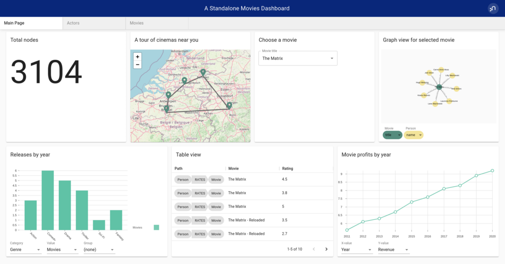
An example standalone dashboard generated from the Neo4j movie database. Use the sharing button on the editor sidebar to generate a standalone dashboard link.
Wrapping up
You can try out NeoDash yourself in your web browser, or by installing it into Neo4j Desktop. Suggestions and feedback are more than welcome in the Github Repository.
Keep in mind that reporting is only a part of a graph visualization journey: Visualization tools like Neo4j Bloom will let data analysts go a lot deeper into exploring and analyzing graphs.
If you’re running graph algorithms on huge datasets, you may need an offline tool such as Gephi to render high-volume graph visualizations.
If you’re interested to learn more about the different types of Neo4j visualization tools, check out my blog post here.
15 Tools for Visualizing Your Neo4j Graph Database
Happy dashboarding!
NeoDash 2.0 — A Brand New Way to Visualize Neo4j was originally published in Neo4j Developer Blog on Medium, where people are continuing the conversation by highlighting and responding to this story.
Share Article


Explore
Related Articles
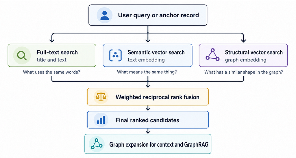
Hybrid Search in Neo4j: Full-Text, Vectors, and Graph Topology with Cypher