NeoDash: Build Neo4j dashboards without writing any front-end code

Product Manager, Neo4j
6 min read
Working at Neo4j, I frequently build front-end applications that use graph data. Fortunately, a ton of tools exist to make the life of a Neo4j front-end developer easier (great examples are the GrandStack and Neode). In many cases, however, I’m looking for something that allows me to quickly prototype a dashboard with a direct database connection. Enter NeoDash, a tool that allows you to build a dashboard in minutes.
NeoDash is a lightweight web app that hooks directly into Neo4j, letting you build a front-end without touching any code. It supports a variety of reports that natively work with Neo4j data types. For easy storage and version control, dashboards can be exported as JSON files.
This post will give a quick run-through on how to get started with building your own NeoDash dashboards. First, I’ll provide a summary of the main features and visualizations. Next, I’ll also explain how you can save and store dashboards with your Neo4j projects.
Building a dashboard
If you’re using Neo4j Desktop, you can install NeoDash from the Graph App Gallery. Alternatively, you can try out the demo here.
1. Connecting to Neo4j
When first starting up the application, you are prompted to connect to your Neo4j database (NeoDash will automatically connect to your active database if you’re using Neo4j Desktop.) The Neo4j JavaScript driver then uses your specified connection to run queries and populate your reports. NeoDash works with all flavors of Neo4j: Desktop, Neo4j Aura, clusters, and single instances.
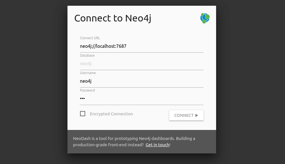
Want to restrict the type of queries in your reports to read-only? Create a read-only Neo4j user and use those credentials to connect.
2. Creating your dashboard
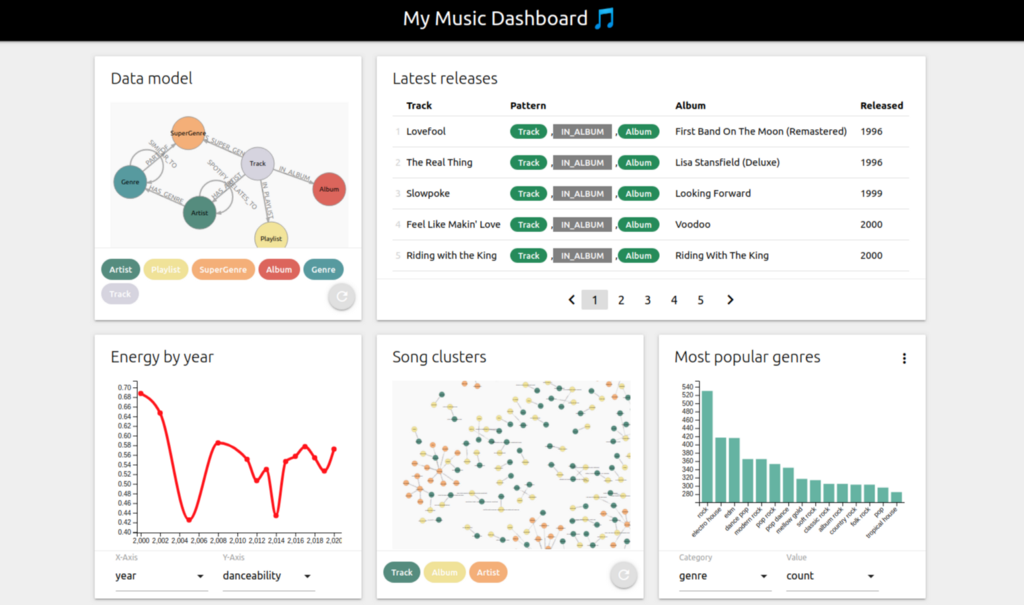
Dashboards consist of a variable number of reports (cards) that run independently. For each report, you specify a single Cypher query — the results of which will populate the report. Reports sit together in a responsive grid layout, allowing them to be resized and moved around. When reordered, reports try to fit together to fill available space.
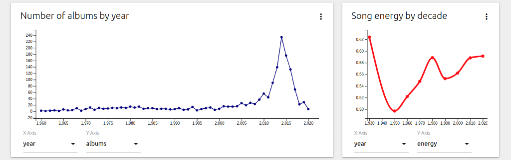
The image below contains an example of four reports fitting together.
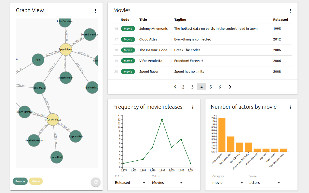
The current version of NeoDash supports five types of data reports:
- Graph visualizations
- Table views
- Bar charts
- Line charts
- JSON output
As a sixth (informative) report type, there is the option to add markdown text.
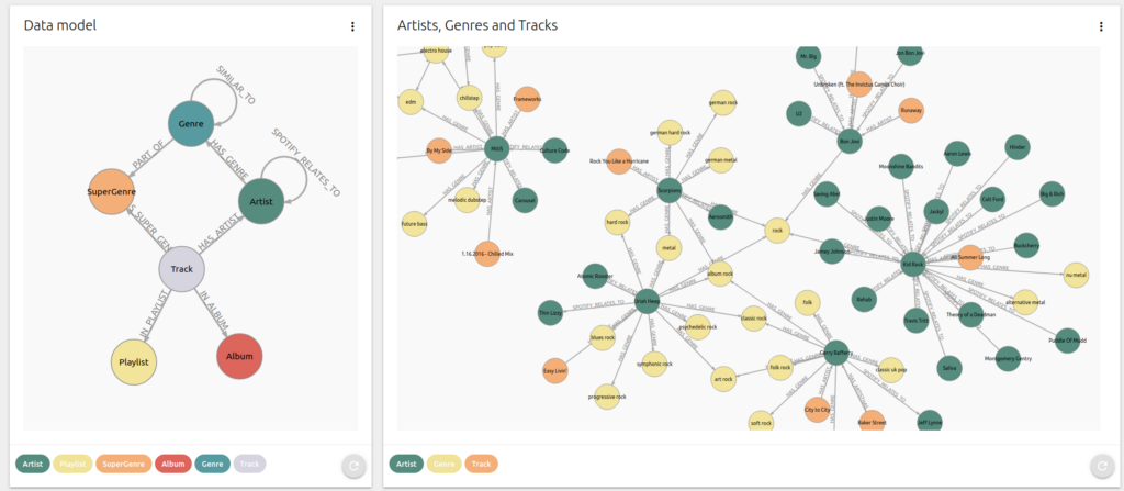
Graph visualizations
For almost all use cases, a force-directed graph visualization is your go-to report type. In NeoDash, you’ll be able to visualize your graph similar to how the Neo4j browser would, selecting a node color and parameter for the graph layout. Any query returning nodes, relationships, or paths can be visualized as a graph, NeoDash will automatically pick up these results from your Cypher query.
Doing some exploration? Clicking a node will show all properties of that node.
Some style properties of the visualization can be overridden by passing in extra parameters to your Cypher query. To use custom colors for the nodes, add the following text to the Cypher Parameters in the report settings:
{
    "nodeColors": ["navy","green","red"]
}
Table views
The table view renders Neo4j native types in a standard table format. These types include strings, numbers, and dates, but also nodes, relationships, and paths.
Table columns are ordered in the order they are returned by Neo4j, with their names set to the names of your returned variables. This means that you’ll directly control what the column headers are in Cypher.
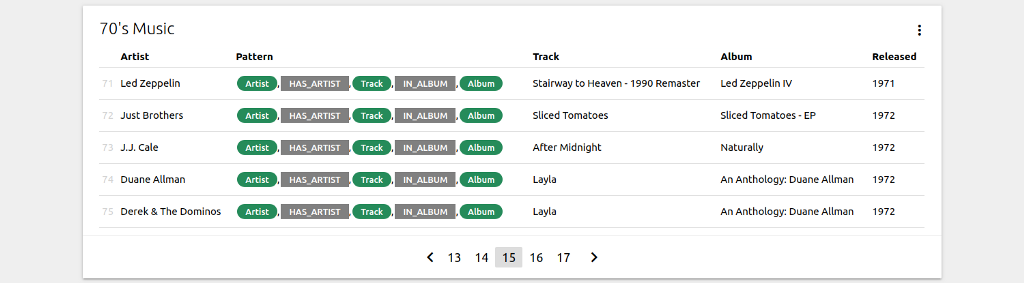
If your table contains nodes and relationships, the colors of the nodes and relationships in the table can be set using the Cypher Parameters, for example:
{
    "nodeColor": "orange",
    "relColor": "black"
}
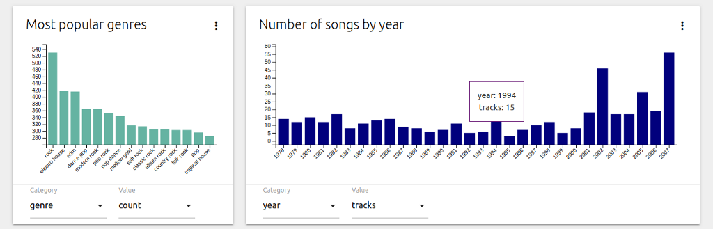
Bar charts
Bar charts can be used to visualize categorical data. Naturally, a bar chart will need a numeric value to plot on the y-axis. The properties to visualize can be dynamically selected based on the returned values of your Cypher query.
The color of a bar chart can be customized by setting the following value in the Cypher Parameters:
{
    "color": "red"
}
Line charts
Line charts can be used to visualize the relationship between two numeric variables. Just like the bar chart, you’ll select two of the resulting fields to be plotted on the x- and y-axis.
The Cypher Parameters setting can be used to customize several style properties of your line chart. Add the following parameters to create a red curved line chart, with a line width of 4 and a marker radius of 4:
{
    "curve": true,
    "radius": 4,
    "color": "red",
    "width": 4
}
Report settings
Each report has a settings screen that can be accessed by clicking the (⋮) icon on the top right of the report. The settings menu can be used to set the Cypher query as well as other configuration parameters:
- The type of report
- The size of the report
- Parameters for your Cypher query
- A refresh interval for the report
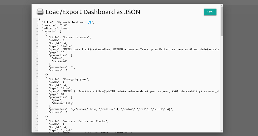
3. Saving your dashboard
Dashboards are automatically cached in Neo4j Desktop or your web browser. To share/store your dashboards externally, you can export them as JSON by clicking the ‘Load/Export’ button. Copy-paste the JSON code into a text file, and you can add it to your project repository if needed.
To load your dashboard back up again, paste back the JSON into the ‘Load/Export’ textbox and hit save.
Performing a hard reset
You can reset NeoDash by clearing the ‘Load/Export’ box and saving the dashboard. Alternatively, If you’d like to start over fresh, you can consider performing a hard reset. A hard reset will also give you a chance to save your latest dashboard.
To perform the reset, you can navigate to:
https://nielsdejong.nl/neodash/?reset=true
This will clear the application cache, restore the default dashboard and print the latest cached dashboard for you.
Using NeoDash from Neo4j Desktop? Reinstall the graph app to reset the cache.
Wrapping up
Using a direct database connection, NeoDash is a great tool to build a quick proof-of-concept dashboard. However, for something production-grade, I highly recommend you to put an API layer in between your DB and your front-end. If you’re in the process of building a solution and need some advice, feel free to get in touch.
What’s next?
In the short term, I’m looking to add more report types, specifically geographic visualizations. More customization options for the existing reports are also on the horizon. If you are enjoying the tool, found bugs, or have any suggested improvements, get in touch!
NeoDash: Build Neo4j Dashboards Without Writing Any Front-End Code was originally published in Neo4j Developer Blog on Medium, where people are continuing the conversation by highlighting and responding to this story.
Share Article


Explore
Related Articles


SumoDB in Neo4j: Chaining Multiple Graph Algorithms in Snowflake — Part 3