Advanced Visualizations
|
This documentation pertains to the unsupported version of NeoDash, as part of Neo4j Labs. For users of the supported NeoDash offering, refer to NeoDash commercial. |
Advanced visualizations let you extend your dashboard with complex, powerful visualizations beyond the standard visualizations. For specific use-cases, these visualizations may convey information that a simple visualization cannot. To use advanced visualizations, enable them in the Extensions Window. This makes them selectable inside reports, as well as add examples to the Example window.
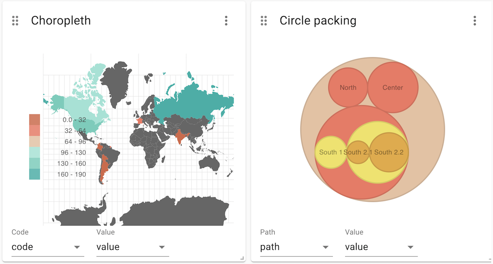
The following visualizations are part of this extension: - A 3D Graph to visualize a graph in three dimensions. - A Sankey Chart to visualize flows. - Three charts to plot hierarchical data (Sunburst, Circle Packing, Treemap) - A Gauge Chart to show percentages. - An Choropleth to visualize numeric, country-data. - An Area Map to show an interactive world map, annotated with numeric country / region values. - A Gantt chart to visualize dependencies between tasks. - A Radar Chart to create a radial view of multiple categoric values.