15 best graph visualization tools for your Neo4j graph database

Product Manager, Neo4j
15 min read

More in this guide:
- Categories of graph visualization tools
- 1. Neo4j Browser (development tool)
- 2. Neo4j Bloom (exploration tool)
- 3. Neo4j visualization library (NVL) (embedded tool)
- 4. ipysigma (development tool)
- 5. NeoDash (dashboarding tool)
- 6. react-force-graph (embebbed tool)
- 7. Cytoscape (embedded tool)
- 8. Cosmograph (Embedded Tool)
- 9. Linkurious (exploration tool)
- 10. GraphAware Hume (exploration tool)
- 11. SemSpect (exploration tool)
- 12. yFiles graphs for Jupyter (development tool)
- 13. Graphileon (dashboarding tool)
- 14. KeyLines (embedded tool)
- 15. yFiles for HTML (embedded tool)
- Wrapping up
The real power of graphs is revealed when you visualize your data. It allows anyone to see connections in the data and understand the bigger context. Visualization produces many insights that are difficult or impossible with traditional tables and business intelligence tools.
However, visualizing graphs isn’t easy; creating intuitive graph visualizations takes significant work.
Thankfully, many emerging tools make graph visualization easier. In this article, I share 15 of my favorite tools for visualizing your Neo4j graph database to help you find one that meets your needs.
Categories of graph visualization tools
Visualization tools can be used for different purposes, and tools are typically developed with one or two of these purposes in mind. To choose the best one for your needs, it’s important to know what purpose a particular tool serves:
- Exploration tools help analysts explore data relationships.
- Development tools help developers work with graph data.
- Dashboarding tools let you create and organize data reports.
- Embedded tools enable you to embed graphs into your own applications.
You’ll also want to know what tech support and service level you can expect from your tool. Are you OK with using a community tool, or do you want an enterprise tool that’s error-free and regularly maintained?
The image below organizes the tools in this roundup by their main category from the earlier list. Tools are plotted on the vertical axis based on product type: Neo4j product, community project, or enterprise software. The tools that sit on the line between two types are available in both. It should be noted that some enterprise tools fit multiple categories. For these, the tool has been placed in their primary category.

Here are 15 best graph visualization tools for your Neo4j graph database, in no particular order:
1. Neo4j Browser (development tool)

Neo4j Browser is likely the first thing you run into when working with Neo4j. A tool for database developers to run Cypher queries, Neo4j Browser lets you render query results in a graph or table format. Although it’s limited in visualization capabilities, I use it daily to rapidly design and optimize Cypher queries.
Key features:
- Easy to get started but offers limited visualizations and styling choices
- Direct views of your graph data but requires (technical) Cypher knowledge
- Great for rapid query development
Neo4j Browser is great for one-off tasks like database querying, schema exploration, and quick data validation. While it lacks advanced styling and isn’t a reporting tool, it’s a good first development environment for designing and testing Cypher queries. A new version of Neo4j Browser is available in the new Aura console, with an improved visualization component and built-in natural language queries.
Knowledge graphs 101
Your data has hidden patterns waiting to be discovered. Learn how to build a knowledge graph that connects and organizes information for faster querying and smarter applications.
2. Neo4j Bloom (exploration tool)

Neo4j Bloom is a tool for interactively exploring Neo4j graphs. Whereas Neo4j Browser is mainly used by developers, Bloom is better suited for data analysts and those who want to explore graphs dynamically without writing Cypher. Bloom supports text-based search, allowing people without Cypher knowledge to investigate a Neo4j graph database. It is used by professionals in different industries, such as finance, cybersecurity, and customer relationship management.
Bloom lets users create perspectives that determine how data is displayed so they can focus on specific aspects of the graph and highlight relevant relationships. For a given perspective, users can create several scenes (views of the graph).
Key features:
- Offers a point-and-click graph exploration experience
- Provides performant views of large graphs with extensive custom styling
- Enables editing your Neo4j graph with a visual interface
- Supports storing and sharing graph perspectives
- Can render various graph layouts
For non-technical users needing a straightforward tool to view and explore Neo4j data, Bloom is an excellent choice. Bloom also supports advanced features such as Saved Cypher and custom actions. Just like Neo4j Browser, Bloom is now also available in the new Aura console, allowing you to use it directly with your other Neo4j tools.
3. Neo4j visualization library (NVL) (embedded tool)

NVL is a Neo4j-supported JavaScript library that helps developers build custom graph visualizations into their own applications. NVL is the graph visualization library that powers the new version of Neo4j Browser as well as Bloom and comes with a ton of customization options, while also being scalable to thousands of nodes.
Key features:
- Enables Neo4j customers with a supported JavaScript library to draw graphs
- Use with a React wrapper or as a plain JavaScript library
- Uses user-specified style properties based on label, property, or community
- Custom handlers for interactive features like hover information and click events
For front-end developers, NVL provides a stable option for those looking to integrate graphs into their apps. For developers using React, the built-in wrapper makes it easy to implement a graph visualization in a couple lines of code.
4. ipysigma (development tool)

ipysigma is a Python library for rendering interactive graph visualizations within Jupyter notebooks. Built on the Sigma.js library, it offers seamless integration for Python-based workflows, making it ideal for developers and data scientists working on exploratory graph analysis or data storytelling.
Key features:
- Supports pan, zoom, and hover interactions for exploring graph structures intuitively
- Nodes and edges can be styled dynamically based on graph attributes
- Optimized for rendering small- to medium-size graphs directly within a notebook environment
- Work with Neo4j graphs and/or networkx graphs
ipysigma is an excellent choice for Python users looking for an interactive, notebook-based graph visualization tool. Be mindful that ipysigma requires some custom work to convert your Neo4j objects into their own graph format, as it is a general-purpose graph visualization library.
5. NeoDash (dashboarding tool)

NeoDash is a web-based application for quickly building dashboards from Neo4j data. It connects to Neo4j via Bolt and populates reports with Cypher queries. Query results can be rendered as tables, graphs, bar charts, and more. Using parameters, NeoDash lets you create interactive dashboards with text inputs and drill-downs. It offers different styling options, such as modifying background color or visualization colors, as well as custom rule-based styling.
Key features:
- Available as an online demo application and for self-managed deployments with Docker
- Allows visualization of query results as tables, graphs, and bar charts with custom styling
- Build interactive dashboards with query parameters
- Allows mixing visualizations with Markdown text to create a “living document” using your graph data
- Supports loading and saving dashboards as JSON
NeoDash is straightforward to set up and provides a flexible, low-code environment for creating data-driven dashboards. The experimental version of NeoDash is available as part of Neo4j Labs and is free to use. For those looking for a stable and supported tool, Neo4j offers a commercial version of NeoDash with Enterprise support.
6. react-force-graph (embebbed tool)

react-force-graph is an open source JavaScript library for embedding graph visualizations in web applications. Built with React, it leverages WebGL and Canvas for efficient rendering of force-directed graphs. It supports both 2-D and 3-D layouts, providing flexibility for visualizing graph data interactively. Key features:
- Supports WebGL for smooth performance even with thousands of nodes and links
- Offers 2-D, 3-D, and even VR modes to visualize graphs in different dimensions
- Includes built-in interactions such as panning, zooming, and dragging
- Nodes and links can be styled dynamically with a large variety of properties or events
react-force-graph is ideal for developers looking to embed lightweight, interactive graph visualizations in their applications. Its flexibility and well-documented API make it suitable for dashboards, exploratory analysis tools, or educational projects. Being a general-purpose graph library, it does require additional setup for advanced features like exploration and graph editing but comes with a lot of power in return.
7. Cytoscape (embedded tool)

Cytoscape is a tool originally built for visualizing biological networks, but is now also used in a variety of network analysis use cases. The tool comes in two flavors:
- Cytoscape Desktop (a stand-alone Java-based visualization tool)
- Cytoscape.js (an open source JavaScript library for graph visualizations)
Cytoscape.js is by far the most extensive open source library available for visualizing graphs in terms of supporting graph layouts, advanced styling, event handling, and more. Even though Neo4j support is not a core feature of Cytoscape Desktop, several plugins let you build visualizations directly from your Neo4j database.
Key features:
- Highly optimized graph rendering
- Uses layouts for automatically or manually positioning nodes
- Rich analytical capabilities across clustering, statistical analysis, and data integration
- Custom styling
- Easily embeddable into web applications
- Open source and easy to extend with custom functionality
Cytoscape is widely used in fields like bioinformatics, social network analysis, and research applications where complex relationships need to be explored and analyzed. Cytoscape’s capabilities make it suitable for projects that require deep network analysis, from protein interactions to organizational structures.
Cytoscape is a great fit for midsize datasets. However, for projects requiring high scalability or GPU-accelerated performance, alternatives like react-force-graph may be better suited.
8. Cosmograph (Embedded Tool)

Cosmograph is a modern JavaScript library tailored for embedding interactive graph visualizations in web applications. It combines ease of use with strong rendering performance, catering to developers seeking a lightweight solution for rendering big graphs.
Key features:
- Supports force-directed, hierarchical, and custom graph layouts
- WebGL acceleration: Enables smooth performance for large datasets *Supports basic styling options for nodes, edges, and labels
Cosmograph is ideal for projects requiring quick, interactive, and aesthetically pleasing graph visualizations. Cosmograph scales well, enabling you to render hundreds of thousands of nodes and relationships in the browser. Cosmograph is available free of charge for non-commercial use under the CC BY-NC 4.0 public license, but for commercial use, there is a proprietary license available.
9. Linkurious (exploration tool)
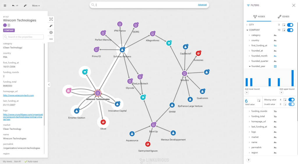
Linkurious Enterprise is an on-premises graph exploration and analysis tool. It’s feature-packed and intended to be used by data analysts, commonly for investigating use cases such as detecting money laundering, cyber threats, and other criminal activities. Linkurious supports an extensive list of features for graph-based search and analysis, as well as graph manipulation.
Key features:
- Offers interactive graph exploration with predefined workflows for common use cases
- Supports graph-based search for node/relationship properties
- Allows storing and sharing graph perspectives in a team
- Supports dynamic graph editing and the ability to render different graph layouts
- Enables creating alerts based on specific patterns or anomalies detected in the data to aid in proactive monitoring
Linkurious Enterprise is made for enterprise environments that need scalability, security, and collaboration. As a commercial product, it is tailored for larger organizations, making it less suitable for startups or smaller projects.
10. GraphAware Hume (exploration tool)
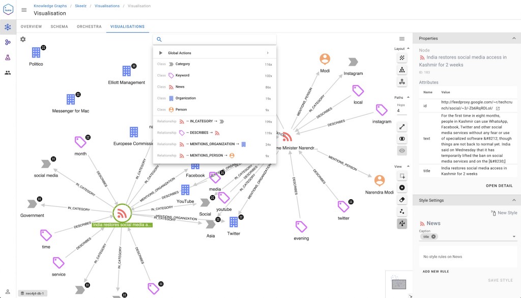
Hume is a graph exploration and analysis tool developed by GraphAware. It supports a complete graph workflow — from building knowledge graphs (ETL) to text-based search, as well as data science applications.
Graph-based search is a main feature of Hume, with a workflow where searching the graph and exploration go hand in hand. Hume lets you define custom user actions to create a tailored experience for data analysts. It’s used in a variety of business domains, such as national security, marketing, recommendation engines, and knowledge engines.
Key features:
- Provides a platform for building knowledge graphs with a strong focus on natural language processing
- Offers interactive graph exploration and search and integration with Neo4j Graph Data Science
- Has a variety of graph layouts, custom styling, and node groupings
- Supports embeddable visualizations as iframes and custom exploration actions
- Offers SSO support and has a strong focus on RBAC and security features
- Supports native virtual relationships, perspectives, and time-based filtering
- Offers automated alerts, workflows, and integration with graph algorithms and large language models to uncover critical insights and enhance predictive analysis
Hume’s comprehensive feature set and user-friendly interface make it suitable for enterprise applications requiring deep insights from connected data. However, as an enterprise-grade solution, it requires an investment that makes it less suitable for startups.
11. SemSpect (exploration tool)

SemSpect is a semantic graph exploration tool for analyzing and visualizing large-scale, complex graph datasets. SemSpect takes a different approach from most other exploration tools – favoring top-down schema-based exploration vs. looking at individual entities. Key features:
- Aggregation for scalability: Groups related nodes and edges to present a manageable view of even the largest datasets.
- Schema-based exploration enables users to build and filter deep exploration trees without writing any queries.
- Customizable visualizations: Tailors node and edge representations to match the underlying data semantics and preferences.
SemSpect is ideal for domains where semantic relationships play a critical role, such as knowledge graph management, data lineage tracing, and ontology exploration. It’s particularly valuable for researchers, data scientists, and professionals working with linked open data or enterprise knowledge graphs. SemSpect’s focus on scalability and semantic precision makes it a specialized tool, well suited for environments where understanding complex data schemas is core to the business.
12. yFiles graphs for Jupyter (development tool)

yFiles Graphs for Jupyter is a graph visualization library designed to integrate with Jupyter Notebooks. It provides a streamlined way for developers and data scientists to create and explore graph visualizations directly within their notebook workflows.
Key features:
- Graph visualization in notebooks: Generates high-quality, interactive graph visualizations in Jupyter Notebooks without leaving the notebook environment
- Customizable layouts: Includes a wide range of layout algorithms (e.g., tree, hierarchical, organic) for rendering graph data
- Interactive features: Enables users to zoom, pan, and interact with graph elements directly within the notebook
- Support for large graphs: Handles complex datasets efficiently, with optimized rendering and layout calculations
yFiles Graphs for Jupyter is ideal for data scientists, educators, and researchers who work extensively with graph data. This tool integrates seamlessly into Jupyter environments, allowing for iterative development and immediate feedback on graph visualizations. It’s also easy to plug into Neo4j, allowing you to build your first visualizations with a few lines of code.
13. Graphileon (dashboarding tool)
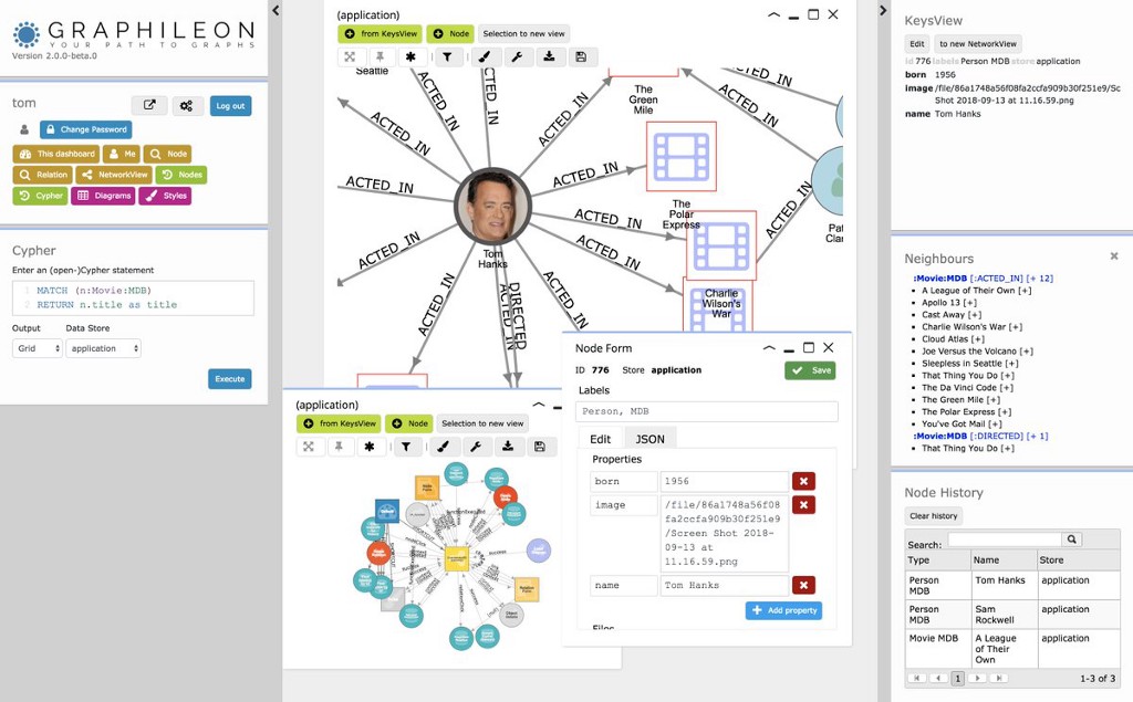
Graphileon is a dashboard development environment for visualizing graph data. It allows you to easily design, build, and share dashboards using data from Neo4j and various other graph databases. Offering an extensive set of features, Graphileon can be used as a tool or for presenting the contents of your graph database, a prototyping tool, or even a full-fledged application framework.
Key features:
- Can report on a Neo4j database with networks, tables, forms, charts, maps, timelines, calendars, and more
- Allows organizing interactions in dashboards via functions and triggers
- Supports styling your visualizations using different layouts, icons, colors, and shapes
- Supports saving visualizations as diagrams or images
- Allows embedding dashboards and charts in other applications
- Provides access control and sharing dashboards with teams
Graphileon has a personal free edition and an enterprise edition with additional features. Graphileon’s low-code environment is accessible to users with varying technical expertise, and its ability to connect to multiple graph databases and create interactive dashboards makes it versatile.
14. KeyLines (embedded tool)
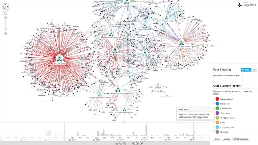
KeyLines is an enterprise library for building graph visualizations in JavaScript. Compared to Neovis.js and Popoto.js, KeyLines has a far greater list of features (layouts, styling, grouping, filtering) and was built to be performant on large graphs.
Key features:
- Uses WebGL for efficient rendering, working well even with large and complex datasets
- Supports time-based analysis, geospatial graph analysis, and social network analysis
- Supports geographical (map) visualizations
- Offers custom graph layouts (grouping) and styling
KeyLines provides the reliability and depth needed for handling extensive graph data. For simpler or small-scale visualizations, lighter alternatives like Neovis.js or Popoto.js are more practical, as they’re easier to use and cost less.
15. yFiles for HTML (embedded tool)

yFiles for HTML is a JavaScript library for creating and visualizing sophisticated graphs and diagrams in web applications. With its roots as a diagramming library, yFiles provides a rich set of features for layout algorithms, styling, and interactions, catering to both simple and complex graph visualizations. Key features:
- Advanced layout algorithms: Includes hierarchical, circular, tree, organic layout, and many more
- Customizable rendering: Highly customizable node, edge, and label styles using SVG and Canvas
- Rich integration: Works seamlessly with modern frameworks like React, Angular, and Vue
- High performance: Efficient rendering and support for large graphs
yFiles for HTML is designed for developers building sophisticated graph-based applications. Its capabilities are ideal for industries such as logistics, network analysis, and organizational charting. Being a commercial tool, yFiles for HTML is a great option for projects requiring high-quality, enterprise-ready graph visualization features.
Wrapping up
This wraps up the list of tools for graph visualization. You’ll find the visualization landscape is rapidly evolving, so this list is by no means complete! It should be mentioned that there are also a variety of different types of visualization (such as Sankey charts, maps, or 3-D formats) to render graph data. If you’re interested in more details on how tools work with Neo4j, check out the website.
Be sure to give the tools that suit your use case a try — after all, that’s the best way to see if a tool works for you!
Visit our documentation to learn more about graph data visualization
15 Best Graph Visualization Tools for Your Neo4j Graph Database was originally published in Neo4j Developer Blog on Medium, where people are continuing the conversation by highlighting and responding to this story.
Share Article


Explore
Related Articles
Hybrid Search in Neo4j: Full-Text, Vectors, and Graph Topology with Cypher


A workbench for teams to query, explore, and visualize graph data