


Fake news is nothing new – bad journalism and propaganda have always existed – but what is new is its ability to spread through social media.
In this post, we’ll see how graph analysis and visualization techniques can help social networking sites stop the spread of fake news. We’ll see how, like fraud, fake news detection is about understanding networks. We’ll discuss how Neo4j and the KeyLines graph visualization toolkit can power a comprehensive fake news detection process.
A quick note: For simplicity, in this post we’ll limit the term ‘fake news’ to describe completely fictitious and unsubstantiated articles (see examples like PizzaGate and the Ohio lost votes story).
How Is Fake News a Graph Problem?
To detect fake news, it’s essential to understand how it spreads online – between accounts, posts, pages, timestamps, IP addresses, websites, etc. Once we model these connections as a graph, we can differentiate between normal behaviors and abnormal activity where fake content could be shared.
Let’s get started.
Building Our Graph Data Model
When we’re detecting fraud, we usually rely on verifiable, watch-list friendly, demographic data like real names, addresses or credit card details. With fake news, we don’t have this luxury, but we do have data on social networking sites. This can give us useful information, including:
- Accounts (or Pages) Age, history, connections to other accounts, pages and groups
- Posts Device fingerprint / IP address, timestamp, number of shares, comments, reactions and ‘Reported’ flags
- Articles Host URL, WHOIS data, title, content and author
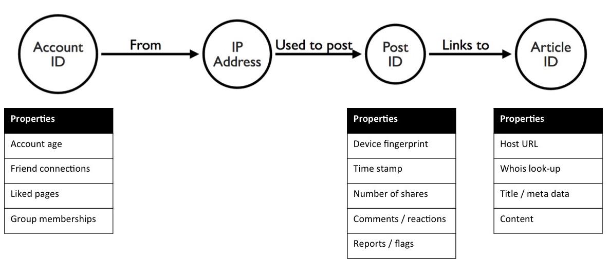
Our fake news detection graph model
Detection vs. Investigation
Fake news spreaders are just as determined as regular fraudsters. They’ll adapt their behavior to avoid detection, and employ bots to run brute-force attacks.
Relying on algorithmic or manual detection isn’t enough. We need a hybrid approach that combines automated detection and manual investigation:
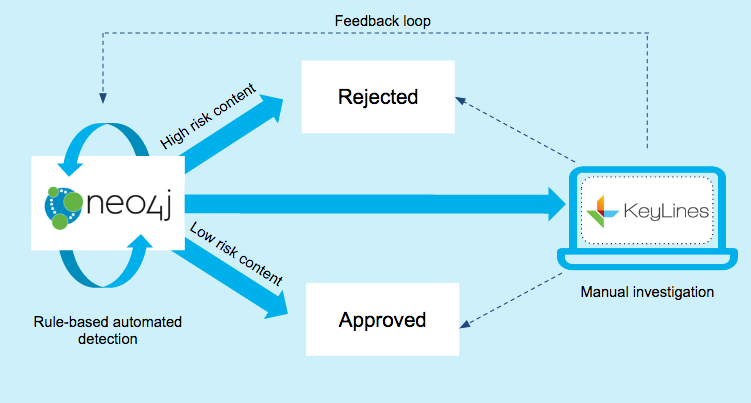
A simplified model showing fake news detection powered by Neo4j and KeyLines
- Automated detection This uses a Neo4j graph database as the engine for an automated, rule-based detection process. It isolates posts and accounts that match patterns of behavior previously associated with fake news (‘known fraud’).
- Manual investigation At the same time, a manual investigation process, powered by a KeyLines graph visualization tool, helps uncover new behaviors (‘unknown fraud’).
Detecting Fake News with Neo4j
Once we’ve created our data store, we can run complex queries to detect high-risk content and accounts.
Here’s where graph databases like Neo4j offer huge advantages over traditional SQL or relational databases. Queries that could take hours now take seconds and can be expressed using intuitive and clean Cypher queries.
For example, we know that fake news botnets tend to share content in short bursts, using recently registered accounts with few connections. We can run a Cypher query that:
- Returns all accounts:
- that have fewer than 20 friend connections
- that shared a link to www.example.com
- between 12.07pm – 12.37pm on 13 February 2017
MATCH (account:Account)--(ip:IP)--(post:Post)--(article:Article)
      WHERE account.friends < 20 AND article.url = 'www.example.com'
            AND post.timestamp > 1486987620000
            AND post.timestamp < 1486989420000
RETURN account
Investigating Fake News with KeyLines
To seek out ‘unknown fraud’ – cases that follow patterns that can’t be fully defined yet – our manual investigation process looks for anomalous connections.

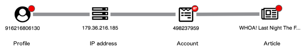
Visual investigation tools provide an intuitive way to uncover unusual connections that could indicate fake content
A graph data visualization tool like KeyLines is essential for this.Building a Visual Graph Model
Let’s define a visual graph model so we can start to load data from Neo4j into KeyLines.
It’s not a great idea to load every node and link in our source data. Instead we should focus on the minimal viable elements that tell the story, and then add other properties as tooltips or nodes later.
We want to see our four key node types, with glyphs to highlight higher-risk data points like:
- New accounts
- Posts that have been reported by users
- URLs that have previously been associated with fake content
Loading the Data
To find anomalies, we need to define normal behavior. Graph visualization is the simplest way to do this.
Here’s what happens when we load 100 Post IDs into KeyLines:
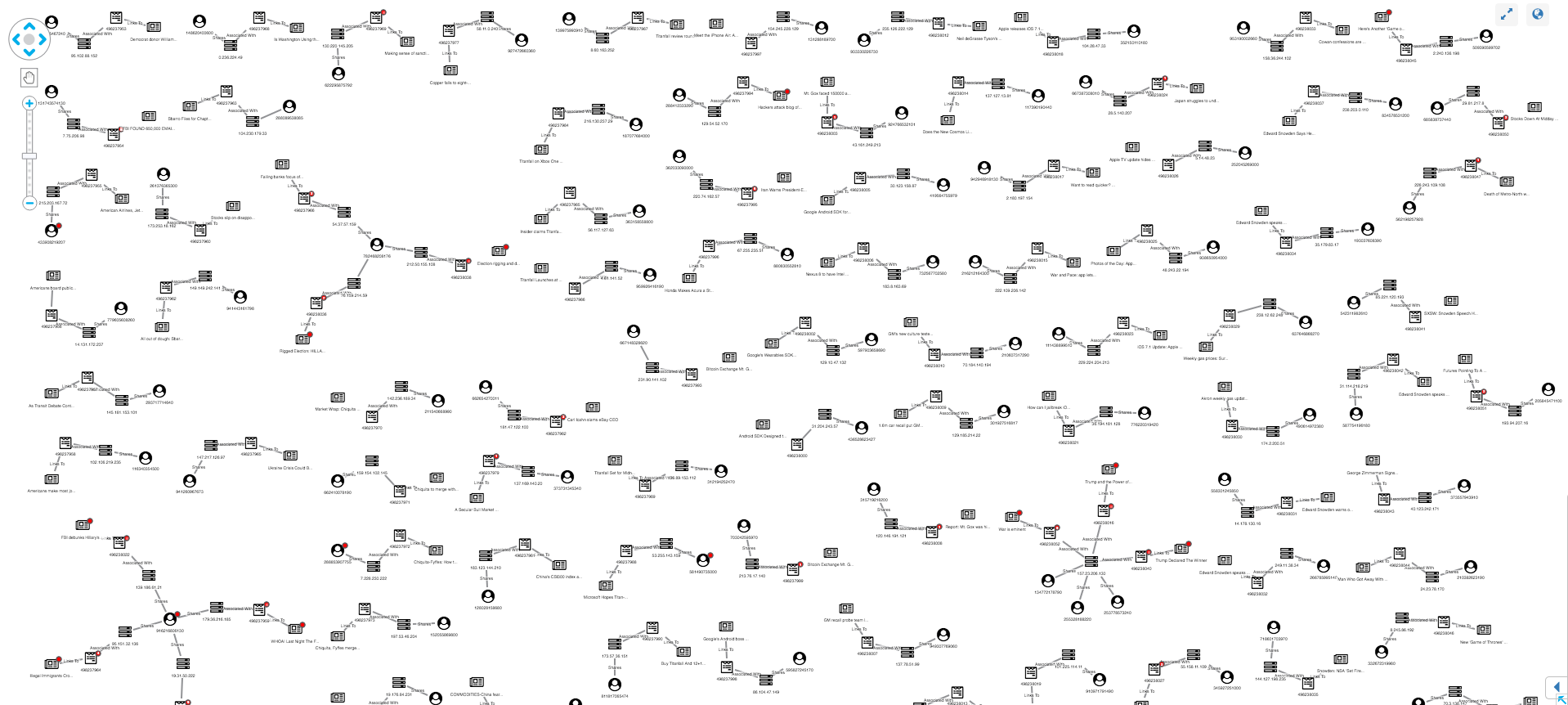
Loading the metadata of 100 Facebook posts into KeyLines to identify anomalous patterns
Our synthesized dataset is simplified, with a lower rate of sharing activity and more anomalies than real-world data. But even in this example we can see both normal and unusual behavior:
Normal user sharing behavior, visualized as a graph
Normal posts look similar to our data model – featuring an account, IP, post and article. Popular posts may be attached to many accounts, each with their own IP, but generally this linear graph with no red glyphs indicates a low-risk post.Other structures in the graph stand out as unusual. Let’s take a look at some examples.
1. Monitoring New Users
New users should always be treated as higher risk than established users. Without a known history, it’s difficult to understand a user’s intentions. Using the New User glyph, we can easily pick them out:
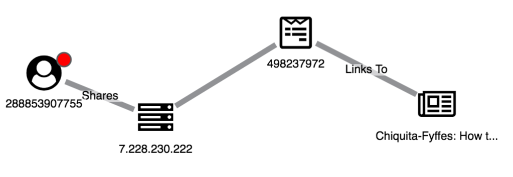
A non-suspicious post being shared by a new user
This structure is much more suspicious, with a new user sharing flagged posts to articles on known fake news domains
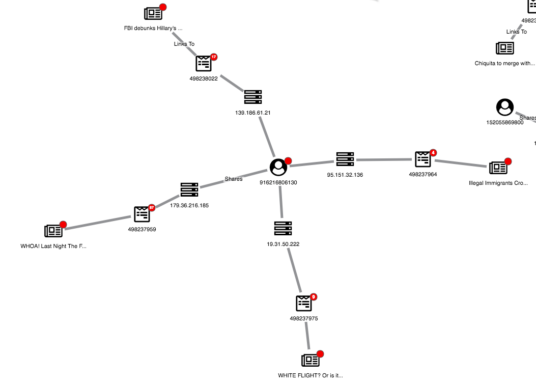
2. Identifying Unusual Sharing Behavior
We can also use a graph view to uncover suspicious user behavior. Here’s one strange structure:
An anomalous structure for investigation
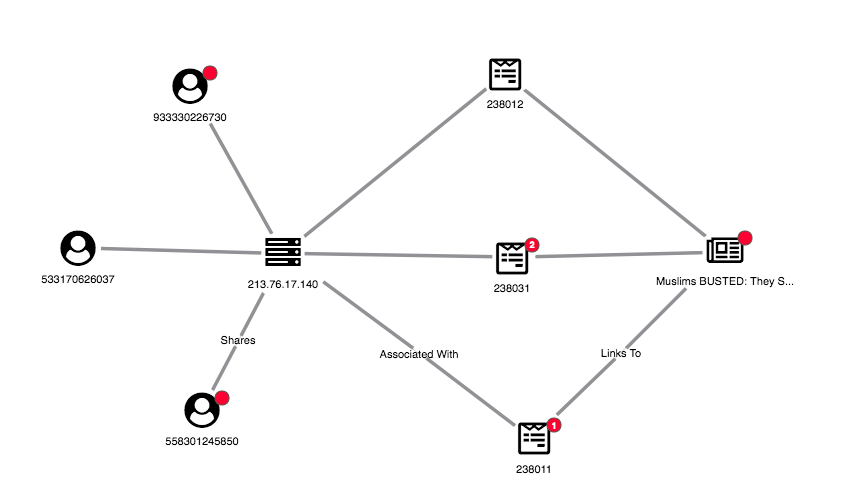
We can see one article has been shared multiple times, seemingly by three accounts with the same IP address. By expanding both the IP and article nodes, we can get a full view of the accounts associated with the link farm.3. Finding New Fake News Domains
In addition to monitoring users, social networks should monitor links to domains known for sharing fake news. We’ve represented this in our visual model using red glyphs on the domain node. We’ve also used the combine feature to merge articles on the same domain:
Using combos to see patterns in article domains
This view shows the websites being shared, rather than just the individual articles. We can pick out suspicious domains:
Try It for Yourself
This post is just an illustration of how you can use graph visualization techniques to understand the complex connected data associated with social media. We’ve used simplified data and examples to show how graph analysis could become part of the crackdown on fake news.
We’d love to see how this approach works using real-world data. Catch my lightning talk or stop by our table at GraphConnect on 11th May to see how we could work together!
References
The dataset we used here was synthesised from the following two sources: Cambridge Intelligence is a Silver sponsor of GraphConnect Europe. Use discount code CAMBRIDGE30 to get 30% off your tickets and trainings.
Join us at the Europe's premier graph technology event: Get your ticket to GraphConnect Europe and we'll see you on 11th May 2017 at the QEII Centre in downtown London!
Sign Me Up
Sign Me Up


