NeoDash 2.4: Unleashing the Power of Neo4j Graph Dashboards

Product Manager, Neo4j
5 min read

When building your Neo4j project, dashboards are a great tool to let people understand and analyze graph data. Dashboards are also useful for rapid prototyping, as they offer a fantastic means to reduce time-to-value.
If you’re using a graph database, graph visualizations are essential to your dashboard. While they are naturally an amazing way to display network data, in practice, you’ll need a variety of different visualizations to really make your data shine.
Enter NeoDash, a tool to build interactive graph dashboards with charts, maps, and graphs. It works natively with Neo4j’s Cypher and is optimized to handle nodes and relationships. Together with Neo4j Bloom & Neo4j Browser, you can use NeoDash to make your data visible and get the most out of Neo4j.
NeoDash – Dashboard Builder for Neo4j – Neo4j Labs
Since NeoDash was first released 3 years ago, we’ve added a ton of features: custom visualizations, extensions, styling, and more. Many of these are integrated as extensions to NeoDash.
The latest release of NeoDash is packed with several new features to power up your graph dashboards even further. In this post, we will dive into three topics:
- Liven up your dashboard with 3D Graphs.
- Adding Interactivity through Forms & more.
- Customize your interface with Extensions.
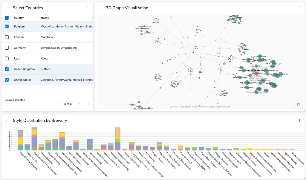
3D Graphs
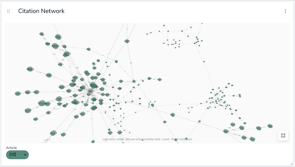
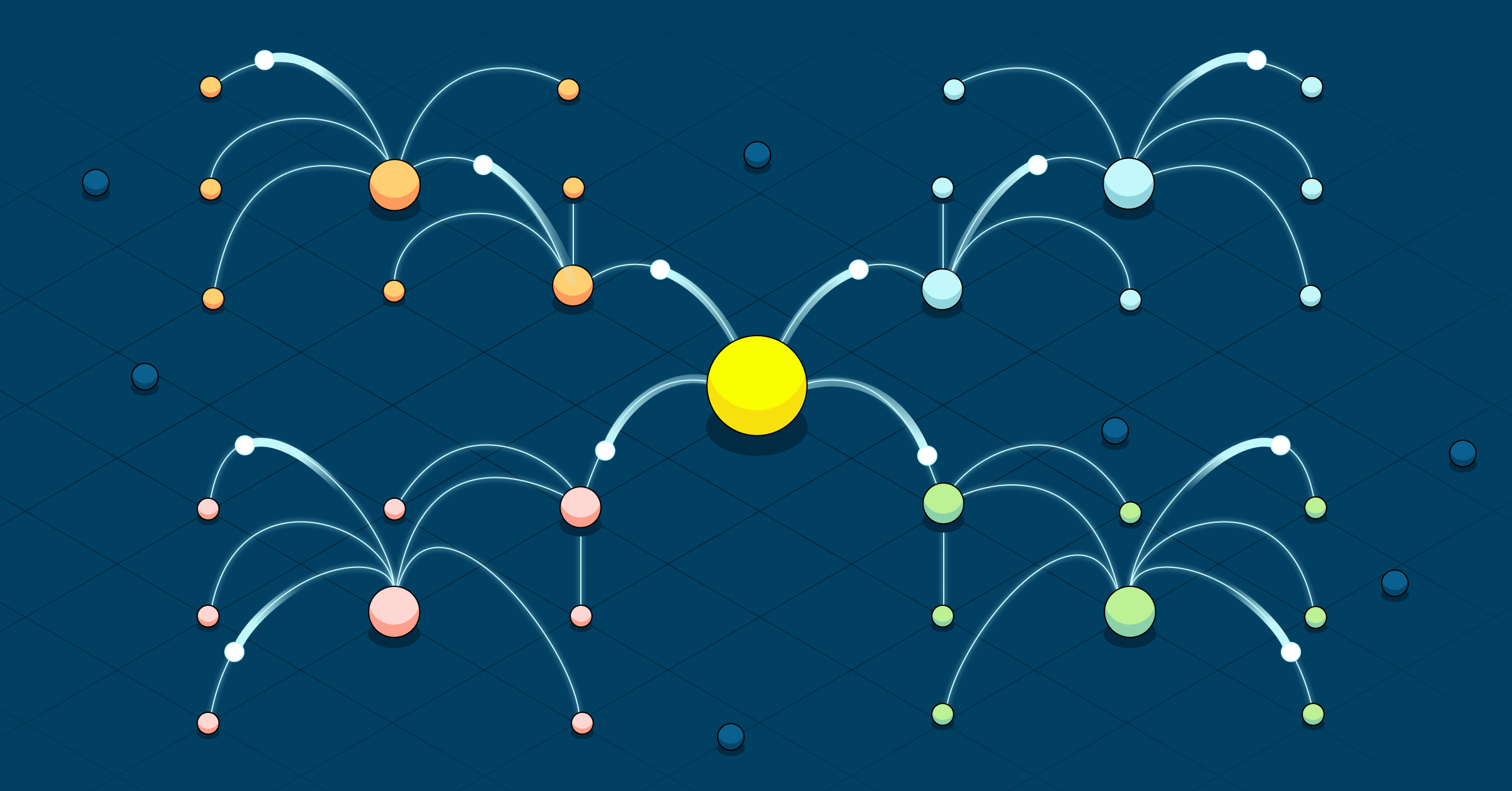
NeoDash 2.4 introduces 3D graphs as part of the Advanced Visualizations Extension. This new report type uses a WebGL library (3d-force-graph) to render your nodes and relationships in an interactive 3D view. For complex and dense graphs, the 3D view with coloring makes it a lot simpler to understand the relationships between clusters of elements:
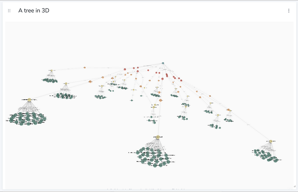
In addition to the default force-directed graph layout, 3D graphs also support tree layouts for hierarchical data. A 3-dimensional tree is especially useful for displaying a tree with a high branching factor:
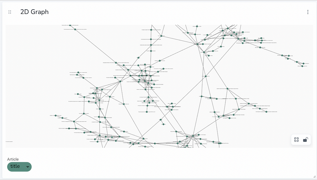
3D graphs support the same customizations as the ‘regular’ 2D graph. Style options range from simple node colors and sizes, to animated edges, and even rule-based styling. For a full overview of customizable styling, check out the documentation.
Interactivity Through Forms
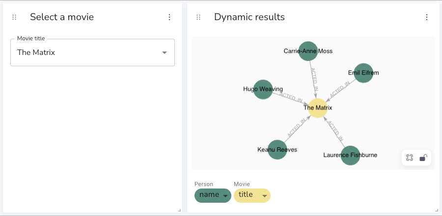
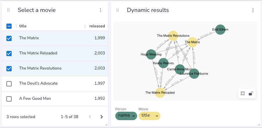
NeoDash uses query parameters as a main tool for making dashboards dynamic and interactive. For example, you may want to use a parameterized Cypher query to visualize a graph:
MATCH (p:Person)-[a:ACTED_IN]->(m:Movie)
WHERE m.title = $neodash_movie_title
RETURN p, a, m
Then, creating a parameter selector report, you can dynamically set $neodash_movie_title based on a textbox input:
For advanced usage, parameters can also be set using the report actions extension. As of NeoDash 2.4, you can transform your table views into an interactive checklist, which can, in turn, be used as a query parameter:
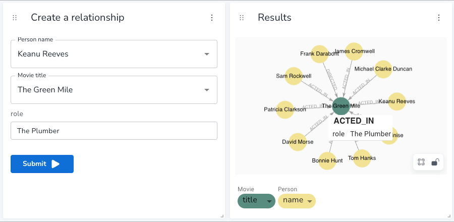
Another new feature in NeoDash 2.4 is forms. After enabling this extension, you can execute parameterized write queries to your database. For example, to create new relationships in the database, you might want to use the following Cypher query:
MATCH (m:Movie), (p:Person)
WHERE m.title = $neodash_movie_title
AND p.name = $neodash_person_name
CREATE (p)-[:ACTED_IN{role:$neodash_role}]->(m)
In a NeoDash form, you can specify the input parameters with a list of dropdowns. The query is then executed when the user clicks on the ‘Submit’ button:
In short — parameters provide an awesome way to make your dashboards more interesting and interactive. Combining different selectors will let you build all kinds of cool graph apps!
Customize Your Dashboard With Extensions
The NeoDash engine is designed as a modular toolkit for graph applications. We make advanced features available through the Extensions interface, taking the form of new visualizations, or other extra functionality.
NeoDash can also be deployed with your own theme colors and branding. You can even hook it up with your Neo4j SSO provider for a seamless connection experience. As of version 2.4, we also support an experimental dark mode, and let you add custom colors to visualizations.
If you are looking to build your own extensions for NeoDash, check out our developer guide.
Need professional help with extending NeoDash?
Get in touch with Neo4j Professional Services.
Wrapping up
Finished your dashboard? Use the new Dashboard Management Sidebar to create, import, save, and load dashboards. Dashboards are stored in Neo4j, so you can easily share dashboards with others using the same database.
To learn more about NeoDash, check out the official documentation. Suggestions and contributions are more than welcome on our GitHub repository.
Interested to see more applications of NeoDash? Check out NeoDash at NODES 2023:
- Guido Thys shows how to use NeoDash to solve historical research issues with Neo4j.
- I demonstrate how to use NeoDash to create Graph Dashboards With LLM Powered Natural Language Queries.
NeoDash 2.4: Unleashing the Power of Neo4j Graph Dashboards was originally published in Neo4j Developer Blog on Medium, where people are continuing the conversation by highlighting and responding to this story.
Share Article


Explore
Related Articles
New research finds enterprises earn 230% ROI with Neo4j Graph Intelligence Platform

SumoDB in Neo4j: Chaining Multiple Graph Algorithms in Snowflake — Part 3