Graph visualization tools
Types of graph visualization
There are three architectural categories into which most of graph visualization tools fall. You will see how each of these categories handles the exported data and be provided with some pros and cons of the different architectures. Depending on the visualization needs, one of these categories may define the set of tools you can choose to implement as a solution to your business needs.
1. Standalone product tools
Certain tools and products are designed as standalone applications that can connect to Neo4j and interact with the stored data without involving any code. These applications are built with non-developers in mind - for business analysts, data scientists, managers, and other users to interact with Neo4j in a node-graph format.
Many of these tools involve commercial licenses and support but can be configured specifically to your use case and custom requirements. They also require little or no developer integration hours and setup.
The next paragraphs help us get a feel for the types of products in this area.
Neo4j Bloom
Neo4j Bloom is a data exploration tool that visualizes data in the graph and allows users to navigate and query the data without any query language or programming.
Users can write patterns similar to natural language questions to retrieve data and traverse layers of the graph. Bloom also allows appropriate users to edit, update, or correct the graph when missing information or bad data is found.
Neo4j Bloom is available in the following formats:
-
Neo4j Bloom local with users accessing Bloom via Neo4j Desktop (free for local database instances)
-
Neo4j Bloom server with users accessing Bloom via a web browser
-
Neo4j Bloom through the sandbox
-
Neo4j Bloom through Neo4j Database as a Service, AuraDB
-
Included in Neo4j Startup Program
Bloom Resources
-
Developer Guide: Neo4j Bloom User Interface Guide
-
Blog post: Bloom-ing marvellous! Introducing Bloom 1.3
-
Product information: Neo4j Bloom landing page
NeoDash
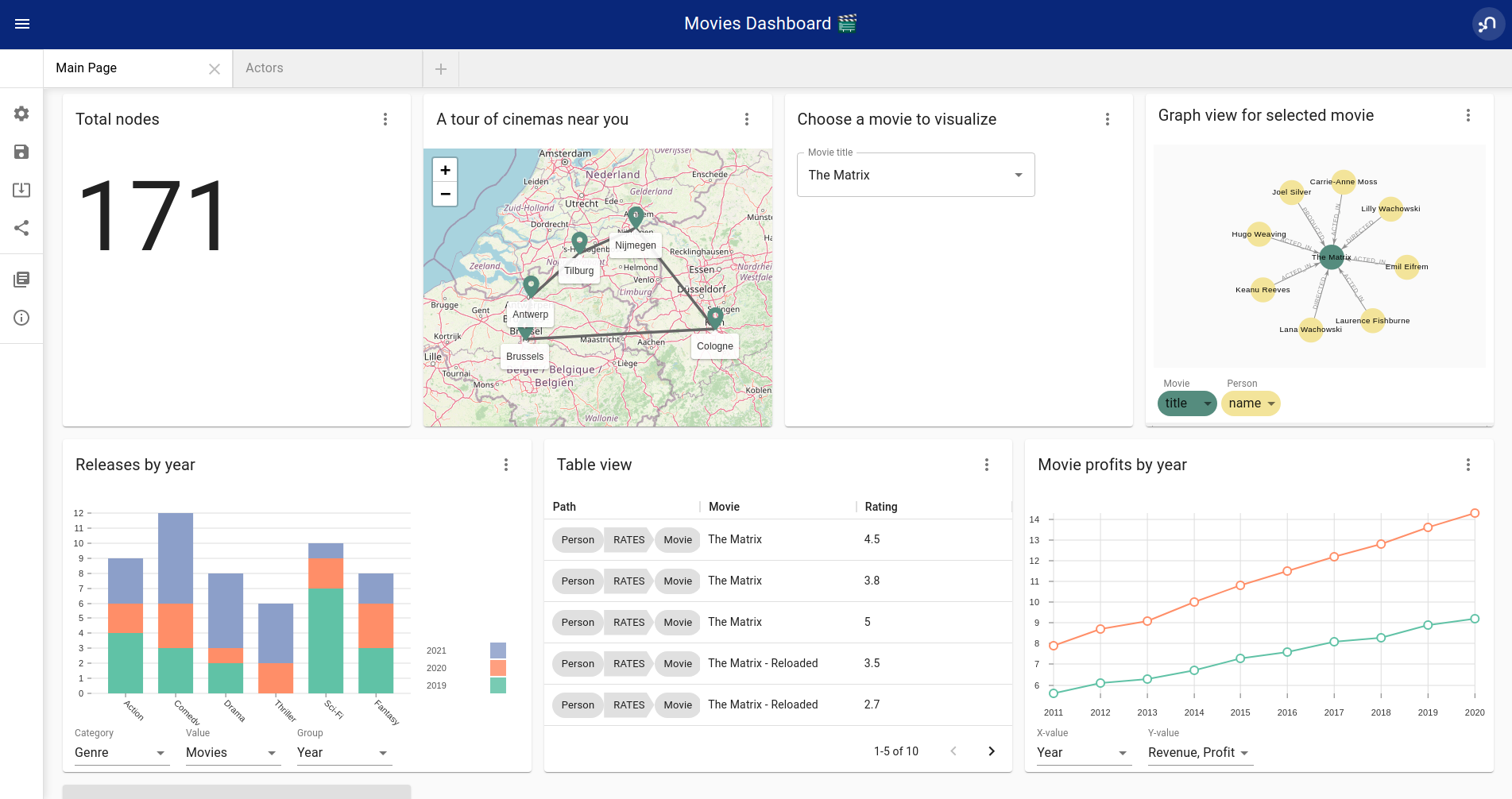
NeoDash is an open-source, low-code Dashboard Builder for Neo4j. As a part of Neo4j Labs, NeoDash is developed and supported via the online Community.
NeoDash lets you build an interactive dashboard with tables, graphs, bar charts, line charts, maps and more. Dashboards can be saved and shared directly from your Neo4j database.
-
A low-code dashboard builder with a drag-and-drop interface
-
Create visualizations directly from Cypher®
-
The ability to add customization and interactivity to dashboards
-
Build and publish dashboards for read-only access
NeoDash Resources
-
User Guide: NeoDash User Guide
-
Try NeoDash: NeoDash Online Demo
GraphXR
GraphXR is a start-to-finish web-based visualization platform for interactive analytics. For technical users, it’s a highly flexible and extensible environment for conducting ad hoc analysis. For business users, it’s an intuitive tool for code-free investigation and insight.
-
Collect data from Neo4j, SQL dbs, CSVs, and Json.
-
Cleanse and enrich with built-in tools as well as API calls.
-
Analyze links, properties, time series, and spatial data within a unified, animated context.
-
Save back to Neo4j, output as a report, or embed in your webpage.
GraphXR supports a wide range of applications including law enforcement, medical research, and knowledge management.
Kineviz also has a graph app version of this tool that can be installed in Neo4j Desktop. The blog post about the graph app is included in the resources below.
GraphXR Resources
-
Blog post: Evaluating Investor Performance Using Neo4j, GraphXR and MLl
-
Product information: GraphXR Datasheet
yFiles
yWorks provides sophisticated solutions for the visualization of graphs, diagrams, and networks with yFiles, a family of high-quality, commercial software programming libraries. The yFiles libraries enable you to easily create sophisticated graph-based applications powered by Neo4j. They support the widest range of desktop and web technologies and layout algorithms with the highest quality and performance. With the wide-ranging extensibility and large feature set, all your visualization needs can be satisfied.
yWorks also provides a free graph explorer app that is based on the yFiles technology. It can be installed in Neo4j Desktop.
yFiles Resources
-
Blog post: Custom Visualization Solutions with yFiles and Neo4j
-
Webinar: Technical intro to yFiles with Neo4j
-
Product information: yFiles Visualization Libraries
Linkurious Enterprise
Linkurious Enterprise is an on-premises and browser-based platform that works on top of graph databases. It brings graph visualization and analysis capabilities to analysts tasked to detect and analyze threats in large volumes of connected data. Organizations such as the French Ministry of Economy and Finance, Zurich Insurance or Bank of Montreal use Linkurious Enterprise to fight financial crime, terror networks or cyber threats.
Linkurious Resources
-
Blog post: Panama Papers Discovery with Neo4j and Linkurious
-
Blog post: Fraud detection with Neo4j and Linkurious
-
Blog post: Detect and Investigate Financial Crime with Neo4j and Linkurious
-
Solution: Linkurious Enterprise + Neo4j
-
Product datasheet Linkurious Enterprise
GraphAware Hume
GraphAware Hume is a government-grade data analytics platform for fast, intuitive intelligence analysis. From the user interface to the database, GraphAware Hume is uniquely graph-based, showcasing the full power of Neo4j through code-free UIs.
GraphAware Hume ingests and connects structured and unstructured data sources via configurable data workflows. It supports both streaming and batch processing to establish a unified and up-to-date single source of truth.
As more intelligence sources are integrated, specialized graphs can be created to support different types of analysis. Analysts can leverage graph data science to understand node importance within networks, predict links, and set up automated graph-based alerts.
GraphAware Hume comes with robust deployment options (including containerized and air-gapped setups), strong security features (such as SSO, RBAC, and audit logging), high availability, backup capabilities, and open standards and API, ensuring no vendor lock-in and full ownership of your graph-enabled solutions.
Graphistry
Graphistry brings a human interface to the age of big and complex data. It automatically transforms your data into interactive, visual investigation maps built for the needs of analysts. Quickly surface relationships between events and entities without writing queries or wrangling data. Harness all of your data without worrying about scale, and pivot on the fly to follow anywhere your investigation leads you.
Ideal for everything from security, fraud, and IT investigations to 3600 views of customers and supply chains, Graphistry turns the potential of your data into human insight and value.
Graphistry Resources
-
Source code: Graphistry on Github
-
Product information: Graphistry graph visualization
Graphlytic
Graphlytic is a highly customizable web application for graph visualization and analysis. Users can interactively explore the graph, look for patterns with the Cypher language, or use filters to find answers to any graph question. Graph rendering is done with the Cytoscape.js library which allows Graphlytic to render tens of thousands of nodes and hundreds of thousands of relationships.
The application is provided in three ways: Desktop, Cloud, and Server. Graphlytic Desktop is a free Neo4j Desktop application installed in just a few clicks. Cloud instances are ideal for small teams that need them get up and running in very little time. Graphlytic Server is used by corporations and agencies with highly sensitive data typically in closed networks.
Graphlytic Resources
-
Product webpage: https://graphlytic.biz
-
Online Demo: Graphlytic Demo
-
Free Desktop Installation: How To Install And Use Graphlytic In Neo4j Desktop
-
Features: Graphlytic Feature Clips
-
Blog post: Parallel Relationship Models with Graphlytic
Perspectives
Tom Sawyer Perspectives is a robust platform for building enterprise-class graph and data visualization and analysis applications. It is a complete graph visualization software development kit (SDK) with a graphics-based design and preview environment. The platform integrates enterprise data sources with the powerful graph visualization, layout, and analysis technology to solve big data problems. Enterprises, system integrators, technology companies, and government agencies use Tom Sawyer Perspectives to build a wide range of applications.
Perspectives Resources
-
Product information: Perspectives graph visualization
Keylines
KeyLines makes it easy to build and deploy high-performance network visualization tools quickly. Every aspect of your application can be tailored to suit you, your data and the questions you need to answer. KeyLines applications work on any device and in all common browsers, to reach everyone who needs to use them. It is also compatible with any IT environment, letting you deploy your network visualization application to an unlimited number of diverse users. You can build a custom application that is scalable and easy to use.
Keylines Resources
-
Product information: Keylines graph visualization
Semspect
SemSpect is a highly scalable knowledge graph exploration tool that uses visual aggregation to solve the hairball problem faced by standard graph visualization approaches. The data guided construction of the exploration tree empowers the users to build complex requests intuitively without query syntax. Its meta level approach is very effective for grasping the overall structure of the graph data, while flexible access to node and relationship details ensures easy inspection and filtering. SemSpect furthermore allows to define query-based node labels during exploration to refine the graph data schema.
SemSpect is available as follows:
-
SemSpect as Graph App for Neo4j Desktop (free for local database instances)
-
SemSpect as Web App for Neo4j database servers
Semspect Resources
-
Product information: SemSpect for Neo4j
-
Blog post: A Different Approach to Graph Visualization
Visualization Resources
-
Blog series: Neo4j Visualization
-
Neo4j Visualization: YouTube videos
2. Embeddable tools with built-in Neo4j connections
These kinds of tools can be included as a dependency within an application and can easily be configured and styled for your application and Neo4j. Each is easily connected to an instance of the graph database using configuration properties and allows you to style the visualization based on nodes, relationships, or specific properties.
Embedding the visualization within the application allows the developer to create applications that include the visualization as part of the user interface. This also means that the developer can write other components and customize the application experience and other components involved in the application to the exact business requirements.
On the downside, these libraries don’t often support extremely complex or heavy workloads and do not have vendor support or SLAs for functionality requests. Because they are managed by the community, the tools depend on the community for support and feature improvements. Also, this typically means that our client application is connecting directly to the database, which might not always be the desired architecture.
Let us look at some of the tools in this category.
Neovis.js
This library was designed to combine JavaScript visualization and Neo4j in a seamless integration. Connection to Neo4j is simple and straightforward, and because it is built with Neo4j’s property graph model in mind, the data format Neovis expects aligns with the database. Customizing and coloring styles based on labels, properties, nodes, and relationships is defined in a single configuration object. Neovis.js can be used without writing Cypher and with minimal JavaScript for integrating into your project.
|
The Neovis library is one of our Neo4j Labs projects. To learn more about Neo4j Labs, visit our Labs page. |
To maximize functionality and data analysis capabilities through visualization, you can also combine this library with the graph algorithms library in Neo4j to style the visualization to align with results of algorithms such as page rank, centrality, communities, and more. Below, we see a graph visualization of Game Of Thrones character interactions rendered by neovis.js, and enhanced using Neo4j graph algorithms by applying pagerank and community detection algorithms to the styling of the visualization.
An advantage of enhancing graph visualization with these algorithms is that we can visually interpret the results of these algorithms.
Neovis.js Resources
-
Blog post: Neovis.js
-
Download neovis.js: npm package
Popoto.js
Popoto.js is a JavaScript library that is built upon D3.js. Popoto.js will help users build queries in a visual way to execute against Neo4j. Users can also customize the results and the visual display. Along with the visualization, you can include auto-complete searches for potential queries, see the Cypher translations that are generated from the visualization, review text results from queries, and more.
To use Popoto.js in your application, you simply need to include each component independently bound to a container id in an HTML page. The rest of the content will be generated from that.
3. Embeddable libraries without direct Neo4j connection
These libraries offer the ability to embed graph visualization in an application, but without connecting directly to Neo4j. An advantage here is that you can populate your visualization with data sent from an API application that connects to the database, ensuring the client application is not querying the database directly. The downside, however, is that you often must transform the results to export from Neo4j into the format expected by these libraries.
You will get a closer look at these tools in the next paragraphs.
Neo4j Visualization Library (NVL)
NVL is a collection of libraries that can be used to build custom graph visualizations like those used in Neo4j Bloom and Explore in the Aura console. NVL is written in TypeScript and can be used in any JavaScript project. It is also available as a React component that can be used in React applications.
NVL Resources
-
Documentation: Neo4j Visualization Library
-
NVL API documentation: NVL API
-
NVL code examples: NVL Code examples
D3.js
As the first line on D3’s website states "D3.js is a JavaScript library for manipulating documents based on data." You can bind different kinds of data to a DOM and then execute different kinds of functions on it. One of those functions includes generating an SVG, canvas, or HTML visualization from the data in the DOM.
Neo4j’s movie example applications use d3.js, and you can find a variety of other projects using Neo4j and d3. The complicated part of D3 (or any embeddable library that doesn’t have direct Neo4j connection) is converting your graph data into the expected map format for export. D3 expects two different collections of graph data - one for nodes[] and one for links[] (relationships). Each of these maps includes arrays of properties for each node and relationship that d3 then converts into circles and lines. Version 4 and 5 of d3.js also support force-directed graphs, where the visualization adjusts to the user’s view pane.
D3.js Resources
-
Website: D3.js
-
D3 and graphs example: D3 Examples
-
Neo4j Github examples with d3: Examples with Neo4j
Vis.js
This library offers a variety of visualizations designed to handle large, dynamic data sets. There are a variety of formats to style your data, including timeline, dataset, graph2d, graph3d, and network. The most common format seen with Neo4j is the network visualization.
Even with the network format, there are numerous customizations available for styling nodes, labels, animations, coloring, grouping, and others. For additional information and to see everything that is available, check out their docs and examples linked in the resources below.
Vis.js Resources
-
Vis.js website: Vis.js
-
Network format examples: Format Examples
-
Source code project: Vis.js Github
Sigma.js
While some libraries are meant to include all the capabilities in one bundle, Sigma.js touts a highly-extensible environment where users can add extension libraries or plugins to provide additional capability. This library takes exported data in either JSON or GEXF formats.
Users can start from a very basic visualization right out of the box, and then begin adding custom functions and rendering for styling preferences. Once the requirements surpass what is possible there, users can write and use their own custom plugins for specific functionality. Be sure to check out the repository, though, for any existing extensions!
Sigma.js Resources
-
Website: Sigma.js
-
Source code: Sigma.js Github
-
Blog post: Sigma.js+Neo4j
Vivagraph.js
Vivagraph.js was built to handle different types of layout algorithms for arranging nodes and edges. It manages data set sizes from very small to very large and also renders in WebGL, SVG, and CSS-based formats. Customizations and styling are available through CSS modifications and extension libraries. It also can track changes in the graph that update the visualization accordingly.
Vivagraph.js Resources
-
Source code: Vivagraph.js Github
-
Blog post: Viavgraph.js+Neo4j
Cytoscape.js
This library is also meant to visualize and render network node graphs and offers customization and extensibility for additional features. Cytoscape.js responds to user interaction and works on touch screen interfaces, allowing users to zoom, tap, and explore in the method that is relevant to them. You can customize styling and web page view with a variety of style components.
Cytoscape.js Resources
-
Website: Cytoscape.js
-
Source code: Cytoscape.js Github