I built a digital twin of my amateur-built airplane

Vice President of Product Marketing, Neo4j
10 min read
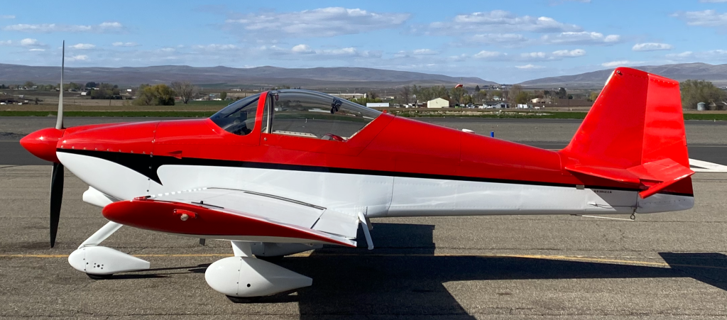
A co-worker suggested it to me at a tech meetup, and I dismissed it on the spot. A digital twin sounded like the kind of thing a car plant or an airline does, with a team and a budget to match. I maintain and fly a small, high-performance, experimental airplane in my spare time. The idea didn’t seem to fit my hangar.
The seed had been planted, and before long, I couldn’t stop thinking about it. I started listing the questions I wanted to ask. Some of them were embarrassingly simple. What size fastener goes on the wheel pants? What’s the torque value for the aileron hinge bolts? Which air filter model do I actually run? These are things I look up, forget, and look up again, every time. Then the questions became more complex. How is my oil consumption trending? Is engine performance drifting over the years I’ve owned the plane? And then the fun ones. Could I plan a route that adds 10 new airports to my logbook with less than 2 hours of flight time?
Before long, I was convinced a digital twin was something I should build to help me answer and track all these questions. Here’s what I learned, and why I think you can build one too, whatever you maintain.
What a digital twin actually is
A digital twin is a living model of a physical thing, kept in sync with real data about that thing. It’s not a 3D rendering, and it’s not a dashboard, though it can feed both. It’s a record of what your asset is, what’s happened to it, and what state it’s in now, structured so you can ask questions and get real answers.
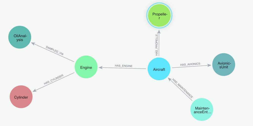
Here’s the part that made the whole project click for me: an airplane is already a graph. It’s a network of connected things. An airframe has an engine. The engine has four cylinders. The plane has flown 100 flights, each departing from one airport and arriving at another. Every oil sample connects back to the engine it came from. Every maintenance entry is linked to the part it affected. Different owners may connect to the aircraft over time.
Most of the value lives in those connections, not in the individual records. A graph database stores the connections directly, the same way you’d draw them on a whiteboard. So when I model the airplane as a graph, the questions I want to ask map cleanly onto the data. I don’t have to flatten my airplane into a stack of spreadsheets and then reassemble them in my head every time.
Why build one for a homebuilt airplane
If you maintain your own aircraft, you already know where your data lives. It lives everywhere. The engine monitor exports CSV files. Oil analysis comes back as PDFs from the lab. The pilot operating handbook is a Word document. Weight and balance is a spreadsheet. The airframe and engine logbooks are paper, decades of handwritten entries. Airworthiness directives and service bulletins are their own scattered digital pile, and it’s on me to know which ones apply to the systems, parts, and serial numbers on my airplane.
Once a year, condition inspection means pulling all of that together by hand. I cross-reference the logbook and parts lists of what’s installed against Airworthiness Directives and Safety Bulletins spanning FAA and vendor websites. This isn’t an area for mistakes, so gathering the information requires a thorough, painstaking effort.
I wanted to stop reassembling that picture from scratch every time. I wanted to ask one question and get one answer, drawn from all of the data at once.
What goes into the twin
The twin pulls together four kinds of data about one airplane. Getting each source into a clean, consistent shape was the bulk of the work, and I want to be honest that this part isn’t glamorous. It’s the unsexy 80% of any twin.
The static identity of the airframe came first: the aircraft, engine, propeller, cylinders, avionics, modifications, and ownership history. This is also where the airworthiness data lives, including the airworthiness certificate and its 28 operating limitations, as well as the airworthiness directives and service bulletins that apply to my aircraft and its equipment.
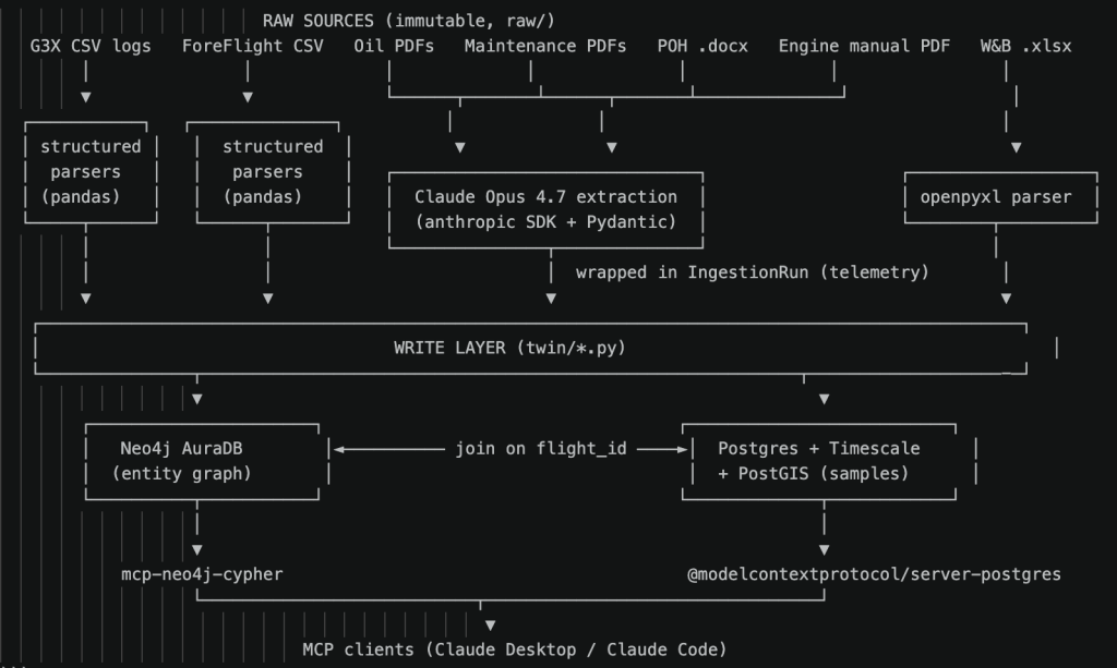
Maintenance history came next. That’s the logbook entries, the oil-analysis samples, and the running times on each component. The logbooks contain pages of handwritten or typed entries, so I rendered each page to an image and had Claude read it into structured records, including the references to past ADs.
Flight telemetry is the high-volume source. My Garmin G3X Touch primary flight display (PFD) records a reading every second of every flight. Across 100 flights, that’s about 178,000 individual samples.
Reference specifications round it out. The pilot operating handbook provides V-speeds, weights, and performance data. The Lycoming engine manual provides authoritative operating limits and redline numbers for parameters such as cylinder head and oil temperatures. The weight-and-balance spreadsheet gives me the empty weight and the center-of-gravity envelope.
For the documents that have no machine-readable form—the PDFs, the Word file, and the handwritten pages—I used Claude to extract the values into a defined schema and then wrote them into the database. Every extraction run logged its own cost and any errors, so I could audit what happened after the fact.
How I built it
The graph is the backbone of the whole thing. It runs on Neo4j AuraDB, which is the managed cloud version, so I’m not babysitting a database server. The model is what you’d expect from the whiteboard sketch: an Aircraft node connected to its Engine, Propeller, Cylinder, and AvionicsUnit nodes, Flight nodes connected to the Airport nodes they departed from and arrived at, OilAnalysis samples connected back to the engine, and MaintenanceEntry nodes routed to whatever part they touched. As it stands today, that’s roughly 1,500 nodes and 3,800 relationships. For one airplane, that’s plenty to answer real questions.
There’s one place where a graph isn’t the right tool, and that’s time series data. That per-second flight telemetry, the 178,000 samples, isn’t a good fit for a graph. It’s dense, repetitive, time-ordered data, and that’s exactly what a time-series database is built for. So the telemetry lives in PostgreSQL, with the TimescaleDB and PostGIS extensions handling the time-series and the flight-track geometry. The two stores share a common flight identifier, so a flight in the graph links straight to its second-by-second data in Postgres. Graph for the structure and the meaning, time-series database for the firehose. Both run on a cloud instance, so the whole twin lives in one place I can reach from anywhere.
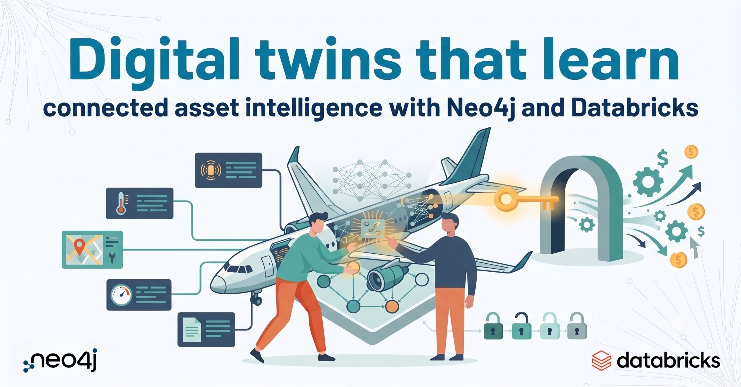
If this split sounds familiar, it’s the same shape the big implementations use. Neo4j and Databricks describe a commercial aircraft digital twin that puts fleet telemetry in a Databricks lakehouse and the aircraft topology in a Neo4j knowledge graph, joined together and queried as a single entity. I arrived at the same architecture independently, for one airplane, in my spare time. That’s the whole point. The gap between my hangar project and a fleet solution is mostly scale, not concept.
How I use it: I just ask
Here’s the part that turned the twin from a database into something I use every week. I don’t write queries. I connect Claude to the graph via Neo4j’s official Model Context Protocol (MCP) server and ask questions in plain English. The MCP server is what lets Claude talk to my database directly. I ask, the graph is queried, and I get an answer. A second MCP server does the same for the telemetry in Postgres, so I can ask about both the structure and the flight data the same way.
I don’t have the patience (or frankly the proficiency) to write Cypher every time I’m standing at the airplane with a wrench in my hand. With the twin built, having an editor write queries by hand no longer made sense. I just ask. And if I’m being honest, I’m pretty bored of typing and tend to ask verbally using Wispr Flow.
The small lookups are the ones I use most: “What’s the inflation PSI for my main landing wheels?” “How many quarts of oil did I add between oil changes?” “When will my Garmin navigation databases expire?” These are the questions that used to send me digging through manuals and old notes, or out to the hangar to have a look.
The trend questions are where the digital twin earns its keep. I can ask how my oil consumption is trending over time, or what the wear metals in my oil samples have been doing across the last year and a half of analysis, or whether engine performance is drifting. Those answers come from connecting many records, which is exactly what the graph is good at.
Condition-inspection research is the job that got dramatically easier. I can ask which airworthiness directives and service bulletins apply to my aircraft and its installed equipment, and pull together the checklist from data instead of from memory and a stack of paper.
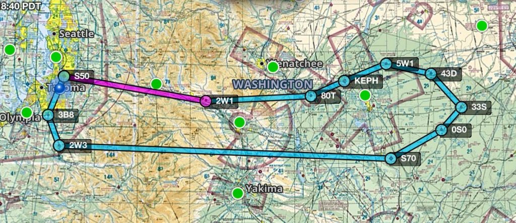
And then there’s the route question, the fun one that pushed me to start building in the first place. I can ask the twin to plan a route that adds the most new airports to my logbook for the least distance flown, because it knows every airport I’ve already visited.
What I get out of it
The most concrete benefit is time. Questions that used to mean digging through manuals or paper logbooks now take seconds. Condition-inspection research that used to take the better part of a day is shorter, because the twin assembles the picture for me.
The second benefit is visibility. Watching wear metals and oil consumption as trends, rather than as a folder of individual reports, means I notice a slow change while it’s still small. That’s the kind of thing that’s easy to miss when each oil report sits in its own PDF.
The third benefit is harder to measure but real: I enjoy owning and flying this airplane more. Being able to ask it anything, from a fastener size to a year-long performance trend, changed my relationship with the work.
None of this is unique to aviation, and none of it requires a fleet. An airline gets these same benefits across hundreds of aircraft. I get them for one tail number, built by one person, on a hobbyist budget. If you maintain machines, vehicles, or equipment of your own, the same approach is open to you.
Where to go next
If you want to see what this looks like at scale, Neo4j and Databricks walk through a commercial aircraft digital twin that uses the same graph-plus-telemetry split I landed on, built for a whole fleet. It’s a good map of where this idea goes when the budget and the stakes grow. You can read it here.
And if you want to build your own, you can start for free on Neo4j AuraDB. Pick the thing you maintain, sketch it as a graph on a whiteboard, and start with the connections you already understand. That’s all I did.
Share Article


Explore
Related Articles
Neo4j Named “One to Watch” in Snowflake’s 2026 Modern Marketing Data Stack Report
1 of 3: The difference between a graph, a knowledge graph, and a context graph
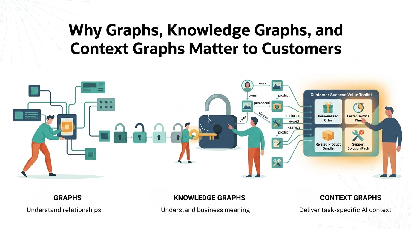
2 of 3: Why graphs, knowledge graphs, and context graphs matter to customers
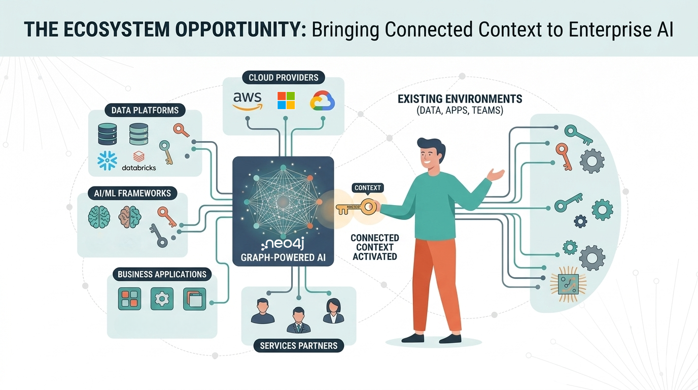
3 of 3: The graph ecosystem: Bringing connected context to enterprise AI