Creative use of network science with Graph Commons

Founder of Graph Commons
7 min read

How might we model graphs beyond the most common use cases, and take a more creative approach to graph modeling?
This post introduces the Graph Commons platform and walks through novel graph examples from the community.
Full presentation: Creative use of network science with Graph Commons
My name is Burak Arikan and I’m the founder of Graph Commons, which is an online platform, where you can create graphs manually and visually, import data or just use an API programmatically to interact with the graphs. It’s an open collaborative program that’s free to use – the target audience for this product is basically everybody.
Most types of people who use this platform are journalists, activists, artists, curators, archive researchers and more. They use this graph system because it’s quite easy to use; like the way you hand-draw diagrams on the whiteboard, you can use this platform in the same way. And I’ll show you some examples of that.
What is Graph Commons?
Graph Commons is quite accessible. You just open your browser and start using it right away. We currently have more than 15,000 users around the world in many languages. People make graphs of a variety of topics, and there are thousands of graphs on the platform at the moment. We use a single instance of Neo4j for this.

On Graph Commons, there’s usually a visual interface, where you can define a type, make nodes and define connections. Then, you can start building a graph quite easily.
It also has advanced features, like making multiple connections at once and so on. Furthermore, you can import from a spreadsheet, such as Google Spreadsheets, Excels or CSVs.
You can also navigate through the graph by selecting – like the way you would select a file on your desktop – and then highlighting those paths within the complex graph. This is something we do all the time when dealing with graphs.

On the right bar, we also have features that allow you to filter the graph based on properties of your nodes that might have certain common properties. We also apply simple analyses, such as degree distribution of the graph or distribution of a specific property among all the nodes within a graph.
The nice thing about Graph Commons is that it’s a social platform, so the people who make these graphs can also share them online on Twitter, Facebook or other social media sites. They can also embed their graphs interactively into Medium posts or Youtube videos. All of this allows for the distribution of your graph to a wide audience in the world.
Also, there’s a place on the site where you can start building a community around your graph. Graphs are often not just a drawing or a simple dataset – they convey specific information to an audience. In this way, Graph Commons allows anyone to explore very interesting aspects of a complex issue at hand.

That’s why journalists prefer Graph Commons. When they write an article that contains many actors, they’re able to build up their story in a graph structure. Likewise, an organization can use Graph Commons to apply an organization strategy for the multiple actors who are interacting in many ways among each other.
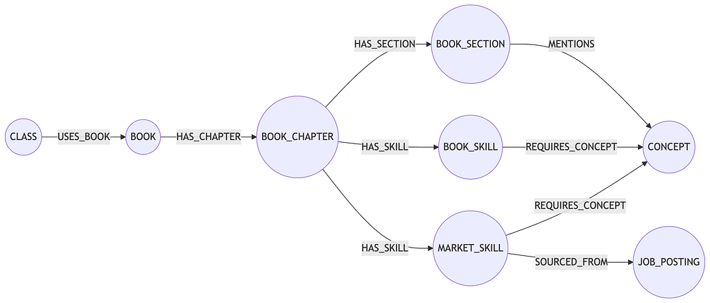
We also have an API, with the structure of graphs, nodes and edges, as shown below. In that, there are some objects, you can push in, see the graph and query it back. Additionally, you can utilize some of the APOC, more advanced calls, on the graph itself.

We also have options for selecting things within a graph, because a graph is often giant and not everyone can understand everything at once. To digest a complex system like that, you want to not only look at the certain area, but also move slowly and navigate through the graph step by step. For this reason, we have many different options, even a system that makes stories out of graphs.
Real-life exhibitions
Moreover, we provide these options for PDF and SVG exports, with which people make exhibitions. For example, the one below is from the MAXXI Museum in Rome.

Below is another example. This is a journalistic work from Turkey about a corruption case that happened around the Erdogan Regime. The news organization published this vertically to fit into the cover page of the paper. We’re quite proud of this.

Again, all kinds of organizations are on Graph Commons: academic institutions, think tanks, NGOs.
Online use cases
Now I’ll show you some examples, which are all live on our website.
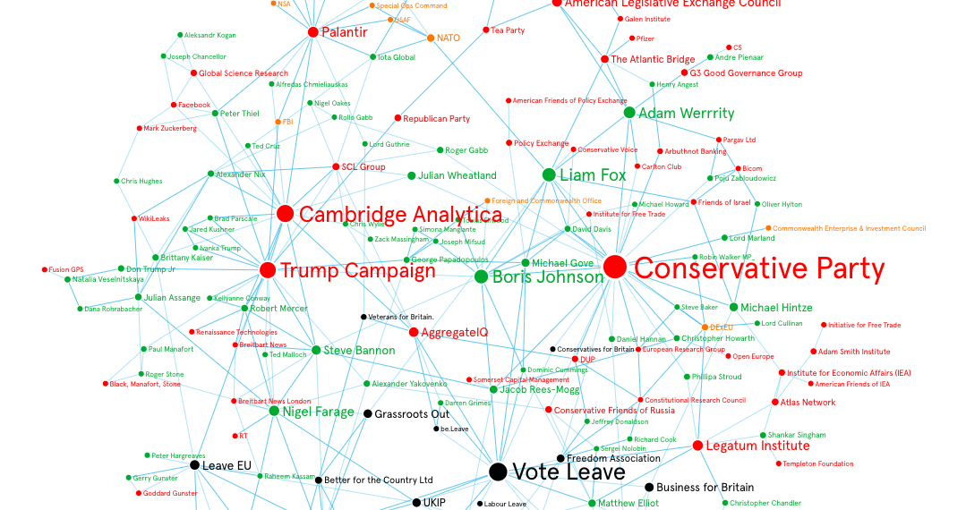
The first is this one called Brexnet. It tells the story of Brexit in the UK, what influences Brexit and so on.
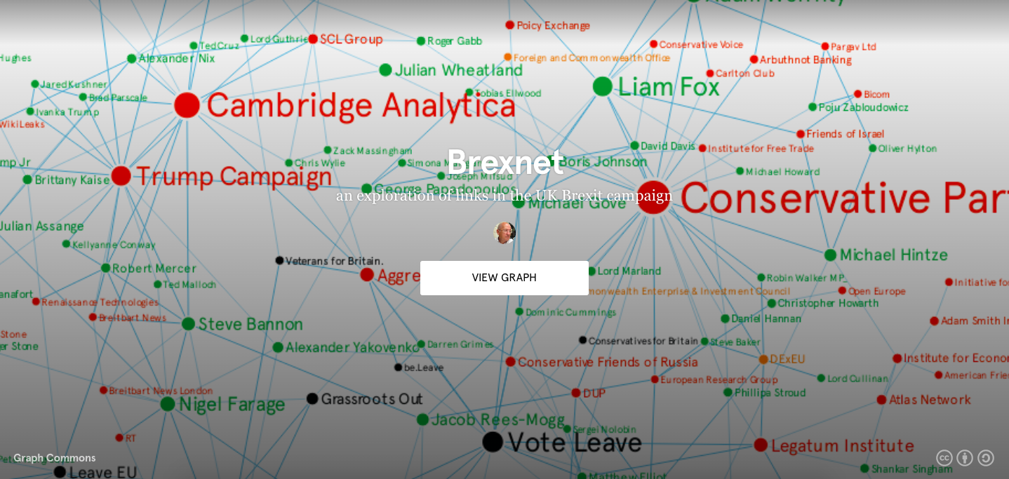
When you look at the details, you’ll see the different parties in the UK, what their connections are and how they’re collaborating with one another. All of the nodes are movable – it’s an interactive page.
If you click the info bar, you get a little summary of what’s happening in the graph.

Now you can see the types of nodes: players, organizations, Brexit campaigning groups and governments. In terms of connection types, we have collaborations and investigations.
Sidenote: all of these graphs are licensed – in Creative Commons license – to the author of the graph. You can download all this data as a JSON format and use it in your own projects as long as you reference back to this graph and the author.
Another example is on Syrian Refugees and NGOs in Turkey, done by a journalist from Turkey, who made a map about these Syrian refugees and their support networks.

As you can see, there are these different cities; for example, Hatay is a big city that is close to Aleppo, the big city of Syria.

You can also see which countries around the world are helping with this conflict. For example, when you click on Germany, you get a detailed card.

Here, we see how different organizations from Germany are active in this conflict. For instance, this organization called Deutsche Welthungerhilfe is active in the city of Gaziantep.
Since this isn’t an easy graph to analyze, we have a comments section, where there’s a conversation going on.

This next example is one about the artist collector network.
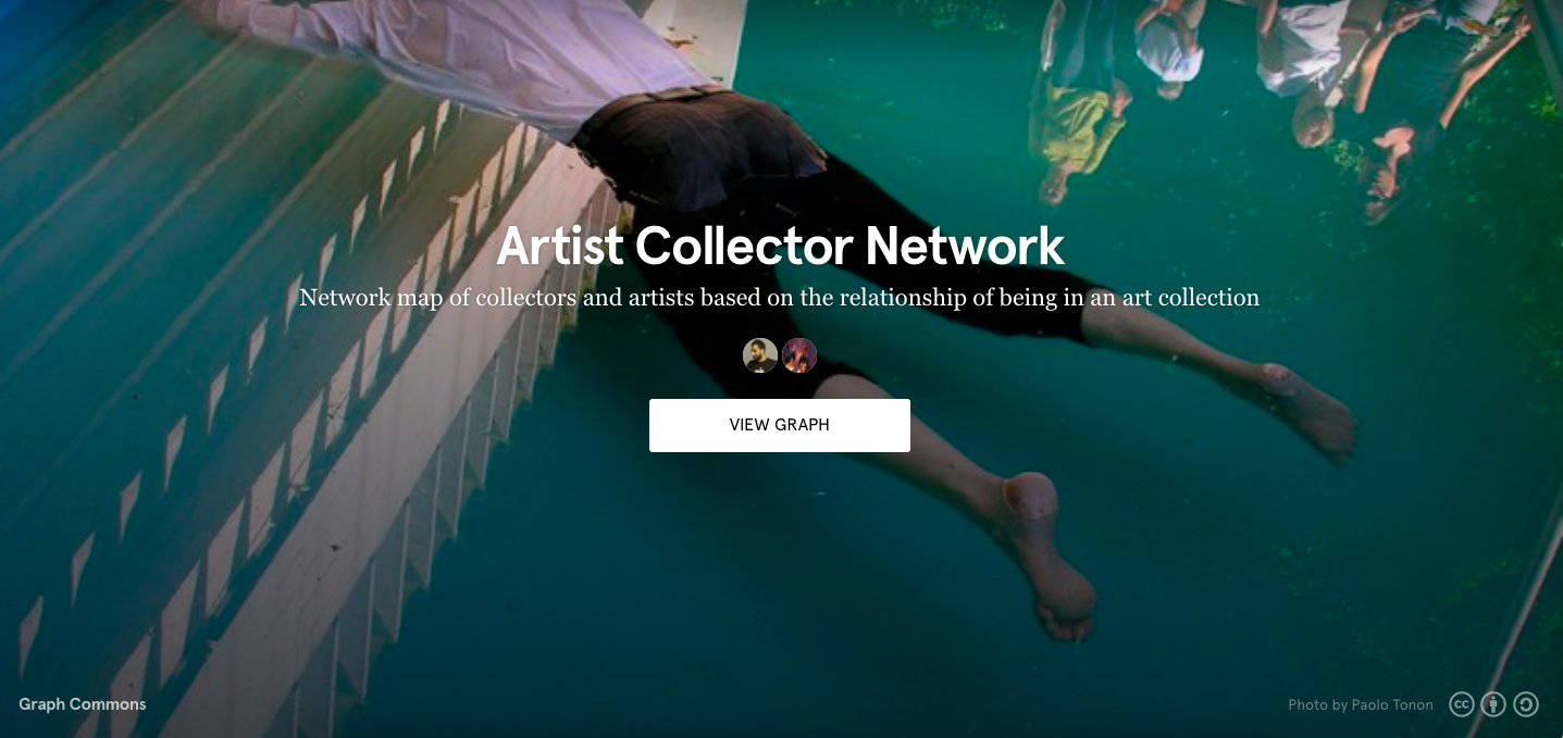
Here, red dots are collectors and black dots are artists. If there’s a connection between an artist and a collection, this means that an artist’s piece is in the collection.

Sometimes, you have ticked lines, which means there are multiple pieces from an artist in that collection. In a graph like this, you can start reading the influence of collectors in a certain art world. It’s very functional; there’s only one relationship type, which is being in a collection. There are two types of nodes: artist and collector.
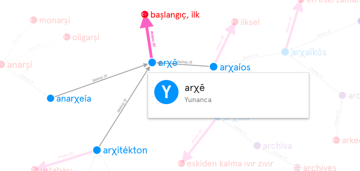
In Graph Commons, people do all kinds of stuff; it’s quite wild. For example, our next use case is of an etymological map.

The creator of this graph takes a book, observes what’s happening in it, looks at different letters and where they come from and makes the connections between these words and phrases in history.
I’ll show you one more example. The following graph is from Dow Jones, which used Graph Commons to map hurricanes, how hurricanes affected various industries and the ways in which they affected them.
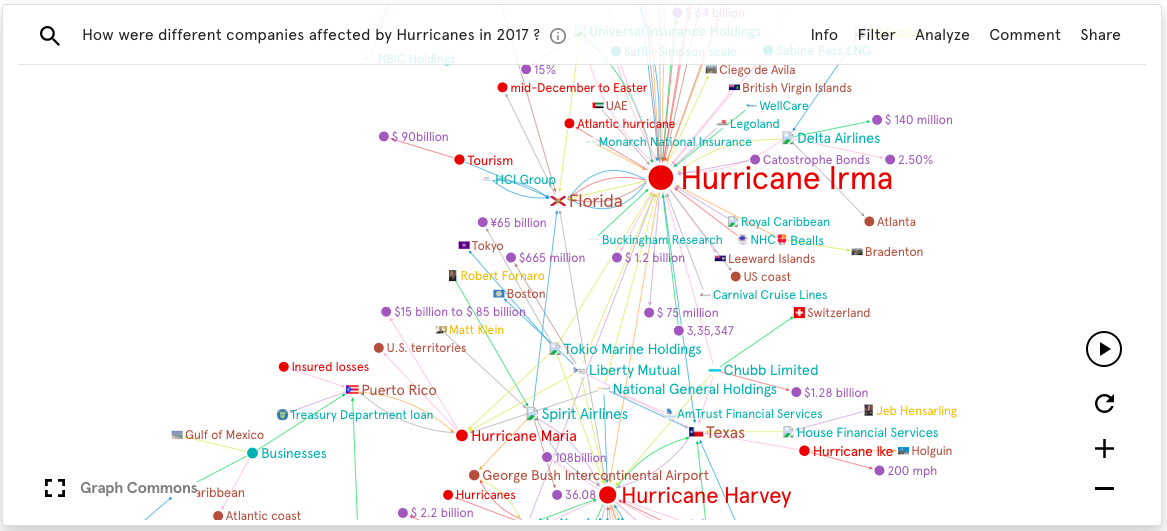
They wrote the program behind the scenes analyzing this data, and then put it into this Graph Commons structure, which generated these graphs. Now, they can embed it into their own network effects page.
Here, we see how geographic areas were affected by hurricanes in 2017. When you zoom in, you start seeing a city and what kinds of things happened. They made each node into events, concepts and locations.
Learn more about Graph Commons on graphcommons.com, and @graphcommons on all social media!
Share Article


Explore
Related Articles


A workbench for teams to query, explore, and visualize graph data
Hey LLM, you’re using OPTIONAL MATCH wrong. Here’s the Cypher that actually works.