What is graph visualization?

Product Manager, Neo4j
10 min read
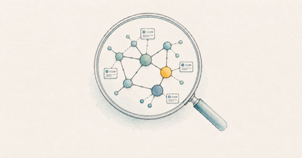
When you’re dealing with thousands of data points, it can be a struggle to see how everything is connected. Tools like bar charts or dashboards are still the right call for summarizing metrics and trends, but they don’t help you understand how data points connect and influence each other. As graphs become more complex, especially knowledge graphs, it can become harder to follow the connections between entities. That’s what graph visualization tools are for.
Using little to no code, graph visualization tools turn connected data into an intuitive, interactive diagram where entities such as customers or systems appear as connected nodes that you can follow and explore. Viewing the entire network all at once reveals the relationships, dependencies, and patterns that are key to insights but difficult to spot in rows, columns, or separate records.
For example, a single customer order connects a buyer, product, payment, warehouse, supplier, and delivery route. With the right graph visualization tools, you can easily see the impact that a closed delivery route has on the customer. That connected view is why graph visualization has become critical in relationship-driven use cases, from supply chain mapping to analyzing AI agent memory.
More in this guide:
How does graph visualization work?
Graph data has three core elements: nodes, relationships, and properties.
- Nodes represent entities such as customers, products, companies, or devices.
- Relationships connect those entities and describe how they are related, such as a customer placing an order or an employee working for a company.
- Properties capture extra information about nodes and relationships, including names, dates, amounts, and status. This adds context to the graph.
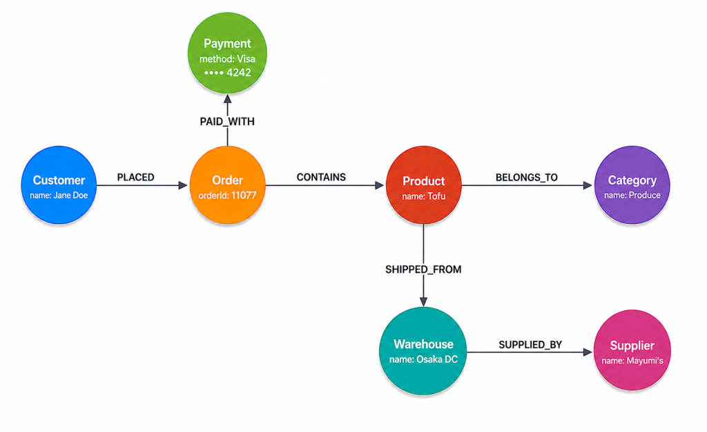
A graph visualization tool renders those elements as an interactive graph. Nodes appear as circles. Relationships are shown as lines between nodes. Properties provide labels and control visual elements such as color, size, and icons, helping distinguish entity types at a glance.
If you’re working with a knowledge graph, you can query to visualize your nodes and relationships directly. For example, if you want to see whether customers will be affected by a supply issue for tofu, a simple query can show a color-coded graph with multiple suppliers connected to one regional processor.
This ability to connect information across multi-hop pathways is at the heart of many scenarios that use graph visualization.
When to use graph visualization
If your goal is to understand relationships, dependencies, or paths through connected data, a graph provides insights that other visualization types aren’t designed to show. However, graph visualization may not be the best option for every situation. Bar charts, line charts, pie charts, and dashboards are better for summarizing metrics, trends, distributions, and key performance indicators.
Graph visualization serves a different purpose: showing how entities connect to one another. It’s valuable for exploring unfamiliar data and quickly spotting connected structures.
Graph visualization becomes even more powerful when you combine it with graph algorithms. These algorithms identify patterns, paths, and communities that may not be immediately obvious.
Graph visualization is used across a range of scenarios, from fraud detection and supply chain mapping to customer experience and AI agent memory. The examples below show how teams use graph visualization to work with connected data in different contexts.
AI agent memory
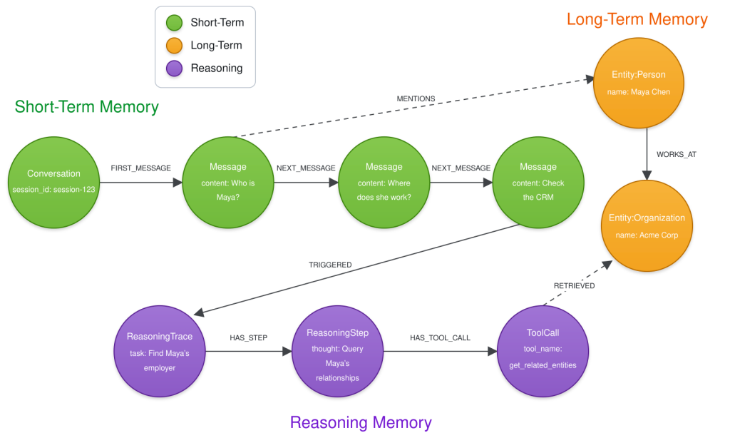
As AI agents move into production, understanding what they know and why they responded as they did is a critical new area for graph visualization.
Enterprises must be able to trust agent responses, which can draw on conversations, documents, entities, user preferences, and other knowledge that provides context.
Agent memory forms one part of the broader context graph, which may also include enterprise knowledge, situational data, decisions, outcomes, and recorded traces. By following the relationships between facts, conversations, and reasoning, graph visualization helps you inspect how the AI agent assembled the context for the task.
Fraud detection
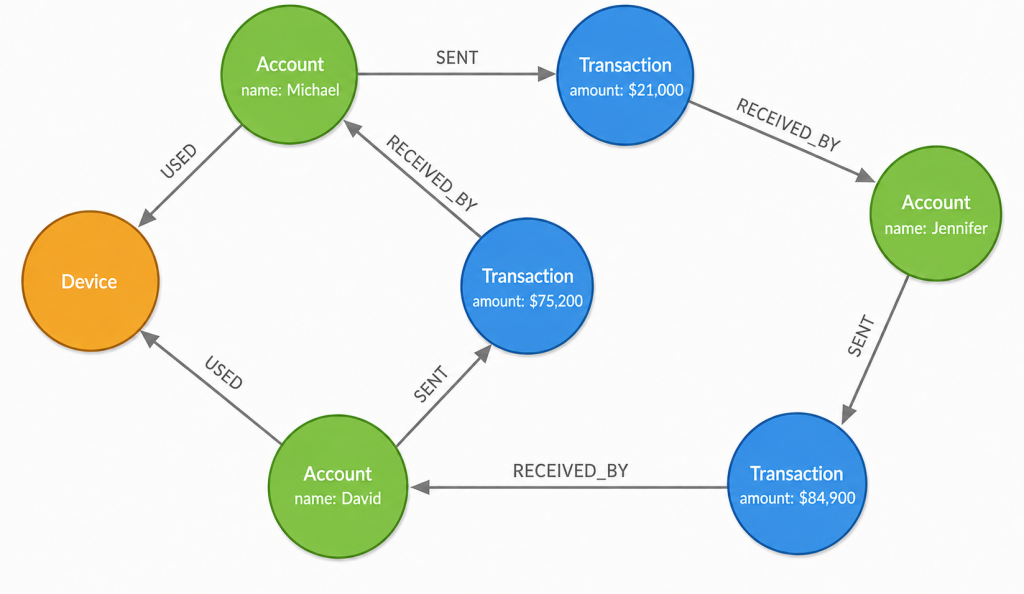
Fraud can span multiple transactions. More often, it’s hidden across a web of accounts, devices, transactions, and shared behaviors that are difficult to spot using traditional reports or other data visualizations. Graph visualization brings those relationships together in a comprehensive view, making it easier to identify unusual relationships and fraud rings.
Investigators can start with one suspicious account and quickly trace connected devices, addresses, transactions, and other entities. Following those relationships helps them understand how fraudulent activity spreads across the network, uncover previously hidden connections, and investigate cases more efficiently.
Supply chain mapping
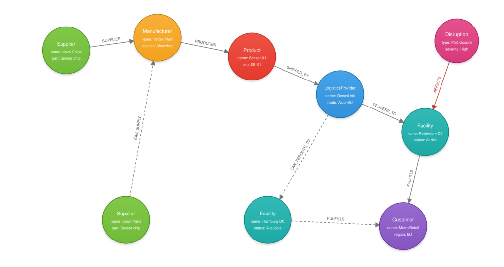
A supply chain is a network of suppliers, manufacturers, logistics providers, facilities, and products that depend on one another. Graph visualization brings those relationships into a unified view, making it easier to understand how a disruption in one part of the network can affect the chain and the customer. When a disruption occurs, teams can trace its impact across the network to understand what may be affected. Following those relationships helps identify bottlenecks, evaluate alternative suppliers or routes, and respond before the disruption spreads.
Network and IT operations
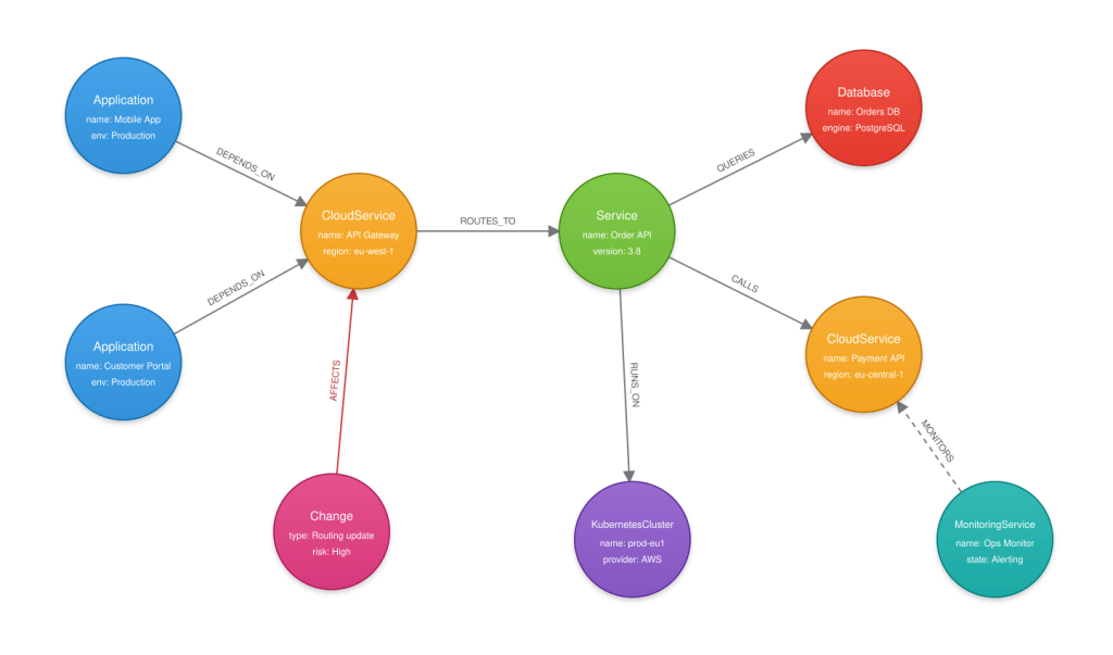
Modern IT environments connect applications, cloud services, infrastructure, and network components. Graph visualization maps those dependencies in a graph, making it easier to see how systems relate, how a change in one part of the environment affects the rest, and how information flows across the network. For example, teams can trace a dependency from an application to the cloud service it uses and see which other systems may be affected by a change.
Recommendations
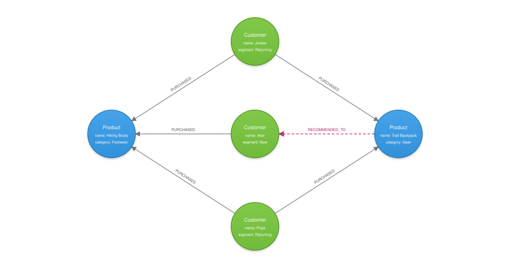
Graph visualization can also help developers understand recommendation systems. For example, if someone buys a pair of hiking boots and later sees a backpack recommended, the graph reveals that other customers who bought the same boots also bought that backpack. helping developers validate recommendation logic, troubleshoot unexpected results, and solve operational issues more efficiently.
Customer 360
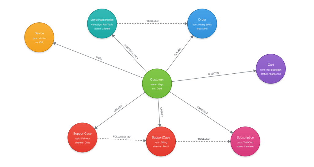
Customer experiences are built over time with disparate yet related data points, making it a natural fit for graph visualization. Interactions, preferences, and touchpoints across multiple channels help shape the full customer experience. Graph visualization connects purchases, support cases, devices, marketing interactions, and communication channels into a single view, making it easier to see how customer interactions connect across the entire journey.
Teams can trace those connected interactions to understand what happened before a purchase, support escalation, or renewal. For example, a customer who contacts support multiple times before abandoning a shopping cart or canceling a subscription may highlight friction points that would otherwise be difficult to identify. This connected view helps teams uncover customer pain points, improve experiences, and make more informed engagement decisions.
Graph visualization tools
Graph visualization tools help you explore graph data visually with little to no code. They also help you build visual dashboards from your graph data. Neo4j Studio offers a suite of graph visualization tools for exploring graphs and building dashboards — whether you’re on Neo4j Desktop, Neo4j AuraDB, or Neo4j Enterprise.
Neo4j Bloom
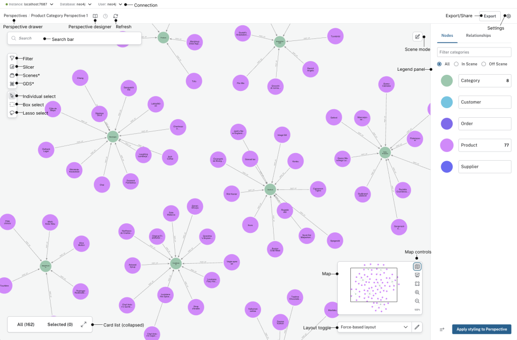
Neo4j Bloom provides a no-code visual interface for exploring graph data, available in Neo4j Studio. You can use natural language to search for graph patterns, expand the results to follow relationships, and inspect other connected nodes. If you discover missing or incorrect information, you can edit and update the graph directly from the interface with the appropriate permissions.
Bloom also lets you save perspectives that control how data appears, so the view stays focused on the entities and relationships that matter for a particular task. Clicking a node reveals its properties. Expanding a node shows its connected entities. You can also filter the graph by node or relationship type, zoom in or out, and rearrange nodes for a clearer view of the network.
A layout determines where each node appears in the visualization. Different layouts arrange nodes in different ways depending on what you want to see.
Neo4j Dashboards
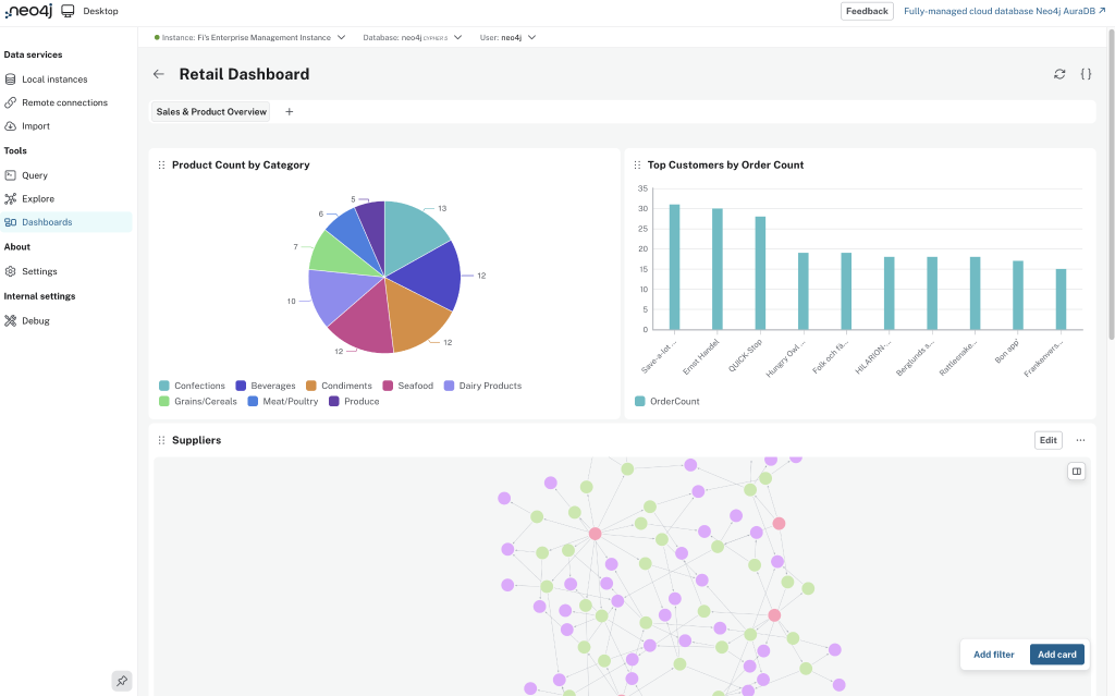
Neo4j Dashboards is a dashboard builder for Neo4j, available in Neo4j Studio. It lets you combine graphs, tables, charts, maps, and key metrics into a single dashboard that you can save and share. You can also use AI to create dashboards easily from natural language requests.
Neo4j Visualization Library
If you want to build custom graph visualization capabilities directly into your application, Neo4j Visualization Library (NVL) provides the foundation. Written in TypeScript and compatible with JavaScript projects, NVL provides React components to build your custom graph visualization with fine-grained control over how the data is rendered and explored. For Python applications, the neo4j-viz package wraps NVL to enable interactive graph visualizations in environments like Jupyter Notebooks and Streamlit. For AI applications, NVL is especially useful for visualizing an agent’s retrieval path or memory graph directly within the application interface.
Getting started with graph visualization
Graph visualization helps you understand and explore connected data by making relationships, patterns, and dependencies easier to see. Whether you’re investigating a network, validating a graph model, or sharing insights with others, Neo4j provides tools for each stage of the process.
The easiest way to start visualizing your graph is to try the Neo4j Studio in the Neo4j Aura console or Neo4j Desktop if you’re self-hosting.
Don’t have a graph yet? Create a fully managed graph database for free with Neo4j AuraDB, which includes Bloom and Dashboards for visual exploration.
Try Neo4j AuraDB
Create a free graph database and begin exploring graph data.
Graph visualization FAQs
Graph visualization turns connected data into an interactive diagram where entities appear as connected nodes that you can follow and explore. It makes it easier to understand relationships, patterns, and dependencies than viewing the same information as separate records. A graph visualization tool takes relevant nodes and relationships, draws them as circles and lines, and places them into a visualization layout.
Common uses include fraud detection, supply chain mapping, network and IT operations, recommendations, customer experience, and inspecting the context or reasoning of an AI application.
Dashboards are built for summarizing metrics, trends, and KPIs. A graph shows how entities connect, making patterns such as fraud rings, dependency chains, and clusters easier to spot than in charts or summary views.
A knowledge graph stores entities, relationships, and properties organized in a structured way. To visualize it, query or select the part of the graph relevant to your question to render the nodes and relationships. Expand those to see other related nodes connected to them, which provides additional context.
Neo4j Bloom handles no-code graph exploration. Neo4j Dashboards builds dashboards. Neo4j Visualization Library builds custom graph visualization capabilities into your own app.
An LLM can help generate a graph query from a natural language request. Graph visualization can also help you inspect context or retrieval paths that an AI agent has reasoned through.
Share Article


Explore
Related Articles

Finding the Ultimate Beneficial Owner in a Pile of KYC Documents with Document Intelligence

Connected Intelligence: Accelerating Enterprise AI throughout the cloud ecosystem